

Design Fundamentals
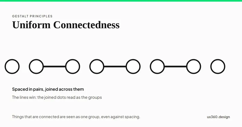
Uniform Connectedness: Why a Line Can Group Things Better Than Space
Uniform connectedness says elements joined by a line or shared area read as one group. See how it beats spacing, where interfaces use it, and the research.
The elements and principles of design, with real interfaces as examples. Balance, contrast, emphasis, hierarchy, white space, Gestalt and more.
Prefer to read these in order? Take the fundamentals path
Design fundamentals are the elements you work with and the principles that govern how you arrange them. This series takes them one at a time: the seven elements (point, line, shape, space, form, color and texture), the eleven principles from repetition to unity, and the seven Gestalt principles of perception. Start with the two overview articles, then read the individual principles you need.
45 articles
Uniform connectedness says elements joined by a line or shared area read as one group. See how it beats spacing, where interfaces use it, and the research.
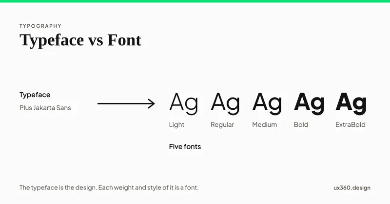
A typeface is the design, like Helvetica. A font is one weight and style of it, like Helvetica Bold. See the difference, its origin, and why it matters.
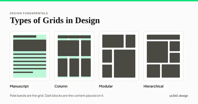
The five types of grids in design: manuscript, column, modular, hierarchical and baseline. See when to use each, why 12 columns is popular, and how grids adapt.
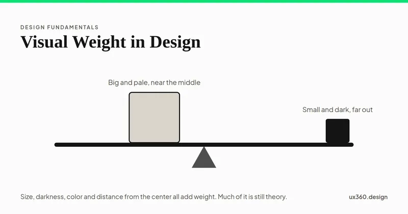
Visual weight is how strongly an element pulls the eye. See what adds weight, how it balances a layout like a seesaw, and which parts of it have been tested.
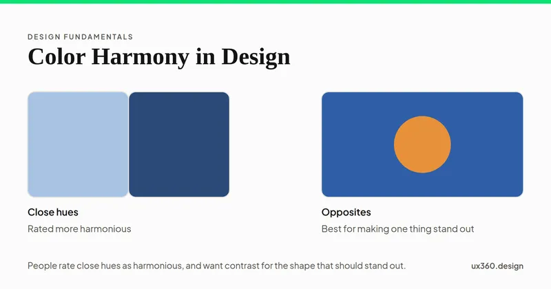
Color harmony is how well colors look together. See the classic color wheel schemes, what experiments found people prefer, and how to build a UI palette.
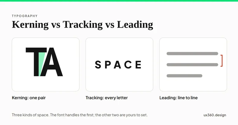
Kerning sets the space between two letters, tracking the space across a word, and leading the space between lines. See each one and what the research says.
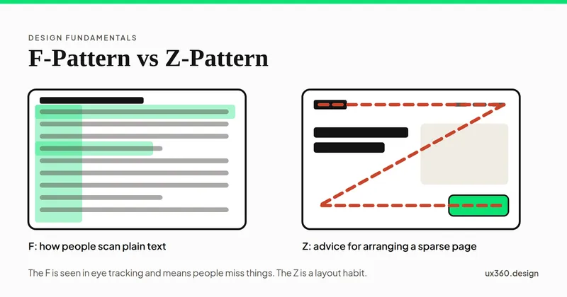
The F-pattern is how people scan pages of plain text; the Z-pattern is layout advice for sparse pages. See the eye-tracking evidence and which to design for.
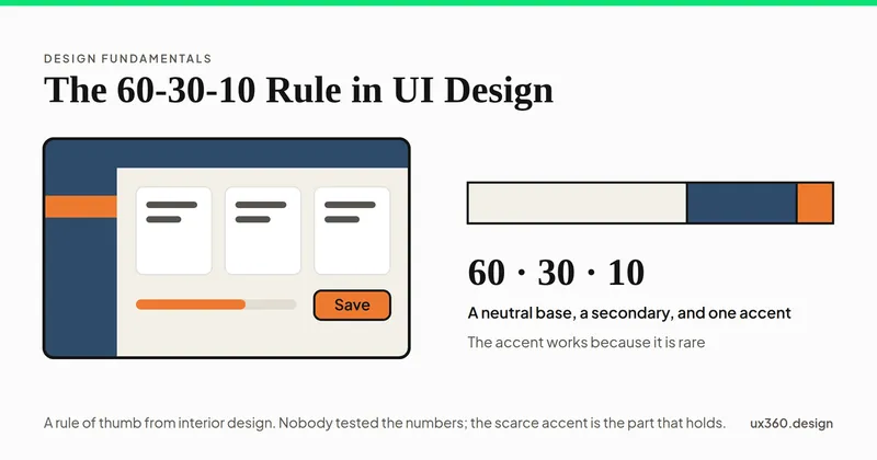
The 60-30-10 rule splits a design into 60% base color, 30% secondary and 10% accent. See how it works on a screen, why the accent matters most, and its limits.
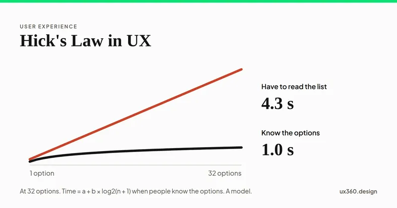
Hick's law says the time to choose grows with the number of options, but only by a little. See where it holds, where it breaks, and how to design menus with it.
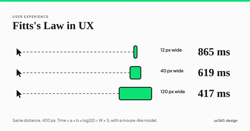
Fitts's law says the time to hit a target depends on its distance and its size. See the formula live, why screen edges are fast, and how to size buttons.
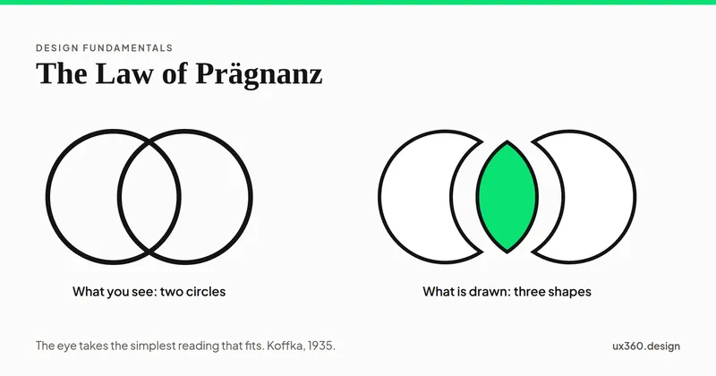
The law of Prägnanz says we see the simplest shape that fits what is in front of us. See it in rings, cubes and cards, and how to use it to simplify a design.
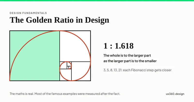
The golden ratio is about 1.618 to 1. See how it splits a layout, which famous examples hold up, and when a type scale or grid on 1.618 helps your design.
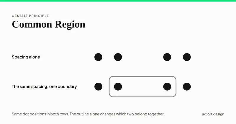
The law of common region: a shared boundary groups whatever it encloses. Why it beats proximity, what counts as a boundary, and what every boundary costs.
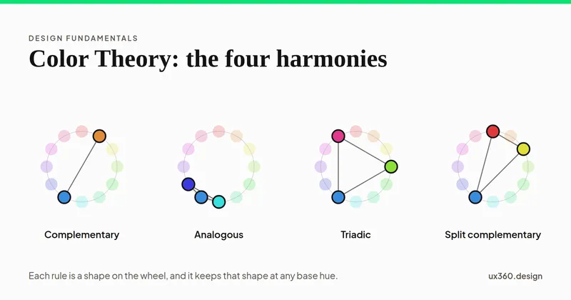
How colors combine: additive RGB and subtractive CMYK, the wheel, the harmonies, tint and tone, simultaneous contrast, palettes and the contrast floor.
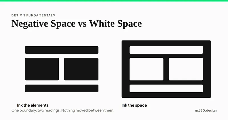
White space and negative space name the same empty area. The difference is the job it does: one separates elements, the other forms a shape of its own.
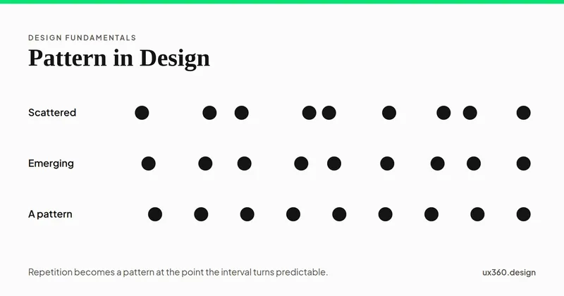
A pattern is repetition regular enough to predict. What pattern means in composition, how it differs from repetition and rhythm, and where it fails.
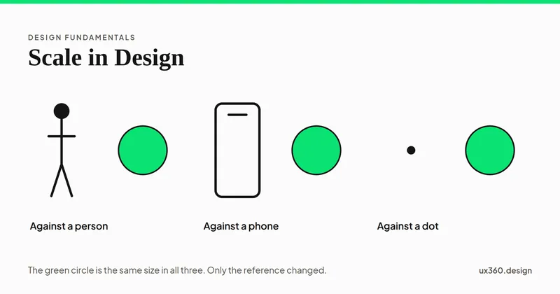
Scale is the size of an element measured against a reference. What scale means, how it differs from proportion, and how to use it to build hierarchy.
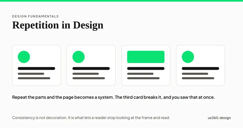
Repetition is reusing an element so a design reads as one piece. Learn what to repeat, how it builds consistency and recognition, and when it turns dull.
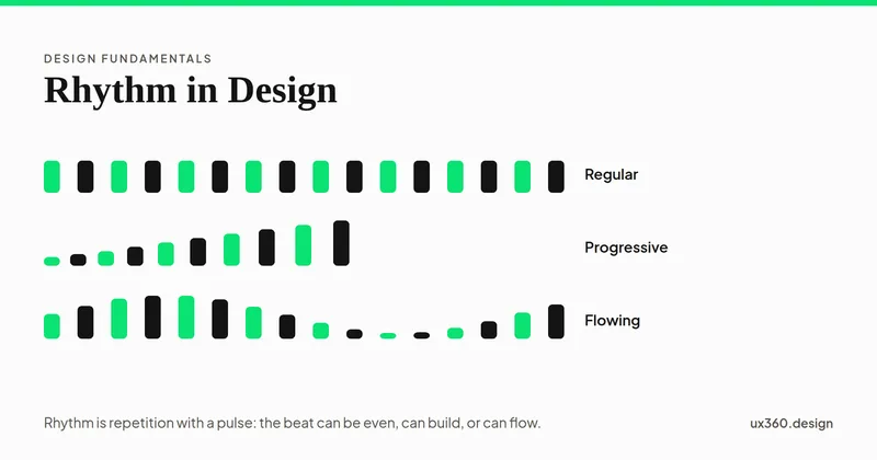
Rhythm is repetition at intervals that sets a pace for the eye. Learn the five types, from regular to progressive, with examples from real interfaces.
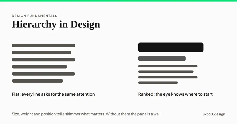
Hierarchy is the order in which a design is read. Learn how size, weight, color, position and space set that order, with examples from real interfaces.
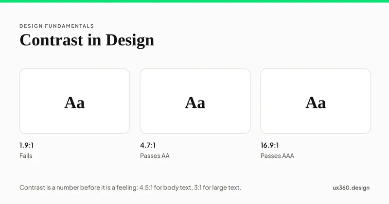
Contrast is the difference between two elements that makes each one easier to see. Learn the six types, with examples, and how much contrast is enough.
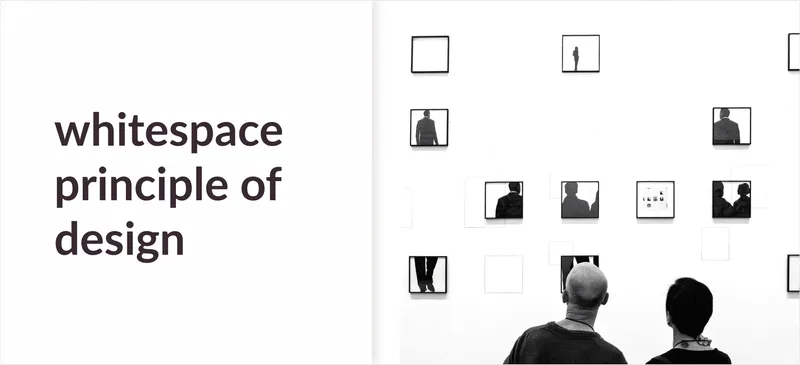
White space (negative space) is the empty area between elements. What it does for hierarchy, readability and focus, with Squarespace and Apple examples.

Emphasis is how you pull the eye to one part of a composition. Learn the techniques (contrast, isolation, placement, scale) with real UI and poster examples.
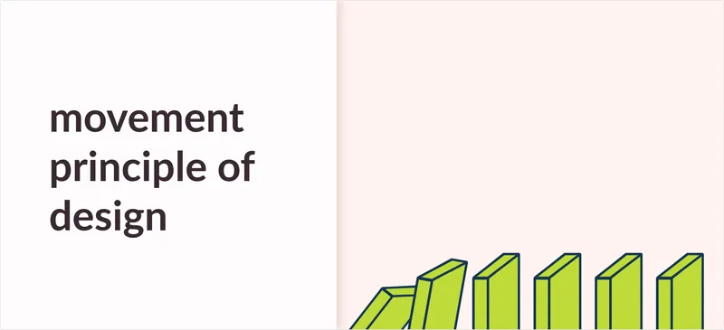
Movement guides the viewer's eye along a path through a composition. Learn the techniques, from lines and repetition to actual motion, with examples.
![Balance Principle of Design [Infographics Included]](/_astro/balance.BV5QcTGX_Z1n5BXH.webp)
Symmetrical and asymmetrical balance explained. How visual weight works and how to check whether a design feels balanced, with an infographic.
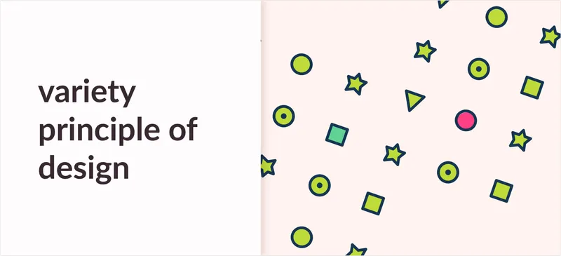
Variety breaks monotony and creates visual interest. What it means, how it balances against unity, and how to add it with shape, color, size and texture.
![Unity Principle of Design [Infographics Included]](/_astro/banner_unity-principles-of-design.COhBGowc_UBwSU.webp)
Unity ties every element of a composition together. Learn the methods that create it (proximity, repetition, alignment, continuation) with examples and a free infographic.
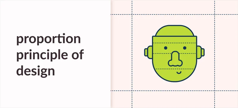
What proportion means in design, how size and visual weight relate, and how to use scale to guide attention. Clear examples from apps, posters and architecture.
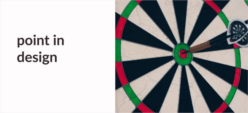
The point is the first element of design. What a point is, how points create focus, lines and patterns, and examples from typography, layout and art.
![Texture In Design: Types & Importance [Infographics Included]](/_astro/texture-article-banner.Dc61Nt14_Z1yJ9Gb.webp)
The types of texture in design (tactile and visual, real and implied) with examples from print and digital work, and how texture changes how a design feels.
![Line in Design: Types & Examples [Infographics Included]](/_astro/line-article-banner.B1VwnEUC_Z1fm9Dr.webp)
The types of line in design (horizontal, vertical, diagonal, curved, implied) and what each communicates, with examples from art, logos and interfaces.
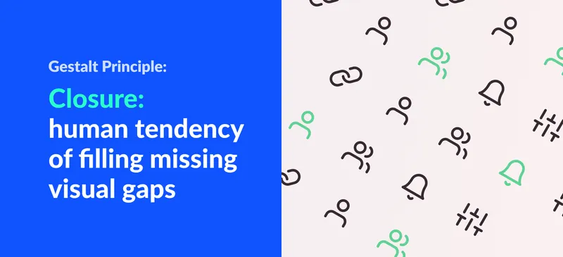
The law of closure: why the brain completes missing shapes. Examples from famous logos and interfaces, and how to use closure deliberately in your designs.
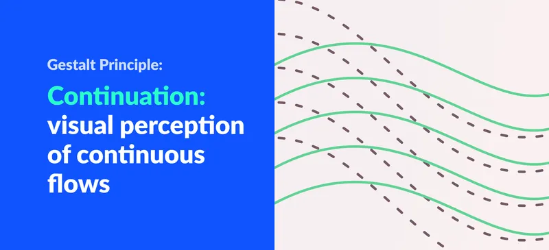
The law of continuation explains why the eye follows lines, curves and paths. What it is, how it differs from similarity, and how designers use it in layouts.
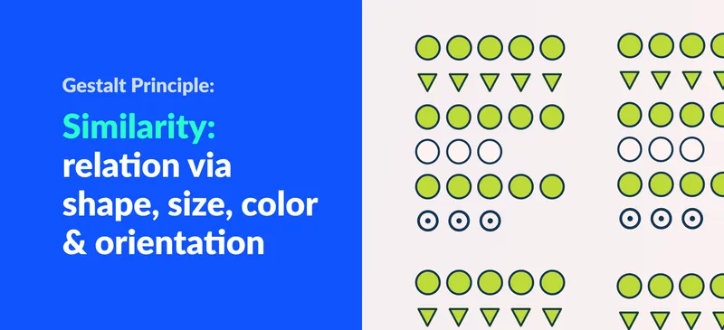
The law of similarity: elements that share shape, size, color or orientation are seen as related. How it differs from proximity, with examples.
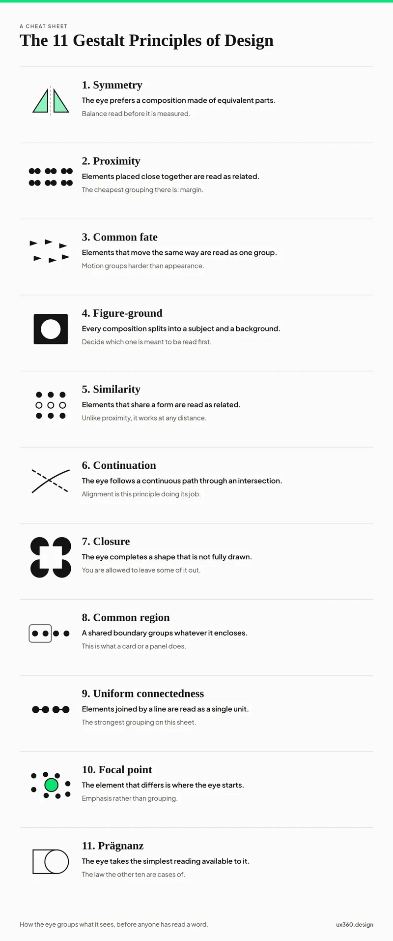
All 11 Gestalt principles with interface examples and interactive diagrams, from proximity and closure to common region and Pragnanz. Free cheat sheet PDF.
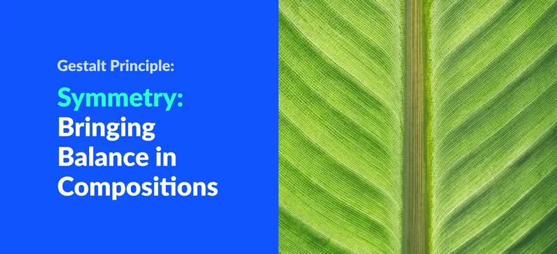
The Gestalt law of symmetry explains why balanced compositions feel stable. What it is, how symmetry and asymmetry create balance, plus web examples.

Wabi-sabi is the Japanese philosophy of finding beauty in imperfection. What the term means, examples in design and how the lifestyle shapes interiors.
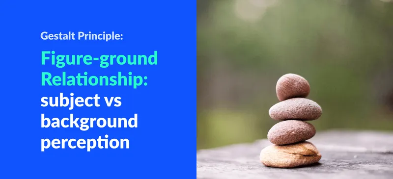
Figure-ground is how we separate a subject from its background. What it is, ambiguous examples like Rubin's vase, and how designers use it in logos and UI.
The law of proximity: things placed close together are read as a group. Proximity vs similarity, and how spacing alone can organise a layout. Examples included.
Legibility is whether you can recognise letters. Readability is whether you want to keep reading. What each means, what affects it, and how to improve both.
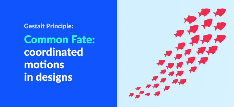
The law of common fate says elements moving together are perceived as a group. What it is and how motion, animation and interaction design put it to work.
![Alignment Principle in Design: Importance & Examples [Infographics]](/_astro/alignment-principle-in-design-banner.BQW7fOhr_Z17WjHo.webp)
Alignment is the simplest principle of good layout. The types of alignment, why edge alignment beats centering, real interface examples and a free PDF.
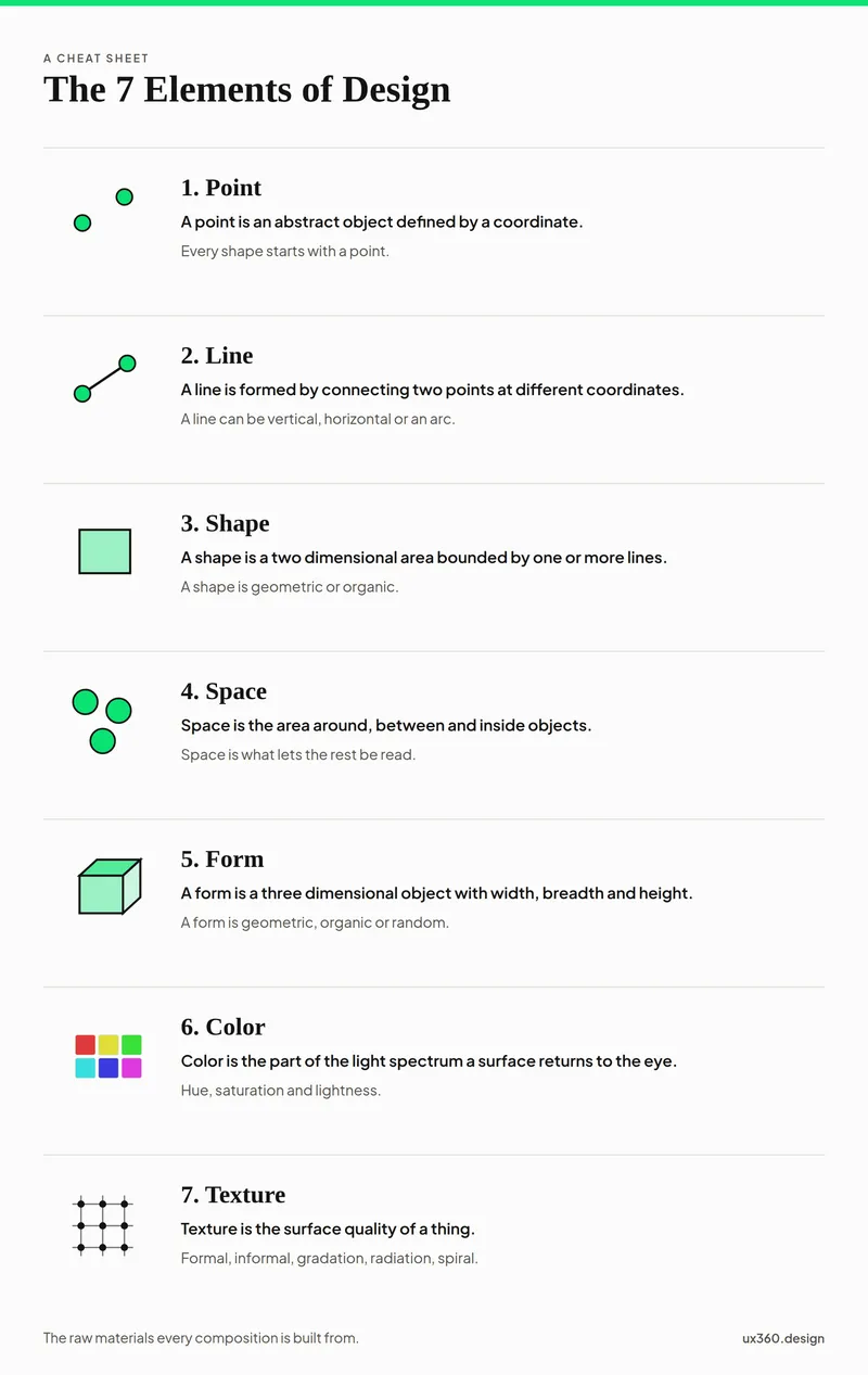
The 7 elements of design are point, line, shape, form, space, color and texture. Each one explained with real interfaces, plus a free printable infographic PDF.
The rule of thirds divides a composition into a 3 by 3 grid and places key elements on the lines or intersections. Why it works and how to use it.
![The 11 Principles of Design and Art [Infographics Included]](/_astro/principles-of-design-and-art-1.jIpeTnWF_192c4L.webp)
Repetition, rhythm, movement, balance, proportion, white space, contrast, emphasis, hierarchy, variety and unity, explained with examples and a free PDF.