Law of Prägnanz: Why the Eye Takes the Simplest Reading
The law of Prägnanz, also called the law of simplicity, says people see the simplest, most regular reading that fits what is in front of them. It is the Gestalt principle the others grow from. In design, a screen gets read the simple way whether or not you meant it, so fewer edges, shapes and colors help.
What is the law of Prägnanz? The law of Prägnanz says that people see the simplest, most regular shape that fits what is in front of them.
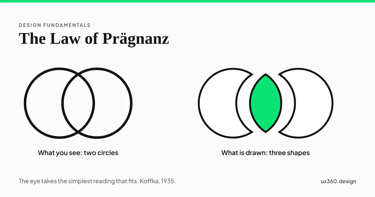
Look at two overlapping rings and you see two circles. You do not see a lens and two crescents, even though the lines draw those too. The eye picks the reading with the fewest, most regular parts, and it does this before you think about it.
In short
- What it is: a Gestalt principle that says perception picks the simplest reading available.
- Other names: the law of simplicity, or the law of good figure. Prägnanz is German for something close to “conciseness”.
- Why it matters: your screen is read the simple way, whether or not that is the way you meant.
- How to use it: reduce what the eye has to sort out: fewer edges, shapes, sizes and colors.
Where does it come from?
The Gestalt psychologists worked in Germany in the early 1900s. They studied how people see whole shapes rather than separate lines and dots. Max Wertheimer described the grouping rules in 1923. Kurt Koffka stated the law of Prägnanz in 1935: the mind organizes what it sees as well as the conditions allow.
Every other Gestalt principle is a special case of it. Proximity, similarity and closure all pick a simpler reading than “a lot of separate things”. See the Gestalt principles for the full set.
See the simple reading win
Here are two overlapping outlines. Slide the overlap, then pull apart the shapes the lines actually make.
Two circle outlines overlapping by 40%. The usual reading is two whole circles, one over the other. The same lines also enclose three shapes, two crescents and a lens, which hardly anyone sees first.
On screen there are three closed shapes. You see two circles. Nothing in the drawing says “circle”. Your eye supplies it, because two whole circles is a simpler story than three odd shapes that happen to fit together. The Olympic rings work the same way, with five circles instead of two.
When a flat drawing stays flat
Simplicity can even decide whether you see depth. Here is a wire cube. Turn it slowly away from 0°.
Turned 0°, the nearest and farthest corners land on the same point. The drawing is a regular hexagon with six lines meeting in the middle, as symmetric as a flat pattern gets, and nothing in it says which way is near.
At 0°, the drawing is a regular hexagon with six spokes. As a flat pattern it is very simple, and many people see it as flat. Turn it a few degrees and the flat pattern becomes irregular. Now the simpler reading is a box, and it pops into depth.
In 1953, Julian Hochberg and Edward McAlister showed people drawings like these and measured how long each one looked flat or solid. The drawings that made simpler flat patterns were seen as flat more of the time. It was one of the first attempts to put a number on “simple”.
What “simple” means
Simple does not always mean fewer things. Researchers still argue about it. A 2012 review led by Johan Wagemans described Prägnanz as the brain settling on the simplest organization the input allows. A 2023 review by Eline Van Geert and Wagemans argued that the original idea was richer: a “good” figure is regular, balanced and clear, not only small.
For design, the practical version is enough. The eye prefers:
- Regular shapes over irregular ones.
- Symmetry and alignment over near misses.
- Continuous lines over broken ones.
- Repeated sizes and colors over many slightly different ones.
- Whole objects over loose parts.
Why it matters for screens
People judge a page very fast. In a 2013 study, Katharina Reinecke and colleagues showed 548 people 450 websites for half a second each. Two measurable traits, visual complexity and colorfulness, did much of the work in how appealing people found a page at first sight. Along with age and education, they explained about half of the differences in ratings.
So a screen with many edges, shapes and colors is not just harder to read. It makes a worse first impression before anyone reads a word.
How to use the law of Prägnanz
- Line things up. Every new left edge is one more thing to sort out. Share edges where you can.
- Use few shapes. One corner radius, one icon style, one button shape.
- Limit color. One accent color tells people where to look. Four tell them nothing.
- Cut decoration that adds shapes. Dividers, badges and outlines each add an edge the eye has to explain.
- Make icons from simple forms. Circles, squares and clean lines are recognized faster than detailed drawings.
- Check what the simple reading is. If two things look like one group, people will treat them as one. Make sure that is what you meant.
Try it yourself: simplify a card
Here is a product card where nothing quite matches. Turn on each fix and watch the count of differences fall.
The card has 4 left edges, 4 corner radii, 3 accent colors and 2 decorations: 13 differences to sort out. Nothing lines up and nothing matches, so the eye has to check each part on its own.
Each switch removes one kind of difference. The card at the end has the same content. It just asks less of the eye, so it reads as one object instead of a pile of parts.
The law of Prägnanz and other principles
- It is the umbrella over the other Gestalt principles, such as closure and common region.
- It is why unity and repetition work: repeated forms are simpler to take in.
- It supports alignment: a shared edge is one line, not several.
- It explains part of the aesthetic-usability effect: a simple screen looks better, so people expect it to work better.
See all the laws of UX, in the order a click happens.
Common mistakes
- Removing meaning along with clutter. Simple is not empty. Keep the labels people need.
- Near misses. Two edges a few pixels apart read as a mistake, not as two edges.
- Decoration as personality. Extra shapes cost attention. Put personality in one strong choice instead.
- Forgetting the simple reading may be wrong. If the simplest reading is not the one you meant, change the design, not the user.
Frequently asked questions
What is the law of Prägnanz?
The law of Prägnanz is the Gestalt principle that people see the simplest, most regular form that fits what is in front of them. It is also called the law of simplicity or the law of good figure.
What is an example of the law of Prägnanz?
The Olympic rings. People see five overlapping circles, not the many curved pieces the overlapping lines actually make, because five circles is the simpler reading.
How do you use the law of Prägnanz in UI design?
Give the eye less to sort out: line up edges, use one corner radius, keep one accent color, and remove decoration that adds shapes without adding meaning.
What does Prägnanz mean?
It is a German word close to 'conciseness' or 'pithiness'. A prägnant figure is one that is clear, regular and easy to take in at a glance.

Written by