F-Pattern vs Z-Pattern: How People Scan Pages, and Which to Design For
The F-pattern is how people scan pages of plain text, found in eye tracking: across the top, across a bit lower, then down the left edge. It means they miss things. The Z-pattern is layout advice for sparse pages, with little research behind it. Format text so people can scan it, rather than designing for the F.
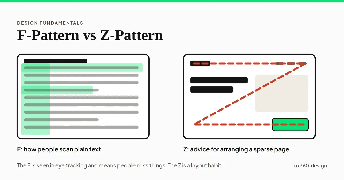
What are the F-pattern and the Z-pattern? The F-pattern is a way people scan a page of text: across the top, across part of a line lower down, then down the left edge. The Z-pattern is a layout guideline that places key items along a Z, from the top left to the bottom right.
They are often taught as a pair, but they are different kinds of thing. The F-pattern was found in eye-tracking research, and it is a warning sign. The Z-pattern is design advice, and it has little research behind it.
In short
- F-pattern: what people do on pages of plain text. It comes from eye tracking, and it means they miss things.
- Z-pattern: a way to arrange a simple page, like a landing page. It is a rule of thumb, not a finding.
- Do not design for the F. Format text so people can scan it: subheadings, bullets and key words first.
- Use the Z loosely. On a sparse page it is a fine starting point. Size and contrast still decide what people see first.
What is the F-pattern?
In 2006, Jakob Nielsen’s team at Nielsen Norman Group (NN/g) ran a large eye-tracking study. They recorded how 232 people looked at thousands of web pages. On pages of text, the heatmaps kept making the same shape:
- A line across the top. People read the first line or two in full.
- A shorter line lower down. They move down and read part of another line.
- A stripe down the left side. Then they scan down the left edge, taking in only the first words of each line.
Sometimes it looked more like an E, or an upside-down L. In 2017, Kara Pernice at NN/g reported that the F was still there in their newer eye tracking. She also found that in right-to-left languages like Arabic, people scan in a mirrored F.
The F is only one of several patterns NN/g has seen. Switch between them below. The page is made up, and the green bands sketch the shape of NN/g’s heatmaps.
A page with no subheadings or bullets. The reader looks across the first line, then across part of a line further down, then only down the left edge. Words at the ends of lines and in the lower half are skipped. This is the F-pattern, and NN/g calls it a sign that a page is hard to scan.
In 2019, Pernice described the others. In the layer-cake pattern, people jump from heading to heading and read only under the one they want. In the spotted pattern, they hunt for one thing, like a number or a link. In the commitment pattern, they read everything. NN/g calls the layer-cake by far the most effective way to scan.
Why the F-pattern is a warning, not a goal
NN/g is clear that the F-pattern is bad for users and for businesses. People miss whatever is not at the top or on the left. Pernice lists three things that make it happen together:
- the page has text with little or no formatting,
- the reader wants to be quick, and
- the reader does not care enough to read every word.
You cannot change the last two. Most people are in a hurry, and few read every word. But you can change the first. A page with clear subheadings and bullets lets people scan in a layer-cake instead of an F.
Attention also leans left. In an NN/g study on wide screens, about 80% of what people looked at was on the left half of the page. So whatever you put in a right-hand column, or at the end of a long line, is the first thing to be missed.
What is the Z-pattern?
The Z-pattern says the eye moves across a simple page in a Z. It starts at the top left and goes to the top right. Then it runs diagonally down to the bottom left, and across to the bottom right. So designers put the logo at the top left and the menu at the top right. An image or headline goes along the diagonal, and the main button goes at the bottom right.
It grew out of the Gutenberg diagram, a model of how the eye moves over a page. It is credited to Edmund Arnold, a newspaper designer, and said to date from the 1950s. In the usual telling, the eye enters at the top left and leaves at the bottom right, and the other two corners get the least attention.
Here is the catch. We could not find a controlled eye-tracking study that shows people actually look at web pages in a Z. The Z is a way to arrange a page, not a description of how people see one. Draw it over three kinds of page and see what it covers.
On the landing page the Z passes over 5 of 6 elements: the logo, the menu, the short description, the image and the button. A sparse page has few elements, most of them near the corners, so a Z touches nearly all of them. This is the kind of page the Z is advice for.
On a sparse landing page, the Z passes over nearly everything, because there are only a few elements and most sit near the edges. That is why it seems to work there. But it is easy to fit a Z to a simple page after the fact. On a grid or an article, the Z misses most of the content, and it tells you nothing useful.
F-pattern vs Z-pattern
| Question | F-pattern | Z-pattern |
|---|---|---|
| What is it? | How people scan text, seen in eye tracking | A guideline for arranging a page |
| What is the evidence? | NN/g eye tracking, 2006 to 2019 | Little direct research; grew out of the Gutenberg diagram |
| Where does it show up? | Pages of text with weak formatting | Simple pages with few elements, like landing pages |
| What should you do? | Format text to avoid it | Use it as a loose starting layout |
Which one should you design for?
Pages with a lot of text: neither. Design for scanning. Articles, help pages, product details and search results all get the F when they are plain walls of text. Break them up so readers can scan in a layer-cake: headings that say something, short sections, and bullets.
Simple pages: the Z is a fine starting point. On a landing page with a logo, a headline, an image and one button, putting the button at the end of the Z does no harm. But what people see first is decided by hierarchy: the biggest, boldest, most colorful thing wins. A small grey button at the end of a perfect Z still loses to a big headline. A bright accent, kept rare as in the 60-30-10 rule, does more than its position.
Grids, dashboards and feeds: neither pattern fits. People look for the thing they want. Clear labels, alignment and enough white space between items help more than any path.
How to write for people who scan
- Put the main point first. Start the page, each section and each paragraph with what matters most.
- Write headings that carry meaning. “Refunds take 5 days” beats “Refund information”. A scanner may read only the headings.
- Lead each line with the key words. The F shows that the starts of lines get looked at, and the ends often do not.
- Use bullets for lists. In NN/g’s eye tracking, one reader went back to a bulleted list eight more times after her first scan.
- Bold a few key words, not many. Bold works because it is rare. If every line has bold, nothing stands out.
- Keep important things on the left. Do not put key facts in a narrow right-hand column.
- Keep lines a readable length. Very long lines push the important words far to the right. See legibility vs readability.
- Flip it for right-to-left languages. In Arabic or Hebrew, the F is mirrored, so the right edge is the one that gets scanned.
Try it yourself: format a page for scanners
Here is the made-up help page again, with its six key points marked. Turn on the formatting, one piece at a time, and see how many points a scanning reader catches.
With no formatting, a scanning reader catches 1 of the 6 key points: returns within 30 days. They miss the free return label, refunds in 5 days, keep the tags on, no returns on sale items and exchanges in store. Only the first line is read in full, and the rest is an F down the left edge.
With no formatting, the reader catches only the point in the first line. Subheadings that name the point catch half of them, because readers jump between headings. Add key words at the start of each line, and the reader catches all six. Bullets alone help less than you might think: they draw the eye to the start of each item, so they only work when that is where the key words are.
Scanning patterns and other principles
- They are hierarchy in action: what stands out is seen first, whatever the path.
- Movement is the designer’s side of the same idea: leading the eye on purpose.
- Emphasis decides where a scan stops.
- Alignment makes a clean left edge for the eye to run down.
- White space separates sections, so the layers of the layer-cake are easy to find.
Common mistakes
- Designing for the F. Putting everything in the F’s path accepts that people will miss the rest. Fix the formatting instead.
- Treating the Z as science. It is a layout habit, not a finding. Test the real page.
- Using the Z on a page full of content. On a grid or an article, the Z misses most of what is there.
- Vague headings. “Overview” and “More info” give a scanner nothing to stop on.
- Key facts at the ends of lines. That is exactly where the F stops looking.
- Forgetting mobile. On a phone, the page is one narrow column, so headings and the starts of lines matter even more.
Frequently asked questions
What is the F-pattern in web design?
The F-pattern is a way people scan a page of text, found in eye-tracking studies by Nielsen Norman Group. They read across the top, then across part of a line lower down, then scan down the left edge. Words on the right and lower down get skipped.
What is the Z-pattern in web design?
The Z-pattern is a layout guideline for simple pages. It assumes the eye moves from the top left to the top right, then diagonally down to the bottom left, then across to the bottom right, so designers put the logo, menu, image and main button along that path.
What is the difference between the F-pattern and the Z-pattern?
The F-pattern is observed behavior: eye tracking shows people scanning text this way when it has no headings or bullets. The Z-pattern is advice for arranging a sparse page, and it has little direct research behind it. Use formatting to beat the F on text pages, and treat the Z as a starting point for simple pages.
Should I design my page for the F-pattern?
No. The F-pattern is a sign that a page is hard to scan, because people miss what is not at the top or on the left. Add clear subheadings, bullets and key words at the start of lines, so people can jump between headings instead.

Written by