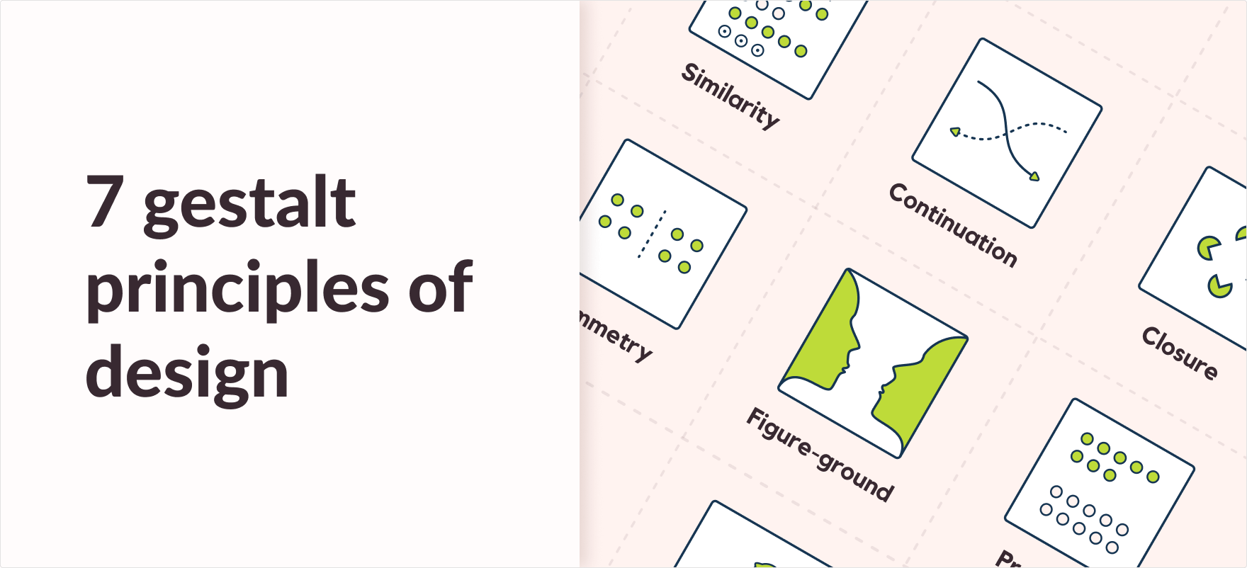
7 Gestalt Principles of Design [Infographics Included]
What are the Gestalt Principles?
Gestalt principle is a set of guidelines that deal with how the human brain perceives the world around them: simplifying, organizing, and rearranging complex objects so that it can make sense to us better.
In this article, we will be looking at the 7 gestalt design principles with examples. Here is a handy infographic for those who are looking for gestalt principles cheat sheet:
Quick Links
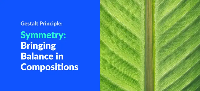
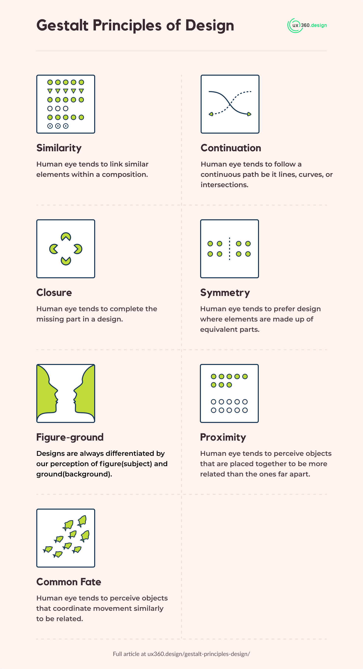
1. Symmetry
Symmetry principle states that the human eye tends to prefer design where elements are made up of equivalent parts.
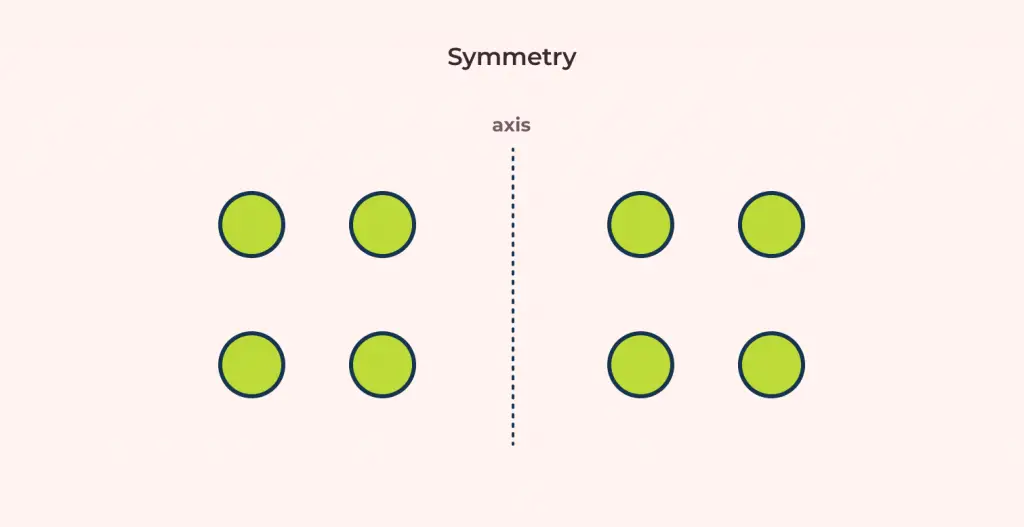
An example of symmetry would be how human faces have two equivalent elements like eyes, ears, hands, and legs forming symmetry. The goal is to bring balance to compositions using symmetry.
If you are looking to learn more about the symmetry principle, I suggest reading my article on Symmetry: How we bring balance to Compositions.
2. Proximity
Proximity principle states that the human eye tends to perceive objects that are placed together to be more related than the ones far apart.
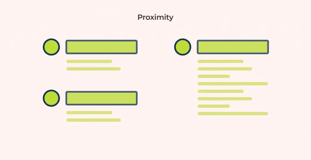
For example, if we put a bunch of random numbers together, people would perceive it to be some kind of code or a phone number. In UX, grouping numbers like this to convey information is known as chunking. If we put the same numbers separated from each other, people would simply assume that they are merely separate, individual numbers, and nothing other than that.
If you are looking to learn more about the proximity principle, I suggest reading my article on Proximity: Associating relatedness through placement.
3. Common Fate
Common fate principle states that the human eye tends to perceive objects that coordinate movement similarly to be related.
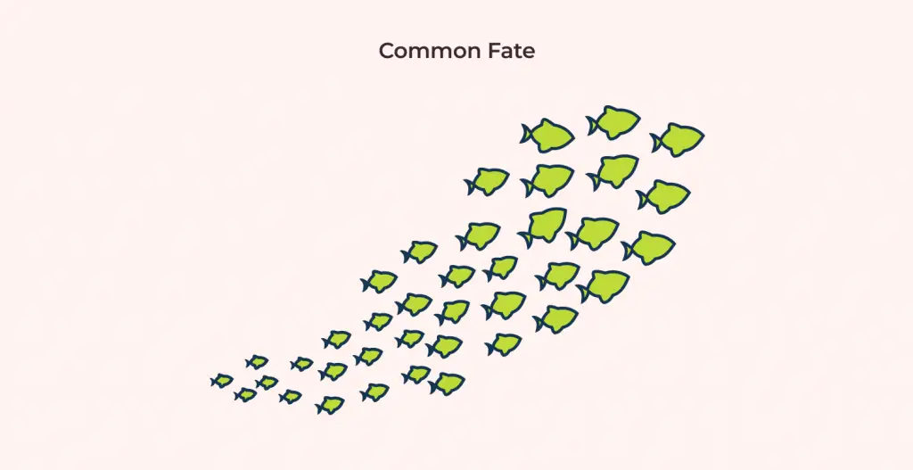
An example of common fate would be coordinated movements of a school of fish or an army of ants.
If you are looking to learn more about the common fate principle, I suggest reading my article on Common Fate: Using Coordinated Motion in Design to Associate Relations.
4. Figure-ground Relationship
Figure-ground principle states that the designs are always differentiated by our perception of figure(subject) and ground(background).
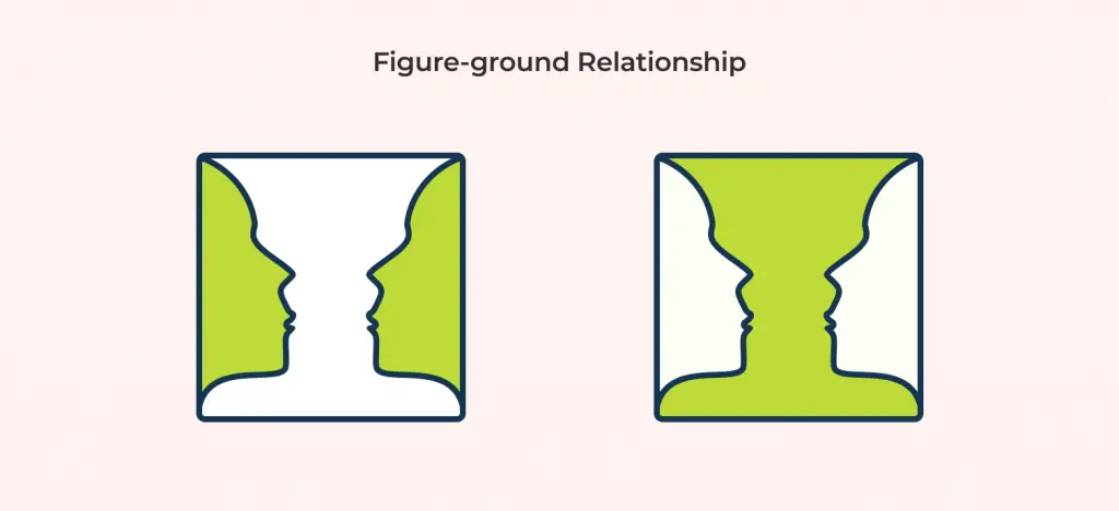
Simply put, the figure is the focus of any compositions, and the ground is the supporting background. For example, in the image above contrasting colors are used to differentiate subject and background. Our eyes see either two human faces or the vase depending on how we use the color to highlight the foreground.
If you are looking to learn more about the figure-ground principle, I suggest reading my article on Figure-ground Relationship: Differentiating Elements by Perception of Subject & Background.
5. Similarity
Similarity principle states that the human eye tends to link similar elements within a composition.
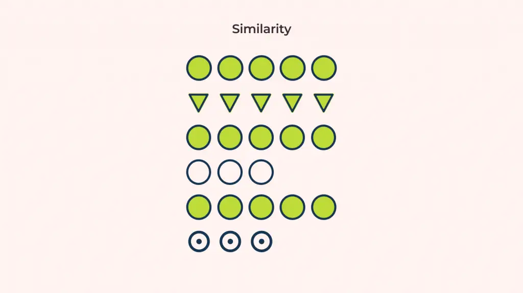
For example, in blog posts, we can differentiate headings, content, and links by how they are designed or formatted. While scanning the post we will start linking the similar elements with big bold fonts as the header, normal fonts as content, and blue colored texts as links.
If you are looking to learn more about the similarity principle, I suggest reading my article on Similarity: Associating relatedness through shape, size, color & orientation.
6. Continuation
Continuation principle states that the human eye tends to follow a continuous path be it lines, curves, or intersections.
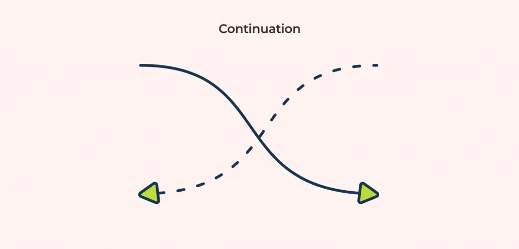
In the above image, our eyes will follow the path directed by the arrow regardless of intersections or line type.
If you are looking to learn more about the continuation principle, I suggest reading my article on Continuation: Visual Perception of Continuous Flows & Paths.
7. Closure
Closure principle states that the human eye tends to complete the missing part in a design.
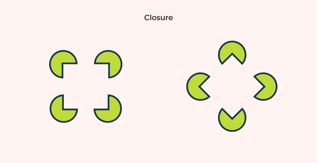
In the above image, our eyes will notice a square inside the Pacmans whereas there is no square present in the image. Our brain will complete the missing parts itself.
If you are looking to learn more about the closure principle, I suggest reading my article on Closure: how our brains fill in the missing visual gaps & how to use Closure in designs.
Further Reading
If you are looking to research further on design principles, then I would recommend reading up on the following articles: