
Types of Grids in Design: Manuscript, Column, Modular, Hierarchical and Baseline
A grid is a set of invisible lines that divides a page into columns, rows and margins, so content lines up and spacing stays consistent. There are five main types: manuscript, column, modular, hierarchical and baseline. Most websites use a column grid, often with 12 columns on desktop and fewer on phones.
What is a grid in design? A grid is a set of invisible lines that divides a page into columns, rows and margins. Content is placed along those lines, so it lines up and the spacing stays consistent.
Grids came from print. The Swiss designer Josef Müller-Brockmann made them famous with his 1981 book Grid Systems in Graphic Design. Today almost every website and app is built on one, even when you cannot see it.
In short
- What a grid does: gives every element a place to line up with, so a page looks ordered and is faster to build.
- The five types: manuscript, column, modular, hierarchical and baseline.
- The usual choice for the web: a column grid, often 12 columns on desktop, 8 on tablets and 4 on phones.
- Why it works: it uses alignment and consistent spacing, which the eye reads as order.
The five types of grids
Pick each type below and see the same page laid out on it.
A column grid splits the page into columns, here three, with gutters between them. Content spans one or more columns, so a wide image can take two and a sidebar one. Most websites use this kind.
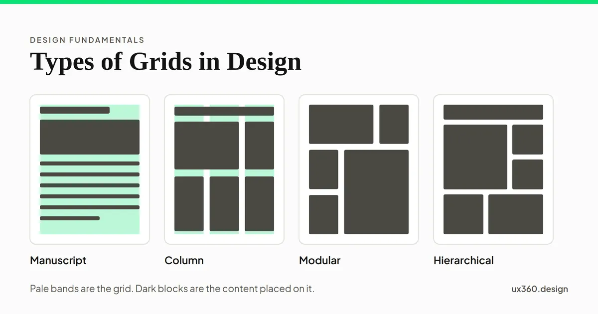
- Manuscript grid. One large block of text inside margins. It is the grid of a book page, a long article or a document. Simple, and built for reading.
- Column grid. The page is split into columns with gutters between them. Content spans one or more columns: an image might take two, a sidebar one. Most websites use this type.
- Modular grid. Columns plus rows, which make a set of equal boxes called modules. Content takes one or more modules. It suits galleries, product listings and dashboards, where many items share one shape.
- Hierarchical grid. Areas sized by importance instead of by regular columns. Home pages and news pages often work this way: one big feature, a few medium stories, and a row of small ones.
- Baseline grid. Evenly spaced horizontal lines that text sits on. It keeps lines of text in different columns level with each other. It is usually combined with a column grid rather than used alone.
The parts of a grid
- Columns: the vertical strips that hold content.
- Gutters: the gaps between columns. They keep content in neighboring columns apart.
- Margins: the space between the outer columns and the edge of the screen.
- Rows and modules: in a modular grid, horizontal divisions and the boxes they make.
- Spacing unit: many teams also use a base unit, often 8 pixels, for every gap and size, so spacing stays consistent everywhere.
How many columns?
More columns give more possible layouts, but each column gets narrower. The magic is in what a number divides into. Change the number of columns and see which even splits it allows.
12 columns in a 1200 px container with 24 px gutters: each column is about 78 px wide. 12 splits evenly into halves, thirds, quarters and sixths. That flexibility is why many CSS frameworks, like Bootstrap, use 12 columns.
Twelve divides evenly into halves, thirds, quarters and sixths, so one grid can hold a two-column layout, a three-card row and a four-card row. That flexibility is why many CSS frameworks, such as Bootstrap, use 12 columns. Numbers like 5 or 7 split into almost nothing evenly, though uneven splits still work.
Sixteen and 24 columns give finer control, but each column gets very narrow. They suit wide dashboards more than ordinary pages.
Grids on different screens
A grid has to change with the screen. A common pattern, used by Google’s Material Design, is:
- Phones: 4 columns, with narrow margins and gutters.
- Tablets: 8 columns.
- Wider screens: 12 columns.
Content keeps its place on the grid but spans more of it as the screen narrows. A card that takes 4 of 12 columns on a laptop might take all 4 of 4 on a phone, so it fills the width and the cards stack.
On the web, CSS Grid and Flexbox make this straightforward. A grid can change its number of columns at each screen size, and every element follows.
How to use a grid
- Start with the content. A long article wants a manuscript grid. A product listing wants a modular one. A marketing page often wants a column grid.
- Choose the column count. 12 for desktop web pages is a safe default; 4 for phones.
- Set gutters and margins. Use the same spacing unit for both, such as multiples of 8 pixels.
- Line up to the columns, not just inside them. Edges of text, images and buttons should fall on column lines.
- Break the grid on purpose. A full-bleed image or an element that crosses a gutter draws attention because everything else is aligned.
- Check it on every screen size. A layout that works on 12 columns has to still make sense on 4.
Try it yourself: a responsive grid
Change the screen width and how much of a wide screen each card should take. Watch the grid change its number of columns and the cards reflow.
At 1280 px, about the width of a wide screen, the grid has 12 columns of about 81 px, with 24 px gutters and 24 px margins. Each card spans 4 of the 12 columns, so 3 cards fit per row and the six cards take 2 rows.
On a wide screen, cards that span a third sit three to a row. Narrow the screen to a tablet, and the grid drops to 8 columns, so the same cards take half the width each. On a phone, with 4 columns, they take the full width and stack. The cards never leave the grid; the grid itself changes.
Grids and other principles
- Grids are alignment made systematic: every edge has a line to sit on.
- Consistent gutters use proximity: things close together look related, things apart look separate.
- Repeating the same column widths creates rhythm and repetition across a page.
- A strong grid helps unity, so screens feel like one product.
- Breaking the grid once is a tool for emphasis.
Common mistakes
- Content placed “about right.” Elements a few pixels off the grid look careless, even if no one can say why.
- Too many columns. A 24-column grid for a simple page adds choices without adding order.
- Forgetting the gutters. Text running right up to the next column is hard to read.
- Desktop grid on a phone. Twelve tiny columns on a small screen leave nothing usable.
- Following the grid over the content. A grid serves the content. If a layout fights it, change the layout or the grid.
Frequently asked questions
What are the main types of grids in design?
Manuscript grids are one block of text with margins. Column grids split the page into columns. Modular grids add rows to make boxes. Hierarchical grids size areas by importance. Baseline grids are horizontal lines that text sits on.
Why do websites use a 12-column grid?
Twelve divides evenly into halves, thirds, quarters and sixths, so one grid can hold many layouts. That flexibility is why many CSS frameworks, such as Bootstrap, use 12 columns.
How many columns should a mobile grid have?
Usually 4. A common pattern, used by Google's Material Design, is 4 columns on phones, 8 on tablets and 12 on wider screens, with narrower margins and gutters on small screens.
What is the difference between a column grid and a modular grid?
A column grid divides the page only vertically, into columns. A modular grid also divides it horizontally, into rows, so the page becomes a set of equal boxes called modules.

Written by