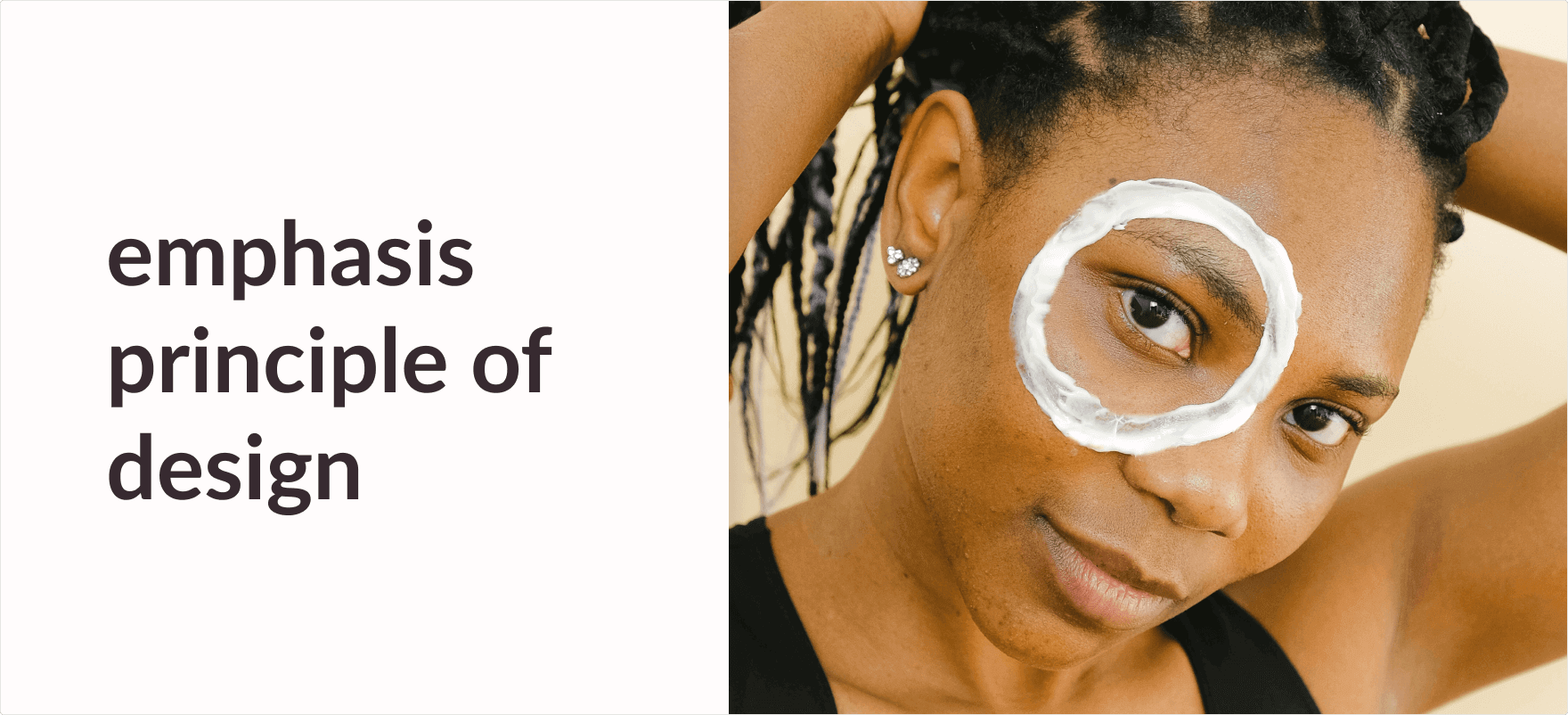
Emphasis Principle of Design
Emphasis in design means bringing more attention to a particular part of a visual composition.
Have you ever looked at a design and noticed being drawn towards a particular part? If you answered Yes to the question, then this topic should help you understand why it happens. The part that caught your attention most probably had more emphasis than the rest of the features in the composition.
Oftentimes, designers and artists use emphasis in their work to create a sense of importance to a feature. Keep in mind, emphasis is part of the Principles of Design and Art so you might want to read more on that before getting deeper into this.
Essentially, emphasis in design is highlighting a certain focal point in your work.
So, what is a focal point? A focal point is where you want the viewers to look at first and is an integral part of a design because this is where all the attention should be directed towards.
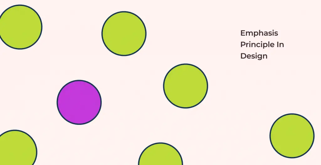
In the example below, you notice how you are attracted to the purple circle first? This is because of Emphasis. We emphasized the presence of the purple circle using a color contrast. A simple difference in the color of the element causes the viewer to be automatically drawn towards it, creating visual importance to the object.
How can you apply the principle of Emphasis in design?
Emphasis is best applied to your design when it is used in unison with other design principles. Here I have accumulated some ways we can use basic design principles to bring emphasis to your design:
Emphasis by Contrast:
Creating contrast between surrounding objects and the element helps create emphasis on that element.
As mentioned previously, you can see how I have emphasized the pink circle from the plain background by using the concept of color contrast. The disruption in color in the design brings visual importance to the circle.

Some other forms of contrast that you can use includes:
- Scale Contrast
- Type Contrast
- Shape Contrast
You can find more on Contrast in my blog here (link) to get more information on how it is used to bring emphasis to your design.
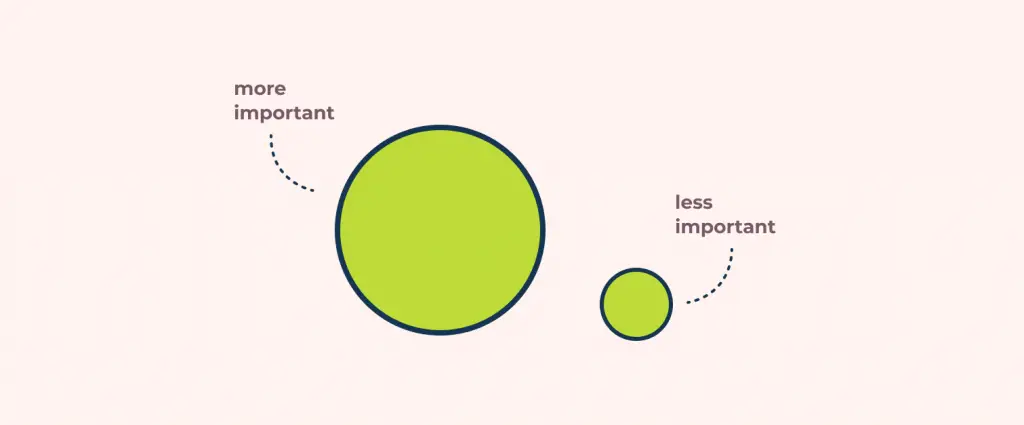
Emphasis by Scale & Proportion:
Next, we have scale and proportion. Objects with a bigger size in relation to other objects will be more emphasized.
In the image down below, the larger circle is perceived to be more important than the smaller circle.
You can play around with scale in a bunch of different ways to make your design much more dynamic.
Emphasis by White Space:
When it comes to utilizing white space for emphasis, you can use the large negative space around an object to highlight it.
In our example here, notice how the whitespace around the big circle and the surrounding shapes make it look like planets in space?
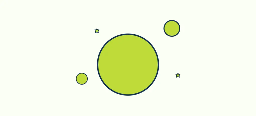
If we hadn’t put any whitespace between the components it would look like random shapes that have been stacked together that diverts the audience from the intended story.
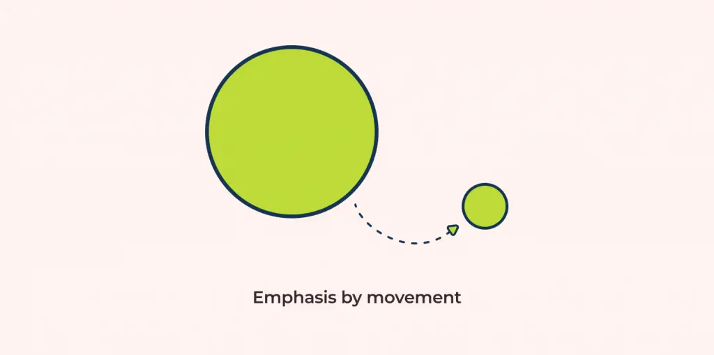
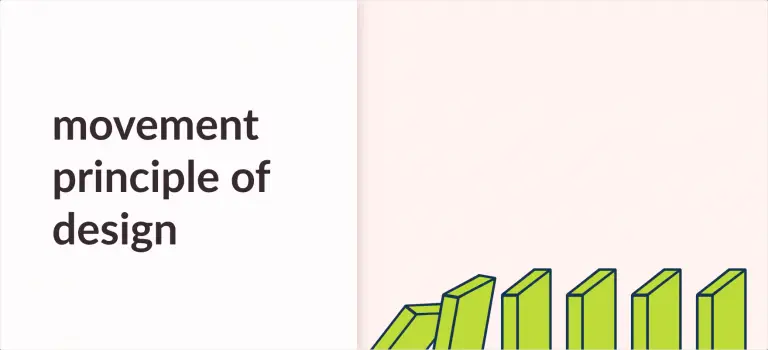
Emphasis by Movement:
The idea behind emphasis by movement is that even though we are drawn to the bigger circle first, our path of vision immediately follows the arrow to the smaller circle. Simply put, it is guiding the viewer’s eyes through our design, which ultimately lets us make points on areas we want emphasis on.
Examples of Emphasis in UI/UX
An example of emphasis in UI/UX can be seen on the Dollar shave club website.
In this small snippet of the site, you are automatically drawn towards the product that is showcased on the page. This is because of the concepts of scale and proportion principle and the white space principle. The exaggerated size and the amount of white space around the product build more emphasis on it than the rest of the elements present on the page. Emphasis when used properly can make a designer’s work more effective.

What is the principle of Emphasis used for?
Emphasis in design is essentially used to bring focus to the areas where you want it to be.
After you have nailed down the ways to use Emphasis, you can build the rest of your designs around it.
Summing Up
In conclusion, Emphasis allows designers to highlight the key components of the design. By using emphasis in unity with other design principles like Contrast, Scale, Whitespace, and Movement, you can emphasize different parts of the design.
If you would like to learn more, on the other different principles of designs just like Emphasis, make sure to give my other article 11 Principles of Design and Art a read.

![Balance Principle of Design [Infographics Included]](https://ux360.design/wp-content/uploads/2022/01/balance-768x350.png)
![Unity Principle of Design [Infographics Included]](https://ux360.design/wp-content/uploads/2021/12/banner_unity-principles-of-design-768x350.png)