Balance Principle of Design [Infographics Included]
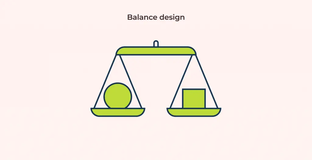
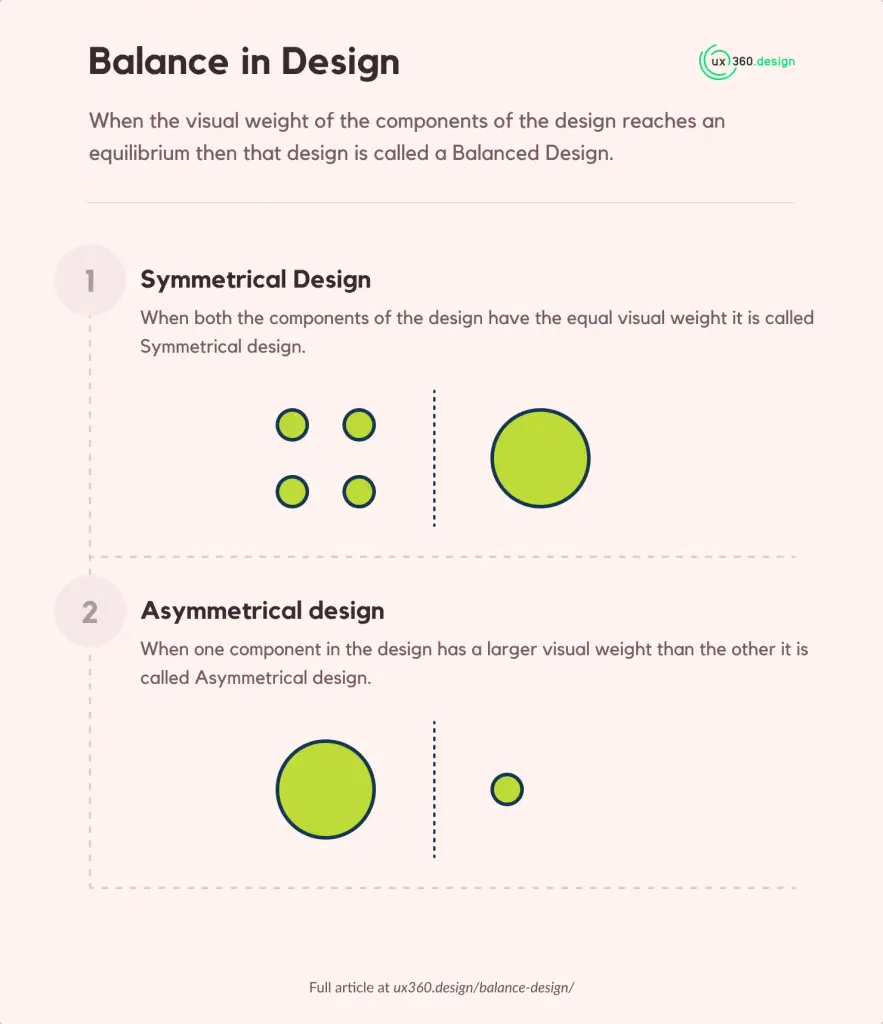
When the visual weight of the components of the design reaches an equilibrium then that design is called a Balanced Design.
Have you ever looked at a design and thought that “something just seems off”? The design follows all the guidelines from adding contrast to correcting visual hierarchy but something just doesn’t seem right. This could mainly be the problem of balance.
Balance is what makes or breaks your design. It is one of the key ingredients in making your design look good.
You might be wondering what exactly is this “equilibrium” or “visual weight”? Don’t worry! we will be covering all of that in this article. Now let’s get started!
What is Visual Weight?
While talking about balance we talk a lot about this thing called visual weight.
So what exactly is Visual weight? Visual weight is the force with which an element attracts human attention.
Every element in the design like typography, colors, images, shapes, patterns, etc has its own visual weight.
Some elements are heavy and draw the eye, while other elements are lighter.
So, if one component attracts more attention than the other this just means it has more visual weight than the other.
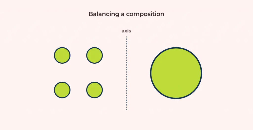
In order to create that perfect harmony in your design, you need this visual weight to be just right for all your components. This creates what we call a visual equilibrium or in other words Balance.
What is an example of balance in design?
We can take a look at Gucci’s website as an example for Balance.
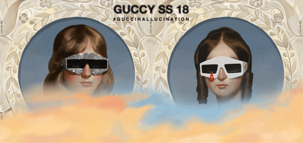
The heads on both sides of the page make the website perfectly symmetric.
Although the heads are not exactly the same, they have the same visual weight giving the overall design a symmetrical look.
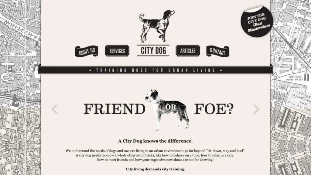
Here is one more example from the City Dog website. In the image below, we can see how the whole homepage is symmetrical on both sides of the center axis. Even the headings and the paragraphs are center-aligned. Now you know, alignment can also be used to achieve balance.
What is the function of balance in principles of design?
Now that you know what balance is, you might be wondering why it is so important.
If we were to take the scientific route of explaining the importance of balance, it all boils down to the amount of strain in the human brain. When anything is balanced it reduces the work for the brain. So, naturally, people are drawn to Balanced designs.
From a design point of view, balance helps give your design more structure, dimension, and stability. Not only that it can also be used to emphasize certain areas in the design.
What are the 2 Types of Balance?
There are namely two types of balance based on Symmetry: Symmetrical & Asymmetrical Balance.
Symmetry is a visual property in which elements are made up of equivalent parts to resemble proportion and balance. If you want to know more about Symmetry here is my article on it: Symmetry: Bringing Balance to Compositions.
Getting back to the topic, let’s take a look at the two different types of Balance:
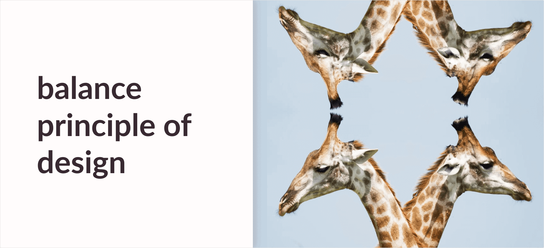
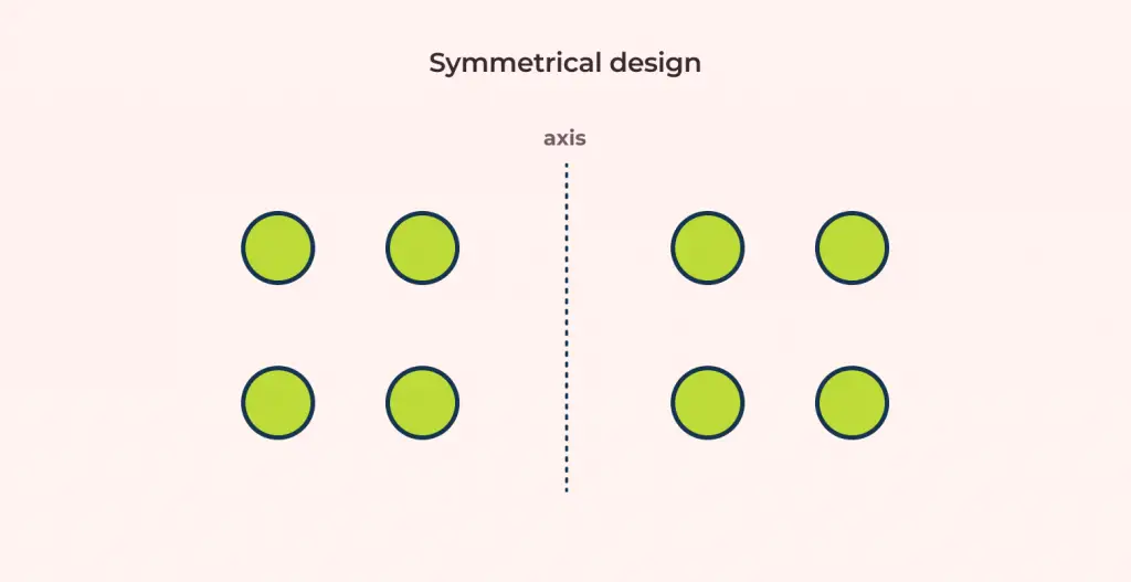
Symmetrical Balance
Imagine a see-saw, when both the ends of the see-saw have equal weights, the see-saw looks symmetric. Similarly in design, when both the components of the design have equal visual weight we say that the design is Symmetrically Balanced.
Here is a real-world example of Symmetrical designs. Notice how a mirror image of the giraffe on either side makes it balanced? Yes! That is how Symmetrical balance works.

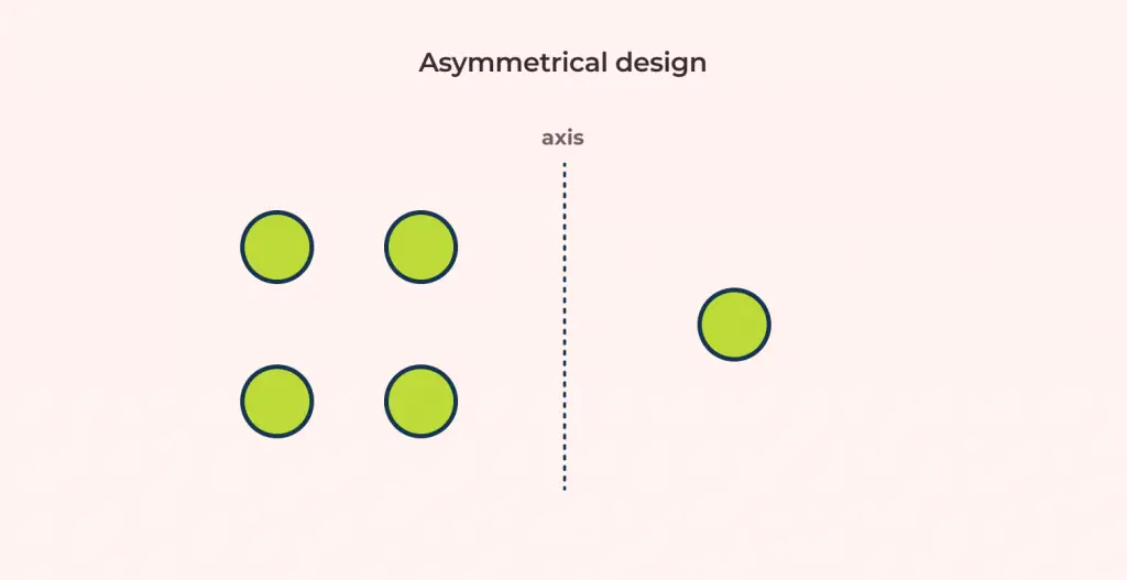
Asymmetrical Balance
Again sticking with the see-saw example, imagine one end of the see-saw is heavier than the other, in this case, the see-saw looks asymmetric. Similar to that in design, when one component in the design has a larger visual weight than the other, the design is called Asymmetrically balanced.
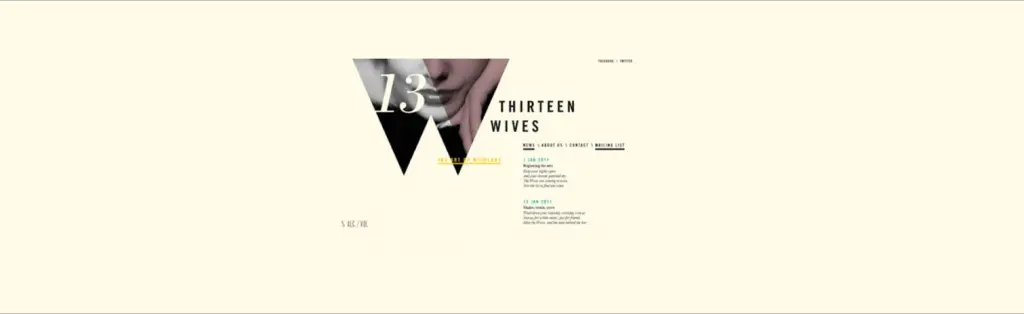
As an example let’s take a look at the Thirteen Wives website. The image pinned to the top of the webpage is balanced by the uneven alignment between the heading and the paragraphs. This creates an asymmetrical balance between the components.
Final Words
As you can see Balance is what makes an average design a good design. In this article, you learned that typography, colors, images, etc everything has a visual weight to them.
Some elements are heavy and draw the eye, while other elements are lighter. The way these elements are laid out on a page should create a feeling of Balance.
You also learned that there are types to balance categorized on the basis of Symmetry. They are Symmetrical balance and Asymmetrical balance.
Also, don’t forget to read my article Gestalt Principle: Symmetry (How we bring balance to Compositions) next to enhance your concept on Balance.
![Unity Principle of Design [Infographics Included]](https://ux360.design/wp-content/uploads/2021/12/banner_unity-principles-of-design-768x350.png)