Legibility vs Readability: What distinguishes them?
We have all faced situations in which reading a particular piece of written text ended up giving us headaches instead of furthering our knowledge and understanding. In the vast majority of cases, this is because the text is poorly written.
But what do we mean when we say that a text is “poorly written”? Broadly, there are two core issues that determine whether a text is easy to read or not: Legibility and Readability.
While both terms aim for the same result i.e. to provide information the easiest way possible, they use different ways to achieve the goal. This section is devoted to these two terms.
What is the difference between legibility and readability?
Legibility is the appearance of fonts/texts whereas readability is a measure of how difficult a paragraph is to read.
Now that we got the basic definition out of the way, let’s take a look at these terms in a bit more detail.
What is Legibility?
Legibility is the visual clarity of texts or articles.
Legibility is generally based on the size of texts, the fonts used, and the spacing between texts and characters. The space between paragraphs also plays a role in improving legibility.
This concept pre-dates the rise of electronic media, as bad and dirty handwritings are often called illegible (i.e. not legible). To say that someone’s handwritten text is illegible is to say that the shape and form of the individual letters and words written by the writer are somewhat deformed or misshapen to the human eye.
A similar concept applies to written texts in electronic media.
For example, it is difficult to read a block of text that is written completely in uppercase. In this case, the text gives us the impression that the author is shouting (or screaming) at us for some reason, regardless of what the actual intention of the author was while they were writing the text.

In other words, when our human minds interpret a given text as being somewhat “deformed” in terms of physical appearance, that text is not said to be legible.
What is Readability?
Readability refers to the level of difficulty involved in understanding the meaning conveyed by a paragraph or an article.
Difficult words and unnecessarily complex sentence structures often reduce the readability of a given text.
In other words, while legibility refers to the shape and appearance of letters and words in a given text, readability refers to things such as grammar and the simplicity and appropriateness of the words used in a text.
A legible text has clear and easily understandable letters, while a readable text has proper grammar, simple sentences, and words whose meanings are easy to understand.
Tips for achieving better Legibility in our UI works
Tip #1: For websites, it is optimal to use 16/18pt font size for ease of reading.
Mobiles generally use 14/16pt whereas for printing use 9-12pt.
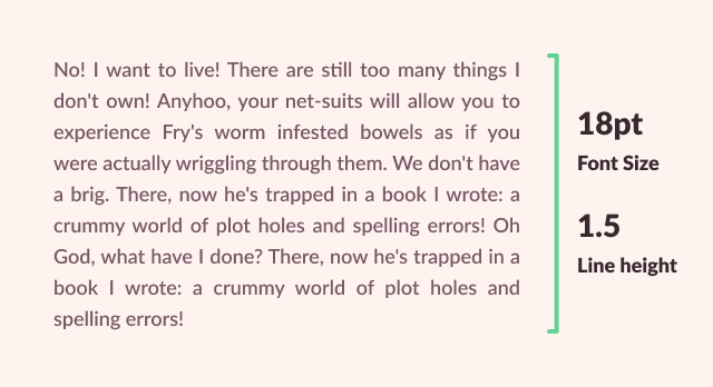
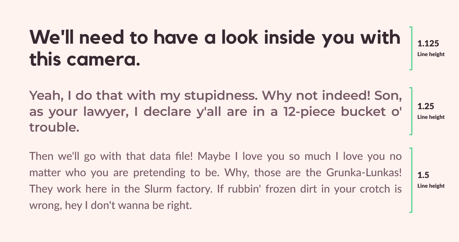
Tip #2: Line height for normal texts such as paragraphs should be 1.5.
However, for larger texts, such as headings, we need to reduce the ratio to 1.25 or 1.125.
Tip #3: Space your texts properly to put less strain on people’s eyes.
I personally use an 8-point grid to space paragraphs and headings. Also, read my article on how I used these techniques to create a website.

Use bold text and headings in appropriate places so users have an easy time reading texts. Breaking up long articles and texts into chunks is always a good practice.
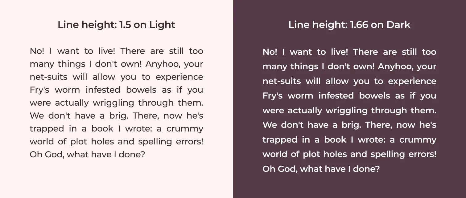
Tip #4: Adjust the contrast by using a light text color for dark backgrounds and vice versa.
Adding bright colored text on a bright colored background renders the text unreadable. Not only this, we always have to accessibility in mind too. While using colors always do proper tests so that even color blind peoples can easily read them.
Also, avoid flashy or patterned backgrounds.
Bonus tip: Line height on a dark background should be 1.66 to make it more legible.
Tips for achieving better Readability in our writing:
Tip #1: Use common words and short sentences for clarity.
Give the simplest explanation possible for any topic, especially for those topics that are more complex.
Omit unnecessary words that increase the complexity of the text. Make sure to not remove words that harm the meaning of the sentence.
Tip #2: Use software applications that help determine the readability of your work.
I use Grammarly for all my articles. The free version provides lots of features that are sufficient to get started. The paid version will provide additional features like plagiarism report and advanced grammatical suggestions but I would highly suggest going with the free version.
Bonus Tip: Grammarly and Hemingway App can be used to check your readability score. Also, heading analyzer from Advanced Marketing Institute is a great tool to judge our headings.
Why we should avoid bad Legibility or Readability implementations?
People might need to put in extra work to read our writings.
They might have to pull up a dictionary frequently to find the meanings of the words we used. (Poor Readability)
They might have to go closer to the screen because they cannot see the texts properly. This all adds up and we should not let this happen. (Illegible Text)
Users will have a hard time understanding our main points.
Long sentences or less spacing means people need to read the same phrases multiple times just to get a general gist of it.
Users will also not be able to keep their focus.
The texts or article becomes boring and inefficient.
Informative texts need to provide information as fast as possible. When we don’t properly organize our texts, users would have to go through every line to find what they were looking for. This is boring since everybody knows that there are better ways to convey the core messages.
Unorganized content drives users away.
If our articles or texts are very long, they start looking like those boring essays we were forced to read/write in high school.
How many times have we looked up an article on some topic, only to get long essays devoted to it? Most of the time, we simply throw our hands in the air in despair and say, “I’m not reading any of this nonsense, no matter how good or informative it is.”
That’s generally what happens when we don’t organize our articles. We have limited attention-spans, and it is most unwise to ignore that fact in favor of a long and disorganized text.
Always keep in mind that most users just scan through the heading of the articles and only go through the text that is most relevant to them. Organizing your article is key here.
For example: Below is an article about 1200 words explaining the principles of design. Here I have divided every reading content into one or two paragraphs. Also, I have highlighted important points so that users can find what they are looking for quickly.

If you want to learn more about text alignment psychology, I suggest you read up on Alignment Principle in Design: Why Alignment is important for Usability?
Summing Up
- Legibility helps with the visual clarity of texts. Readability deals with the understanding of the writings.
- Good legibility and readability help us convey our messages effectively and efficiently.
- These concepts also help us in greatly simplifying our text. Keep in mind that the more complex topics require an even simpler explanation.
- These concepts have an enormous effect on the aesthetics of the text, which is vital for keeping people intrigued and interested in our content.