Alignment Principle in Design: Importance & Examples [Infographics]
As beings who desire order and organization, we are naturally attracted towards objects that look well-placed and well-positioned. After all, proper positioning and placing are important aspects of an organization.
In this section, we will explore one of the simplest, yet one of the most fundamental, principles of proper organization: alignment.
What is alignment in design?
In design, the alignment principle states that multiple objects are said to be aligned when they are placed such that their left or right edges, or center-lines line up on a common position.
A most common example of alignment as a feature can be seen on Google docs and Microsoft Office Suite’s text align features.
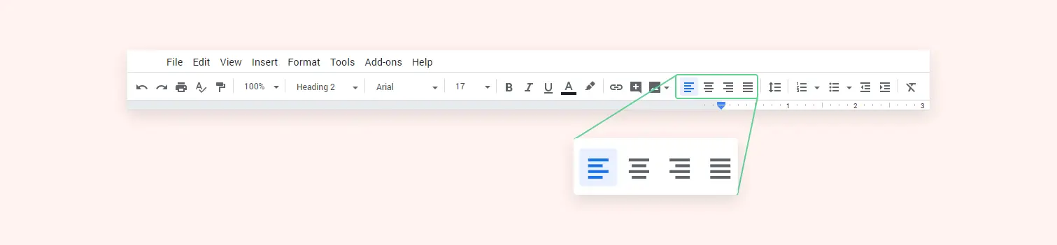
Left alignment aligns the edges of the text to the left of the document, while the center and right alignments align the text to the center and the right sides of the document, respectively.
Consider a table with rows and columns. We relate the texts or elements in the same row or column to be connected. This is how alignment is used in UX design to create easily scanable datas.
Types of Alignment
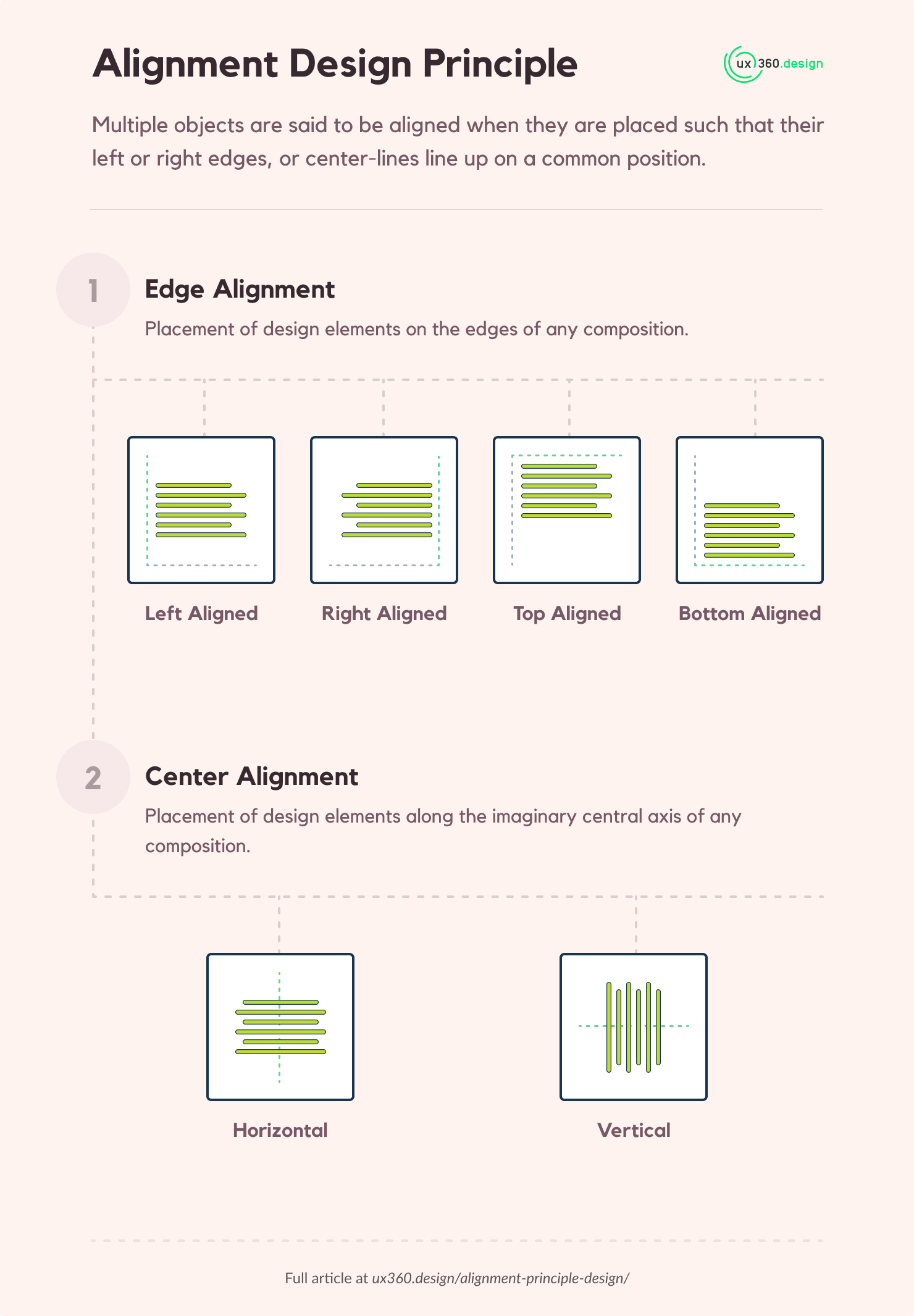
There are two types of alignment: edge alignment & center alignment.
Edge alignment is the placement of design elements on the edges of any composition. There are four types of edge alignments:
- Left aligned: stick elements to the left of the y-axis
- Right aligned: stick elements to the right of the y-axis
- Top aligned: stick elements to the top of the x-axis
- Bottom aligned: stick elements to the bottom of the x-axis
Center alignment is the placement of design elements along the imaginary central axis of any composition. There are two types of center alignments:
- Horizontally center-aligned: place elements along the central y-axis
- Vertically center-aligned: place elements along the central x-axis
Here is a handy infographic for those who are looking for visual representation on alignment principle and its types:
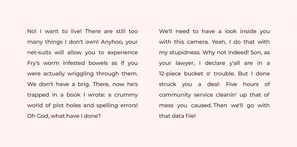
Alignment Examples for Text
Let’s take a look at how alignment is used in text paragraphs. In the image below, we can see left, center and right aligned texts.
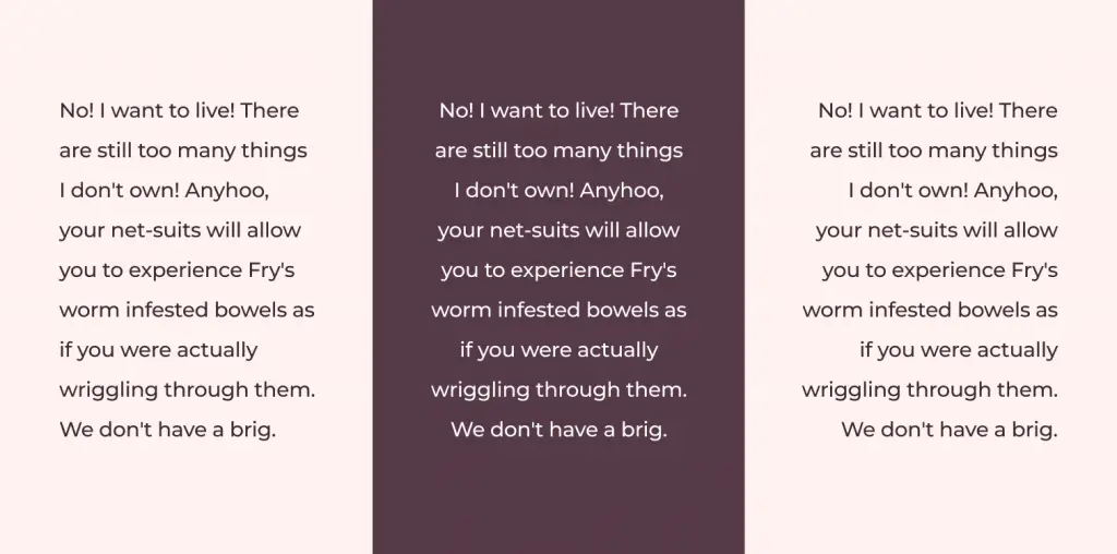
If we try to read the above texts, we can notice that the left-aligned text is easier to read. The center-aligned text is not so bad but it is a bit odd compared to the left alignment. However, the center-aligned text is easier to read if there are only a few sentences. So, we can use center alignment for headings and slogans.
The right-aligned text is difficult to read. I am not implying that all right-aligned text is difficult to read. Some languages are written from right to left. So, the default for that language is the right alignment. And using the left alignment for those particular languages might look weird.
The final alignment type for text I want to touch upon is justified alignment. This is used primarily by print media. For justified alignment, we stick both left and right sides of the text paragraphs to their respective edges.
Newspaper articles primarily use justified texts because they implement multiple columns for their text composition. The justification works as the separator between the blocks of text. Column separation is used because using long sentences can cause readers to easily lose track of which line they are reading. You can observe this effect in the image below.
If you want to understand more about typography psychology, I suggest you read up on Legibility vs Readability: What distinguishes them?
Alignment in UI and UX Design
Let’s start with what arrangement of UI elements are visually pleasing to the users. Similar to what we discussed for text alignments, aligning items to one of the edges or the central axis.
In the image below, we can see that the first part labeled “in alignment” is more pleasing to look at then the second part which is out of alignment.
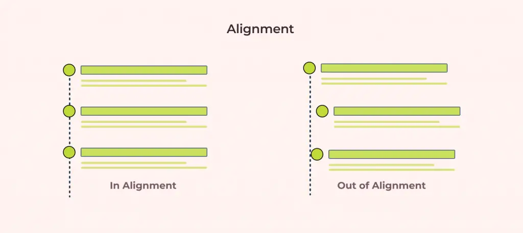
In the image below there are two elements: a logo and the branding slogan. But for the first one, both elements are left-aligned and for the second one the logo is left aligned and the slogan is right-aligned.

The goal here is to bring unity in the branding and informing users that both the elements are part of the same design element. We achieve this in the first part of the image whereas the second part looks like elements of different designs.
We can conclude that the combination of common alignment and proximity with design elements can unify them. If you are interested in proximity principle then I suggest you read up on Proximity: Associating relatedness through placement.
Using Alignment for Numerical Figures
Have you ever wondered why the amount figures in invoices are always right-aligned?
Amount figures are right-aligned because the units, tens, and hundreds must align to create easily scannable lists. Even the decimals need to be aligned to create a better experience.
You can try scanning the prices in the sample invoice image below.
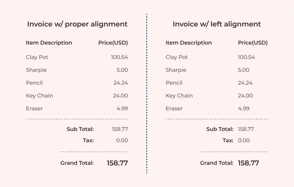
Observe how the invoice with right-aligned price figures is easy to scan. This is because we can easily make out the cents figures from the dollars.
We start getting confused with the decimals while trying to scan through the invoice with only left alignment.
Using Grids for UI Creation
Most modern design tools allow for layout grids that acts as guide. To make our design consistent and always ensure the desired alignment I highly suggest using grids for your designs.
Below is one my designs for Bank app where I use grids to align layout elements. This helped me keep a consistent gutter width between the columns as well.
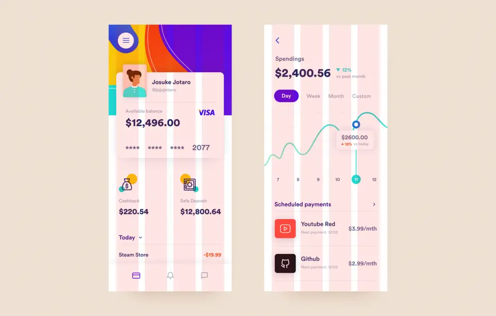
You can follow the dribble link and download the source files for experimentation. I made it available for everyone so that they can test out different stuffs 🙂.
Why alignment is important in design?
- Alignment contributes to the aesthetics of our products. Aesthetics are important for creating first impressions. Alignment helps create designs that are more visually pleasing to users.
- Alignment promotes proper product organization that helps users navigate easily through our product. Users prefer things that are organized. It helps them find what they are looking for.
- Alignment creates a sense of unity in the product. Playing around with different types of alignment can create an interesting outcome where we can unify or vary the design.
- Alignment guides the users with design. Alignment helps the user better understand the connections between different elements without the need for external helpers.
Additional Information on Alignment
- Align comes from the French a, meaning “to” and ligne meaning “line”.
- There are exceptions to this principle where we can misalign to grab the attention of users. However, this is difficult to pull off but with enough practice, it is possible. We can come up with some visually interesting designs.
TLDR
Here is a summary for the Alignment design principle:
- Multiple objects are said to be aligned when they are placed in such a way that their edges or central axis line up on a common position.
- There are two types of alignment: edge alignment & center alignment.
- It contributes to the aesthetics of our product making it cleaner to use.
- Use alignment as a general rule unless for some exceptions like misaligning to create visual interest.
Further Reading
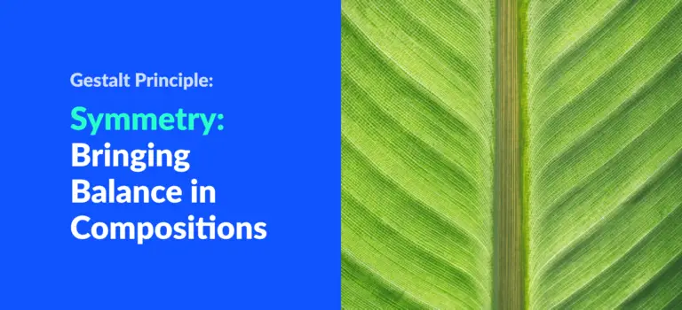
If you are interested in researching further on balance and alignment, I suggest you read next on Symmetry: Bringing balance to our compositions.
Understanding proximity is also important to create sleek UIs in combination with alignment. Read up on Proximity: Associating relatedness through placement for a deep dive into the topic.
For a complete list of design principles, take a look at the 11 principles of design.