Kerning vs Tracking vs Leading: The Three Kinds of Space in Type
Kerning, tracking and leading are the three kinds of space in type. Kerning adjusts the space between one pair of letters, like T and A. Tracking adjusts the space between all the letters in a word or line. Leading is the space between lines, set in CSS as line-height. Kerning fixes uneven pairs; tracking suits capitals and headlines.
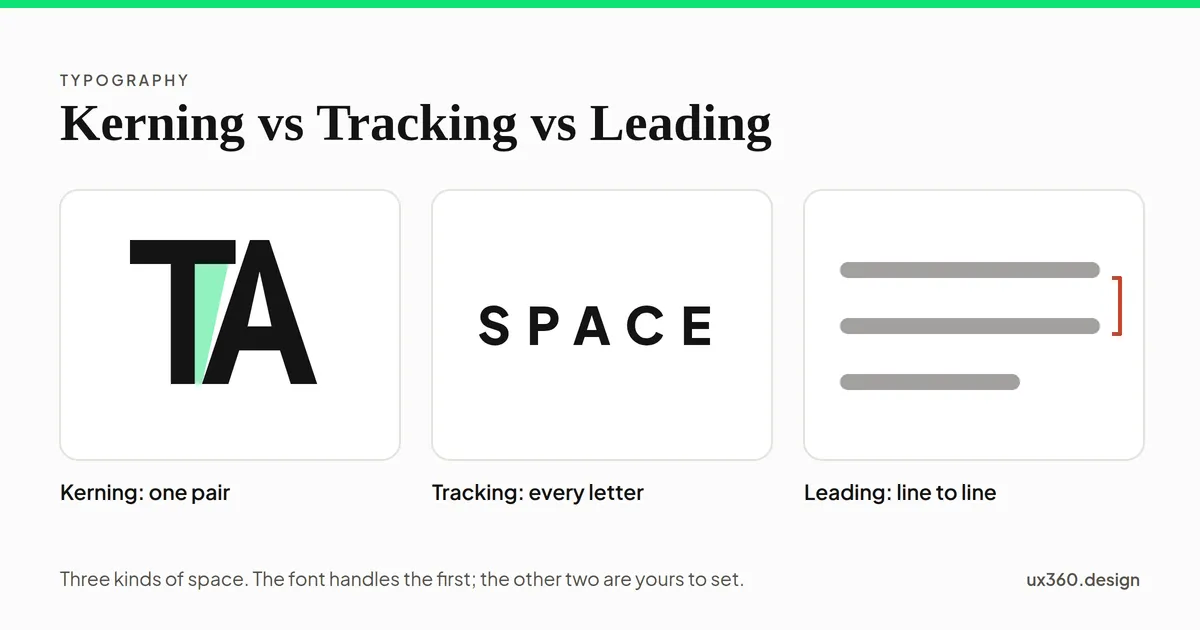
What are kerning, tracking and leading? Kerning is the space between one pair of letters. Tracking is the space between all the letters in a word or line. Leading is the space between lines.
All three are about space, and space decides whether text looks even and reads easily. Most of the time the font and the browser handle kerning for you. Tracking and leading are yours to set.
In short
- Kerning: adjusts one pair of letters, like A and V, so the gaps look even.
- Tracking: adds or removes the same space between every letter. In CSS it is
letter-spacing. - Leading: the space between lines. In CSS it is
line-height. - Rules of thumb: body text with a line height of about 1.5, a little extra tracking for small capitals, a little less for big headlines, and kerning left on.
What is kerning?
Every letter in a font sits in an invisible box, and the boxes sit side by side. That works for straight letters like H and I. It fails for shapes like T, A, V, L and O, which leave big open gaps beside them. Set “TA” by the boxes alone, and there is a hole between the letters.
Kerning fixes this by moving particular pairs closer together, or sometimes further apart. The goal is not equal distances. The goal is equal-looking white space.
Here is the word TOTAL, drawn from simple shapes so the white space between each pair can be measured.
Spaced by their boxes, every pair of letters sits the same distance apart, but the white space between them is not the same: TO 286, OT 286, TA 327, AL 200, where 100 is two straight letters set the same distance apart. TA holds 1.6 times the white space of AL, so the word looks uneven, with a hole between T and A.
Spaced by their boxes, every pair sits the same distance apart, yet the T and A pair holds far more white space than the others. Kerned, the pairs move different distances, and the word looks even. Some pairs cannot close all the way: the O would hit the arm of the T first.
You rarely kern by hand. Good fonts come with kerning tables built in, often with thousands of pairs, and browsers usually apply them on their own. Hand kerning is worth it for logos, big headlines and short words in capitals, where a single uneven gap is easy to see.
What is tracking?
Tracking adds or removes the same amount of space between every letter, across a whole word, line or paragraph. Designers also call it letter spacing, which is its name in CSS.
It is best measured in em, a fraction of the font size, so the same value works at every size. At 16 pixels, letter-spacing: 0.05em adds 0.8 pixels between each pair of letters.
Capital label, "FREE SHIPPING", at 12 px with tracking of 0 em: 0 px between each pair of letters. Capitals are spaced to sit beside lowercase letters, so a word set all in capitals tends to look cramped. Small capital labels usually get about +0.05 to +0.1 em.
Tracking needs change with size and case:
- Small text in capitals gets more. Capital letters are spaced to sit beside lowercase letters, so a word set all in capitals looks cramped. Labels and buttons in capitals usually get about +0.05 to +0.1 em.
- Large headlines often get less. A font’s default spacing is usually set for text sizes. At 48 pixels and up, the gaps can look loose, so headlines are often tightened slightly.
- Body text usually stays at zero. The font’s own spacing was designed for reading.
What the research says. Manuel Perea and colleagues have tested letter spacing many times. In studies of single words, a little extra spacing helped skilled adult readers recognize words faster. But in 2016, his team tracked readers’ eyes across whole stories. With extra spacing, each glance was shorter, but readers made slightly more glances, so reading took no less time. Understanding was the same.
Extra spacing does seem to help some readers with dyslexia. In 2012, Marco Zorzi and colleagues found that children with dyslexia made fewer reading errors when the spacing between letters was much wider. Later studies agree on the fewer errors, but are less sure that it makes reading faster.
What is leading?
Leading is the space between lines of text. The name comes from metal type, where printers put thin strips of lead between the rows of letters.
On the web, leading is set with line-height, usually as a plain number that multiplies the font size. With 16 pixel text and a line height of 1.5, each line takes 24 pixels, from one baseline to the next.
- Body text: about 1.4 to 1.6. WCAG’s strictest level (AAA) asks for at least 1.5 within paragraphs.
- Headlines: about 1.1 to 1.3. Big text with body-text leading looks like separate lines, not one heading.
- Long lines need more. The eye has further to travel back to the start of the next line, and extra space helps it find the right one.
What the research says. In 2016, Luz Rello, Martin Pielot and Mari-Carmen Marcos tracked the eyes of 104 people reading Wikipedia articles at different font sizes and line spacings. Font size made a real difference: bigger text was easier to read. Line spacing mattered much less. Only the most extreme settings they tried, the tightest and the loosest, made reading worse. Their advice was to use a larger font and normal line spacing.
So leading is about avoiding the extremes. Within a normal range, it is a matter of taste and fit.
Kerning vs tracking vs leading
| Question | Kerning | Tracking | Leading |
|---|---|---|---|
| What space? | Between one pair of letters | Between all letters | Between lines |
| Direction | Horizontal | Horizontal | Vertical |
| CSS | font-kerning (on by default) | letter-spacing | line-height |
| Who usually sets it? | The font | The designer | The designer |
| Matters most for | Logos, big headlines, capitals | Capitals, headlines | Body text |
How to set them
- Leave kerning on. Browsers usually apply the font’s kerning on their own. Do not turn it off.
- Set body line height to about 1.5. Then adjust by eye for the font and the line length.
- Tighten headline leading. Start around 1.2 for large headings.
- Track small capitals. Add about 0.05 to 0.1 em to labels, buttons and tags set in capitals.
- Tighten big headlines slightly, if needed. Try −0.01 to −0.02 em at large sizes, and stop before letters touch.
- Use em for tracking. Then the spacing scales with the font size.
- Let users change it. WCAG 1.4.12 says a page must still work when a user sets line height to 1.5, letter spacing to 0.12 em and word spacing to 0.16 em. Avoid fixed-height boxes that cut off text when it grows.
- Kern logos by hand. Look at the word upside down or blurred, so you see the gaps instead of the letters.
Try it yourself: set a paragraph
Change the size, the leading and the tracking. The bracket shows the distance from one baseline to the next, and the readout checks it against WCAG and the research.
Text at 16 px with a line height of 1.5: 24 px from one baseline to the next, 8 px of space added between lines. Tracking is 0 em. This meets 1.5, the line spacing WCAG asks for at its strictest level (AAA), and sits in the range most body text uses.
At 1.0, the lines nearly touch. Somewhere around 1.4 to 1.6 the paragraph settles into one calm block. Push past 1.8, and it starts to fall apart into separate strips. Extra tracking makes every line longer, so watch how many words still fit.
Type spacing and other principles
- Leading and line length together decide readability, how easy a block of text is to read.
- Kerning serves legibility: telling letters and words apart at a glance.
- Spacing is a kind of white space, and it groups letters into words and lines into paragraphs, like proximity.
- The steps between heading sizes come from a type scale. The type scale generator builds one for you.
- All three are set on a font, one weight and style of a typeface. See typeface vs font.
Common mistakes
- Tracking lowercase body text. It rarely helps, and it makes lines longer.
- Leaving capitals at zero tracking. Small labels in capitals look cramped without a little extra.
- Body-text leading on headlines. A two-line heading at 1.5 looks like two separate headings.
- Fixed heights around text. When a user increases spacing, the text spills out or gets cut off.
- Tight leading to save space. Below about 1.2 for body text, lines crowd each other and the eye loses its place.
- Kerning every word by hand. That is the font’s job. Save hand kerning for logos and large display type.
Frequently asked questions
What is the difference between kerning, tracking and leading?
Kerning changes the space between one specific pair of letters. Tracking changes the space between every letter in a word, line or block of text by the same amount. Leading is the vertical space between lines of text.
What is a good line height for body text?
Most interfaces use a line height of 1.4 to 1.6 times the font size for body text. WCAG's strictest level asks for at least 1.5. Headlines usually need less, around 1.1 to 1.3.
When should you add letter spacing?
Add a little to small text set in capitals, about 0.05 to 0.1 em, because capitals look cramped next to each other. Large headlines often go slightly tighter. Body text usually stays at the font's default.
What is kerning in CSS?
Fonts carry their own kerning tables, and browsers usually apply them on their own. The font-kerning property can turn them on or off. Tracking is set with letter-spacing, and leading with line-height.
Turn this into sizes you can use. The free type scale generator builds a whole scale from one base size and one ratio, with CSS to copy.Open the type scale

Written by