

User Experience
Jakob's Law: People Expect Your Site to Work Like the Others
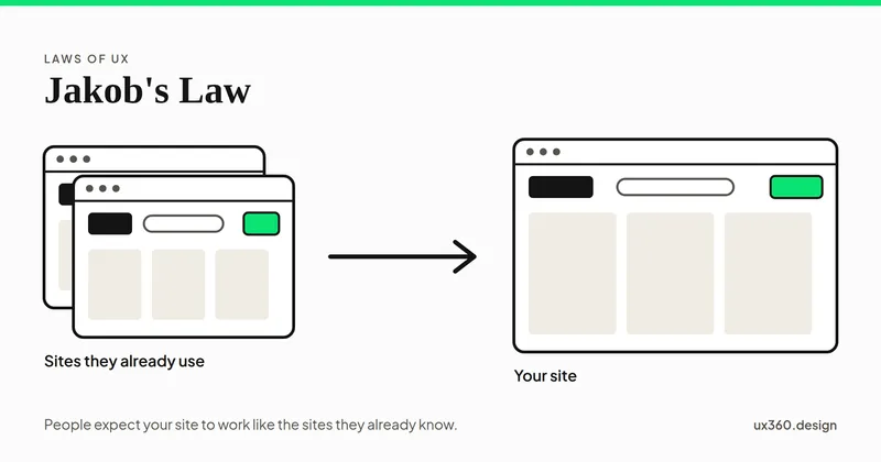
Jakob's law says people expect your site to work like the sites they already use. See the research behind it, examples, and when breaking a convention pays.
What UX actually involves. Research, personas, journeys, usability, psychology, and the mindset that separates UX from UI.
Here for the biases? See all of them sorted by who has them
Here for the laws of UX? See them in the order a click happens
User experience is the study of how people actually use a product, not how it looks. These articles cover the psychology behind it: cognitive biases such as anchoring and the framing effect, memory limits such as chunking and recognition over recall, and practical methods such as usability testing and accessibility. Most are short reads with real interface examples.
46 articles
Jakob's law says people expect your site to work like the sites they already use. See the research behind it, examples, and when breaking a convention pays.
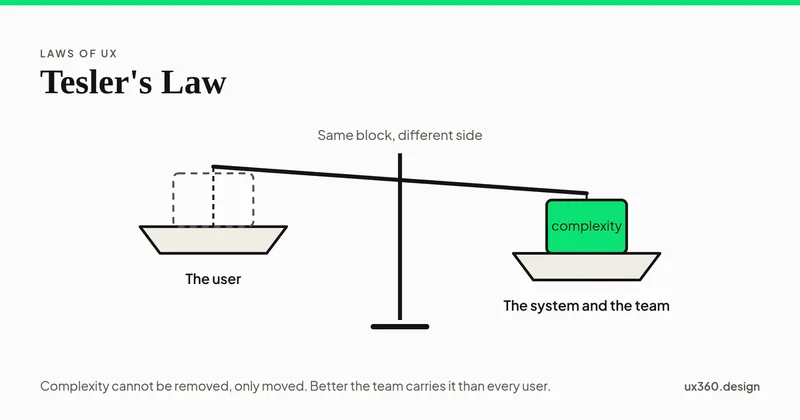
Tesler's law says some complexity can never be removed, only moved between the user and the system. See where it came from and when moving it actually helps.
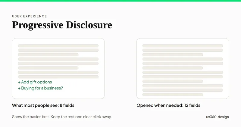
Progressive disclosure shows the basics first and the rest only when needed. See examples, the training wheels research, and when hiding things backfires.
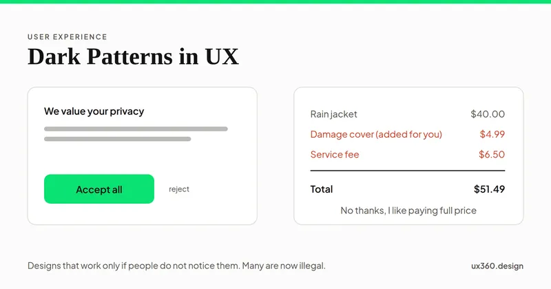
Dark patterns are designs that trick people into choices they would not make. See common examples, research on how well they work, the laws, and honest fixes.
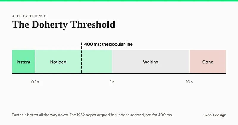
The Doherty threshold says people work best when a screen responds in under about 400 ms. See what the 1982 IBM paper found, and how to handle slow waits.
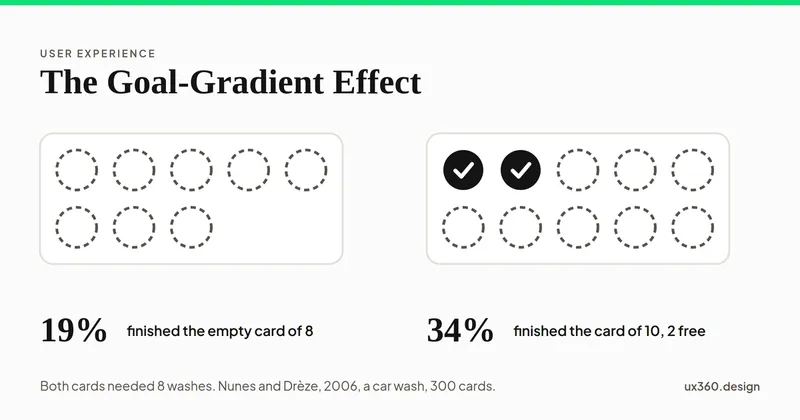
The goal-gradient effect: people try harder the closer they get to a goal. See the loyalty card studies behind it and how to use progress honestly in a product.
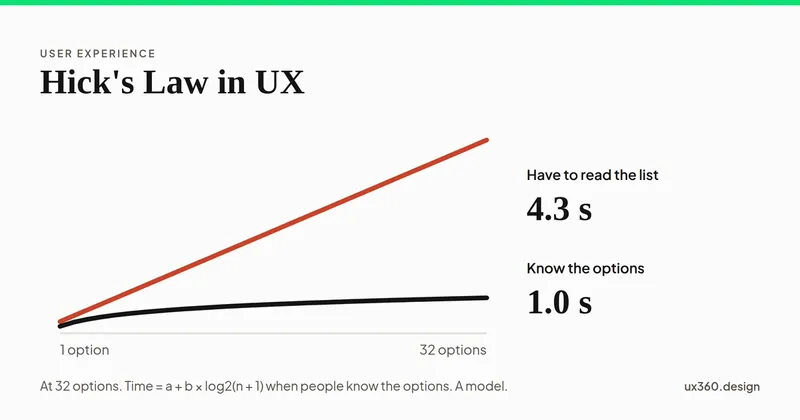
Hick's law says the time to choose grows with the number of options, but only by a little. See where it holds, where it breaks, and how to design menus with it.
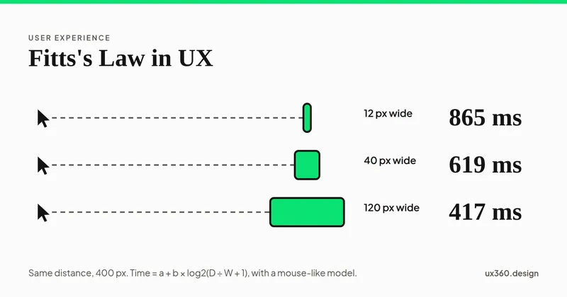
Fitts's law says the time to hit a target depends on its distance and its size. See the formula live, why screen edges are fast, and how to size buttons.
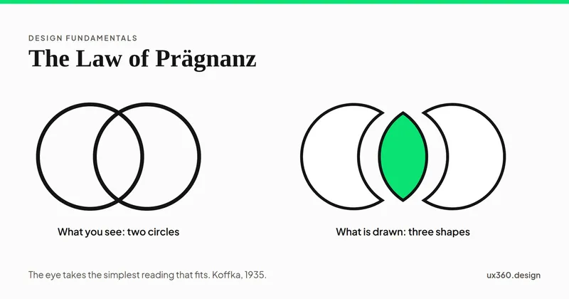
The law of Prägnanz says we see the simplest shape that fits what is in front of us. See it in rings, cubes and cards, and how to use it to simplify a design.
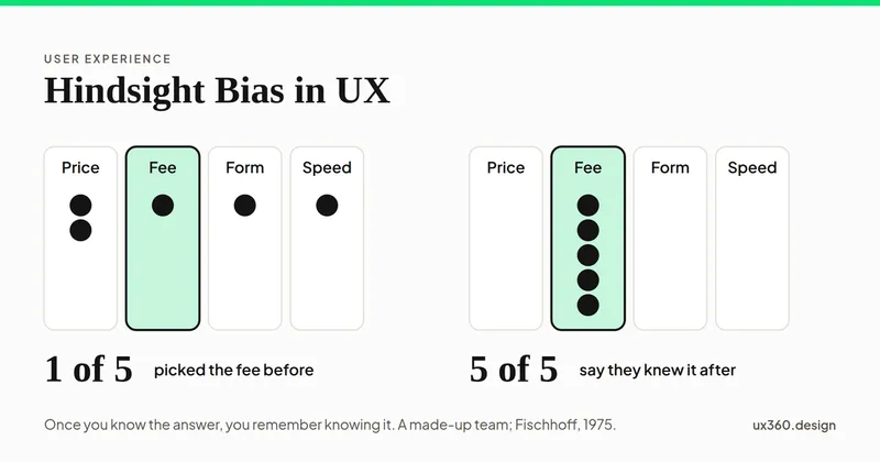
Hindsight bias makes a result feel obvious once you know it. See how it hides what research taught you, with the classic studies and a way to stop it.
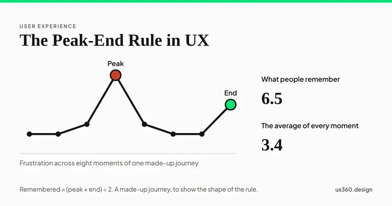
The peak-end rule says people judge an experience by its worst moment and its end, not its average. See the studies, examples and how to design the last step.
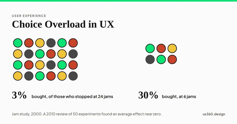
Choice overload is when too many options make a choice harder. See what research says, when it happens in UX, and how to ease the load without removing choice.
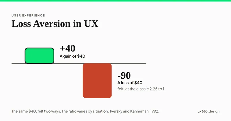
Loss aversion is feeling a loss more than an equal gain. See how it shapes trials and warnings in UX, what the research really says, and how to use it fairly.
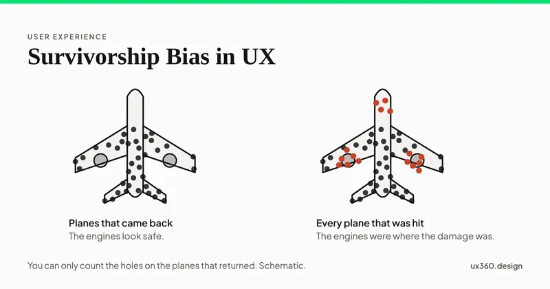
Survivorship bias is studying only the people who made it through. See how it skews UX surveys and reviews, with a famous WWII example and a way to catch it.
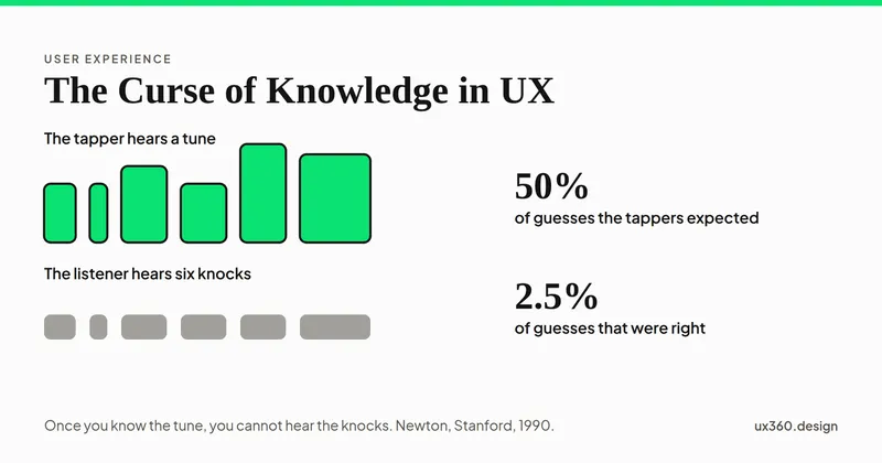
The curse of knowledge is forgetting what it is like not to know something. See how it hides in labels and steps, with a classic study and a way to fix it.
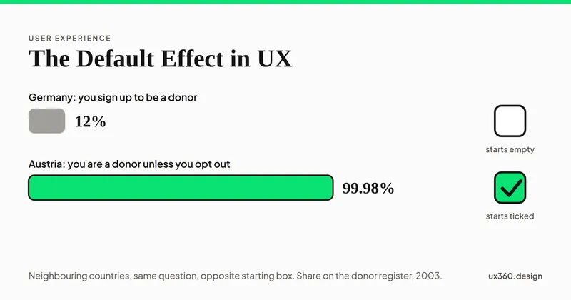
The default effect is the habit of keeping whatever is already selected. See how it works in forms and settings, with studies and a fair way to set defaults.
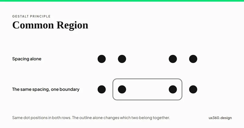
The law of common region: a shared boundary groups whatever it encloses. Why it beats proximity, what counts as a boundary, and what every boundary costs.
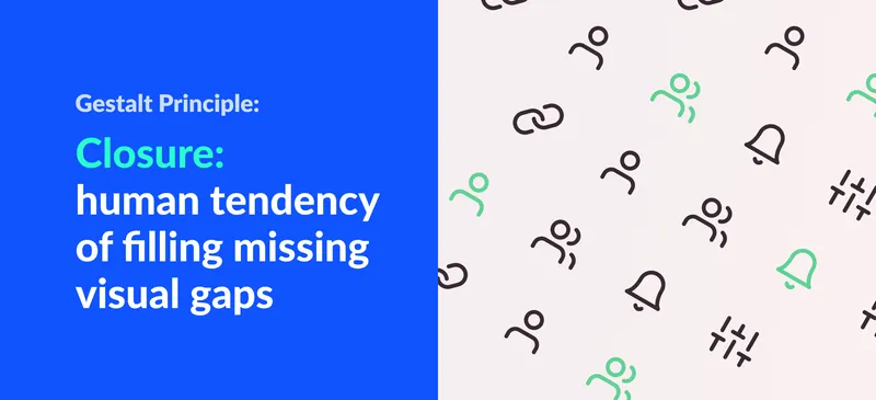
The law of closure: why the brain completes missing shapes. Examples from famous logos and interfaces, and how to use closure deliberately in your designs.
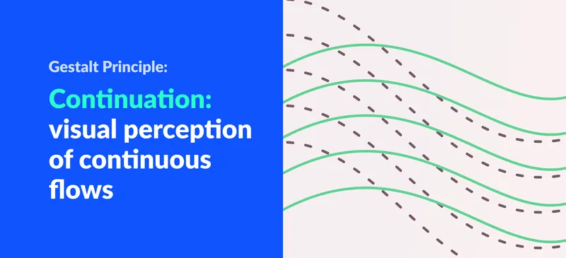
The law of continuation explains why the eye follows lines, curves and paths. What it is, how it differs from similarity, and how designers use it in layouts.
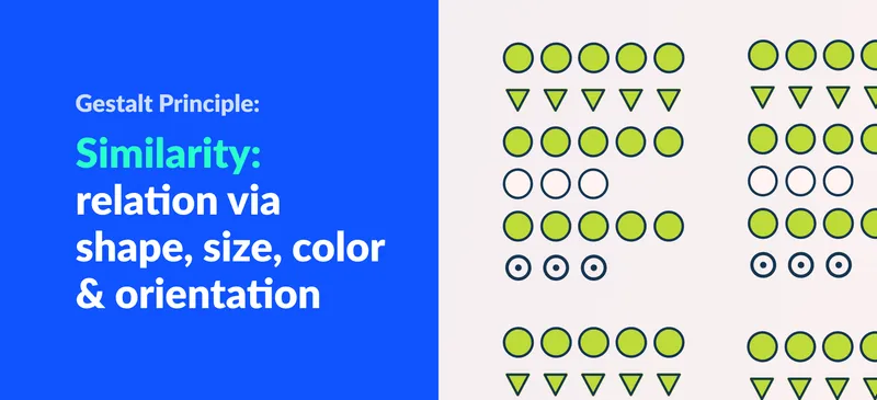
The law of similarity: elements that share shape, size, color or orientation are seen as related. How it differs from proximity, with examples.

The Gestalt law of symmetry explains why balanced compositions feel stable. What it is, how symmetry and asymmetry create balance, plus web examples.
The false consensus effect makes us assume our beliefs are more common than they are. Why it misleads UX designers and how research keeps it in check.
Anchoring bias makes people rely heavily on the first information they get. How it shapes decisions and why marketers and designers should understand it.

Wabi-sabi is the Japanese philosophy of finding beauty in imperfection. What the term means, examples in design and how the lifestyle shapes interiors.
The bandwagon effect: adopting ideas because many others hold them. Why it hurts design decisions, how to avoid it and how it plays out on social media.
Selection bias is a cognitive bias where systematic errors in sample selection skew results. Learn its four types and how to avoid it in UX research.
Bias towards information that supports previous beliefs or experiences. Learn to avoid the confirmation bias for rational thinking.
Recognition is easier than recall, so interfaces should show options rather than make users remember them. How the two differ, with UI examples.
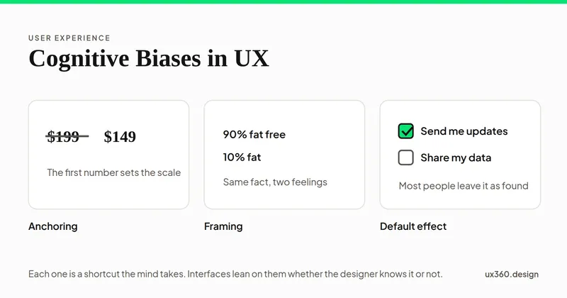
Here are the 7 types of biases every UX designers and marketers should know about. All of these biases can be used to our advantage.

We change our behavior according to what is socially accepted at the moment. Here, we will go into detail how marketers use conformity bias.
In this article, we are going to look at one of the cognitive biases: framing and how we can frame content to influence decision making.
Figure-ground is how we separate a subject from its background. What it is, ambiguous examples like Rubin's vase, and how designers use it in logos and UI.
Chunking breaks information into memorable groups. Where the idea comes from, why 7 plus or minus 2 is misread, and how to chunk content in interfaces.
The law of proximity: things placed close together are read as a group. Proximity vs similarity, and how spacing alone can organise a layout. Examples included.
Legibility is whether you can recognise letters. Readability is whether you want to keep reading. What each means, what affects it, and how to improve both.

Why do realistic robots, mannequins and CG characters feel unsettling? An introduction to the uncanny valley, Mori's graph and what it means for design.
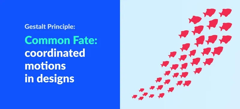
The law of common fate says elements moving together are perceived as a group. What it is and how motion, animation and interaction design put it to work.
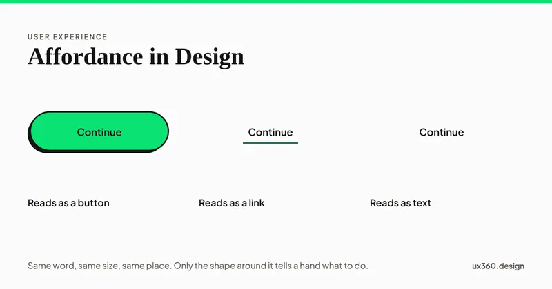
Affordance means an object's physical properties suggest how it is used. What it is, why it makes products efficient, and how to apply it in UI design.

Accessible design lets anyone use a product fully. Learn the four traits (perceivable, operable, simple, forgiving) with examples from Fortnite and Xbox.
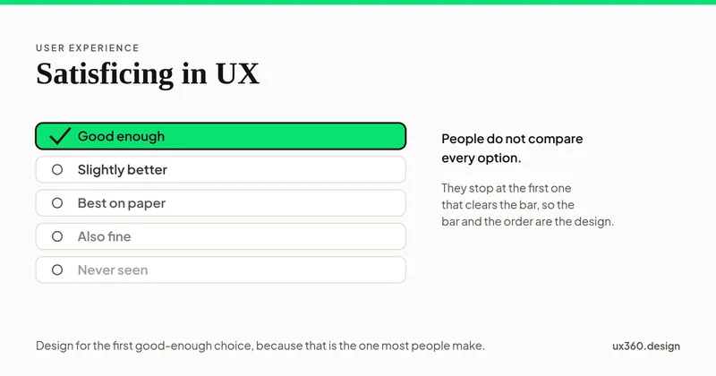
Satisficing is a decision-making behavior where users settle for a satisfactory solution instead of a better solution which would require more effort.
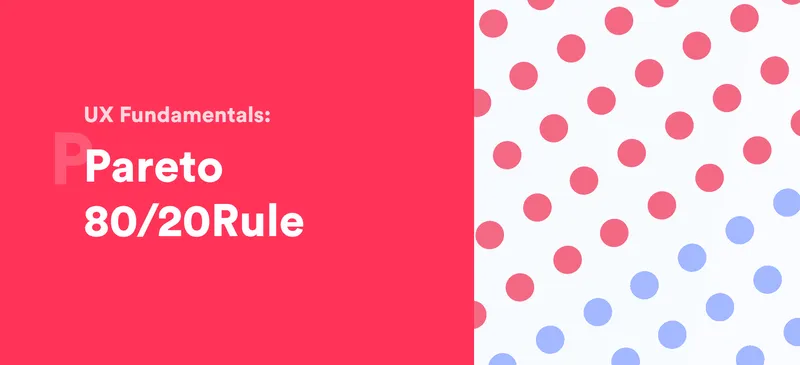
The Pareto principle says 80% of effects come from 20% of causes. How to find the 20% of features users rely on and give them priority in your UX design.
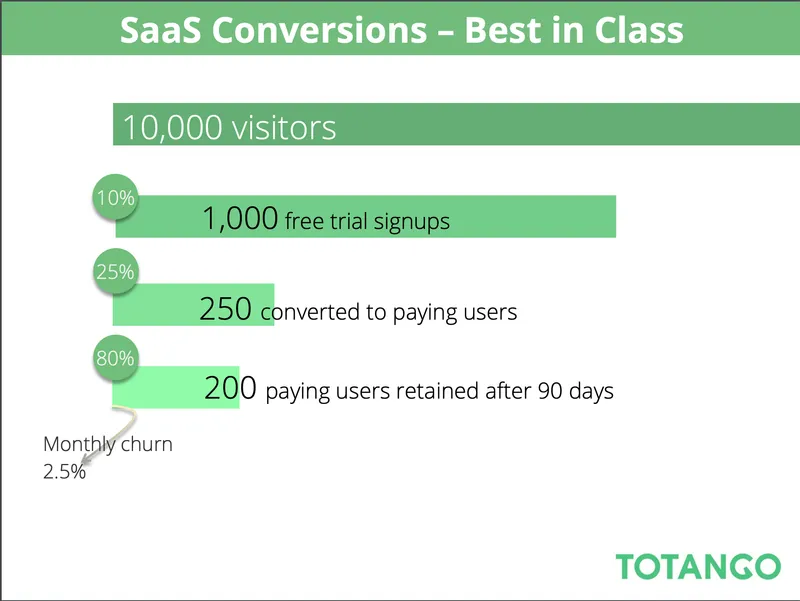
Cognitive dissonance is the discomfort of holding conflicting beliefs. How people reduce it, and how UX copy, branding, pricing and free trials use it.
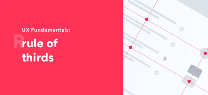
The rule of thirds divides a composition into a 3 by 3 grid and places key elements on the lines or intersections. Why it works and how to use it.
In this article, we will look into how we can analyze our product by comparing cost and benefit. We will learn more about cost-benefit analysis in design.
The aesthetic usability effect: people judge attractive designs as easier to use. Why it happens, what research shows and where form over function fails.
Usability testing means watching real participants use your product. Six reasons to start, eight steps to run a test, plus DIY and remote options.