

Color Theory in Design
Color theory is the set of relationships that describe how colors combine. It covers additive mixing in RGB and subtractive mixing in CMYK, the three properties of a single color, and the harmonies drawn from positions on the wheel. On a screen one more rule applies: text contrast has to clear a measurable floor.
What is color theory in design? Color theory is the set of relationships that describe how colors relate to each other and what happens when you combine them.
It is older than design as a profession and most of it predates screens entirely. What survives the move to a screen is the part about relationships. A relationship between two colors does not care what device it is on.
What does not survive is the assumption that you can pick any two colors you like. On an interface one more constraint applies, and it has a number attached.
Additive and subtractive: light against ink
This is the first thing that trips people who learned color with a brush, and it explains why more than one color wheel exists.
Mixing light is additive and mixing ink is subtractive. A screen emits light, so every color you add puts more light in and the mixture climbs towards white. Ink works by absorbing wavelengths and reflecting what is left, so every color you add removes more light and the mixture falls towards black.
The two systems start from opposite ends. Additive starts at black, an unlit screen, and builds up. Subtractive starts at white, a blank sheet, and takes away.
Look at what the overlaps do, because this is the part worth remembering.
The primaries of each system are the secondaries of the other. Red, green and blue light overlap into cyan, magenta and yellow. Cyan, magenta and yellow ink overlap into red, green and blue. They are one relationship seen from two directions, not two unrelated facts to memorise.
RGB, the additive system
RGB is the additive system every screen uses: red, green and blue light, mixed by a pixel.
All three at full strength give white. All three at zero give black, which on a screen means no light at all. Everything you specify for a screen is RGB underneath, whatever notation you type. Hex is RGB written in base 16. HSL is RGB with a friendlier set of dials on the front.
On a screen, red and green light make yellow. In paint that is nonsense, and mixing red and green pigment gives mud. Neither is wrong. They are different systems.
CMYK, the subtractive system
CMYK is the subtractive system print uses: cyan, magenta and yellow ink, plus a black.
Each ink subtracts one of the additive primaries from the white light bouncing off the paper. Cyan absorbs red, magenta absorbs green, yellow absorbs blue. Lay down all three and in theory you have absorbed everything and arrived at black.
In practice you have not, and the K is why.
- Three inks do not make a convincing black. Real pigments are impure, so full cyan, magenta and yellow gives a muddy dark brown rather than a true black.
- Black text needs one plate, not three. Setting small type from three inks means three plates must register perfectly or the letters fringe with color.
- Three inks cost three inks. Black is the most used color in most printing, and one cheap black is better business than three expensive ones.
- Paper can only absorb so much. Piling all three at full coverage soaks the sheet and it may not dry cleanly.
The K stands for key, not black. The black plate was the key plate that the others were registered against, and the letter avoids a collision with the B already used for blue.
RYB, and why you were taught it
RYB, red, yellow and blue, is the traditional artists’ wheel. It is the one most people meet at school, and it is a teaching model for mixing pigment rather than a description of how light or modern inks behave.
It survives because it is a good enough approximation with a paintbox and because the harmonies taught on it still work. It is worth knowing that it is a convention, so that the first time your screen refuses to behave like your paints you know why.
What this means in practice
You will design in RGB and someone will eventually print it.
The CMYK gamut is smaller than the RGB gamut, so some screen colors cannot be printed at all. A vivid saturated green or a bright orange that glows on a display will come back from the press noticeably duller, because no combination of those four inks reaches it.
Three habits handle this.
- Design for the medium the work will actually ship in, and convert late rather than early.
- Expect a shift on conversion, and check the saturated colors first, because they are the ones that move.
- Ask for a proof for anything where the color matters, and judge it under the light the piece will live in.
The three properties of a color
Any color can be described by three values, and design tools almost always expose exactly these.
- Hue is the color itself, its position around the wheel, measured in degrees. Red sits at 0, green near 120, blue near 240.
- Saturation is how much of that hue is present, running from the full strength version down to grey.
- Lightness is how close the color sits to white or to black.
Two colors can share a hue and still do completely different jobs, because saturation and lightness carry most of the work in an interface.
This is the most useful idea on the page for anyone building their first palette. A working set of colors is usually one or two hues at many saturations and lightnesses, not eight different hues.
Hue gets the attention because it is the part with names. Lightness does the work, because lightness is what the eye uses to separate text from its background, and it is the only one of the three that the contrast rules later in this article actually respond to.
These three properties sit alongside the other raw materials in my article The 7 Elements of Design and Art [Infographics Included].
Tint, shade and tone
Three words for three ways of moving away from a pure hue, and they are constantly used as though they were interchangeable.
A tint is a hue with white added. A shade is a hue with black added. A tone is a hue with grey added.
In the three properties above, a tint raises lightness, a shade lowers it, and a tone lowers saturation while leaving lightness roughly where it was.
Tones are the ones beginners skip, and they are the ones most professional palettes are full of. A fully saturated hue is exhausting across a large area. Knocking the saturation back is what turns a color you picked into a color you can live with on a page.
Most of a usable palette is one hue that has been moved, not many hues that have been collected.
The color wheel
The color wheel arranges hues in a circle so that the distance between two colors describes their relationship.
On the traditional wheel, three primaries cannot be mixed from anything else. Mixing neighbouring primaries gives the three secondaries. Mixing a primary with the secondary beside it gives the six tertiaries, which is where the double-barrelled names come from: red-orange, blue-green.
The wheel is still worth knowing even though your screen does not use the version you were taught. The harmonies below are defined by position on it, and a position is a position on either wheel.
What the wheel is really doing is turning a relationship into a distance. Opposite means maximum difference in hue. Adjacent means minimum. Everything in the next section is a rule about how far apart to stand.
The harmonies
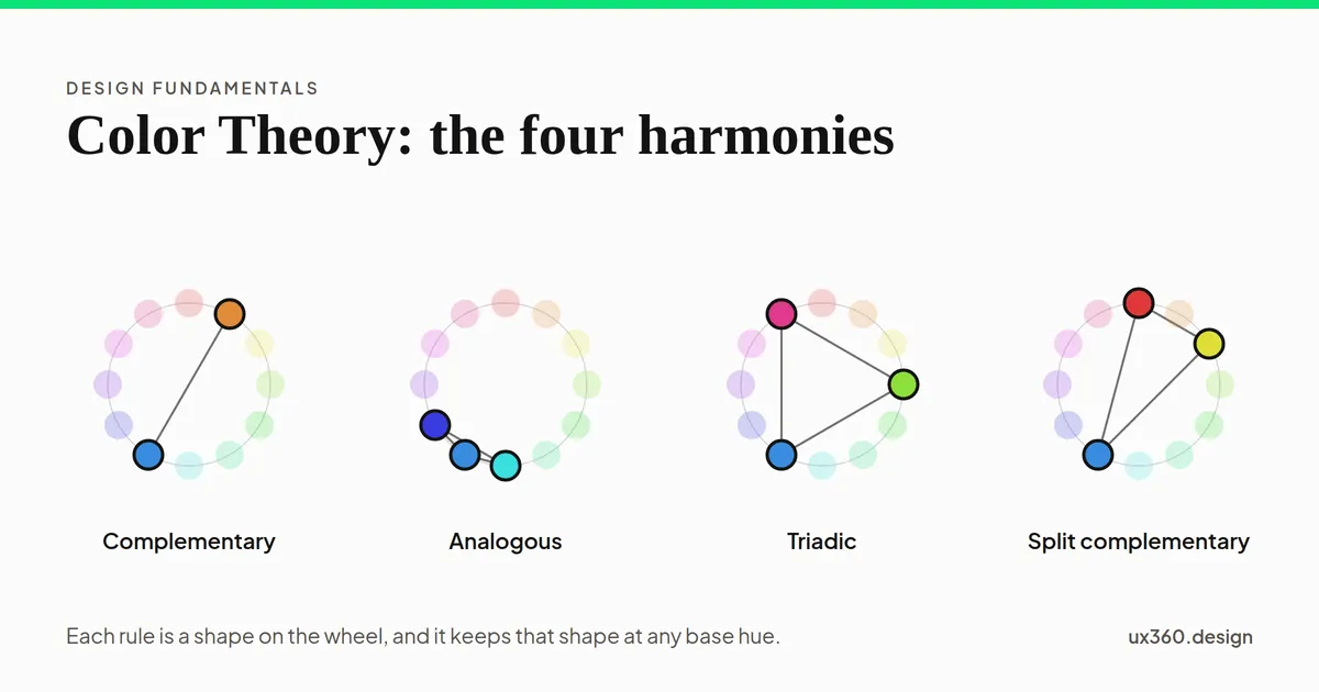
A harmony is a rule for picking colors by their positions on the wheel. There are many, and six cover nearly all real work.
- Complementary. Two colors directly opposite, such as blue and orange. The widest hue gap available, which makes the pair loud and makes it excellent for a single accent against a dominant color.
- Analogous. Three neighbours, such as yellow, yellow-green and green. The eye reads them as a family, which is calm and risks nothing standing out, so push one of the three in lightness.
- Triadic. Three colors evenly spaced. Balanced and lively, and hard to control, because all three want equal attention. Almost always used with one dominant and two supporting.
- Split complementary. One color plus the two neighbours of its opposite. Most of the tension of a complementary pair with less of the shouting, which makes it the safest of the six for a first palette.
- Monochromatic. One hue at several lightnesses and saturations. Impossible to make discordant, and the one most interfaces should start from.
- Tetradic. Two complementary pairs, four hues. The most color a composition can usually carry, and it needs one clear dominant or it falls apart.
Every harmony is a rule about hue only, which is why a palette that follows one can still fail on lightness.
That sentence is the hinge of this whole article. A harmony tells you nothing about whether the text will be readable, and a beautiful triad can be completely unusable. The section on contrast is where that gets settled.
Warm and cool
The wheel splits roughly in half. Reds, oranges and yellows are warm. Blues, greens and violets are cool.
The useful part is not the mood association, which varies by culture and is oversold. It is that warm colors appear to advance and cool colors appear to recede. That gives you depth on a flat surface without drawing a shadow.
A warm accent on a cool ground will come forward whether or not you wanted it to. Worth knowing before you choose an accent color for a button, and worth remembering when a warm illustration refuses to sit back behind the text in front of it.
Temperature is also relative. A blue can be the warm color in a composition if every other color in it is bluer.
A color is changed by what sits next to it
This is the one that surprises people, and it is the reason a palette approved in a swatch grid can fall apart in a layout.
A color is judged against what surrounds it, so the same value reads differently in two places. The effect is called simultaneous contrast, and Josef Albers built a whole teaching method on it.
The practical consequences are constant. A grey that looked correct on a white artboard turns muddy on a colored section. A border that reads as a hairline against one surface disappears against another. A brand color sampled against the logo looks wrong the moment it sits on a photograph.
The working habit is simple. Judge a color in the context it will ship in, never in a swatch. A palette page is a reference, not a proof.
Building a palette for an interface
Most palette advice is written for posters. An interface has different needs, because it has to keep working across hundreds of screens and states.
Four habits do most of the work.
Start with the neutrals. The greys carry the text, the borders, the surfaces and most of the pixels. A product with excellent neutrals and one accent looks designed. A product with six brilliant hues and careless greys does not.
Use one accent. A color means “act here” only if nothing else on the screen is also shouting. The moment a second accent appears, the first one stops carrying meaning.
Keep a ratio. The 60-30-10 split, roughly 60 percent dominant, 30 percent secondary, 10 percent accent, is a starting point rather than a law. Its value is that it forces a dominant color to exist.
Give every color a job, then reuse it. A palette where green always means success is doing semantic work. A palette where green is sometimes success and sometimes decoration is doing none.
The output of all this is not a handful of swatches. It is a set of ramps: each hue at a run of lightness steps, so that when you need a hover state or a disabled state or a border you take the next step rather than inventing a color.
Contrast, and the floor it has to clear
This is the constraint with no equivalent in paint, and it is not a matter of taste.
Text has to clear a measurable contrast ratio against its background: 4.5 to 1 for body text, and 3 to 1 for large text. Large means 24px, or 18.66px when it is bold. Interface components and meaningful graphics need 3 to 1 under the same standard.
The ratio compares the relative luminance of two colors and runs from 1 to 1, two identical colors, up to 21 to 1, black on white. It is arithmetic, not opinion, and it is the same sum an automated checker runs.
Drag the hue in that diagram and watch how little the number moves. Drag either lightness and watch how much. Contrast is a lightness problem wearing a color costume, which is the good news: a harmony almost never has to be abandoned, only adjusted.
One more rule sits beside it. Color must never be the only carrier of meaning. A red field border says nothing to a reader who cannot distinguish it, so an error needs a message and an icon too.
For the fuller treatment of the standard, I suggest you read my article Design for Accessibility: Meaningful Additions to make Products Accessible.
Color blindness, and why color alone never works
About one man in twelve and one woman in two hundred has some form of color vision deficiency. On any product with real traffic that is not an edge case.
The common forms affect red and green discrimination rather than removing color entirely. Someone with deuteranomaly, the most common form, sees color, and sees red and green as more alike than you do.
That single fact rules out a surprising amount of common practice.
- A red and green status dot with no other difference.
- A line chart identified only by line color.
- A required field marked only by turning its border red.
- A map whose legend is color and nothing else.
Every one of those is fixed the same way, by adding a second cue. A shape, an icon, a label, a pattern, a position. The color can stay. It just cannot be alone.
Contrast ratios help here too, because a pair that clears 4.5 to 1 on lightness stays distinguishable when hue perception changes.
Color in dark mode
A dark theme is not a light theme inverted, and treating it as one produces the three faults you see everywhere.
- Pure white text on pure black. The high contrast causes halation, where light type appears to bleed into the dark ground and the text seems to vibrate. Use an off-white on a very dark grey instead. This site uses ink at #faf8f5 on a ground near #1f1912 for that reason.
- Saturated colors carried straight over. A saturated blue that sits calmly on white will glow on a dark surface. Dark themes generally want the same hues at lower saturation and higher lightness.
- Elevation by shadow. A shadow is a darkening, and there is nothing left to darken. Dark interfaces signal elevation by making a surface lighter, not by putting a shadow under it.
Both themes have to clear the contrast floor independently, because passing in one says nothing about the other.
What color meaning is actually worth
Every color article carries a table saying blue is trust and red is urgency. Treat those with care.
The associations are real but they are cultural, contextual and weak next to everything else on the page. White is mourning in parts of Asia and weddings in parts of Europe. Red is danger on a warning label and good fortune at a Chinese new year.
What is reliable is convention within a context. Red means stop on a road, and it means delete in a toolbar, because people learned that particular pairing rather than something innate about the wavelength.
Use the convention your reader already has, and do not expect a color to argue on its own.
Final Words
To sum everything up, color theory is a set of relationships, and on a screen those relationships have a floor they must clear. In this article you learned:
- What color theory is? The set of relationships describing how colors relate and combine.
- What changes on a screen? Color is light rather than pigment, so it mixes additively, and every color you specify is RGB underneath.
- How do the two systems relate? The primaries of one are the secondaries of the other. RGB light overlaps into cyan, magenta and yellow. CMY ink overlaps into red, green and blue.
- Why does CMYK carry a K? Three inks give a muddy brown rather than a black, small type needs one plate, and the letter stands for key.
- What the three properties are? Hue, saturation and lightness, and lightness does most of the work.
- What tint, shade and tone mean? White added, black added, and grey added.
- What the harmonies are? Complementary, analogous, triadic, split complementary, monochromatic and tetradic.
- Why a color changes between two places? Simultaneous contrast. The eye judges a color against its surroundings.
- What the floor is? 4.5 to 1 for body text, 3 to 1 for large text and for interface components, and color is never the only cue.
If you would like to learn more about the raw materials of a composition, I suggest you check out my article here: The 7 Elements of Design and Art [Infographics Included]
Further Reading:
Frequently asked questions
What is color theory?
Color theory is the set of relationships that describe how colors relate to one another on the color wheel and what happens when they are combined.
What are the main color harmonies?
Complementary uses two colors opposite each other. Analogous uses neighbours. Triadic uses three evenly spaced colors. Split complementary uses one color and the two neighbours of its opposite. Monochromatic uses one hue at several lightnesses, and tetradic uses two complementary pairs.
What is the difference between additive and subtractive color?
Additive mixing combines light and is what screens do, starting from black and climbing to white with red, green and blue. Subtractive mixing combines ink and is what print does, starting from white paper and falling towards black with cyan, magenta and yellow. The primaries of each are the secondaries of the other.
What does the K in CMYK stand for?
Key, not black. The black plate was the key plate the other three were registered against, and the letter also avoids colliding with the B already used for blue. A separate black exists because three inks give a muddy brown rather than a true black, and because small text needs one plate instead of three.
What is the difference between tint, shade and tone?
A tint is a hue with white added, which raises lightness. A shade has black added, which lowers it. A tone has grey added, which lowers saturation and leaves lightness roughly where it was.
What contrast ratio does text need?
WCAG 2.2 at AA asks for 4.5 to 1 for body text and 3 to 1 for large text, meaning 24px, or 18.66px when bold. Interface components and meaningful graphics need 3 to 1.
What is the 60-30-10 rule?
A split that gives about 60 percent of a layout to a dominant color, 30 percent to a secondary, and 10 percent to an accent. It is a starting ratio, not a law, and its real value is forcing a dominant color to exist.
Why does the same color look different in two places?
Simultaneous contrast. The eye judges a color against what surrounds it, so one swatch will look lighter on a dark ground than on a light one even though the value has not changed.

Written by
![The 11 Principles of Design and Art [Infographics Included]](/_astro/principles-of-design-and-art-1.jIpeTnWF_192c4L.webp)