
The Golden Ratio in Design: What It Is, and Where It Actually Helps
The golden ratio is about 1.618 to 1: split a line so the whole is to the larger part as the larger part is to the smaller. In design it gives a pleasing, consistent proportion for layouts, crops and spacing. It is not magic: most famous examples were measured after the fact, and nearby ratios look the same.
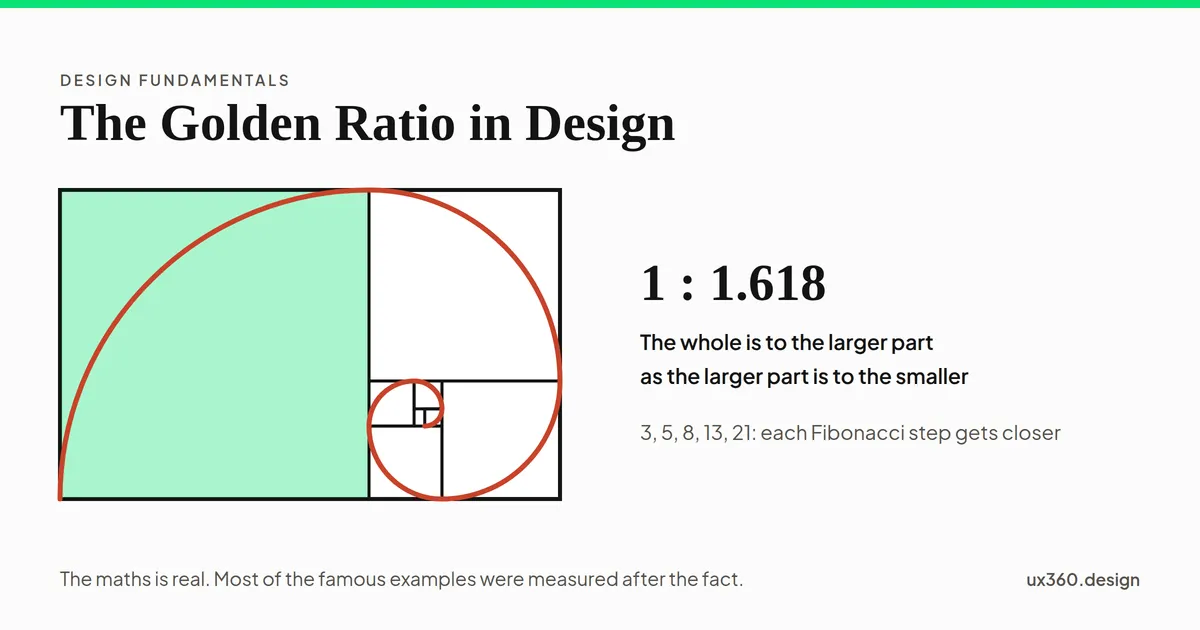
What is the golden ratio? The golden ratio is a proportion of about 1.618 to 1. Split a line so that the whole is to the larger part as the larger part is to the smaller, and you get it.
Designers use it to size things that sit together: a main column and a sidebar, a photo and its caption, a heading and the text under it. It gives sizes that feel related instead of picked one at a time.
In short
- What it is: a ratio of about 1.618 to 1, written with the Greek letter phi (φ).
- Where it helps: splitting a layout, cropping an image, and building a scale of sizes that belong together.
- What it is not: a secret of beauty. Most famous examples were measured after the fact, and nearby ratios look the same.
- How to use it: treat 1.618 as one good starting ratio, then adjust by eye.
How does the golden ratio work?
Take a line and cut it into a larger part and a smaller part. There is exactly one place to cut where two things are equal:
- the larger part divided by the smaller part, and
- the whole line divided by the larger part.
That place is at about 61.8% of the way along. Both answers come out at 1.618, and that number is the golden ratio.
It shows up in the Fibonacci numbers too. Each number is the sum of the two before it: 1, 1, 2, 3, 5, 8, 13, 21. Divide any number by the one before it and you get closer and closer to 1.618. So 8 ÷ 5 = 1.6, and 21 ÷ 13 = 1.615.
Split a layout yourself
Here is a page split into two columns. Slide the split and watch the two ratios. Try to make them match.
The larger part is 55.0% of the width and the smaller part is 45.0%. Larger divided by smaller is 1.222, and the whole divided by the larger is 1.818. The two ratios only agree at 61.8%, where both are 1.618. Here they are 0.60 apart.
The two ratios only agree at one spot, 61.8%. That is the whole definition. On a page 1200 pixels wide, the golden split is a main column of about 742 pixels and a sidebar of about 458.
Do the famous examples hold up?
Many articles say the golden ratio hides in the Parthenon, the Mona Lisa and the Apple logo. Most of these claims do not survive a careful look.
Buildings. In 1992 the mathematician George Markowsky looked at the claims about the Parthenon. Different authors measured between different points, and they left out parts of the building that did not fit. Measure a large, complex building enough ways and some pair of lengths will come close to 1.618.
Logos. Overlays of golden circles on the Apple logo are popular. Rob Janoff, who designed it in 1977, has said he worked from real apples, not from circles. The product designer David Cole checked the overlays and found that they only fit if you stretch what counts as a match.
Taste. In the 1860s, Gustav Fechner, one of the founders of experimental psychology, found that people preferred rectangles close to the golden ratio. Later studies got a mixed bag of results. When Christopher Green reviewed them in 1995, much of the evidence turned on how the tests were run. Markowsky also reports that people struggle to pick the golden rectangle out of a line-up of others.
None of this makes the ratio useless. It means the reason to use it is practical, not magic.
Close is close enough
Here is the golden rectangle as a dashed outline, with common screen and photo ratios drawn on top at the same width.
The filled rectangle is 16:10, 1.6. On a hero 1200 pixels wide it is 750 pixels tall, against 742 for golden: 8 pixels taller, a 1.1% difference that is very hard to see.
16:10, the shape of many laptop screens, is about 1% off the golden rectangle. Nobody can see that. So if your design is close to 1.618, it already has whatever the golden ratio gives. And 3:2 or 16:9 are fine choices too.
Where it actually helps
- Two-column layouts. A 62/38 split gives a clear main column and a sidebar that still has room.
- Image crops. The phi grid puts its lines at 38% and 62%, a little nearer the middle than the rule of thirds.
- Spacing. Multiply a base gap by 1.618 to get the next one: 8, 13, 21, 34. Gaps that grow in steps feel planned.
- Card and image shapes. A golden rectangle sits between a square and a wide banner.
- Logo construction. A grid of related circles keeps curves consistent. The value is the consistency, not the number.
It is a weaker choice for type scales. Each heading would be 1.618 times the size below it, so headings get very big very fast. Try it below.
How to use the golden ratio
- Start from one size you know. A content width, a body text size or a base gap.
- Multiply or divide by 1.618. That gives the next size up or down. The golden ratio calculator does this for you.
- Split widths at 62/38. For columns, panels and image-and-text pairs.
- Round to your grid. 742 pixels can be 744 on an 8-point grid. Nobody will notice.
- Check by eye. If a size looks wrong in the real design, change it. The ratio is a starting point.
- Stay consistent. One ratio used everywhere does more for unity than the perfect ratio used once.
Try it yourself: build a type scale
Each step is the size below it times the ratio. Pick a body size and a ratio, then see what happens to the largest heading on a phone.
Body text is 16 px and each step is 1.618 times the last, so the sizes are 16, 26, 42, 68, 110 px. The largest heading is 6.9 times the body. On a phone column 343 px wide it fits about 5 characters per line, so most headlines would wrap to three lines or more.
With 1.618, the biggest heading is almost seven times the body text. On a phone that leaves room for about one short word per line. Smaller ratios like 1.25 or 1.333 suit most interfaces. The type scale generator sets a whole scale at real size.
The golden ratio and other principles
- It is one tool for proportion, the relationship between the sizes of parts.
- It often works with the rule of thirds for placing a subject in a frame.
- It supports scale and hierarchy, by making size steps that are clearly different.
- It helps balance an unequal layout, where a large part and a small part still feel settled.
Common mistakes
- Treating it as proof of beauty. A design is not good because it measures 1.618.
- Drawing spirals on finished work. You can fit a spiral to almost anything after the fact.
- Using 1.618 for every type step. Headings grow too fast for most screens.
- Fighting your grid for it. Round to the grid. A pixel or two does not matter.
Frequently asked questions
What is the golden ratio in design?
The golden ratio is about 1.618 to 1. In design it is used to size parts of a layout, a crop or a spacing scale so that the larger part relates to the smaller one the way the whole relates to the larger part.
How do you use the golden ratio in a layout?
Split the width at about 62% and 38%. For example, a 1200 pixel page gives a main column of about 742 pixels and a sidebar of about 458. Multiply or divide by 1.618 to get related sizes.
Is the golden ratio really more beautiful?
Not reliably. Early studies in the 1860s found a preference for golden rectangles, but later studies got mixed results, and people struggle to pick the golden rectangle out from others. It is a useful proportion, not a rule of beauty.
Do Apple and other famous logos use the golden ratio?
The claims are mostly drawn on afterwards. The Apple logo's designer says he worked from real apples, and the circles people overlay only fit if you stretch what counts as a match.
Try the proportion on your own layout. The free golden ratio calculator turns one size into its golden partners, a column split and a spacing scale.Open the golden ratio

Written by