Scale in Design
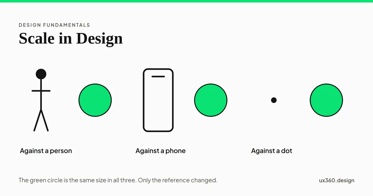
Scale is the size of an element measured against a reference, which may be the human body, the frame, or the element beside it. Proportion asks how parts relate inside a composition. Scale asks how the whole relates to something outside it. Choosing the reference is the design decision.
What is scale in design? Scale is the size of an element measured against a reference.
The reference is the part people forget. A button is not large on its own. It is large beside the text next to it, or large for a thumb, or large on a phone and ordinary on a monitor.
Change the reference and the same object changes size. This is why scale is a decision rather than a measurement. You are not choosing how big something is. You are choosing what it is big compared to.
Scale and proportion are not the same thing
These two words get swapped for each other constantly, and they answer different questions.
Scale is the size of an element against a reference outside the composition. Proportion is the size relationship between elements inside it.
A chair drawn twice the height of the person sitting in it is a scale problem, because the reference is the human body. A chair whose legs are too thick for its seat is a proportion problem, because the reference is the rest of the chair.
Both can be wrong in the same drawing, which is why they feel like one idea. They are two questions. How big is this compared to the world, and how big is this compared to its neighbours.
For more on the second question, I suggest you read my article Proportion Principle of Design.
The three references worth choosing
Almost every scale decision picks one of three references, whether or not the designer names it.
- The human body. A door, a chair, a handrail. Anything a person touches is scaled to the person, and getting it wrong is felt physically rather than noticed visually. Touch targets are this reference on a screen.
- The frame. A headline fills a poster or sits quietly in a corner of it. The frame is the page, the canvas or the viewport, and it changes when the viewport does.
- The neighbouring element. A heading is large because the paragraph under it is small. This is the reference most interface work actually uses, and it is the one that survives a change of screen size.
A scale decision only means something once you have named what it is measured against.
Architects make this explicit by drawing a human figure into an elevation. The figure is not the subject. It is there so the rest of the drawing has a size.
Scale in interface design
Interfaces use scale in three places, and all three work better when the steps are few.
A type scale is a short list of allowed sizes, usually built by multiplying a base size by a fixed ratio. Five or six sizes is plenty. The value is not the ratio. It is the shortness of the list. A reader can tell six sizes apart and cannot tell twenty.
Touch targets are scaled to the finger, not to the layout. That is why a 44px control looks oversized in a design file and feels correct in the hand. The design file is the wrong reference.
One dominant element per screen gives the eye somewhere to start. Scale is the bluntest tool for this, and the most reliable, because size is read before color and before position.
You can see it working on any pricing page. The recommended plan is larger than the others, and you look at it first without deciding to.
Where scale goes wrong
The common failure is scaling everything up. When the heading, the image, the button and the callout are all large, none of them is, because they have become each other’s reference.
The opposite failure is a scale with too many steps. Sizes that differ by two pixels read as a mistake rather than a distinction. If two things are meant to be different, make them clearly different. If they are not, make them the same.
A size difference too small to notice is worse than no difference, because it costs the same effort and buys nothing.
The third failure is scaling a reference that moves. A headline set to fill a desktop viewport becomes unreadable on a phone, because the frame it was measured against is gone.
Why is scale important in design?
Scale is important because of the following reasons:
- It is the first thing the eye reads, before color, position or weight.
- It tells a reader where to start, which is most of what hierarchy does.
- It connects a design to the body that will use it, through targets and reading sizes.
- It gives a composition a sense of real size, which is what makes an illustration feel like a place rather than a diagram.
Final Words
To sum everything up, scale is size with a reference attached, and the reference is the part you design. In this article you learned:
- What scale is? Scale is the size of an element measured against a reference.
- How does it differ from proportion? Scale compares an element to something outside the composition. Proportion compares elements inside it.
- What references are there? The human body, the frame, and the neighbouring element.
- Where does it go wrong? When everything is scaled up together, when the steps are too small to see, or when the reference moves.
If you would like to learn more about the other principles of design, I suggest you check out my article on the core concepts here: The 11 Principles of Design and Art [Infographics Included]
Further Reading:
Frequently asked questions
What is scale in design?
Scale is the size of an element measured against a reference such as the human body, the frame it sits in, or the element next to it.
What is the difference between scale and proportion?
Scale compares an element to a reference outside the composition. Proportion compares elements to each other inside it. A chair too big for a person is a scale problem. A chair with legs too thick for its seat is a proportion problem.
How is scale used in user interface design?
Through a type scale that sets a small number of allowed sizes, through touch targets measured against the finger, and through one dominant element per screen that tells the eye where to start.

Written by