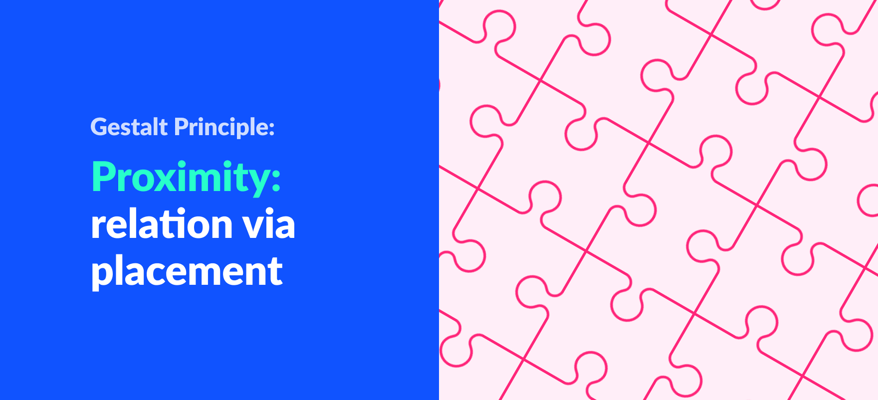
Gestalt Principle: Proximity (Associating relatedness through placement)
“Birds of a feather flock together.” This is a popular proverb in English. We all know what this means: people with similar attitudes and interests often stick together. People with nothing in common rarely enjoy each other’s company, and thus stay as far away from each other as is humanly possible.
This is not only true of the company we keep, but also of our perception of inanimate objects. When objects are close to each other, we say that they are in close proximity.
We have a natural tendency to assume that objects that are grouped together have something in common that unites them all. This tendency of ours is a major player when it comes to UI design.
In this section, we shall discuss this effect in further detail.
About Proximity
Proximity is one of the principles of Gestalt principles of perception. This principle states that objects or elements that are placed together are perceived to be more related than the ones far apart.
If we were to put a bunch of random numbers together, people would perceive it to be some kind of code. Or a phone number from some countries.
If we were to put the same numbers separated from each other, people would simply assume that they are merely separate, individual numbers, and nothing other than that.
Proximity is one of the best ways to indicate that elements are related.
Proximity is generally better in indicating relatedness than, say, similarity. So, it is important to consider proximity layouts in design.
Using Proximity in design
Categorization of similar design elements and features
We can specify elements that are related and group them together. It is one of the best ways to show users that two or more elements in the design are related to each other.
For example, the Settings option in most app groups all the settings-related features of that app together.
Similarly, the lack of proximity in designs leads to multiple chunks that give a perception of being unrelated.
Always arrange elements in designs such that their proximity corresponds to the things they are related to. Unrelated elements should be kept apart from one another.
Simplifying our designs through grouping
When people know about the relatedness of elements, it is easier for them to know what they want and don’t want to use. They can skip the ones they are not going to use. This way the complexity of our design is reduced.
Reenforcing one design element using another
When we put support information for some units in our design, we show how they are related. When we put supportive information in the proximity of the unit in the design, our relation is reinforced.
For example: grouping an image with a caption together will inform the users about the image’s properties. The bond gets weaker the farther away these elements are positioned. As we position them farther, a point comes where users conclude that the caption is not related to the image.
Creating self-explanatory designs
Some layouts of proximity signify specific relationships.
For example, in a bullet list content, placing text without a bullet in the next line implies that this new line is related to the bullet point above it.
Summing Up
- Proximity is used for indicating relatedness between elements in a design.
- Group similar objects together to show relatedness and place them far apart when the objects are not related.
- The complexity of any product is reduced as relations are reinforced.