
Color Harmony in Design: What the Color Wheel Says, and What People Prefer
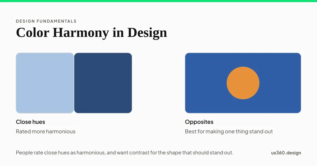
Color harmony is how well a set of colors looks together. Color wheel schemes like complementary and triadic are the classic guide, but experiments find people rate pairs as more harmonious when the hues are close and the lightness differs. Use close hues for the palette, and save strong contrast for the one thing that should stand out.
What is color harmony? Color harmony is how well a set of colors looks together: whether they seem to belong to one design or fight each other.
Most advice on color harmony comes from the color wheel: pick colors in a set pattern, like opposites or neighbors. That is a useful start. But when researchers ask people which pairs look harmonious, the answers do not always match the wheel, and the difference matters for interfaces.
In short
- The classic schemes: monochromatic, analogous, complementary, split complementary and triadic, all picked by position on the color wheel.
- What people rate as harmonious: colors close in hue, often with a clear difference in lightness.
- What people prefer for a shape on a background: contrast, so the shape stands out.
- For a UI: build the palette from close hues spread from light to dark, and save a contrasting hue for the one thing that should stand out.
The classic color harmony schemes
Each scheme picks hues by their position on the color wheel.
- Monochromatic: one hue in different lightness and saturation. Calm and safe.
- Analogous: two or three neighbors on the wheel, like blue, blue-green and green. Calm, with a little more variety.
- Complementary: two opposites, like blue and orange. Strong contrast.
- Split complementary: one hue plus the two neighbors of its opposite. Contrast, with less clash.
- Triadic: three hues evenly spaced around the wheel. Lively and hard to balance.
The schemes are a good way to explore. But they only say which hues to use. They say nothing about how light or dark each color is, or how much of each to use, and those two things decide most of what a palette looks like.
What experiments say about color harmony
In 2011, the psychologists Karen Schloss and Stephen Palmer showed 48 people nearly a thousand color pairs. Each pair was a small square on a larger one. People rated the pairs in three different ways. They were asked how much they liked the pair, how harmonious it was, and how much they liked the small square against its background.
The answers split in an interesting way:
- Harmony went up as the hues got closer. Pairs of similar hues were rated the most harmonious. Cooler and less saturated pairs did a little better too.
- Opposite hues got no special credit. Complementary pairs were not rated any more harmonious than other far-apart pairs. The researchers found no support for the old idea that contrasting hues are harmonious.
- A difference in lightness helped a little. Harmony rose slightly as the two colors got further apart in lightness.
- But a shape on a background was liked more when it contrasted. When people judged the small square on its own, they preferred it to stand out from its background.
Earlier researchers built models of harmony from people’s ratings too. Li-Chen Ou and Ronnier Luo found that lightness and saturation mattered alongside hue. Hue is only part of the story.
Move the two colors below and read both judgments at once.
The two colors are 20° apart on the color wheel and 39 points apart in lightness, with a contrast ratio of 4.1 to 1. As a pair, they are close in hue, the kind of pair people rated most harmonious in Schloss and Palmer's 2011 study, and the clear lightness difference helped a little more. As a shape on a background, the contrast makes it stand out, and in the same study people preferred a shape that contrasted with its background.
This is the useful part for designers. Harmony and contrast are different goals. Close hues make a calm, harmonious palette. A contrasting hue makes one thing stand out. A good interface needs both, in the right places.
Check your palette in grayscale
Lightness does much of the work in a palette, and it is easy to miss when you are looking at hues. A simple test is to view the palette in grey. Pick a palette below and compare the two rows.
One hue, light to dark: one hue, with lightness from 19 to 92, a spread of 73 points. In grey, the colors still step clearly from light to dark, so the palette has room for a background, text and everything between.
A palette built from one or two hues, spread from light to dark, keeps clear steps in grey. You can use the light end for backgrounds, the dark end for text, and the middle for everything else. A palette of five hues at the same lightness looks lively in color, but in grey it collapses into one tone. It has nothing to build hierarchy with, and almost no pair in it is fit for text.
How to build a harmonious UI palette
- Pick one main hue. Often your brand color.
- Spread it from very light to very dark. Make a ramp of 8 to 10 steps. The light steps become backgrounds, the dark ones text.
- Add a neutral. A grey, often tinted slightly toward your main hue, carries most of the screen.
- Choose one accent with real contrast. A hue far from the main one, or the same hue much darker or lighter. Use it for buttons, links and selected states, and keep it rare, as in the 60-30-10 rule.
- Keep meaning colors separate. Red for errors, green for success and amber for warnings sit outside the harmony.
- Lower the saturation of large areas. Strong colors are tiring over big spaces. Save full saturation for small things.
- Check in grayscale, then check contrast. Text needs at least 4.5 to 1 against its background. The contrast checker tests a whole screenshot.
Try it yourself: build a card palette
The background, header and text of this card all come from one base hue. Choose where the other hues come from, then watch the readout check the contrast.
2 hues (215°, 35°), lightness from 22 to 96. Body text on the background is 11.3 to 1, which passes the 4.5 to 1 floor. The button is 3.1 to 1 against the background, and its label reads best in dark text at 5.1 to 1. The button's hue is 180° from the rest, so it stands apart from the calm card. That is where the research puts contrast: on the one thing that should stand out.
With “One hue,” the card is calm, and the button stands out only by being darker. With “Opposite accent,” the card stays calm and the button jumps out by hue as well. That is the research in practice: harmony for the whole, contrast for the one thing that matters most. Push the saturation up, and the tags and button start to fight the text for attention.
Color harmony and other principles
- It is part of color theory, which covers the wheel, mixing and contrast in full.
- A rare accent is a form of emphasis: it stands out because the rest is calm.
- Close hues group things, like the Gestalt principle of similarity.
- Harmony serves unity: screens that share a palette feel like one product.
- It only works if text clears the contrast floor.
Common mistakes
- Picking hues and forgetting lightness. A palette with no light and dark has nothing for text to sit on.
- Using complementary colors in equal amounts. Opposites side by side, at the same size, fight. Let one lead and keep the other small.
- Too many saturated hues. Each one competes for attention, and none of them stands out.
- Trusting the wheel over your eyes. A scheme is a starting point. Judge the real screen.
- Color as the only signal. Some people cannot tell certain hues apart. Pair color with labels, icons or underlines.
Frequently asked questions
What is color harmony?
Color harmony is how pleasing or well-matched a set of colors looks together. Designers usually build it from color wheel schemes, such as complementary, analogous and triadic colors.
What are the main color harmony schemes?
Monochromatic uses one hue at different lightness. Analogous uses neighbors on the wheel. Complementary uses opposites. Split complementary uses one color and the two neighbors of its opposite. Triadic uses three evenly spaced hues.
Are complementary colors harmonious?
Not by people's ratings. In a 2011 study by Karen Schloss and Stephen Palmer, opposite hues were not rated any more harmonious than other far-apart pairs. Close hues were rated most harmonious. Complementary colors do make one color stand out against another, which is why they suit an accent.
How do I choose a harmonious color palette for a website?
Start with one or two close hues and spread them from very light to very dark, so you have backgrounds, text and everything between. Add one contrasting hue for buttons and links. Check the palette in grayscale and check text contrast.

Written by