Contrast Principle of Design
Contrast is the principle of making two elements differ enough that the eye separates them without effort. Designers create it through colour, size, shape, type, space and texture. Contrast is what makes a page readable before it is beautiful, and it is the first thing to check when a layout feels flat.
What is the contrast principle of design? Contrast is the difference between two elements that makes each one easier to see.
Every other principle depends on this one. Emphasis needs something to stand out from. Hierarchy needs levels that look different. Without contrast a composition is a flat field, and the eye has nowhere to land.
You already judge contrast constantly. A black line on white paper reads instantly. The same line on dark grey does not. Nothing about the line changed. What changed is the gap between the line and what sits behind it.
Why contrast comes before beauty
A design can be tasteful and still fail. If a visitor cannot tell a heading from a paragraph, or a button from a label, the work is decorative rather than useful.
Contrast is a readability decision before it is an aesthetic one.
So the useful question is not “does this look good” but “can someone name the most important thing here in one second”. If the answer is no, contrast is what you are missing.
The six types of contrast
Contrast is not only about colour. Any property two elements share can be pushed apart.
- Colour contrast. The difference in hue, saturation or lightness. A green button on a cream page separates because both hue and lightness differ.
- Scale contrast. The difference in size. Making one circle smaller than its neighbours pulls the eye straight to it.
- Shape contrast. The difference in form. One square among circles is found immediately, even at a glance.
- Type contrast. The difference in weight, size or family between two pieces of text. A bold 32px heading above 18px body text is type contrast doing its job.
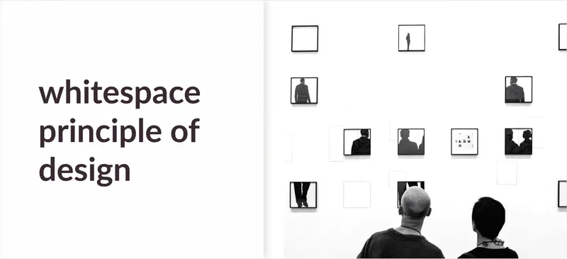
- Space contrast. The difference in how much room elements are given. An element surrounded by space reads as more important than one packed against its neighbours.
- Texture contrast. The difference in surface. A flat panel beside a photograph separates because one is smooth and the other is busy.
Most good layouts use three or four of these together, pointing the same way. That is why a heading is usually larger, heavier and given more space all at once.
Contrast and accessibility
Colour contrast is the one type with a number attached to it, and the number is not a matter of taste.
Body text needs a contrast ratio of at least 4.5 to 1 against its background, and large text at least 3 to 1.
That threshold exists because vision varies. What reads comfortably for a designer on a bright screen can disappear for a reader with low vision, or for anyone outdoors in sunlight. Grey text on a grey card is the most common failure on the web, and it is almost always a choice made for looks.
If you want to learn more about this, I suggest reading my article Design for Accessibility: Meaningful Additions to make your Designs Accessible.
Where contrast goes wrong
Two failures show up again and again.
The first is too little. Everything sits at the same size and weight, so nothing leads. The page looks calm in a mockup and unreadable in use.
The second is too much. Every element shouts, so the eye has no order to follow. When everything is emphasised, nothing is. This is the more common mistake once a designer learns the principle.
The fix for both is the same. Decide what the single most important element is, give it the most contrast, and then rank everything below it deliberately.
Why is contrast an important principle of design?
Contrast is important because of the following reasons:
- It tells the viewer where to look first.
- It separates content into parts the eye can process.
- It makes text legible for people with low vision.
- It gives every other principle something to work with.
Final Words
To sum everything up, contrast is the difference that lets the eye do its work. In this article you learned:
- What contrast is? Contrast is the difference between two elements that makes each one easier to see.
- What types are there? Colour, scale, shape, type, space and texture contrast, usually combined.
- How much is enough? At least 4.5 to 1 for body text, and enough elsewhere that the most important element is obvious at a glance.
If you would like to learn more about the other principles of design, I suggest you check out my article on the core concepts here: The 11 Principles of Design and Art [Infographics Included]
Further Reading:
Frequently asked questions
What is contrast in design?
Contrast is the difference between two elements in a composition. The larger the difference, the faster the eye tells them apart.
What are the types of contrast in design?
The common ones are colour contrast, scale contrast, shape contrast, type contrast, space contrast and texture contrast. Most designs use several at once.
How much contrast is enough?
For text, enough to meet a 4.5 to 1 ratio against its background. For everything else, enough that a viewer can name the most important element in one second.

Written by