
The 60-30-10 Rule in UI Design: How to Split Your Colors
The 60-30-10 rule is a color guideline: about 60% of a design in a dominant color, 30% in a secondary color and 10% in an accent. It comes from interior design. On a screen the 60 is usually a neutral background, and the part that matters most is the 10: an accent works because it is rare.
What is the 60-30-10 rule? The 60-30-10 rule is a color guideline: about 60% of a design in a dominant color, 30% in a secondary color, and 10% in an accent color.
It started in interior design, where the walls take the 60, the furniture the 30, and the cushions and lamps the 10. Designers now use it for websites and apps too. It is a quick way to stop a palette from turning into a fight between colors.
In short
- What it is: a split of about 60% dominant, 30% secondary and 10% accent.
- On a screen: the 60 is usually a neutral background, the 30 is navigation, cards or a brand color, and the 10 is buttons, links and active states.
- The part that matters most: the 10. An accent stands out because it is rare.
- What it is not: a measured law. Nobody tested the numbers, and most real screens are far more neutral than 60%.
How does the 60-30-10 rule work?
You pick three colors and give each one a job.
- The dominant color, about 60%. It covers the most space and sets the mood. On a screen, this is the background and the large surfaces.
- The secondary color, about 30%. It supports the first and adds variety. On a screen, this is often the navigation, the sidebar, cards or headings.
- The accent color, about 10%. It is used sparingly, for the things people should notice or click: the main button, links, a selected tab, a key number.
Here is one app screen with the same three colors shared out three ways. Switch between them and watch where your eye goes first.
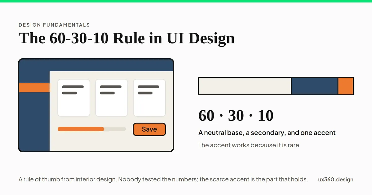
The screen is about 64% pale neutral, 28% deep blue and 8% orange. The neutral fills the background and the cards, the blue holds the top bar and sidebar, and orange marks only the active menu item, the progress bar and the Save button. With so little orange, the eye goes straight to it.
In the 60-30-10 version, the eye goes straight to the orange Save button, because almost nothing else is orange. Give the orange more space and the button stops standing out. Make it the background and the button disappears.
Where does the rule come from?
The 60-30-10 rule is a rule of thumb from interior design. Nobody knows who first wrote it down, and there is no study behind the numbers. Nobody has tested whether 60-30-10 looks better than 70-20-10 or 50-35-15. The numbers are round because round numbers are easy to remember.
That does not make the rule useless. It means the reason to follow it is practical. It forces you to decide which color leads, and it keeps one color scarce enough to mean something.
Why a rare accent works
The 10% is the part with real research behind it, even if that research never mentions the rule.
In 1980, the psychologists Anne Treisman and Garry Gelade asked people to find one item in a crowd. Sometimes the target differed from everything else by one feature, like its color. Then people found it almost as fast in a big crowd as in a small one. The target seemed to pop out. When people had to look for a mix of features, they checked the items one at a time. Every extra item made the search slower.
In 1989, John Duncan and Glyn Humphreys added the other half. Search gets harder as the target looks more like the things around it, and as those other things look less like each other.
Put together, that is the case for a scarce accent. If only your main button is orange, people find it at a glance. If six things are orange, the color no longer helps, and people are back to checking things one at a time. Try it below.
Only the target tile is green; the other 23 are grey. A target that differs by color alone pops out: people find it about as fast among 24 tiles as among 4, because the eye does not have to check them one at a time.
What real screens actually measure
We measured four pages on this site on 2026-10-14. For each one, we took the first screen in a 1280 by 800 desktop window and counted how many pixels fell into each color family.
| Page | Neutrals (white, stone, grey) | Black and near-black | Brand green | Other colors |
|---|---|---|---|---|
| An article (Fitts’s law) | 97% | 2% | 1% | under 1% |
| Another article (proportion) | 97% | 2% | under 1% | 2% |
| The contrast checker | 79% | 5% | 15% | 1% |
| The home page | 18% | 4% | under 1% | 78% (the tan hero and its drawing) |
None of them is 60-30-10. Pages full of text are almost all neutral. Even the tool page, which uses green as a large block, gives it 15% of the screen. And on the article pages the green covers about 1%, yet it is still easy to find, because nothing else on the page is green.
So treat the numbers as a shape, not a target: one color leads, one supports, and one is rare. You do not need to count pixels.
How to use the 60-30-10 rule in UI design
- Start with a neutral base for the 60. White, off-white, a light grey, or a near-black in dark mode. Most of the screen is here, so it should be calm.
- Pick the 30. This is often your brand color. Use it for the top bar, the sidebar, cards or section backgrounds.
- Save the 10 for action. One accent, used for the main button, links, selected states and the most important number. If everything is highlighted, nothing is.
- Keep text out of the count. Text gets its own color, picked so it reads well on whatever it sits on.
- Keep meaning colors separate. Red for errors, amber for warnings and green for success carry meaning, so they sit outside the three.
- Check contrast. Body text needs at least 4.5 to 1 against its background, and the parts of a control people need to see need 3 to 1. The contrast checker tests a whole screenshot at once.
- Never use color as the only signal. Some people cannot tell red from green. Add a label, an icon or an underline as well.
- Redo the accent for dark mode. A color that stands out on white can look dull on near-black. You may need a lighter step of it.
Try it yourself: build the three colors
The screen below keeps the 60-30-10 split. You pick the base, the secondary hue and the accent. The readout checks what the rule never mentions: whether text can sit on each color, and whether the button is different enough from the page around it.
On an off-white base, the screen is about 64% base, 28% secondary at hue 215° and 8% accent at hue 20°. The Save button measures 3.3 to 1 against the base, above 3 to 1, the WCAG floor for the parts of a control people need to see. Its label reads best in dark text, at 5 to 1, which passes 4.5 to 1. White text on the secondary passes at 10.8 to 1. The accent is 165° from the secondary on the color wheel, far enough to read as a separate color.
Try an accent hue of 150° at 46% lightness, close to this site’s own green, on the warm stone base. The button’s shape is only 1.6 to 1 against the page. Dark text on it still reads at over 9 to 1. So a bright accent usually needs a dark label, and a clear edge to stand out on a light page.
Variations on the rule
- 70-20-10. A calmer split with more base and less secondary. It suits pages with a lot of reading.
- One color plus neutrals. Many apps use a neutral base, grey for structure and a single brand color for the accent. That is still the rule’s idea, with the secondary as a grey.
- Tints count as the same color. A pale blue card on a white page with a dark blue sidebar uses one blue in two roles. Lighter and darker steps of a color belong to the same share.
- Dark mode. The base flips to a dark neutral, and the accent often has to get lighter to keep its contrast.
The 60-30-10 rule and other principles
- It is a simple way to apply color theory to a real screen.
- The scarce accent is a form of emphasis: one thing stands out because the rest does not.
- It supports hierarchy, since the eye reads the accent first, then the secondary, then the base.
- A clear lead color helps unity, so the screens of a product feel like one product.
- It only works if the colors pass contrast, for text and for controls.
Common mistakes
- Counting pixels. The numbers are a rough shape. A page that is 90% neutral with a 3% accent is fine.
- Using the accent for decoration. Every orange icon and divider takes attention away from the orange button.
- Picking an accent that fails contrast. A bright accent with white text often fails. Check the label, not just the color.
- Two accents. A second accent splits attention, and neither one means “act here” anymore.
- Forgetting dark mode. The same three colors rarely work on both a white and a near-black base without changes.
Frequently asked questions
What is the 60-30-10 rule in design?
It is a guideline for sharing out color: about 60% of a design in a dominant color, 30% in a secondary color and 10% in an accent color. It started in interior design and is now common advice for websites and apps.
How do you use the 60-30-10 rule in UI design?
Make the 60 a neutral background and the large surfaces. Use the 30 for navigation, sidebars, cards or your brand color. Keep the 10 for the things people should act on, like the main button, links and active states. Then check that text on each color passes contrast.
Do the percentages have to be exact?
No. There is no study behind the numbers. Real screens are often 90% or more neutral, with the accent well under 10%. What matters is the shape: one color leads, one supports, and one is rare.
Does text count in the 60-30-10 rule?
Usually not. Text color is picked for contrast against the color it sits on, and it is judged on its own. Colors for errors, warnings and success are also outside the three, because they carry meaning.
Check your own design. The free contrast checker reads a screenshot and gives every line of text its WCAG ratio and the nearest color that passes.Open the contrast checker

Written by