

Gestalt Principle: Common Region (Grouping by a shared boundary)
Common region is the Gestalt principle that a shared boundary groups whatever it encloses, whether or not those elements are close together or alike. Stephen Palmer named it in 1992, setting it against proximity and finding it wins. It is the principle behind every card, panel and fieldset you have shipped.
What is common region in design? Common region is the Gestalt principle that a shared boundary groups whatever it encloses, even when nothing else about those elements is related.
Draw a box around two things and they are a pair. That is the whole rule, and it holds whether the two things are close or far, alike or unlike, the same color or not.
It is also one of the newest. Gestalt principles of perception were mostly described in Berlin in the 1920s, but common region was named by Stephen Palmer at Berkeley in 1992, which is recent enough that plenty of older design writing does not mention it at all.
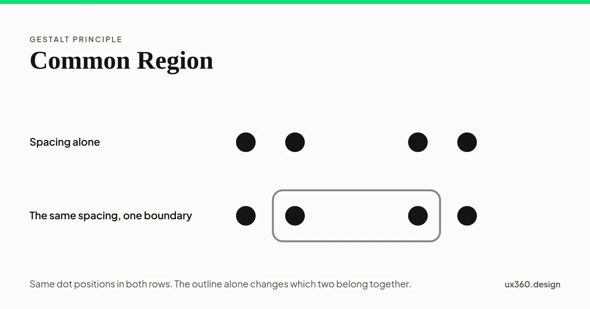
Common region beats proximity
This is the part worth knowing, and it is the reason Palmer’s paper exists. He did not just describe enclosure, he set it against the grouping rule everyone already accepted and showed which one the eye obeys.
Put four dots in two tight pairs and you have grouped them by proximity: two pairs, no ambiguity. Now leave every dot exactly where it is and draw one boundary across the gap in the middle. The pairing you read follows the boundary instead.
Nothing moved between those last two states. The dots are the same size, the same color, the same distance apart. The only thing added was an outline, and it was enough to overrule the spacing underneath it.
Enclosure is a stronger grouping signal than distance. Once you know that, a whole category of layout bug becomes obvious: a heading that belongs to the section below it but sits inside the card above it will be read as part of the card, no matter how much space you put under it.
What counts as a boundary
A common region does not need a drawn line. It needs a perceivable edge, and there are four ways to make one.
- A stroke. The literal border. Cheapest to reason about and the heaviest visually, because a line is ink on the page whether or not anyone is looking at it.
- A fill. A block of a different background color. No line at all, and the edge is just as hard. This is what a striped table row and a highlighted callout are doing.
- Elevation. A shadow implies a raised surface, and a surface has edges. This is a fill and a stroke pretending to be a physical object.
- A pair of rules. One line above a block and one below it encloses the block between them, even though the sides are open. Newspapers have grouped this way for a century.
The fill is usually the one to reach for. It bounds as firmly as a stroke and it adds no line to compete with the content, which matters once a page has more than a few groups on it.
One trap here is worth naming, because it is easy to ship. A boundary the reader cannot actually see does not group anything. A one pixel hairline at barely any contrast against the page reads as nothing, and the layout silently falls back to whatever proximity happens to be saying. If a reader has to see the boundary to understand what belongs with what, it is a graphic required to understand the content, and WCAG 2.2 asks for 3 to 1 against what sits next to it.
You are already using it everywhere
Almost every container in interface work is common region wearing a different name.
A card is an enclosure. So is a modal, a fieldset, a settings panel, a sidebar, a tooltip, a dropdown menu, an accordion panel and a ruled table row. Each one is doing the same job: taking a set of elements that spacing alone could not reliably group and putting a boundary around them.
Common region is what you reach for when you have run out of space. Proximity is free, but it needs room, and room is the one thing a dense interface does not have. A dashboard with eleven things on screen cannot afford the margin that would group them by distance. It can afford eleven outlines.
That trade is the whole decision. Space where you have it, boundaries where you do not.
Every boundary costs ink
The failure mode of this principle is using it when you did not need to.
Each boundary you add is another edge competing for attention, and they compound. Three nested cards is three frames around one piece of content, and the reader has to work out which frame they are supposed to be reading. A layout with room to breathe, grouped by spacing, will beat a heavily boxed one every time.
The nested case deserves its own warning. A region inside a region is a claim about hierarchy, and readers take it literally: they will assume the inner group is a subset of the outer one. If it is not, do not nest it.
The other failure is the accidental region. A background color applied for decoration will group whatever is sitting on it. A panel raised for visual interest makes a claim about what belongs together whether or not you meant to make one. If you draw an edge, you have drawn a group, and the reader does not know which of those you intended.
The boundary is not in the markup
This one catches people who have done everything else right.
A border is paint. A screen reader does not see a card, it sees whatever the HTML says is there, and a <div> with a rounded outline says nothing at all. If a group exists visually and not structurally, then the grouping is available to sighted readers and to nobody else.
The fix is to make the region real. A set of related form controls is a <fieldset> with a <legend>. A set of like items is a list. A panel with a heading is a <section> with an accessible name. A table is a table. In each case the boundary you drew and the group the markup declares are then the same group, which is the only version of this principle that works for everyone.
If you draw a region, declare it.
Try it yourself
Everything above in one drawing. Widen the gap and proximity starts arguing for two groups of three. Put a boundary across the middle and it argues for the two dots inside it. Change how the boundary is drawn, then nest a second region around the whole row and watch what that does to the reading.
The thing worth hunting for is the gap wide enough to beat the boundary. There isn’t one, and finding that out by trying is worth more than my saying so.
Common region and the other grouping rules
Several of the eleven Gestalt principles answer the same question: what belongs with what. It helps to know roughly how they rank when they disagree.
Connectedness is the strongest. Two elements joined by a visible link read as one thing even when everything else says otherwise. Common region comes next, which is the finding on this page. Proximity and similarity sit below both, and of those two, proximity is generally the stronger.
That ordering is a rule of thumb rather than a law, and it is most useful backwards: when a layout is grouping things you did not mean to group, start with the strongest signal on the screen and work down.
For the full set, I suggest you read my article on 11 Gestalt Principles of Design [Infographics Included].
Why is common region important in design?
Common region is important because of the following reasons:
- It groups elements that spacing alone cannot group, which is most of a dense interface.
- It overrides proximity, so it settles the case where two grouping signals disagree.
- It is the mechanism behind cards, modals, panels and fieldsets, which means you are using it whether or not you are choosing it.
- It fails loudly when it is wrong: an accidental enclosure groups things that have nothing to do with each other.
Final Words
To sum everything up, common region is the strongest grouping tool you have that costs nothing but a line, and the cost of that line is the reason to use it sparingly. In this article you learned:
- What is common region? The principle that a shared boundary groups whatever it encloses.
- How does it compare to proximity? It wins. Enclosure overrides distance when the two disagree.
- What counts as a boundary? A stroke, a fill, elevation, or a pair of rules. It needs a perceivable edge, not a drawn line.
- What does it cost? Ink, and a hierarchy claim every time you nest one region inside another.
- What does it not do? It does not group anything for a screen reader unless the markup declares the group too.
If you would like to learn more about the other principles of perception, I suggest you check out my article here: 11 Gestalt Principles of Design [Infographics Included]
Further Reading:
Frequently asked questions
What is the principle of common region?
Common region is the Gestalt principle that elements sharing an enclosed area are perceived as a group. The boundary does the grouping on its own, with no help from spacing, color or shape.
What is the difference between common region and proximity?
Proximity groups by distance, common region groups by enclosure. When the two disagree, enclosure usually wins: an element sitting closer to its neighbour than to anything else will still read as part of whatever box it is drawn inside.
What counts as a common region?
Anything that reads as an enclosed area. A stroked border, a filled background, a raised surface with a shadow, or a pair of rules above and below a block. The boundary does not have to be a line, it has to be a perceivable edge.
Does a visual boundary group anything for a screen reader?
No. A border is paint. Unless the grouping also exists in the markup as a fieldset with a legend, a list, a table or a labelled region, a screen reader reads the contents as a flat run of items.

Written by
![The 11 Principles of Design and Art [Infographics Included]](/_astro/principles-of-design-and-art-1.jIpeTnWF_192c4L.webp)