

Uniform Connectedness: Why a Line Can Group Things Better Than Space
Uniform connectedness is the Gestalt principle that elements joined by a visible connection, like a line or a shared area, are seen as one group. It is one of the strongest grouping cues and often overrides spacing and color. Interfaces use it in progress steps, tabs, tooltips and nested lists. Research backs its strength, with debate about when it wins.
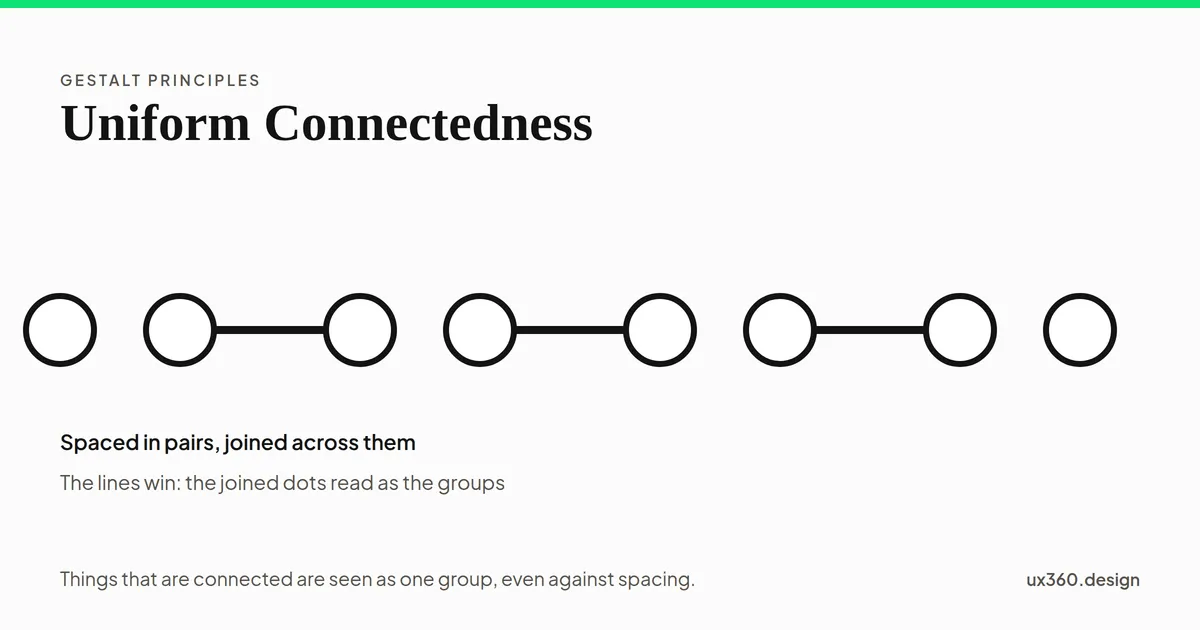
What is uniform connectedness? Uniform connectedness is the Gestalt principle that elements joined by a visible connection, such as a line or a shared area, are seen as one group.
It is one of the strongest ways to show that things belong together. A thin line can group two items that sit far apart, and it can even override the spacing around them. It is one of the principles in the Gestalt principles family, alongside proximity, similarity and common region.
In short
- What it is: things that are connected are seen as related.
- How strong it is: strong enough to beat spacing and color, especially on busy screens.
- Where you see it: progress steps, tabs, tooltips, trees and charts.
- How to use it: connect the things that belong together, and do not connect things that do not.
Connection versus spacing and color
Here are eight dots, spaced in pairs. Add lines that join each dot to its neighbor in the next pair, or add color, and see which grouping wins.
Only spacing differs, so the eight dots read as four pairs: each dot groups with the one closest to it. That is proximity.
With spacing alone, the dots pair up by distance. Add the lines, and for most people the joined dots become the units instead, even though the gaps have not moved. Color alone gives an ambiguous picture that many people flip between. Connection is the cue that settles it.
Where the idea comes from
The classic Gestalt principles, like proximity and similarity, were described in the 1920s. Uniform connectedness came much later. In 1994, the psychologists Stephen Palmer and Irvin Rock argued that connected regions are among the very first things the visual system picks out. A region of uniform color or texture, or elements joined together, is treated as one unit before other grouping happens.
Palmer had already described common region in 1992. Together, the two principles explain much of how interfaces use lines, boxes and backgrounds to group things.
How settled is it? Not entirely. In 1999, Shihui Han, Glyn Humphreys and Lin Chen found that grouping by proximity can happen as fast as grouping by connection, which challenged the idea that connection always comes first. Later work by Han’s group found that the two were equally fast when there were only one or two objects, but connection pulled ahead when more objects were on screen.
That fits what designers see: on a simple screen, spacing does the job. On a busy one, a line is clearer.
How interfaces use connection
A progress stepper joins its steps with a line, so five separate circles read as one path, and the filled part of the line shows how far along you are.
- Progress steppers. A line joins the steps, so separate circles read as one path, and the filled part shows progress.
- Tabs. The selected tab merges into its panel, so it is clear which content belongs to which tab.
- Tooltips and callouts. A pointer connects the note to the control it explains.
- Nested lists and trees. Lines join child items to their parent.
- Charts. A line through data points makes them read as one series, and a line from a label to a point says which point it names.
- Forms. A border or background that joins a label to its field makes the pair hard to misread.
How to use uniform connectedness
- Connect what belongs together. Use a line, a shared background or a joined edge when a relationship must be clear.
- Do not connect what does not. A decorative line that runs between unrelated items creates a false group.
- Use it when spacing is not enough. On dense screens, where there is no room for generous gaps, a connection groups more reliably.
- Keep the connection quiet. A light line is enough. Heavy lines add clutter and can become the most visible thing on the page.
- Combine it with other cues. Connection and color together, or connection and spacing, make a grouping obvious at a glance.
- Use it to show order. A connected line implies a sequence, which makes it ideal for steps and timelines.
Try it yourself: a progress stepper
Here is a five-step checkout progress bar. Change the spacing, turn the line on and off, and set how many steps are finished.
The steps are 50 units apart and joined by a line, so they read as one path from Cart to Review, however far apart they sit. 2 of 5 steps are finished, and the filled part of the line shows how far along you are.
With the line, the five steps read as one path at any spacing, and the filled part of the line shows progress at a glance. Without it, close steps still read as a group, but spread them out and they become five separate items, with no clear order. A single thin line does more than all the spacing in the world.
Uniform connectedness and other principles
- Proximity groups by distance; connection can override it.
- Common region groups by a shared boundary; connection groups by a link.
- Similarity groups by looks; combined with connection, it makes groups unmistakable.
- Continuation explains why the eye follows a connecting line from one end to the other.
- The law of Prägnanz says people take the simplest reading, and a connected group is often the simplest.
Common mistakes
- Decorative lines that connect unrelated things. Dividers that touch neighboring items can group them by accident.
- Too many lines. When everything is connected, nothing stands out as a group.
- Heavy borders. A thick connector can outweigh the content it connects.
- Broken connections. A tab with a border between it and its panel looks detached, so people are less sure which content it controls.
- Relying on connection alone for meaning. Some people cannot see thin, faint lines. Back them up with spacing, labels or order.
Frequently asked questions
What is uniform connectedness?
Uniform connectedness is a Gestalt principle of perception: elements that are visually connected, by a line, a shared background or a continuous area, are perceived as more related than elements that are not connected.
Is uniform connectedness stronger than proximity?
Often, yes. A line joining two elements can make them read as a group even when spacing says otherwise. Research is mixed on how early and how always it wins, but in busy displays connection tends to beat proximity.
What are examples of uniform connectedness in UI design?
Progress steppers joined by a line, a selected tab that merges into its panel, tooltips that point at their control, nested lists drawn as trees, and lines joining points in a chart.
What is the difference between uniform connectedness and common region?
Common region groups elements that sit inside the same boundary, like a card. Uniform connectedness groups elements that are joined to each other, like two dots linked by a line or a tab joined to its panel.

Written by
![The 11 Principles of Design and Art [Infographics Included]](/_astro/principles-of-design-and-art-1.jIpeTnWF_192c4L.webp)