Fitts's Law in UX: Why Big, Close Targets Are Faster to Hit
Fitts's law says the time it takes to point at a target grows with its distance and shrinks with its size. Paul Fitts described it in 1954, and it still predicts pointing well. In UX it means important buttons should be big and close, screen edges are easy to hit, and small targets next to each other cause mistakes.
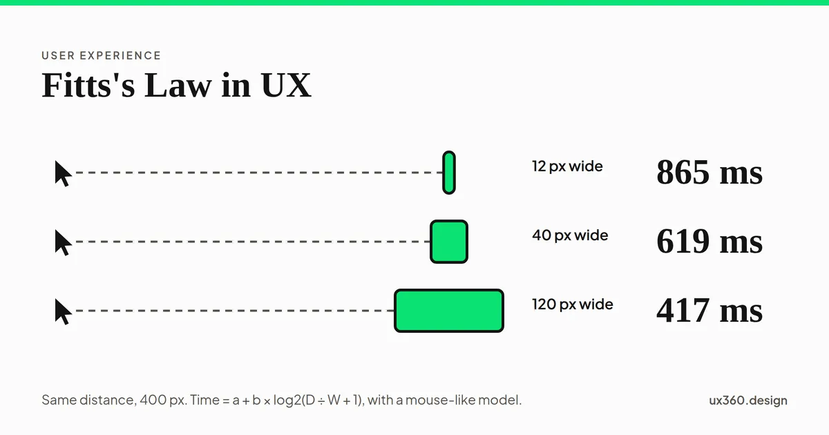
What is Fitts’s law? Fitts’s law says the time it takes to point at a target depends on how far away it is and how big it is. Closer and bigger targets are faster to hit.
It sounds obvious. What makes it useful is that it is precise. It tells you how much faster, and it shows that size and distance trade against each other in a fixed way.
In short
- What it is: a model of pointing. Time grows with distance and shrinks with target size.
- Who found it: the psychologist Paul Fitts, in 1954.
- Why it matters: every click and tap is a small Fitts task, repeated thousands of times.
- How to use it: make important targets big and close, use screen edges on desktop, and keep risky buttons away from common ones.
The formula
Fitts studied people tapping between two metal plates with a stylus. He changed the distance between the plates and their width, and timed each tap. The time followed a simple rule.
The form used in most interface research today comes from Scott MacKenzie, in 1992:
time = a + b × log2(distance ÷ width + 1)
- The log2 part is the index of difficulty, measured in bits. Double the distance or halve the width and the task gets about one bit harder.
- The constants a and b depend on the device and the person. Researchers find them by timing many taps.
Because of the log, doubling the distance does not double the time. It adds a fixed amount. And making a target twice as wide saves as much time as moving it twice as close.
Try the formula
Here is a pointer and a target, drawn to scale. Slide the distance and the width. The times use typical numbers for a mouse, so treat them as a model, not a measurement.
The target is 24 px wide and 400 px away. The index of difficulty is log2(400 ÷ 24 + 1) = 4.14 bits, so the model predicts about 721 ms to reach it.
A 24 pixel target 400 pixels away is over 4 bits. Make it 96 pixels wide and it drops to about 2.4 bits, and the predicted time falls by more than a third. You did not move it at all.
The edge of the screen is a huge target
On a desktop, the pointer stops at the edge of the screen. You cannot overshoot it. So a target that touches the edge is, in effect, as deep as you like.
The menu bar floats 8 px below the edge, so File is a target only 20 px deep and an overshoot misses it. The model predicts about 700 ms for a move of 300 px.
This is why the Mac puts its menu bar at the very top of the screen, and why the four corners are the easiest spots on a desktop to hit. A menu that floats a few pixels below the edge throws that away.
This trick does not work on touch screens. A finger does not stop at the edge of the glass the way a pointer does.
Fitts’s law on touch screens
On a phone, the thumb is the pointer, and its tip is wide. The rules are about size first:
- Apple asks for targets of at least 44 by 44 points.
- Google’s Material Design asks for at least 48 by 48 dp.
- WCAG 2.2 sets a floor of 24 by 24 CSS pixels at level AA, and 44 by 44 at level AAA.
A 2006 study by Pekka Parhi, Amy Karlson and Benjamin Bederson tested one-handed thumb use. Targets of about 9 millimeters, close to Material’s 48 dp, were large enough for good speed and accuracy.
How to use Fitts’s law
- Make the main action big. The button people press most should be the easiest to hit.
- Put it where the pointer already is. Place the next action near the last one, like Save near the end of a form.
- Use the whole target. Make the full row or card clickable, not just the small text inside it.
- Use edges and corners on desktop. Toolbars and menus that touch the screen edge are fast.
- Keep risky buttons apart. Delete should not sit next to Save. Distance and a smaller size make mistakes rarer.
- Do not shrink targets to fit more in. A crowded toolbar of tiny icons is slow and error-prone.
Try it yourself: place the Save button
Here is a form on a phone, drawn to scale. The thumb rests on the last field. Change the buttons and watch the time to Save, and the gap to Delete.
The buttons are 28 px tall, in the top corner, the far end of the screen. Save is 264 px from the thumb and 28 px across at its narrowest, so the model predicts about 607 ms. Delete sits only 4 px away, so a slightly off tap can hit Delete instead.
Taller buttons and a spot near the thumb both cut the time. The gap does not change the time at all, but it changes what happens when a tap is a little off. Fitts’s law is about speed. Spacing is about mistakes. A good layout needs both.
Fitts’s law and other principles
- It pairs with Hick’s law, which is about how long it takes to choose rather than to point, and with choice overload. Fewer, bigger options help with all three.
- It explains part of affordance: a target that looks big and pressable invites a confident move.
- It supports hierarchy: the most important action should be the largest and easiest to reach.
- It is behind the target size rules in accessible design. People with tremors or limited movement need bigger targets most.
See all the laws of UX, in the order a click happens.
Common mistakes
- Tiny icon buttons. A 16 pixel icon with no padding around it is hard to hit, even with a mouse.
- Only the text is clickable. People aim at the whole row. Let them hit it.
- Danger next to the default. Delete beside Save turns a near miss into lost work.
- Floating menus on desktop. A gap below the screen edge throws away the fastest spot on the screen.
Frequently asked questions
What is Fitts's law?
Fitts's law says the time to move to a target and hit it depends on two things: how far away it is and how big it is. Closer and bigger targets are faster to hit.
What is the Fitts's law formula?
The common form is time = a + b × log2(distance ÷ width + 1). The log part is the index of difficulty, in bits. The constants a and b are measured for each device and person.
How do you apply Fitts's law in UI design?
Make important targets large, put them near where the pointer or thumb already is, use screen edges and corners for frequent actions on desktop, and keep risky buttons away from common ones.
How big should a touch target be?
Apple asks for at least 44 by 44 points and Google's Material Design for 48 by 48 dp. WCAG 2.2 sets a floor of 24 by 24 CSS pixels at level AA, and 44 by 44 at level AAA.

Written by