Typeface vs Font: What Is the Difference, and Does It Still Matter?
A typeface is the design of a set of letters, like Helvetica or Garamond. A font is one version of it: one weight and style, like Helvetica Bold Italic. A font family is all the fonts of one typeface. People often say font for both, which is fine, but the difference matters when you load fonts on a website.
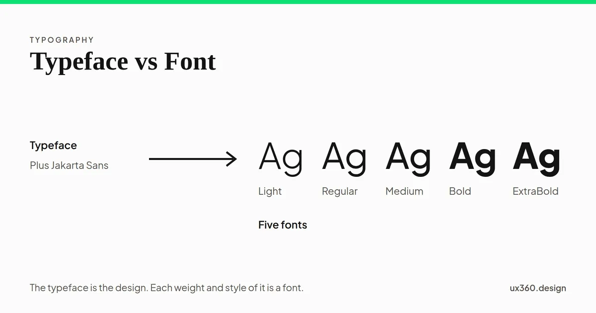
What is the difference between a typeface and a font? A typeface is the design of a set of letters, like Helvetica. A font is one specific version of that design, like Helvetica Bold Italic.
Put another way: the typeface is what you see, and the font is what you use to make it. A typeface usually comes as a family of fonts, one for each weight and style.
In short
- Typeface: the design. Helvetica, Garamond, Arial.
- Font: one weight and style of a typeface. Helvetica Bold, Garamond Italic.
- Font family: all the fonts that belong to one typeface.
- In everyday speech: “font” is used for both, and that is fine. The difference matters when you choose and load fonts.
Where the difference comes from
The words come from metal type. A printer did not own “Garamond.” They owned cases of small metal letters, each case cast in one design, one weight, one style and one size. Each of those cases was a font. The word comes from the French fonte, something cast or melted.
So Garamond was the typeface, and 12-point Garamond Italic was one font. A printer who wanted Garamond in four weights, upright and italic, in six sizes, needed 48 separate fonts. Change the numbers and count.
One typeface in 4 weights, upright and italic. As metal type in 6 sizes, that is 48 separate fonts, each a case of metal letters. As digital fonts, size is free, so it is 8 font files. As variable fonts, every weight lives in one file per style: 2 files. The typeface is the same design throughout.
Digital type made size free: one font file draws the letters at any size. So today a font usually means one weight and style. Variable fonts went further. Introduced in 2016 as part of the OpenType format, they hold a whole range of weights in a single file, so a typeface can arrive as one file for upright and one for italic.
Typeface vs font vs font family
| Term | What it means | Example |
|---|---|---|
| Typeface | The design of the letters | Helvetica |
| Font family | All the fonts of one typeface | Helvetica Light, Regular, Bold, and their italics |
| Font | One weight and style of the typeface | Helvetica Bold Italic |
| Font file | The file that holds one font, or a range of them | HelveticaBold.otf, or one variable file |
In CSS, the words line up neatly. font-family names the typeface. font-weight and font-style pick the font within it.
Kinds of typeface
Typefaces are often grouped by their shape. The four groups you will meet most in interface design:
Serif, shown in Newsreader. Serif typefaces have small strokes, called serifs, at the ends of the letters. They feel traditional and bookish, and they are common in long reading, newspapers and editorial headings.
- Serif: small strokes, called serifs, at the ends of the letters. Bookish and traditional. Common in long reading and editorial headings.
- Sans serif: no serifs. Clean and plain. The usual choice for interface text, labels and body copy on screens.
- Display: made for large sizes, like headlines and logos. Full of character, and harder to read when small.
- Monospace: every character is the same width, so code and numbers line up in columns.
There are more groups, such as slab serif and script, but these four cover most screens.
Why the difference matters on the web
For most people, saying “font” for everything is fine. For designers and developers, the difference is practical:
- Every font is a file to download. A typeface in four weights and two styles can be eight separate files. Each one slows the first view of the page a little.
- Missing fonts get faked. If a page asks for bold or italic and the font is not loaded, the browser makes one up by thickening or slanting the regular letters. These “faux” bold and italic fonts look clumsy next to real ones.
- Variable fonts change the math. One variable file can replace a whole family of weights, often for less download than several static files.
- Licenses are per font. A license may cover some fonts of a typeface and not others, or desktop use but not web use.
How to choose fonts for a project
- Pick one or two typefaces. Often one for text and one for headings. More rarely helps.
- Load only the fonts you use. Most interfaces need two to four: a regular, a medium or semibold, a bold, and perhaps an italic.
- Prefer variable fonts when available. One file, every weight.
- Load a real italic if you use italics. Do not rely on the browser’s faux italic.
- Check the characters you need. Not every font covers every language or symbol.
- Set the sizes with a scale. The type scale generator gives you a set of sizes that belong together.
- Then set the spacing. Size is only half of it. See kerning, tracking and leading.
Try it yourself: choose a font
Pick a typeface, then a weight and a style. That combination is a font. All three typefaces below are the ones this site loads, each as a variable font.
The typeface is Plus Jakarta Sans. The font is Plus Jakarta Sans Regular, weight 400. This page loads Plus Jakarta Sans as a variable font, so every weight from 200 to 800 comes from the same file.
Slide the weight and the letters change smoothly, because every weight comes from one variable file. Turn on italic with Newsreader, and you see a true italic, drawn differently from the upright letters. Turn it on with the other two, and the browser simply slants the upright letters, because this site does not load an italic for them. That is a faux italic, and the difference is easy to see once you look for it.
Typeface vs font and other topics
- Choosing a typeface affects legibility and readability: how easy letters are to tell apart, and how easy text is to read.
- Kerning, tracking and leading are the spacing settings you apply to a font.
- A clear hierarchy usually comes from sizes and weights of one or two typefaces, not from many typefaces.
- Using the same fonts everywhere builds unity across a product.
Common mistakes
- Too many typefaces. Three or four typefaces on one page look like an accident.
- Loading every weight. Nine weights and their italics, when the design uses three, slow the page for nothing.
- Faux bold and italic. If you style text bold or italic, load the matching font.
- Display faces for body text. A headline face at 14 pixels is hard to read in a paragraph.
- Ignoring the license. A desktop license does not always cover use on a website or in an app.
Frequently asked questions
What is the difference between a typeface and a font?
A typeface is the overall design of the letters, such as Helvetica. A font is one particular weight and style of that typeface, such as Helvetica Bold or Helvetica Light Italic. In metal type, each size was a separate font too.
Is Arial a typeface or a font?
Arial is a typeface. Arial Regular, Arial Bold and Arial Italic are fonts, and together they make up the Arial font family.
Is it wrong to say font when you mean typeface?
In everyday use, no. Software menus have called typefaces fonts for decades, and most people use the words the same way. The difference matters most to designers and developers choosing which font files to load.
What is a variable font?
A variable font is a single font file that contains a whole range of a typeface, such as every weight from thin to extra bold. It replaces many separate files with one.
Turn this into sizes you can use. The free type scale generator builds a whole scale from one base size and one ratio, with CSS to copy.Open the type scale

Written by