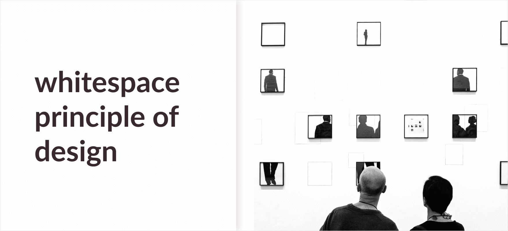
White space in Design
White space is the empty space in a design. It is also known as negative space.
Contrary to the name white space does not technically have to be a clear white area in the design, it can be anything from space between paragraphs to the WWF logo.

In this article, we will take a deeper dive into the designer’s favorite word white space, and what it actually is.
White space Examples
If you were to look around you will realize white space is used everywhere. Let us examine some of them:
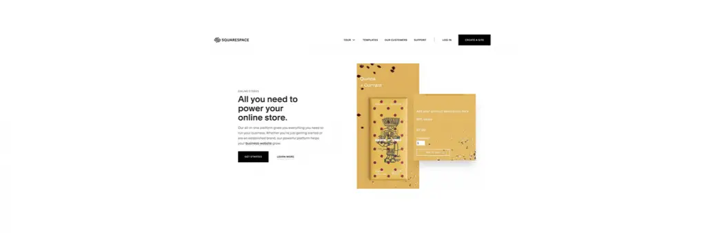
If I were to tell you the best example of white space in design, I am a big fan of the Squarespace website. The well-rounded use of whitespace not just emphasizes the 3d model but also highlights their moto.

You know we had to put Apple when we talk about whitespace. Apple does not leave crumbs when perfecting their design whether that be their phones or their website. The exaggerated size of their products is perfectly harmonized by the amount of whitespace surrounding them. This leads your focus to be directed straight towards their products.
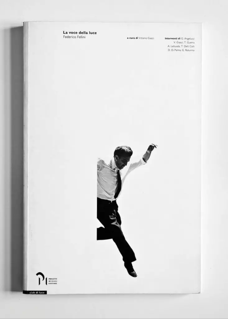
Here is another excellent use of Whitespace. A large amount of space between the jumping gentleman and the text at the top gives the design a dynamic look. Whitespace here not just balances the visual weight but also gives the design a unique touch. As you might have noticed the straight cut out on the left of the man makes it look like he is jumping off of a wall.
So we can see that whitespace can be used in a bunch of different ways. No wonder designers are so obsessed with it.
What is white space in the visual hierarchy?
Whitespace plays a big role in giving visual hierarchy to your design. If you didn’t know, visual hierarchy is a big thing in design.
It tells you what you should look at first. By using whitespace you can do just that.
The amount of whitespace between elements tells us how related they are.
Down below your eyes first, fall on the heading then the leading paragraph, and finally the CTA button. This is because of a clear hierarchy supported by clear contrast and whitespace.

The more outcast an element is the more focus it gets. So basically it is all about using whitespace to create focus on what you want the viewers to look at first. Creating a focus on certain things makes the design easier to scan while not having to sacrifice its visual appeal.
How can white space affect a design?
Imagine you are in a long queue and the people beside you are standing too close for the 80 degrees weather. Would you like that? Obviously not!
Now imagine that everyone had to stand at least 3ft apart from each other on the queue. Would that make the experience more bearable? Absolutely!
Our design needs breathing space too. This breathing space is Whitespace.
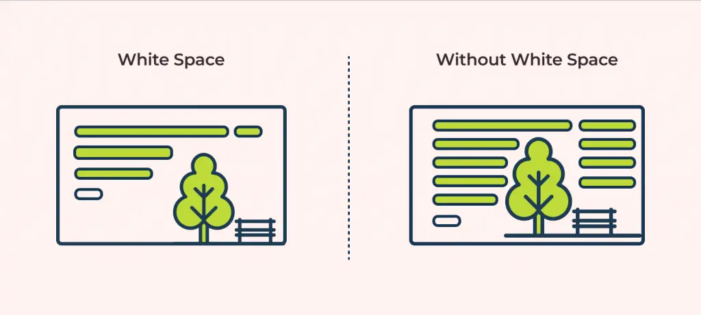
Sometimes having too many things in a single frame can overwhelm the viewers making it difficult for them to articulate your creation.
By including white space into your design you are not just making it easier for the viewers to comprehend your design but also giving yourself more room to play with the components of your design.
What is the Importance of White space in design?
Aside from the obvious reason for making your design aesthetically pleasing. Whitespace is one of the most dynamic tools a designer can use.
Let’s look at why that is:
- Control relation by Proximity: The amount of white space between two elements defines their relation with one another. The closer they are the more related they appear, this is also called Proximity. Therefore, by controlling the amount of white space you can easily change the relation between elements.
- Easier to Scan: When used correctly white space gives your design more dimension making it easier for the user to scan through your design.
- Better UX: While making the design soothing on the eyes, white space also makes the design convenient for the user to navigate through.
- Emphasis: White space lets you make a particular section of your design stand out. While creating any design you usually have a focal point that you want the viewer to focus more on. This is where you can use whitespace.
Final Words
This was everything about White space. By now you might be able to understand why it is so important in design.
Whitespace can make your design both effective and visually appealing. It allows you to show the relation between different components, emphasize focal points and make the design clean as well as easily scannable.
But you need to understand that overuse of whitespace can lead to sacrificing many integral components of the design. So the next time you aim for a minimalistic aesthetic make sure to use just the right amount of whitespace.
To know more about the other principles of design like White space I suggest you read our other article on The 11 Principles of Design and Art.


![Balance Principle of Design [Infographics Included]](https://ux360.design/wp-content/uploads/2022/01/balance-768x350.png)