Visual Weight in Design: What Makes One Thing Feel Heavier Than Another
Visual weight is how strongly an element pulls the eye and how heavy it feels in a layout. Size, darkness, color, isolation and distance from the center add weight. Designers use it to balance a page and to make the most important thing stand out. Much of it comes from Rudolf Arnheim's theory, and only parts have been tested.
What is visual weight? Visual weight is how strongly an element pulls the eye, and how heavy it feels within a layout. Big, dark, colorful and isolated things feel heavier.
Designers use it in two ways: to make the most important thing on a screen stand out, and to keep a layout from feeling lopsided. It is one of the ideas behind balance, emphasis and hierarchy.
In short
- What it is: how much an element seems to weigh and how strongly it pulls the eye.
- What adds weight: size, darkness, saturated color, isolation, detail, and distance from the center.
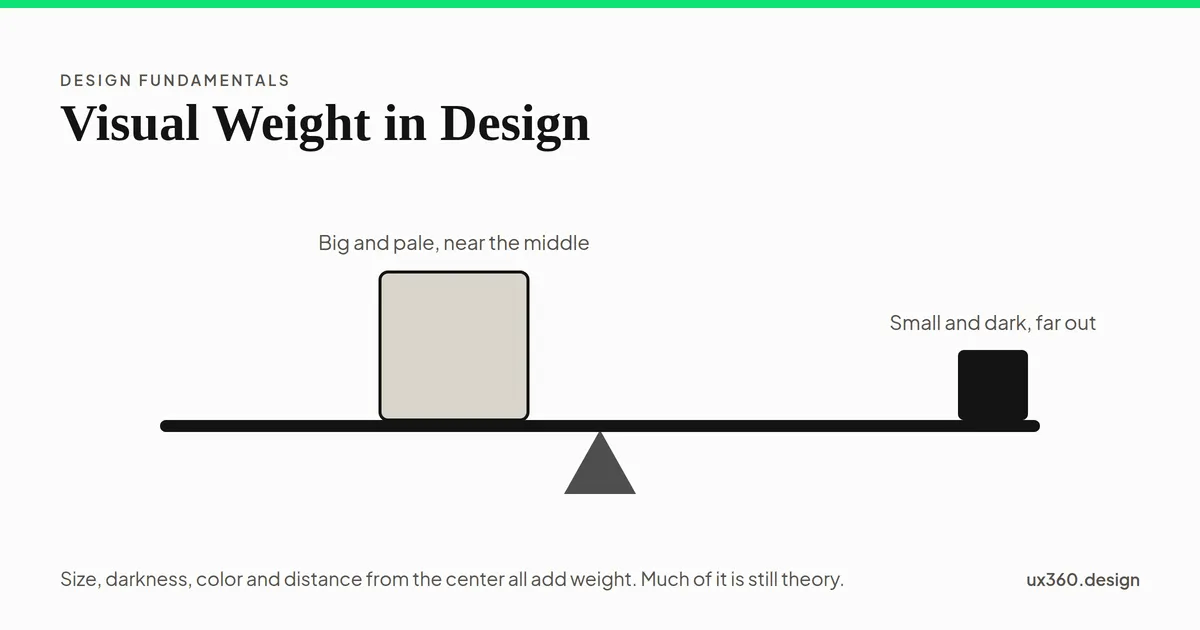
- How it works in a layout: like a seesaw. A small heavy thing far out balances a big light thing near the middle.
- How sure we are: the idea comes mostly from theory. Some parts have been tested; exact weights have not.
What gives an element visual weight?
These are the factors designers usually list. Most come from the art theorist Rudolf Arnheim, who set them out in his 1954 book Art and Visual Perception.
- Size. Bigger is heavier. This one is the least controversial.
- Darkness and contrast. On a light page, a dark shape weighs more than a pale one. What really counts is contrast with the background.
- Color. Saturated colors feel heavier than dull ones. Some hues seem heavier than others at the same lightness.
- Isolation. An element alone in empty space weighs more than the same element in a crowd.
- Detail and texture. A busy, detailed shape pulls more attention than a plain one.
- Position. Arnheim argued that an element weighs more the further it is from the center, like a weight on a lever. He also thought things higher up and on the right weigh a little more.
- Meaning. Faces, people and words we can read pull the eye, whatever their size.
Arnheim himself said that many of these factors still had to be tested. That is worth remembering when a design article states them as rules.
Visual weight works like a seesaw
The most useful part of the idea is the lever. Weight depends not only on what an element is, but on how far it sits from the center. A small dark square at the far end can balance a large pale one near the middle.
In this model, the right square is 28 units wide at 35% lightness, 70 units from the middle; the left square is 28 units at 35%, 70 units out. The two sides balance.
This is what makes asymmetrical layouts work. A big image on one side does not need an equally big image on the other. A short, dark headline, a strong button and some empty space can hold it in balance.
What research says. In 1998, Paul Locher, Pieter Jan Stappers and Kees Overbeeke studied how adults arrange elements when they make a visual display. Their results suggested that balance is one of the main ideas guiding how people compose. But in an earlier study, Locher and Nagy found that where people place a picture’s center of weight and how balanced they judge it are not quite the same thing. Balance is real, and harder to measure than a seesaw suggests.
Color and weight
Do some colors weigh more than others, even at the same lightness? In 1974, Elizabeth Pinkerton and Nicholas Humphrey tested exactly that. Earlier studies had mixed color up with brightness, so they matched colored circles for brightness first. The circles still differed considerably in how heavy they seemed.
Here are two circles matched in lightness, as the eye sees it, so they differ only in hue and saturation.
A red circle and a yellow circle, both at a lightness of 60 on the CIE L* scale, measured, so they differ only in hue and saturation. Any difference in weight you feel comes from the color itself, not from light and dark. Pinkerton and Humphrey (1974) found that colored circles matched in brightness still differed considerably in apparent weight.
In practice, most of a color’s weight in an interface comes from its contrast with the background. A bright green button on white is light in tone but saturated, so it still pulls the eye. A dark grey button is heavy because it is dark. Both work. A pale grey one barely registers.
How to use visual weight in a layout
- Decide what should weigh most. Usually the main headline or the main action. Make it the heaviest thing on the screen.
- Keep everything else lighter. If the logo, the menu and the side panel are all heavy, nothing leads.
- Balance big with dark or far. A large image on the right can be balanced by a dark headline and a strong button on the left.
- Use empty space as a tool. An element surrounded by white space gains weight without growing.
- Watch the corners. A bright badge or a dark icon at the edge of the screen weighs more than its size suggests, because it is far from the center.
- Squint. Blur your eyes or the screen. Whatever still stands out is carrying the most weight.
Try it yourself: balance a page
Move the image, change its size, and change the button. The triangle under the page marks the center of weight, using a simple model: each element’s area times how strongly it stands out from the white.
The image is 90 units wide, on the right, with a dark button. The heaviest element is the image. The center of weight sits within 3% of the middle, so the page feels balanced.
With a large image on the right and a dark button on the left, the page balances near the middle. Shrink the image, and the text side wins. Make the button an outline, and the image pulls the weight across. A bright badge in the corner adds more than its size, because it sits far from the center. The model is rough, but the habit it builds is real: before calling a layout done, ask where its weight sits.
Visual weight and other principles
- Balance is visual weight spread evenly, or traded across a layout.
- Emphasis is giving one element the most weight on purpose.
- Hierarchy is ranking elements by weight, so people read them in order.
- Contrast is the main source of weight on a screen.
- The 60-30-10 rule keeps the heaviest color rare, so it keeps its pull.
Common mistakes
- Everything heavy. If every element is big and dark, the page shouts and nothing leads.
- A heavy logo. The brand rarely needs to outweigh the content people came for.
- Forgetting the edges. A dark element in a corner can drag the whole page toward it.
- Pale main buttons. A light grey call to action can lose to a dark heading or a busy image.
- Treating the factors as laws. They are a guide drawn mostly from theory. Check the real screen with your eyes and with users.
Frequently asked questions
What is visual weight in design?
Visual weight is how much an element seems to pull the eye and how heavy it feels within a layout. Larger, darker, more colorful and more isolated elements feel heavier.
What gives an element more visual weight?
Size, darkness or contrast with the background, saturated color, isolation from other elements, texture or detail, and distance from the center of the layout. Faces and text that people read also draw the eye.
How do you balance visual weight?
Think of a seesaw. A large element near the center can be balanced by a smaller, darker or more colorful element further out. Symmetrical layouts balance by mirroring; asymmetrical ones balance by trading size, color and position.
Is visual weight scientifically proven?
Partly. The idea comes mainly from the art theorist Rudolf Arnheim, who admitted that many of his factors still needed testing. Some have been tested: people do arrange elements to balance them, and colors matched in brightness still differ in how heavy they seem. Exact weights have never been measured.

Written by