

Negative Space vs White Space
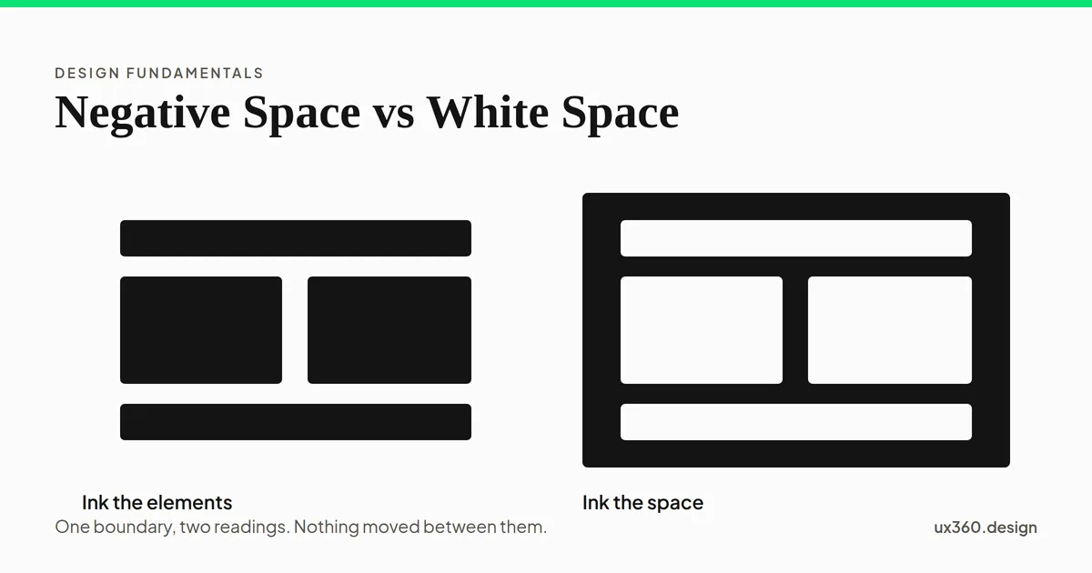
White space and negative space describe the same empty area, and in layout work the two words are used interchangeably. The distinction that matters is the job the emptiness is doing. White space separates and groups. Negative space forms a shape the viewer reads as a subject in its own right.
What is the difference between negative space and white space? They are the same empty area described by two different jobs.
Most of the time the two words are used interchangeably, and that is fine. The site’s own article on the subject treats them as synonyms, because in layout work they are.
The distinction only starts earning its keep when the emptiness stops being a gap and starts being a shape. That is the line worth drawing, and it is a line about intent rather than vocabulary.
What white space does
White space is the unoccupied area that separates and groups the things around it.
It is the margin around a page, the gap between two paragraphs, the room around a button. Nobody is meant to look at it. It works by keeping other things apart, and its success is measured in how the occupied areas read.
Remove it and a layout does not lose an element, it loses legibility. Everything is still there and none of it is findable.
Grouping is the half that gets less attention. Two items close together read as related, which is proximity doing its work. The space around the pair is what makes them a pair. For more on that, I suggest you read my article Gestalt Principle: Proximity (Associating relatedness through placement).
For the full treatment of what this space does for hierarchy and reading, I suggest you read my article White space in Design.
What negative space does
Negative space is the unoccupied area shaped deliberately enough that the viewer reads it as a subject.
Here the emptiness is not background. It is the image. The FedEx logo has an arrow in it that nobody drew, made entirely of the gap between the E and the x. The Rubin vase is two faces or one vase depending on which area you accept as the subject.
This is figure and ground changing places, which is why the idea belongs to perception rather than to layout. For more on the mechanism underneath it, I suggest you read my article Gestalt Principle: Figure-ground Relationship (Differentiating Elements by Perception of Subject & Background).
Closure is the other half of how these marks work. The viewer completes a shape that was never fully drawn, and the gap is what they complete it out of. For more on that, I suggest you read my article Gestalt Principle: Closure (how our brains fill in the missing visual gaps & how to use Closure in designs).
When the difference actually matters
Two situations, and outside them the words can be swapped freely.
- Layout work. Call it white space. You are spacing a page and the emptiness is doing its job invisibly. Arguing about the term here buys nothing.
- Logo, mark and illustration work. Call it negative space. You are shaping the gap on purpose and expecting someone to see it. The gap has an outline you are responsible for.
If a viewer is meant to notice the empty area, it is negative space. If they are meant to notice everything except the empty area, it is white space.
That test is more useful than either definition, because it asks what you want to happen rather than what the area is called.
Neither of them has to be white
This is the misreading the name invites, and it is worth saying plainly.
White space is any unoccupied area, whatever color it is. A black page has white space. A photograph used as a full bleed background has white space wherever nothing is placed on it.
The word comes from print, where the unprinted area of the sheet genuinely was the color of the paper. The name outlived the constraint.
You will also see it written as “whitespace” in code and “negative space” in fine art teaching. Same area, three vocabularies, depending on who trained the person saying it.
Final Words
To sum everything up, the two terms point at one thing, and the only question worth asking is whether the reader should notice it. In this article you learned:
- What the difference is? None in substance. White space and negative space are the same empty area, named for different jobs.
- What white space does? It separates and groups, and works best unnoticed.
- What negative space does? It is shaped so the gap itself reads as a subject.
- Does it have to be white? No. It is any unoccupied area, in any color.
If you would like to learn more about the other principles of design, I suggest you check out my article on the core concepts here: The 11 Principles of Design and Art [Infographics Included]
Further Reading:
Frequently asked questions
What is the difference between negative space and white space?
They name the same empty area and are used interchangeably. The useful distinction is what the emptiness does. White space separates and groups elements. Negative space is shaped deliberately so the gap itself reads as an image.
Does white space have to be white?
No. White space is any unoccupied area regardless of color. It can be black, a photograph or a flat brand color and still do the same job.
Where does negative space matter most?
In logo and illustration work, where a gap can be shaped into a second readable image. The FedEx arrow is the standard example.

Written by
![Unity Principle of Design [Infographics Included]](/_astro/banner_unity-principles-of-design.COhBGowc_UBwSU.webp)