Rule of Thirds: What is it and how to use it?
In this article, we will discuss what is the rule of thirds and how to implement it in your designs and compositions.
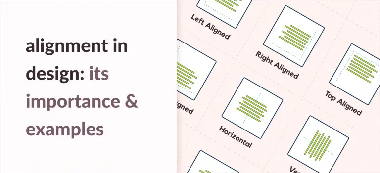
What is the Rule of Thirds?
Rule of thirds also known as the golden grid rule is a technique where a composition is aligned to a three by three grid.
By dividing a composition into three grids, we section it into nine imaginary rectangles with four intersections. The focus subject is aligned at one of the intersecting points or close to them. This creates an asymmetry in the composition. This very resulting asymmetry provides an interesting take on the composition and is pleasing to look at.

The rule is widely applied so much so that you may have even used it or seen it being used. The grid in your camera app is the most common example.
Why is the rule so popular?
The rule is popular because it is very simple to use and yields
Comparing the rule of thirds to the golden ratio, prior is easier to use and implement. The ratio of the rule of thirds is different than that of the golden ratio. However, the ease of application is a good trade-off for the small difference in ratio.
The simplicity of use and positive results for this rule is the major reasons it is so popular with designers and photographers.
Look at this image for an example:


What you can see are the two same images. One follows the rule of thirds. The first image has a dog portrait centered in its frame. We moved our focus subject, i.e the dog to the right intersections to create a more interesting image.
The rule also helps you build an aesthetically pleasing design. Aesthetics play a major role in user perception of a product or composition. This is known as the Aesthetic Usability Effect.
We are all familiar with a famous saying: Don’t judge a book by its cover. The real world, however, does not follow the sentiment of this sentence. A cool poster or an exciting trailer for a movie is one of the major factors that excites us to go see the movie in the theaters.
How our eyes visualize a design?
We are generally tempted to give more focus to the top left corner of any visuals or designs. People scan

First, we look at the top left spot and gradually move down to the bottom left corner. Then to the top right one, and at last, we give the least attention to the bottom right spot.
This is the visual distribution for our eyes.
How to use the Rule of Thirds?
The rule states that the core element of your design should always be at one of the 4 points of intersection. In cases where it is not possible, the element should always be close to one of those intersections.
It is also not required to use this rule. Even after completing the design, we can make it follow the rule by simply repositioning it.
The rule should not be implemented in cases where we want the element to be in the center of the picture. Standard photography for portraits requires the person to be in the middle. In such cases, consult with the client or other teammates before implementing the rule.
Some examples for the rule of thirds
Let us now look at the cityscape in the image below. The image itself is well composed. To implement the rule of thirds in this image, we can shift the tallest building to the left intersections. This creates a focus.


Let us look at another example. When we look at wildlife photography or other similar results, we can see how the rule is used. Below the hummingbird is on the right side of the composition with blurred backgrounds. This creates a more visually interesting image.

Conclusion
We can now conclude that, Rule of thirds:
- is easier to implement than other rules like the golden ratio
- creates visual interest in composition through asymmetry
- makes a composition more pleasing
- is not mandatory to create an attractive design