Gestalt Principle: Closure (how our brains fill in the missing visual gaps & how to use Closure in designs)
What is the principle of Closure?
The gestalt principle of closure is the tendency of human brains to perceive images & elements in their standard form regardless of the elements missing some of their parts.
Simply put, the closure principle states that the human eye tends to complete the missing part in a design.
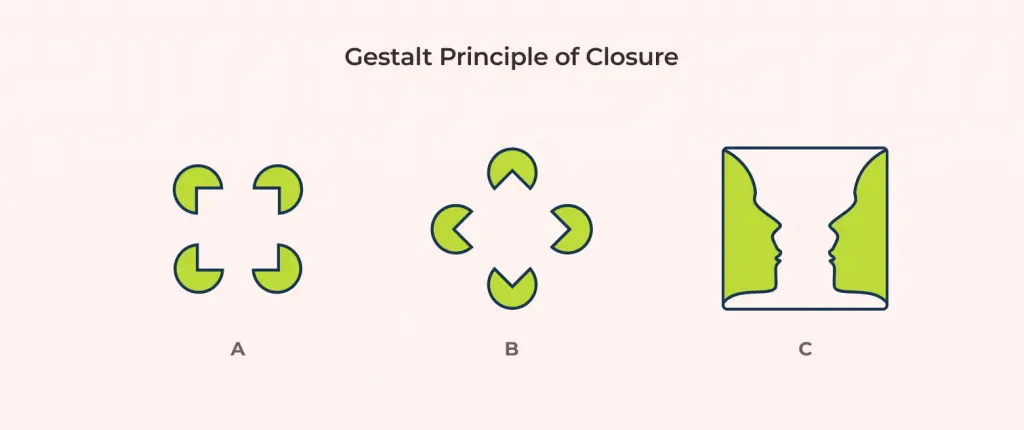
In the above image, for A & B, our eyes will notice a square inside the Pac-Mans even though there is no square present in the images. Our brain will complete the missing parts itself.
For sample C, if we focus on the colored areas, we will see two faces looking at each other. But when we focus on the white space between the colored areas, we will notice a vase shape. Here we used both the positive and negative spaces(white space) to create a composition with two distinct recognizable shapes.
The image is perceived to have a certain shape depending on how the viewer decides which part is the foreground and which is the background of the image. To know more about this phenomenon, read my article on the Figure-ground relationship which is also a gestalt principle.
How can we use the Closure Principle in UX & Design?
Knowing how to use the closure principle can help designers explore and create unique compositions. This principle isn’t very popular in interface designs but can still be implemented to obtain uniqueness in our overall output. Closure is mostly used to make more impact and uniqueness in logo, iconography, and artworks. Let’s look into these in more detail.
Logo Design: Branding Uniqueness with Closure
Logos are the face of companies and institutes. People tend to associate aesthetically pleasing logos with reliability and trust. We can say that logos and branding are not just any graphics but a means to make people feel a certain way. Let’s explore Closure examples with the help of a popular brand: Starbucks.
In the above logo, we can see how the old logo got rebranded to a new one. Both of the logos are still familiar with the changes applied but the newer one is a lot simpler. With the use of negative space, they have portrayed the logo very distinctly resulting in a more graceful, modern, and less cluttered output.
The USA network logo demonstrates how to use closure to create unique designs. The use of negative space for the letter S provides the logo a simple yet elegant look. Similarly, with the WWF logo, the panda is created using the perfect use of positive and negative space.
Closure & Iconography: How we can Leverage this Principle to make Tiny Icons.
The issue with creating icons is that it needs to adapt to being very small or very large. As designers, we know the pain of creating our own perfect icons but when implemented to a smaller canvas like a mobile device, all the details get smushed up.
The awesome thing about the human brain is that it can fill in the gaps even when provided very small information. This is where closure comes to the rescue. Now, we can design them with a few lines/elements and our brain will still recognize them.

Above are some icons that we can take as reference. Our brains automatically fill in the missing information. Hence we can recognize the icons as chain, person, bell, and sliders.
Aesthetics and Visual Interest
Closure allows designers to create aesthetically pleasing effects that grab the attention of viewers. Well made images using the closure principle interests users.
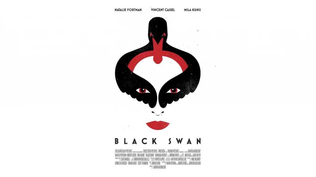
Something as simple as a square can have an interesting output. In the image above, we can see how the negative space is used to create the poster for black swan. We can distincly seperate the two major visual elements as a swan and a person. This results in a layer for added creativity that makes this artowrk worthu of being talked about. These techniques are mostly used by companies in their marketing artworks.
Summing Up
Knowing how to use the closure principle will help any design composition to go a step beyond. It adds interesting twists to familiar shapes and images and encourages originality.


![Balance Principle of Design [Infographics Included]](https://ux360.design/wp-content/uploads/2022/01/balance-768x350.png)