Default Effect in UX Design: Why People Keep What They Are Given
The default effect is the habit of keeping whatever option is already selected. People keep defaults because changing them takes effort, because a default looks like advice, and because many never look at the choice. For designers, the starting option decides the result for most people, so it should be the one most people would pick.
What is the default effect? The default effect is the habit of keeping whatever option is already chosen for you.
A default is the answer a form or an app gives before you touch anything. It can be a ticked box, a country that is already filled in, or a plan marked “Recommended”. Most people leave it as it is.
In short
- What it is: people tend to keep the option that is already selected.
- Why it works: changing it takes effort, it looks like advice, and many people never look at the choice.
- What it means for design: the starting option decides the result for most people. You are always choosing for them, even when you leave a field empty.
- The rule: set the default that most people would pick if you asked them plainly, show it clearly, and make it easy to change.
Why do people keep the default?
There are three reasons, and they work together.
- Changing it takes effort. Even one tap costs a little. When a choice does not seem to matter, most people do not pay that cost.
- A default looks like advice. If the shop picked it, people guess that it is a good pick.
- Many people never look. They skim the form, or they never open the settings at all, so the default is the only answer they ever see.
Think of a waiter who pours you a glass of water before you ask. Most people drink it. Hardly anyone says, “No water, please.” You could refuse, but it would take a word and a small awkward moment, and the glass looks like part of the meal. The glass was a default.
What the research shows
Two studies show how strong this is.
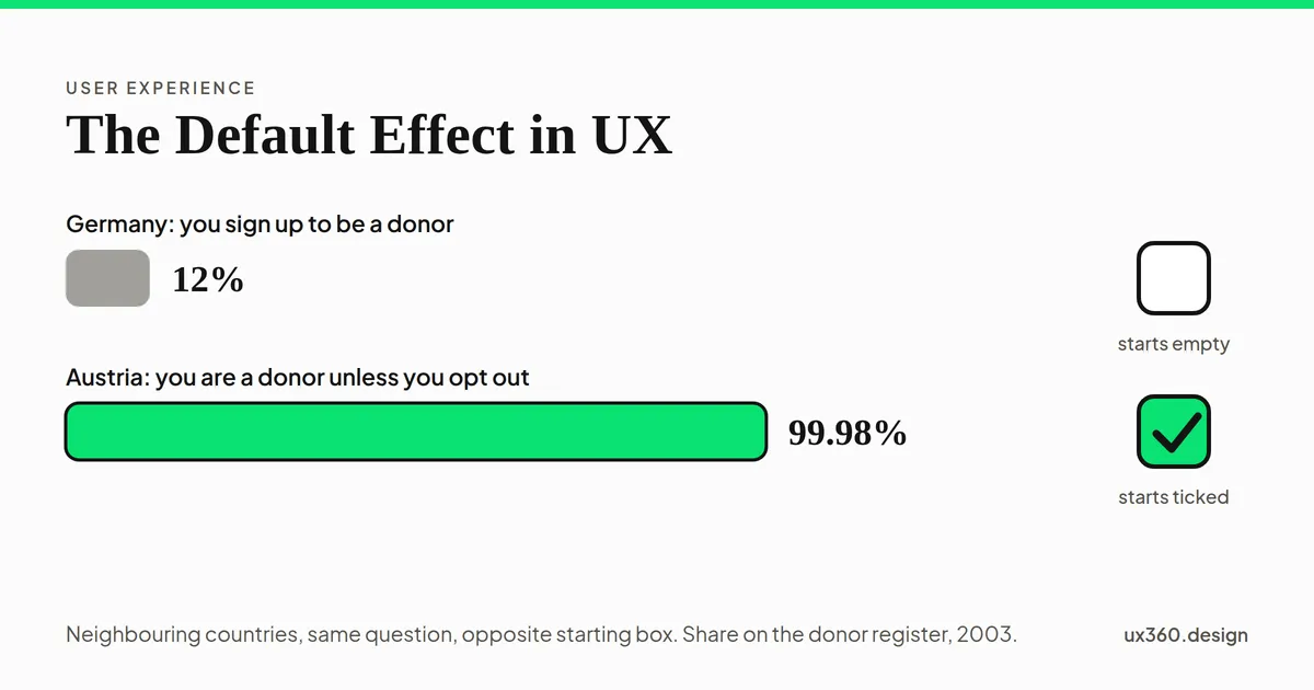
Organ donation. In 2003, Eric Johnson and Daniel Goldstein compared countries by how many people were on the organ donor register. In Germany, where people must sign up to become donors, 12% had done so. In neighbouring Austria, where everyone is a donor unless they opt out, 99.98% were on the register. The two countries are close in culture, and Johnson and Goldstein pointed to the starting box as the main reason for the gap. A register is not the same as real donations, which depend on many other things, but the gap is far too big to be chance.
Saving for retirement. In 2001, Brigitte Madrian and Dennis Shea studied a large US company that began to sign up new workers for its retirement savings plan automatically, unless they said no. The share of new workers who were saving rose from 37% to 86%.
Nobody was forced in either case. The only change was which answer was already selected.
See it in a form
Here is a sign-up form with one box: “Send me offers”. The model below is made up, so use it to see the shape of the effect and not to predict real numbers. There are 100 people, and 20 of them really want offers. The slider is how many people take the trouble to change what they are given.
The box starts ticked and 20 of every 100 people take the trouble to change what they are given. 84 of 100 end up subscribed, and all 20 who wanted offers are among them. 64 of them did not want offers and kept the box ticked because it was already ticked. With the box empty and the same people, the count would be 4.
Leave the slider at 20 and the box ticked. The form ends up with 84 subscribers. Switch the box to empty and the same people give only 4. Nobody changed their mind. Only the starting box changed.
Now look at the 84. Only 20 of them asked for offers. The other 64 are subscribed because the box was already ticked. This is why a pre-ticked box makes a sign-up count look better than it is. In the EU, a court ruled in 2019 (the Planet49 case) that a pre-ticked box is not valid consent for cookies.
A default can also help
A default is not always a trick. A good default saves people work. A shop can fill in the country from the person’s language, start on standard delivery, and use the card they saved last time.
Nothing is chosen. Each of the 5 fields needs a tap, and then one more places the order, so it takes 6 taps. The total is not known yet.
Try the three settings. With nothing chosen, the order takes six taps. With the likely answers, it takes one tap and the total is $40.
The third setting also takes one tap. But two answers were picked for the shop: express delivery and a protection plan. The total is $55, and nobody chose either one. The number of taps did not change. The price did.
A default can help people, or it can cost them. The difference is whose interest it serves.
How to set a good default
- Ask what most people would choose. Imagine asking every person the question in plain words. Set the default to the answer most of them would give.
- Prefer the safe and reversible choice. Private is safer than public. Saved is safer than lost. A trial is safer than a purchase.
- Show the default. Make it clear what is selected and how to change it. A hidden default is a trick.
- Make changing it as easy as keeping it. One tap to change. The same size and weight for both choices.
- Do not default to money or data. Do not pre-select a purchase, a renewal, sharing or tracking.
- Test it with people. After a task, ask, “What did you just agree to?” If they cannot say, the default is working against them.
- Review your defaults. A default that was fair three years ago may not fit today.
Try it yourself: audit the defaults
Here is a made-up photo app. Everything ships switched on, the way a rushed team might leave it. You are the designer. Set each default for a person who will never open the settings.
1 of the 4 defaults works for the person. Still working for the app: location goes onto every photo, contacts are shared with partner companies and weekly offers are sent. Most people never open settings, so for them each of these is a decision the app made without asking.
The right answer is not “everything off”. Saving work automatically protects people, so it should stay on. A default is good when most people, asked plainly, would choose it for themselves.
The default effect and other biases
The default effect rarely works alone.
- It is close to satisficing: people take the first option that is good enough, and the default is always the first option.
- It works like anchoring bias, because the starting answer becomes the point that everything else is judged from.
- The words around a default are framing. “Opt out of sharing” and “opt in to sharing” describe the same choice and feel different.
- A line like “most teams choose this plan” adds conformity on top of the default.
You can see how these fit together on the map of cognitive biases, which sorts them by who has them: you or your users.
Common mistakes
- Treating an empty field as neutral. An empty box is also a default. It favours people who do nothing.
- Judging success by the default rate. A high sign-up rate from a pre-ticked box says little about real interest.
- Using a default to hide a cost. If people would object when they saw the total, the default is not fair.
- Never checking. Defaults are easy to forget. Review them like any other part of the design.
Frequently asked questions
What is the default effect?
The default effect is the habit of keeping the option that is already selected. A pre-ticked box, a pre-filled field or a plan marked Recommended all work this way, because most people accept what they are given.
Why do people stick with the default?
There are three reasons. Changing it takes effort, a default looks like advice from the people who made the product, and many people never look at the choice at all.
Is it ethical to use the default effect in design?
It is fair when the default is the option most people would choose if you asked them plainly, and when changing it is as easy as keeping it. It is a dark pattern when the default works against people, for example by adding a cost or sharing their data.
What is a good example of a default in UX?
A shipping form that starts on standard delivery and a saved card, so one tap places the order. Each answer is the likely one, and the person can change any of them.
This is a bias in the people using your product. See it beside the biases that bend your own research.
From UI to UX: a free one-week course
Become the person in the room who understands the user when everyone else is guessing. Six free lessons, no sign-up.

Written by