

Jakob's Law: People Expect Your Site to Work Like the Others
Jakob's law says people spend most of their time on other sites, so they expect yours to work the same way. Jakob Nielsen stated it in 2000. Studies show that things placed where people expect them are found faster. Break a convention only when the new way is much better and people use it often.
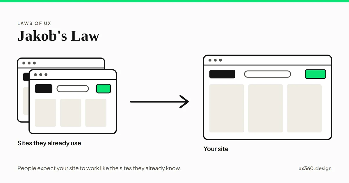
What is Jakob’s law? Jakob’s law says that people spend most of their time on other sites, so they expect your site to work the same way as the ones they already know.
It is one of the laws of UX, and the one about habits. People do not arrive at your product fresh. They bring everything they learned on every other site and app they use.
In short
- The claim: people expect your product to work like the products they use most.
- Why: what they already know costs them nothing. Anything new has to be learned first.
- The evidence: people agree on where common things go on a page, and find them faster when they are there.
- The limit: conventions do change, and a new way can win, but only if it is much better and people use it often.
Where Jakob’s law comes from
Jakob Nielsen is a usability researcher. He co-founded the Nielsen Norman Group with Don Norman in 1998, and he co-created heuristic evaluation, one of the most widely used ways to review a design. In July 2000 he wrote a column called “The End of Web Design.” Its key line was short: “Users spend most of their time on other sites.”
His point followed from that. Every visitor learns how the web works from thousands of pages, and only a few of them are yours. So people prefer sites that work like the ones they already know, and a site that invents its own way of doing things makes every visitor learn it first. His own company now calls it Jakob’s law of internet user experience, and the Laws of UX collection made the short name widely known.
What kind of claim it is. Jakob’s law is advice drawn from years of usability testing. It is not a law of nature. But one part of it, that people expect things in certain places, has been tested directly.
The research: people know where things go
Researchers at the University of Basel ran a series of studies on what people expect from a web page.
- They agree on a layout. In 2010, Sandra Roth and colleagues asked 516 people to build a typical online shop, news site and company site from common parts. People had a clear picture of each type of site, and they agreed on where many parts go, though not all. Men and women, and expert and new web users, gave similar answers.
- Expected places are faster. In 2013, the same group tracked the eyes of 40 people on real websites. When things were placed where people expected them, people needed fewer looks and found them faster. Placement mattered most for things that do not stand out. Things that were easy to see, and looked the way people expected, were less affected by where they sat.
- Expectations shift slowly. In 2016, Silvia Heinz and colleagues ran a new version of the study with 841 people. The logo, the main content and the navigation were still where people expected them. Some things had moved into the footer, and links to social networks had joined the list.
Try it below. Shoppers look for the cart all the time, and most shops put it at the top right.
The cart sits at the top right, the first place people look for it. In this sketch they find it on the first look, without having to think.
Every place the cart is not costs one more look, and every visitor pays it. On a page people visit once, that cost is never paid back.
Examples of Jakob’s law
These are conventions people use without thinking. Breaking any of them makes people stop and work it out.
- The logo goes home. People click the logo at the top left to return to the home page.
- Search sits in the header, usually as a box or a magnifying glass.
- The cart sits at the top right on a shop, often with a number for the items in it.
- Links look like links. Underlined or colored text says “you can click this.”
- Forms work the same way. A label above or beside each field, a clear button at the end, and errors shown next to the field that caused them.
- On phones, gestures carry over. Pull down to refresh, swipe to go back, and tap the bottom bar to switch sections.
None of these is the only good way to do it. They are just the way people already know.
When to break a convention
Jakob’s law does not say that nothing can change. The hamburger menu, pull to refresh and the swipe were all new once. They became conventions because enough products used them and they worked.
A new way of doing something has a cost up front: everyone has to learn it. It only pays off if, once learned, it is clearly better, and if people use it enough to get that payoff. The model below puts numbers on that.
Over 3 visits, the usual design takes 30 seconds in all and the new one 59. The new design is faster once learned, but learning it costs more than it has saved so far. It only pays for itself from about visit 10, so someone who comes once or twice is worse off.
So a new design can make sense in a tool people use every day, and rarely makes sense on a page people visit once. When the new way is only as good as the old one, it is pure cost.
Your own product counts too. Your old design is one of the “other sites” your users know. In early 2018, Snapchat redesigned its app. More than a million people signed a petition asking for the old version back. A few months later, Snapchat’s daily users fell for the first time, from 191 million to 188 million, and its chief executive blamed the disruption caused by the redesign. A change can be better on paper and still cost you, because people have to learn your product again.
How to apply Jakob’s law
- Learn the conventions of your kind of product. A shop, a news site and a banking app each have their own. Look at the products your users already use.
- Use the familiar pattern by default. Put things where people look for them, and make them look the way people expect.
- Spend your creativity on what matters. Your content, your brand and the problem only you solve. Not the place the search box goes.
- Break a convention only with a reason. It should be much better, and people should use it often enough to learn it.
- Test what you change. Watch real people try it in a usability test. If they hesitate, the new way is costing them.
- Change your own product gently. Explain what moved, keep the old way for a while if you can, and change a little at a time.
Try it yourself: break a convention
Here is the same shop page. Each switch breaks one common web convention. See how many it takes before the page stops working the way people expect.
Every part of this page sits where people expect it and looks the way they expect. A first-time visitor can shop with what they already know from other stores.
Each one is small on its own. Together, they turn a page people could use at once into one they have to study first.
Jakob’s law and other laws of UX
- Recognition over recall: a familiar pattern is recognized, not remembered.
- Hick’s law holds when people already know the options. Familiar ones are quick to choose.
- The F-pattern and Z-pattern are about how people scan a page; conventions decide where their eyes stop.
- Tesler’s law: a familiar pattern is one way the team takes complexity away from the user.
- The aesthetic-usability effect is a reminder that looks can be new while behavior stays familiar.
- See all of them in the laws of UX.
Common mistakes
- Being different for the sake of it. A new layout that is only as good as the usual one costs every visitor something and gives nothing back.
- Copying looks instead of behavior. Jakob’s law is about where things are and how they work, not about looking like everyone else.
- Following the wrong conventions. A game, a shop and a bank each have their own. Check what your users actually use.
- Thinking conventions never change. They do, slowly. Check them now and then.
- Redesigning everything at once. Your current users know your old design. Move them gently.
Frequently asked questions
What is Jakob's law?
Jakob's law says that people spend most of their time on other sites, so they expect your site to work like the ones they already know. Familiar patterns let them use your product without learning it first.
Who is Jakob Nielsen?
Jakob Nielsen is a usability researcher who co-founded the Nielsen Norman Group with Don Norman in 1998. He co-created heuristic evaluation, one of the most used usability methods, and stated Jakob's law in a column in July 2000.
Does Jakob's law mean every site should look the same?
No. It is about where things are and how they work: the logo that goes home, the search box in the header, links that look like links. Your brand, colors, type, words and content can still be your own.
Is Jakob's law proven?
The part about placement is well supported. Studies from the University of Basel found that people agree on where common things go on a page, and that they find them faster when they are there. The rest is advice from years of usability testing.
The UX Foundation Course, free
Become the person in the room who understands the user when everyone else is guessing. 4 chapters, 27 free lessons, no sign-up.

Written by