Peak-End Rule in UX Design: Why People Remember the Worst Moment and the Ending
The peak-end rule says people judge an experience mostly by its most intense moment and by how it ends, not by the average of every moment. In UX, one frustrating step or a weak last screen can outweigh many smooth ones. Design the worst moment, the best moment and the ending on purpose.
What is the peak-end rule? The peak-end rule says that people judge an experience mostly by its most intense moment and by how it ends, not by the average of every moment.
Think about a holiday. You may remember the best day and the flight home, and forget most of the ordinary hours in between. If the last day goes badly, the whole trip can feel worse in memory than it really was.
In short
- What it is: people remember an experience by its peak and its end, not by its total or its average.
- Why it matters in UX: one frustrating step or a weak last screen can outweigh many smooth ones.
- What the research says: it was found in studies of pain and other experiences. It is a good rough guide and not an exact law.
- The rule: design the worst moment, the best moment and the ending on purpose.
Why does it happen?
Memory is not a video. We do not store every minute. We keep a few moments that stand out, and we use them to tell the story later.
- Intense moments stand out. A sharp pain or a big surprise is easy to recall.
- The ending is the last thing we saw. It is fresh, and it tells us how things turned out.
- Length gets little weight. In the studies, how long something lasted often mattered less than how it felt at the peak and at the end.
What the research shows
The cold-water study. In 1993, Daniel Kahneman and his colleagues asked people to put a hand in painfully cold water twice. In one trial the hand stayed in 60 seconds at 14 degrees Celsius. In the other it stayed in 60 seconds at 14 degrees, followed by 30 more seconds in water that was one degree warmer. Later, most people chose to repeat the longer trial. It had 30 more seconds of cold, but it ended a little better.
The medical check-up. In 2003, Donald Redelmeier, Joel Katz and Daniel Kahneman studied 682 patients having a colonoscopy, an uncomfortable test. For half of them the doctor left the instrument in for a few extra minutes at the end, which was mildly uncomfortable but less than the worst part. Those patients rated the test as less unpleasant, and they were slightly more likely to come back for a repeat test years later.
The rule is a pattern, not exact arithmetic. It is a rough guide to how memory works, and other things matter too. Treat it as a reason to look hard at the worst moment and the last moment of your product.
The short trial is 60 seconds at 14 degrees Celsius, then the hand comes out. It has less cold in total than the long trial, but it ends at the coldest point, and fewer people chose to repeat it.
See it in a journey
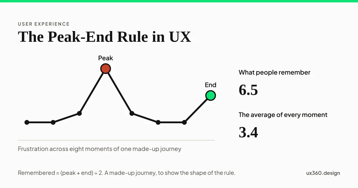
Here is a made-up journey of eight moments. Each bar is how frustrating a moment was, from 0 (calm) to 10 (very frustrating). In this simple model, people remember the peak and the end: the average of the worst moment and the last moment. Slide how frustrating the last moment is.
The last moment is 5 out of 10. The average of all eight moments is 3.4. The worst moment is 8. People remember the peak and the end, so what they remember is (8 + 5) ÷ 2 = 6.5.
Look at the two numbers. The average of all eight moments hardly moves, but what people remember changes a lot. The slow step in the middle is the peak, and the ending decides how the story closes.
Where it shows up
- Checkout and confirmation. The last screen is the end of the story. A bare receipt, an error or a clear thank-you each leave a different memory.
- Onboarding. The first win and the last step of setup are the moments people recall.
- Long tasks. A crash or a lost file near the end can undo an hour of smooth work.
- Support. How a call or chat ends often decides how it is remembered.
- Cancelling. The last thing people see on the way out is what they take with them.
How to design for it
- Find the worst moment. Run a usability test and watch where people sigh, stop or go back.
- Fix the worst moment first. It does more for memory than polishing the easy steps.
- Add one good moment that fits. A small relief or win, such as a clear “saved”. Do not add decoration.
- End well. Use a clear confirmation, say what happens next, and say thank you.
- Do not end on a demand. A sales pitch or a long survey straight after a task is a poor last memory.
- Do not fake it. A cheerful message does not cover a real problem.
- Measure the end. Ask how people felt at the end of the task, not only on average.
Try it yourself: shape the memory
Here is the same eight-step journey of a flight check-in app. Turn on the fixes and watch two numbers: the average and what people remember.
As it ships today, the Pay step is the worst moment at 8 and the last screen is a confusing 5. The average is 3.4, and what people remember is (8 + 5) ÷ 2 = 6.5.
Try making every step a little smoother. The average improves, and what people remember barely moves. Then fix the worst step, or fix the ending, and see which one moves the second number more.
The peak-end rule and other biases
- It connects to loss aversion: a bad moment may weigh more than a good one of the same size.
- The aesthetic-usability effect is about how a product feels, and the peak-end rule is about how an experience is remembered.
- The framing effect shapes how an ending is described, such as “Order received” or “Order failed”.
- Usability testing is how you find the peak.
See the map of cognitive biases for how these fit together.
Common mistakes
- Improving only the average. Smoothing every step helps, but the worst moment and the ending still decide the memory.
- Ending on a form or an upsell. The last thing people see should help them, not ask them for something.
- Ignoring the worst moment. It is usually the peak.
- Faking delight. People can tell.
- Treating the rule as a law. Check it against your own users.
Frequently asked questions
What is the peak-end rule?
The peak-end rule says people judge an experience mostly by its most intense moment and by how it ends, rather than by the average of every moment.
Where does the peak-end rule come from?
It comes from research by Daniel Kahneman and his colleagues in the 1990s. In one study, people put a hand in painfully cold water twice. Most chose to repeat the longer trial, because it ended a little warmer.
How do you use the peak-end rule in UX design?
Find and fix the worst moment first, add one good moment that fits the task, and end with a clear, calm confirmation that says what happens next.
Is the peak-end rule always true?
No. It is a good rough guide and not an exact law. Length and the average still matter in some cases, so check it against your own users.
This is a bias in the people using your product. See it beside the biases that bend your own research.
From UI to UX: a free one-week course
Become the person in the room who understands the user when everyone else is guessing. Six free lessons, no sign-up.

Written by