
Dark Patterns in UX: Examples, Evidence and the Honest Alternatives
Dark patterns, also called deceptive patterns, are interface designs that push people into choices they would not make if they saw them clearly, like hidden fees, hard-to-cancel subscriptions and pre-ticked boxes. They work: in one experiment they nearly quadrupled sign-ups for an unwanted plan. Many are now illegal, and each one has an honest alternative.
What are dark patterns? Dark patterns are interface designs that push people into choices they would not make if they saw them clearly: buying something extra, sharing more data, or staying subscribed.
The UX designer Harry Brignull coined the term in 2010 and started cataloguing examples. He now prefers “deceptive patterns,” a name that describes the problem better. Either way, the idea is the same: the design works against the person using it.
In short
- What they are: designs that trick, pressure or hide, so people act against their own interest.
- Where they show up: checkouts, cookie banners, sign-ups and cancellations.
- Do they work? Yes. In one experiment, aggressive dark patterns nearly quadrupled sign-ups for a plan people did not want.
- Are they legal? Many are not, any more, in the EU and the US.
- The fix: every dark pattern has an honest version that respects the choice.
Common dark patterns, with examples
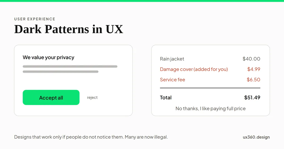
- Sneak into basket. An extra item, like insurance, is added to the order without asking.
- Drip pricing, or hidden costs. Fees appear only at the last step, after people have spent time and effort.
- False urgency. A countdown timer or “only 2 left” message that is not true.
- Confirmshaming. The decline option is worded to make people feel bad: “No thanks, I like paying full price.”
- Preselection. Boxes for marketing or data sharing start ticked, so doing nothing means saying yes.
- Obstruction, or the roach motel. Easy to get into, hard to get out of, like a subscription you can start in one click but must phone to cancel.
- Nagging. Asking again and again until people give in.
- Disguised ads and trick questions. Ads that look like content, or questions worded so the obvious answer means the opposite.
Many dark patterns lean on real quirks of the mind. Preselection uses the default effect. Confirmshaming and false scarcity use loss aversion. Drip pricing works because people who have come this far do not want to start over.
The most common one: the cookie banner
Few designs are seen as often as a consent banner. Change how it offers “no” and count the clicks.
Accept and Reject look the same and sit side by side, so saying no takes one click, the same as saying yes. This is the fair version.
When accepting takes one bright click and refusing takes a small grey link, or a trip through the settings, the banner is designed to collect a yes. Regulators have noticed. In 2019, the EU’s Court of Justice ruled in the Planet49 case that a pre-ticked box is not valid consent. In 2022, France’s data regulator fined Google and Facebook for making cookies harder to refuse than to accept.
Do dark patterns work?
Yes, and by a lot. In 2021, Jamie Luguri and Lior Strahilevitz, two law researchers at the University of Chicago, tested them directly. They led people in the US to believe they were being signed up for a paid data-protection plan. No one was charged, and everyone was told the truth afterwards. Each group saw a different version of the sign-up.
With a plain, honest choice, about 11 in 100 people signed up for the paid plan.
Mild dark patterns more than doubled sign-ups. Aggressive ones nearly quadrupled them. Raising the price from $8.99 to $38.99 a month did not weaken the effect. The researchers also found that the mild patterns drew little anger from the people tricked, which is part of what makes them so common.
And they are common. In 2019, a team at Princeton led by Arunesh Mathur crawled about 11,000 shopping websites. They found 1,818 dark patterns, of 15 types. More popular sites were more likely to use them.
The law has caught up
- European Union. The Digital Services Act bans online platforms from designs that deceive or manipulate users. Under the GDPR, consent must be freely given and as easy to withdraw as to give.
- United States. The Federal Trade Commission has taken companies to court over dark patterns. In September 2025, Amazon agreed to pay $2.5 billion to settle FTC claims that it enrolled people in Prime without clear consent and made cancelling hard. The FTC’s complaint said Amazon’s own name for its cancellation flow was “Iliad,” after Homer’s epic about a long war.
- California. Its privacy law says agreement obtained through dark patterns does not count as consent.
The rules differ by country, but they point the same way: a choice has to be a real choice.
Dark pattern or good persuasion?
Not every nudge is a dark pattern. A simple test: would the design still work if the person fully understood it?
- A progress bar that shows real progress helps people finish. A fake one that jumps to 80% is a trick. See the goal-gradient effect.
- A default that most people would choose anyway saves them time. A default that serves only the business is preselection.
- “3 left in stock” is useful if it is true and harmful if it is not.
If the design depends on people not noticing, it is a dark pattern.
How to avoid dark patterns
- Make “no” as easy as “yes.” Same size, same place, same number of clicks.
- Show the full price first. Every fee, from the first price people see.
- Never add anything to the basket without asking. Offer it, unticked, with its price.
- Use real deadlines and real stock counts only.
- Word the decline option plainly. “No thanks” is enough.
- Make cancelling as easy as signing up. If sign-up is online, cancelling should be too.
- Ask once. If someone says no, remember it.
- Review your flows like a skeptic. Walk through them as someone who wants to say no, and count the steps.
Try it yourself: build a checkout
Here is a checkout for one $40 jacket. Switch on the dark patterns one at a time, and watch the total and the readout.
No dark patterns: the jacket costs $40.00, the total says $40.00, and the way out is a plain "Not now". This is the honest checkout.
Each pattern alone looks small: a $4.99 add-on, a $6.50 fee, a timer, a cheeky line. Together they add almost 30% to what the shopper expected to pay, and they all depend on the shopper not looking closely. Turn them all off, and the checkout is plain and honest. That version may sell a little less today, but it does not generate refunds, chargebacks or complaints tomorrow.
Dark patterns and other ideas
- They abuse cognitive biases, the shortcuts the mind takes.
- The default effect explains why pre-ticked boxes work.
- Loss aversion is behind false scarcity and confirmshaming.
- The framing effect shows how wording alone changes choices.
- The peak-end rule is a reminder that a nasty cancellation is the last thing people remember about you.
Common mistakes
- “Everyone does it.” Common does not mean legal, and it does not mean users like it.
- Testing only the sign-up rate. A dark pattern can raise sign-ups and also raise refunds, complaints and cancellations. Measure what happens next.
- Hiding behind small print. Disclosing a fee in tiny text on page four does not make it clear.
- Fake urgency in emails and apps. The same rules apply outside the website.
- Not checking third-party tools. Some dark patterns arrive in plug-ins and consent tools. You are still responsible for what your users see.
Frequently asked questions
What is a dark pattern in UX?
A dark pattern is a design that tricks or pressures people into doing something they did not mean to do, such as buying an add-on, sharing data or staying subscribed. The UX designer Harry Brignull coined the term in 2010; he now calls them deceptive patterns.
What are common examples of dark patterns?
Common examples include hidden fees shown only at checkout, items added to the basket without asking, fake countdown timers, guilt-trip wording on the decline button, pre-ticked consent boxes, and subscriptions that are easy to start but hard to cancel.
Are dark patterns illegal?
Many are. The EU's Digital Services Act bans deceptive designs on online platforms, EU courts have ruled pre-ticked boxes are not valid consent, and the US Federal Trade Commission has sued companies over them. In 2025, Amazon agreed to pay $2.5 billion to settle FTC claims about its Prime sign-up and cancellation.
Do dark patterns actually work?
In the short term, yes. In a 2021 experiment by Jamie Luguri and Lior Strahilevitz, aggressive dark patterns made people almost four times as likely to sign up for a paid plan they had not asked for. The costs come later: complaints, refunds, fines and lost trust.
The UX Foundation Course, free
Become the person in the room who understands the user when everyone else is guessing. 4 chapters, 27 free lessons, no sign-up.

Written by