Goal-Gradient Effect in UX: Why People Speed Up Near the Finish
The goal-gradient effect says people put in more effort the closer they get to a goal. Loyalty card studies show customers buy faster as a reward nears, and finish more often when they start with some progress. In UX it is the reason progress bars and checklists work, and the reason a head start should be real.
What is the goal-gradient effect? The goal-gradient effect is the tendency to put in more effort the closer you get to a goal.
Runners sprint at the end of a race. Shoppers rush to fill a loyalty card when they are one stamp away. The goal pulls harder as it gets nearer, and the effect is strong enough to change how people use a product.
In short
- What it is: effort grows as the goal gets closer.
- Where it comes from: Clark Hull’s studies of rats in mazes in the 1930s, revived for shoppers in 2006.
- A close cousin: the endowed progress effect. A head start makes people more likely to finish.
- How to use it: show real progress toward a clear goal, and keep what is left short.
Where it comes from
In the 1930s, the psychologist Clark Hull watched rats run a maze to reach food. The rats ran faster the closer they got to the food. He called it the goal gradient.
In 2006, Ran Kivetz, Oleg Urminsky and Yuhuang Zheng tested it on people. They followed real customers of a café with a “buy 10 coffees, get 1 free” card. Customers bought coffee more often as they got closer to the free one. Right after they earned it, they slowed down again, then sped up as the next reward came into view.
The head start that doubles finishing
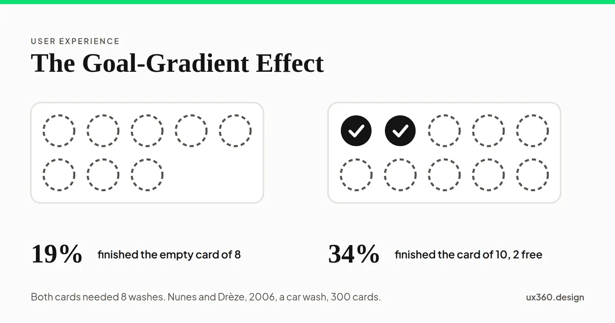
The same year, Joseph Nunes and Xavier Drèze ran a test at a car wash. They gave out 300 loyalty cards. Half got an empty card with 8 spaces. Half got a card with 10 spaces and 2 stamps already filled in. Both groups needed exactly 8 more washes for the reward.
The card has 8 empty spaces. After 0 washes it shows 0% done, with 8 to go. In the study, 19% of people with this card finished it, against 34% with the card of 10 and two free stamps, though both needed the same eight washes.
After nine months, 19% of the empty-card group had finished. Of the head-start group, 34% had. Same effort, nearly twice the finishing rate. The only difference was that one card said “you have already started”.
Nunes and Drèze also found the head start works better when it comes with a reason. Free stamps for no reason feel like a trick. A real reason, like a welcome bonus, makes the progress feel earned.
Watch people speed up
Here is the shape the café study found, on two cards of 10. Each bar is how long a customer waited before a visit. Slide through the visits.
Visit 7 earns stamp 7 of 10 on card 1. The customer waited about 3.2 days before it, and 3 stamps are still to go.
The gaps shrink as the free coffee gets closer, then jump back up on the first visit of the next card. The days are made up. The shape is what the study found. The lesson for design is the dip after the reward: the pull resets, and so does the effort.
Where you see it in products
- Profile and setup checklists. “Your profile is 70% complete” pulls people to finish the last steps.
- Progress bars in forms. A long form feels shorter when people can see the end.
- Loyalty and reward programs. Stamps, points and tiers all show distance to a goal.
- Learning apps. Streaks and lesson counts make the next step feel worth taking.
- Savings and fitness goals. A bar that fills up keeps people going near the end.
How to use the goal-gradient effect
- Make the goal clear. People cannot speed up toward a goal they cannot see.
- Show progress from the start. A bar or checklist that shows how far someone has come.
- Count what people have really done. Signing up and confirming an email are real steps. Count them.
- Keep what is left short. Move optional steps out of the way so the finish is closer.
- Break long tasks into milestones. Each milestone is a nearby goal, so the pull never gets weak.
- Plan for the dip after a reward. Show the next goal right away, so people do not stop.
Try it yourself: an onboarding checklist
Here is a checklist for someone who has just signed up and confirmed their email. Change how it is set up and watch the numbers.
The checklist shows 5 steps, 0 of them done, with 5 left. The steps already done are left off, so the list starts at zero.
Counting the two steps the person really did gives them a head start without any trick. Moving optional steps out of the way makes the finish closer. Both are honest, and both use the goal gradient.
Where it becomes a dark pattern
A head start only works if people believe it. Fake progress, like a bar that starts at 30% for nothing, or a “you are almost there” message that is not true, is a trick. People notice when the last 10% takes longer than the first 90%. A checklist that adds new steps just as someone finishes breaks trust.
Use the effect to help people finish things they want to finish. Not to keep them busy.
The goal-gradient effect and other principles
- It belongs with Hick’s law and Fitts’s law among the laws of UX that shape how people move through a product.
- The peak-end rule says the end of an experience shapes the memory of it. The goal gradient says the end shapes the effort.
- Loss aversion is why “do not lose your progress” messages pull hard.
- Chunking supports milestones: small groups of steps are easier to finish.
See all the laws of UX, in the order a click happens.
Common mistakes
- Fake head starts. Give credit for real steps only.
- A goal that keeps moving. Adding steps near the end makes people give up.
- Hiding how much is left. “Step 2” means little. “Step 2 of 4” pulls.
- Nothing after the reward. Effort dips after a goal. Show the next one.
Frequently asked questions
What is the goal-gradient effect?
The goal-gradient effect is the tendency to put in more effort as you get closer to a goal. People speed up near the finish line, whether it is a race, a loyalty card or a sign-up form.
What is an example of the goal-gradient effect?
In a 2006 study, café customers on a buy-10-get-1-free card bought coffee more often as they got closer to the free one, then slowed down right after they earned it.
What is the endowed progress effect?
It is a related finding: people who start with some progress are more likely to finish. Car wash customers given a card of 10 with two free stamps finished it more often than those given an empty card of 8, though both needed eight washes.
How do you use the goal-gradient effect in UX?
Show progress toward a clear goal, count steps the person has really done, keep the remaining steps short, and break long tasks into milestones. Do not fake progress.
The UX Foundation Course, free
Become the person in the room who understands the user when everyone else is guessing. 4 chapters, 27 free lessons, no sign-up.

Written by