Choice Overload in UX Design: When More Options Make Choosing Harder
Choice overload is the difficulty of choosing when there are too many options. A famous jam study found that fewer jams sold more, but later reviews found the average effect is near zero and depends on the situation. In UX, the safer move is to make choosing easier, not only to remove options.
What is choice overload? Choice overload is the difficulty of choosing when there are many options to compare.
Think of an ice cream shop with 3 flavors and one with 31. In the first you point and pay. In the second you can stand at the counter for a long time, and leave unsure that you picked the best one.
In short
- What it is: too many options make a choice harder, slower, or less satisfying.
- What the research says: a famous jam study found that fewer options sold more. Later reviews found the average effect is near zero, and that it depends on the situation.
- When it happens: when options are hard to compare, when people are unsure what they want, and when they want to finish quickly.
- The rule: do not just cut options. Make choosing easier.
Why can many options be hard?
There are three reasons.
- Every option costs attention. You have to look at it, read it and compare it. Hick’s law says the time to choose grows with the number of options, but slowly.
- Doubt grows. With more options there are more chances that a better one was on the shelf. People feel less sure about what they picked.
- Comparing gets hard. Ten options that differ in five ways are hard to hold in your head.
What the research shows
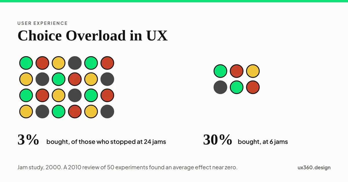
The jam study. In 2000, Sheena Iyengar and Mark Lepper set up a tasting table in a grocery store. One day it showed 24 flavors of jam. Another day it showed 6. More people stopped at the large table, about 60% against 40%. But of the people who stopped, only about 3% bought a jar at the large table, against about 30% at the small one.
The review. In 2010, Benjamin Scheibehenne and his colleagues combined 50 experiments, with 63 conditions and about 5,000 people. The average effect of having more options was close to zero. Some studies found that more options hurt. Others found that more options helped. The lead author’s own attempt to repeat the jam study did not find the effect either.
The conditions. In 2015, Alexander Chernev, Ulf Böckenholt and Joseph Goodman looked at when choice overload shows up. It was more likely in four cases. The choice was hard. The options were hard to compare. People were unsure what they wanted. Or people just wanted to finish fast.
So “less is more” is too simple. More options are a problem in some situations and fine in others.
In the 2000 jam study, about 60% of passers-by stopped at the table with 24 jams and about 40% stopped at the table with 6. Of those who stopped, about 3% bought a jar at the big table and about 30% at the small one.
See how effort grows
Hick’s law is a simple model of effort. It says the time to choose among n equal options is about the logarithm of n + 1. It is a model and not a measurement of seconds, but it shows the shape: each new option adds less than the last, and showing a few first helps a lot.
All 12 options are on screen. By Hick’s law the effort of choosing is about 3.7 units, from log₂(12 + 1). Showing five first would bring it down to about 2.8.
Slide to 24 options and show them all. Then switch to showing 5 first. People still have every option, but they weigh 5 at a time, with a clear way to see the rest.
What to do about it
- Start from the situation, not the count. Ask whether people can compare these options and know what they want.
- Recommend a starting point. A clear “most people choose this”, if it is true, gives people a place to begin.
- Group the options. Group by who they are for or what they do.
- Show a few first. Offer a plain way to see more.
- Make comparing easy. Show the same details in the same order, side by side.
- Help people say what they want. Use filters, or a short “help me choose” quiz.
- Make a choice reversible. “Change plan any time” lowers the fear of picking wrong.
- Watch people choose. See where they pause, and test the fix.
Try it yourself: fix the plan page
Here is a plan page with six plans, all shown at once. Turn on the fixes one at a time and see what changes.
The page shows 6 of 6 plans. All six sit in one flat grid with nothing to say where to start.
None of these fixes removes a plan. They change how people meet the plans. The fix to avoid is a recommendation that favors the plan that pays you most and does not say so.
Choice overload and other biases
- It sits next to satisficing: when there are too many options, people stop at the first one that is good enough.
- A default is one way to lighten the load, because it gives people a starting answer.
- Recognition over recall helps: showing options is easier than asking people to remember them.
- Chunking is the idea behind grouping, and the 80/20 rule helps you decide which options to show first.
- Anchoring matters too, because the first plan people see sets the scale for the rest.
See the map of cognitive biases for how these fit together.
Common mistakes
- Believing “less is always more”. The evidence is mixed. Test with your own people.
- Hiding options people need. Cutting choice can hurt people who know exactly what they want.
- Recommending the plan that pays you most. If people find out, they stop trusting the page.
- Never watching people choose. The count of options is a weak sign. Hesitation is a stronger one.
Frequently asked questions
What is choice overload?
Choice overload is the difficulty of choosing when there are many options to compare. People may put off the decision, pick badly, feel unsure about their pick, or give up.
Is choice overload real?
Sometimes. A review of 50 experiments in 2010 found an average effect near zero, with very different results between studies. A later review found that it becomes more likely when the options are hard to compare, when people do not know what they want, and when they want to finish fast.
What is Hick's law?
Hick's law says that the time to choose grows with the number of options, but slowly: it follows the logarithm of the number of options plus one. Doubling the options adds time, but does not double it.
How do you reduce choice overload without removing options?
Recommend a starting point, group the options, show a few first with a way to see more, make comparing easy, and help people say what they want with filters or a short quiz.
This is a bias in the people using your product. See it beside the biases that bend your own research.
From UI to UX: a free one-week course
Become the person in the room who understands the user when everyone else is guessing. Six free lessons, no sign-up.

Written by