Loss Aversion in UX Design: Why Losing Feels Worse Than Winning
Loss aversion is the tendency to feel a loss more strongly than a gain of the same size. In UX it helps explain why a message about what you will lose often pulls harder than one about what you will gain. The effect varies by situation, so use it to inform people and never to pressure them.
What is loss aversion? Loss aversion is the tendency to feel a loss more strongly than a gain of the same size.
Imagine you find a $20 note on the street. You feel good. Now imagine you open your wallet and find that $20 is missing. The amount is the same, but for most people the second feeling is stronger.
In short
- What it is: a loss usually feels bigger than a gain of the same size.
- How big: the classic estimate is about 2 to 1. Later research shows it varies, and some researchers doubt it holds for every choice.
- Where it shows up in UX: warnings about unsaved work, trials that are ending, streaks and cart reminders.
- The rule: use it to tell people something true about what they could lose. Never invent a loss.
Why does it matter for design?
Because the words around a choice change what people do. “Get 10 projects with Pro” and “You will lose 7 of your projects” describe the same offer. The second one often pulls harder, because people feel that what they already have is theirs, and losing it feels like a cost.
That pull is useful when it protects people. It is harmful when it is used to rush them.
What the research shows
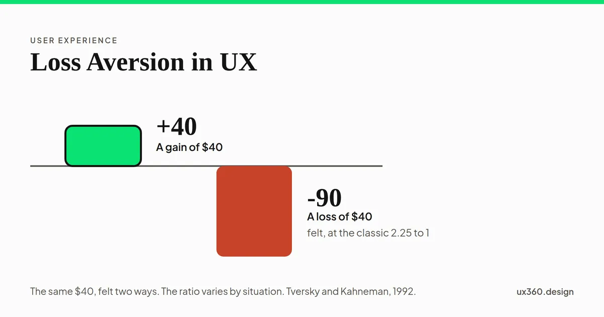
In 1979, Daniel Kahneman and Amos Tversky described prospect theory, and loss aversion is one of its main ideas. In 1992 they estimated that a loss counts for about 2.25 times as much as a gain of the same size. People often shorten this to “losses hurt about twice as much as gains feel good”.
The idea is also argued over. In 2018, David Gal and Derek Rucker wrote that the evidence does not support the claim that losses always weigh more than gains, and that the effect depends on the situation. Other researchers disagree with them.
A fair summary is this. Loss aversion is a real pull in many situations. It is not a law that works the same way everywhere. So treat it as a reason to test your wording, not as a guarantee.
See the size of the pull
Pick an amount and a weight. The bars show how big a gain and a loss of that amount feel. The units are made up. Only the ratio matters.
A gain of $40 feels like 40 units. A loss of $40 feels like 90 units, which is 2.25 times as big. The units are made up and only the ratio matters.
At the classic estimate, a loss of $40 feels as big as a gain of $90. At a weight of 1 to 1 the two bars match. The research is about which of these is closer to the truth in a given situation.
See it on a screen
Here is a trial-ending message. Choose how it is worded, then try the two extras that people add. The rating at the bottom is ours, based on how much a message informs and how much it pushes. It is not data.
The message states plain facts: the trial has ended, the free plan keeps 3 projects and Pro keeps all 10. The way to keep the free plan is easy to see. Our rating: informs, 0 of 5.
The three wordings describe the same plan. Plain facts tell you exactly what changes. A loss wording makes the same change feel bigger. A countdown and a hidden way out add pressure that has nothing to do with what the plan is worth.
Where it shows up
- Unsaved changes. “If you leave, your changes will be lost.” This is a real loss, stated plainly, and it helps people avoid a mistake.
- A trial that is ending. The message can state the date and what stays, or it can scare.
- Streaks. “Don’t break your 12-day streak.” The streak is something the product made up. It can encourage people or pressure them.
- Cart reminders. “You left 2 items in your cart.” This is a fact and a reminder.
- Scarcity. “Only 1 left.” This is fair only if it is true and checked.
- Cancelling. “If you cancel, you lose your photos.” This is fair if it is true and you can export them first.
How to use it fairly
- Name a loss only if it is real. Never invent scarcity or a deadline.
- Say exactly what changes, and when. Use numbers and dates.
- Show the alternative in the same message. The free plan, or a way to export your work.
- Make leaving easy. One clear way out, not a hidden one.
- Use it most for accidents. Warnings about unsaved work or deleted files are its best use.
- Test the wording with people. Ask whether they felt informed or pushed.
- Measure it. The effect varies, so check that it works before you rely on it.
Try it yourself: informs or pressures?
Here are five messages. For each one, decide whether it informs or pressures, and see whether you agree with us. The decisions are judgement, so the reasons matter more than the score.
No message is judged yet. Read each one and choose whether it informs or pressures.
A loss message is not bad by itself. The unsaved-changes warning is a loss message, and it is a good one. What matters is whether the loss is real, whether the facts are shown, and whether the person can still choose freely.
Loss aversion and other biases
- The framing effect is how loss aversion gets used: the same facts, put as a gain or as a loss.
- Anchoring sets the price that makes a discount feel like a gain, or its end feel like a loss.
- The default effect interacts with it, because changing a default can feel like giving something up.
- Conformity can add to it: “Don’t miss what everyone else has.”
See the map of cognitive biases for how these fit together.
Common mistakes
- Treating loss aversion as a law. It varies. Test it.
- Inventing a loss. Fake deadlines and fake scarcity cost trust.
- Using loss wording when the facts are enough. Plain facts often work and leave people feeling respected.
- Hiding the exit. If leaving is hard, people notice, and they remember it.
Frequently asked questions
What is loss aversion?
Loss aversion is the tendency to feel a loss more strongly than a gain of the same size. Losing $20 usually feels worse than finding $20 feels good.
How strong is loss aversion?
The classic estimate, from Tversky and Kahneman in 1992, is that a loss weighs about twice as much as an equal gain. Later research found that the size varies a lot, and some researchers argue it does not apply to every choice.
How is loss aversion used in UX design?
It shows up in warnings about unsaved work, in messages about a trial that is ending, in streaks, and in cart reminders. It is used well when the loss is real and the message says exactly what changes.
When does loss aversion become a dark pattern?
When the loss is invented, as with fake scarcity or a made-up deadline, or when the message rushes people and hides the way out. A fair message states a real loss and shows the alternative.
This is a bias in the people using your product. See it beside the biases that bend your own research.
From UI to UX: a free one-week course
Become the person in the room who understands the user when everyone else is guessing. Six free lessons, no sign-up.

Written by