

ux360.design Principles of design
Name Date
Emphasis
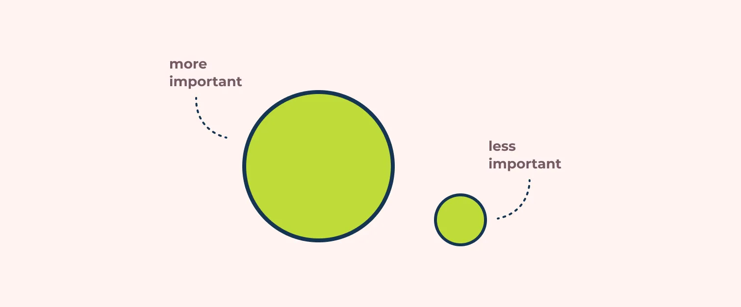
Emphasis makes one part of a design stand out, so people look there first. That part is called the focal point.
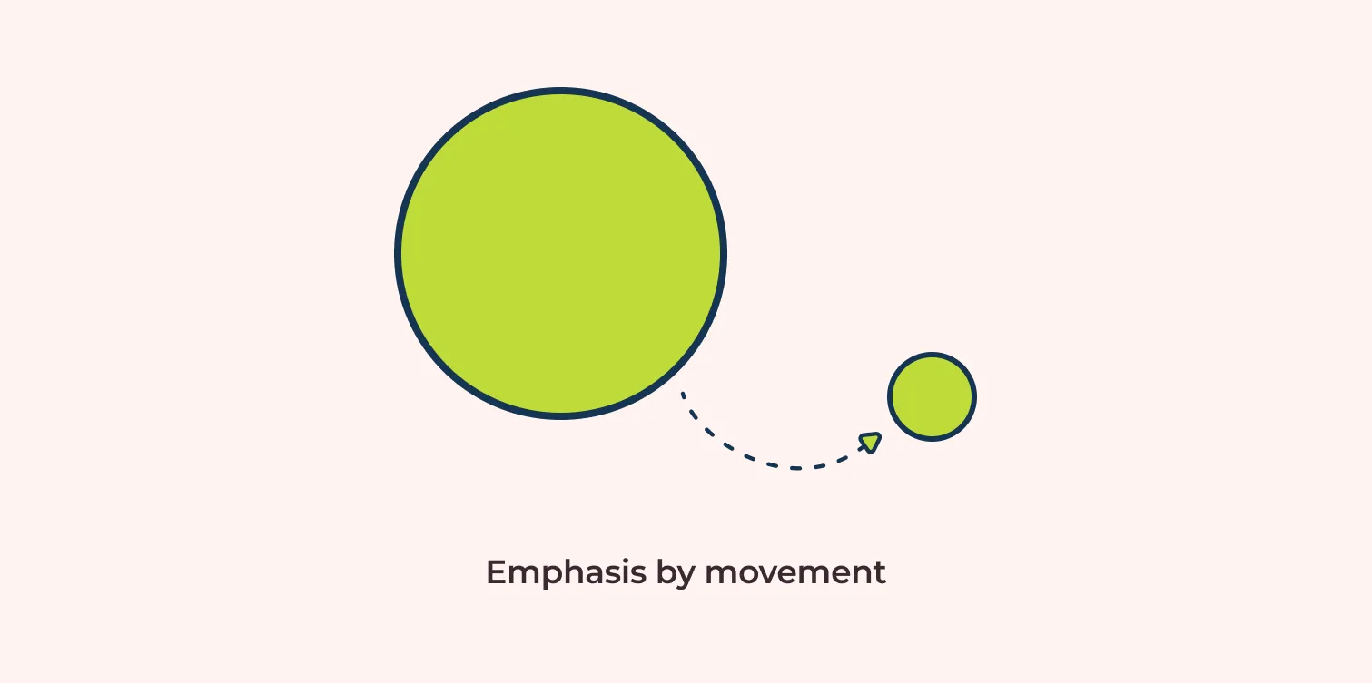
Four ways to create it


Try it
Draw a poster for a school bake sale. Pick one thing to be the focal point, and use one of the four ways to make it stand out.
What is your focal point? Which way did you use to make it stand out?
Read the full lesson: ux360.design/emphasis-design/
ux360.design Emphasis
Name
Check yourself
Circle one answer for each question.
-
1What is a focal point?
- The part of a design people look at first
- The smallest thing in a design
- The background of a page
-
2A page is all green, with one pink circle. Why do you look at the circle first?
- It is in the middle
- Its color is different from everything around it
- People always look at circles first
-
3A designer leaves lots of empty space around a product photo. What does that do?
- It wastes space on the page
- It makes the photo stand out, because nothing competes with it
- It makes the photo look less important
-
4An arrow on a poster points from the headline to a button. Which way of creating emphasis is that?
- Movement
- Contrast
- Scale
-
5A poster makes every word big, bold and red. What happens?
- Every word stands out equally well
- Nothing stands out, because there is no focal point
- Only the first word stands out
Want to check online? The same questions are at the end of ux360.design/emphasis-design/
ux360.design Emphasis
For the teacher
Answer key
- 1A. The part of a design people look at first. The focal point is where you want eyes to land first. Emphasis is how you get them there.
- 2B. Its color is different from everything around it. That is emphasis by contrast. The one thing that is different stands out.
- 3B. It makes the photo stand out, because nothing competes with it. That is emphasis by white space. With nothing nearby, the photo gets all the attention.
- 4A. Movement. Movement guides the eye along a path, so the arrow carries you from the headline to the button.
- 5B. Nothing stands out, because there is no focal point. If everything has emphasis, nothing does. Pick one focal point and keep the rest quieter.
In class, about 20 minutes: read the lesson, do page 1, then page 2.
More free handouts: ux360.design/teachers/