The 11 Principles of Design and Art [Infographics Included]
Before moving on to the individual design principle itself, let’s understand what “principles of design & art” mean? In the simplest form, these principles are the guidelines on how to use visual elements to create a composition.
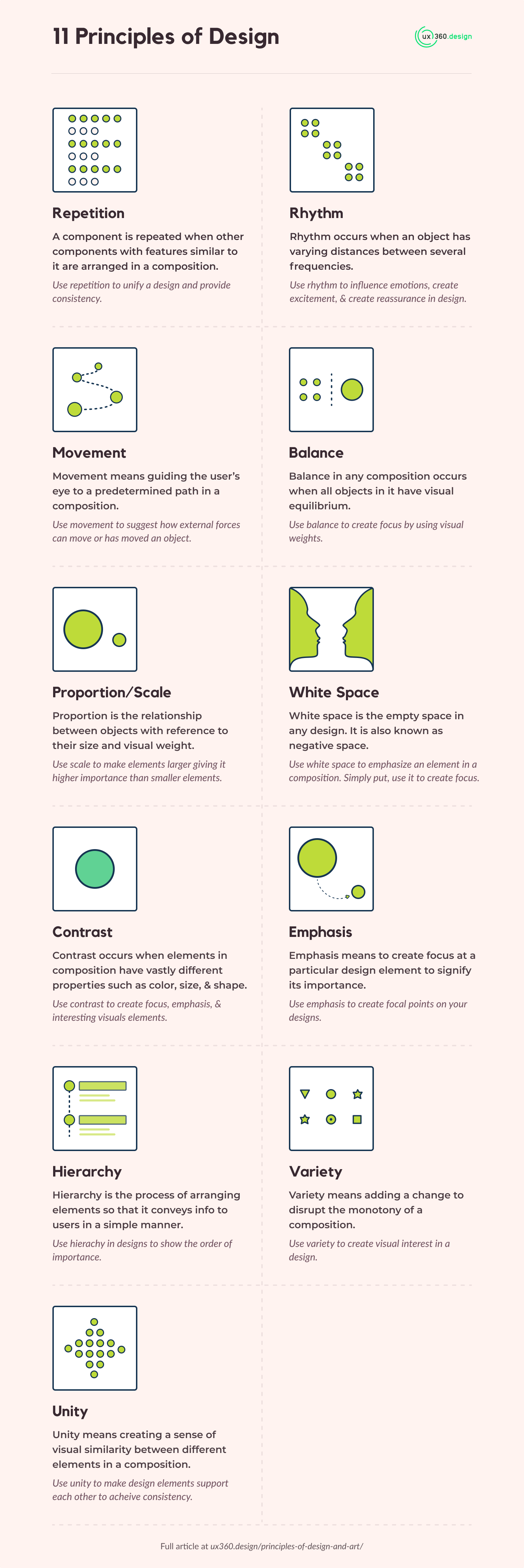
In this article, we will be looking at each of the design principles in detail. Here is a handy infographic for those who are looking for design principles cheat sheet:
Quick Links
1. Repetition
A component is repeated when other components with features similar to it are arranged in a composition.
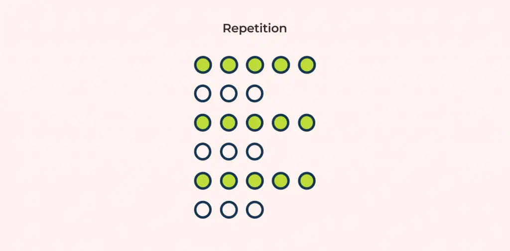
Remember, only one common feature needs to be shared among different components. It does not matter if other features or characteristics of the components are different.
Shared features between components can be form or size.
So how do we determine which common feature is repeated if there is more than one common feature? For this, we choose the most dominant characteristic based on hierarchy, size, etc.
Repetition in design unifies the design, makes the design consistent, and shows the relationship between components.
For example, on Apple’s website, the block for both iPhone XS and iPhone XR is the same, with differences only in the content.

2. Rhythm
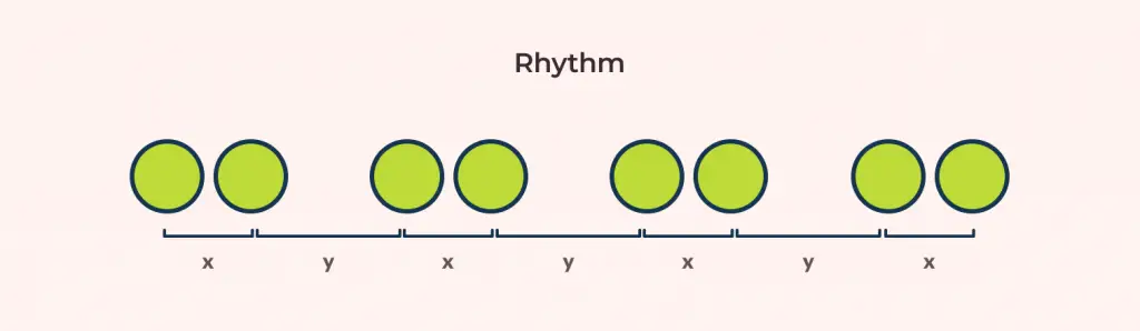
Before we get into detail on how rhythm is created, let us look at what a frequency is. Let’s take a look at the image below to understand different type of frequencies:
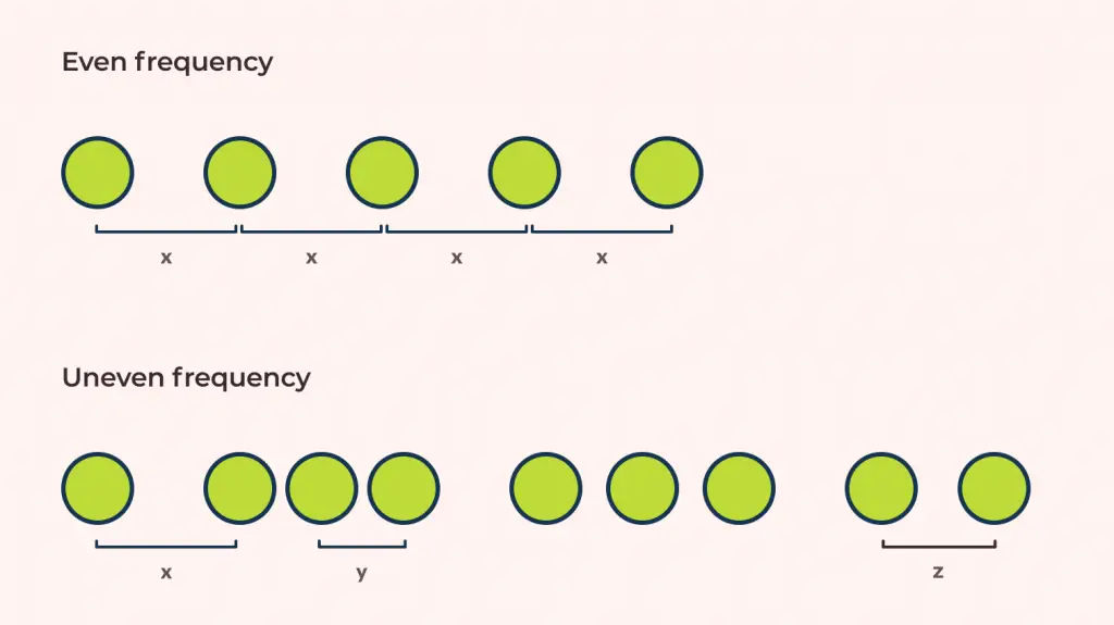
Basically, there are two types of frequencies: even and uneven frequency.
Repetition has an even frequency when two repeating elements have an equal distance between them. If the distance between elements is not equal, then we have an uneven frequency.
To create a rhythm, an object needs to have varying distances between several frequencies.
There are 5 types of rhythm:
- Random rhythm: No Specific distance between frequencies
- Regular rhythm: Some distance between frequencies
- Alternating rhythm: Basically, a rhythm that is seen in a white and black square on a chessboard. We use a 1-2-1-2-1-2 pattern for this.
- Flowing rhythm: A rhythm that follows bend and curves. Example: sand dunes or ocean waves
- Progressive rhythm: A rhythm that changes as they go along with each change building upon the previous.
Rhythm in design influences emotions, creates excitement that builds gradually over time, and creates reassurance in design.
The wave-like rhythm of Poke
3. Movement
Movement means guiding the user’s eye to a predetermined path in a composition.
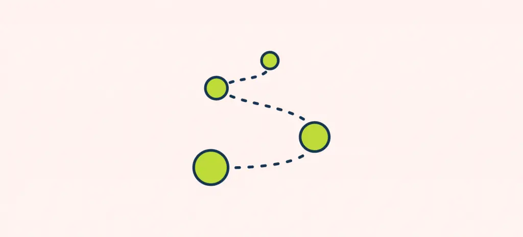
Movement in design can be used in interesting ways such as the position of a subject that can suggest how other external forces can influence to move it. Also, the same position of a subject can also suggest how these forces have influenced its movement before it reached to that position.
What better way to explain movement than give an example of an infographic. Anima graff’s “How a car engine works” uses movement and motion to explain the various steps on how an engine actually works.
For a deeper insight on using movement in your designs, read my article on the Movement Principle of Design.
Also, I suggest you also look into using coordinated motion in design to associate relations through “Gestalt principle: Common Fate”.
4. Balance
Before going into what balance in design actually is, let us look at two basic properties:
-
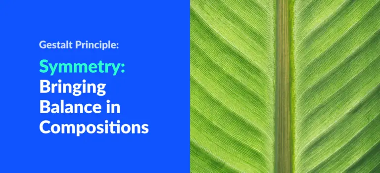
Symmetrical design
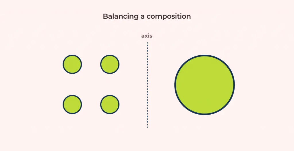
Let’s put an imaginary vertical axis in our design called an axis. Now design is said to be symmetrical when objects on both sides have the same arrangement.
Simply put, the weights of visual elements at both side of the axis is equal.
Layouts can be mono-symmetric and multi-symmetric.
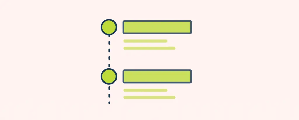
In the image below, the middle dotted line is the axis and circles on both sides of the axis are in symmetry.
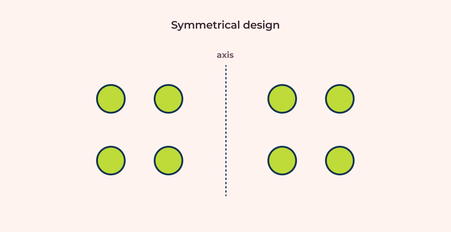
Objects on both sides of the imaginary vertical axis has same arrangement. -
Asymmetrical design
Now, let us remove 3 objects from the right side of the axis and just have one remaining circle. Since both weight and arrangement are not equal, the layout is said to be asymmetric.
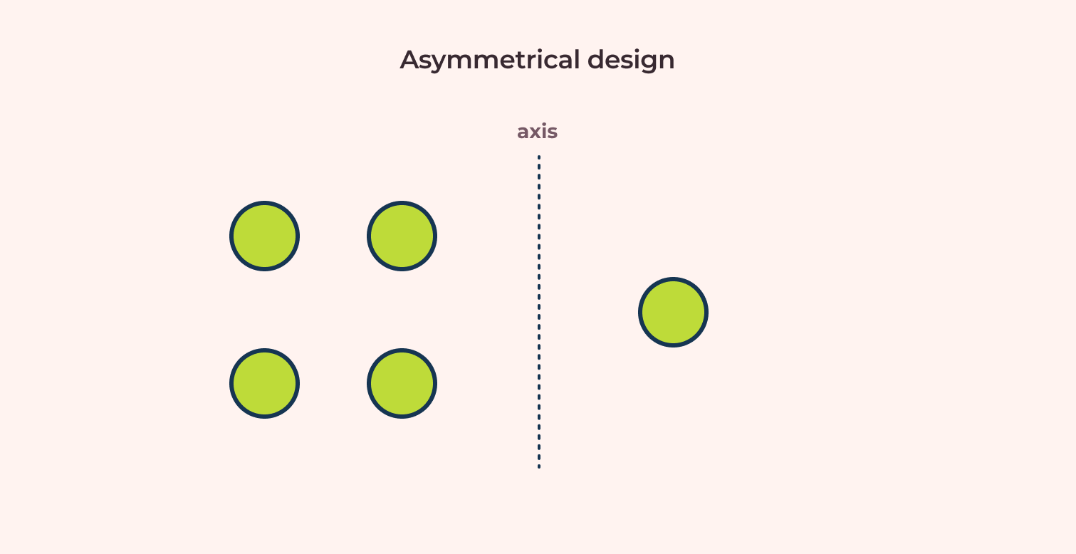
Different arrangement on both sides of the axis to disrupt the symmetry.
So when is a composition balanced? A composition is balanced when all objects in it have visual equilibrium.
We can clarify this with an example using visual weight. We will use the same asymmetrical design image we had earlier. When we make the circle on the right bigger and bolder, objects on both sides appear to have similar visual weight.
Now we created visual equilibrium between all objects of the composition.
Gucci’s website is an excellent example of symmetric balance in websites:
If you want to explore symmetry & balance in-depth, I suggest reading up on my article on Symmetry: Bringing Balance to Compositions.
5. Proportion / scale
In a composition, proportion refers to the relationship between objects with reference to their size and visual weight.
For size, making an element larger gives it much higher importance than those elements with a smaller size.
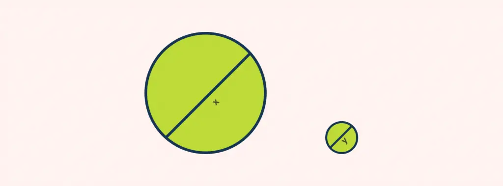
For visual weight, making this part of the sentence bold, makes it look more important than this part of the sentence.
In Avrox’s website, they have a dominantly large image of their product to draw all focus on it.
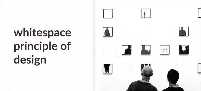
6. White space
White space is the empty space in a design. It is also known as negative space.
For beginners, white space may seem like a bit of a counter-intuitive approach. But white space has its purpose. It emphasizes an object in a composition. Simply put, it creates focus.
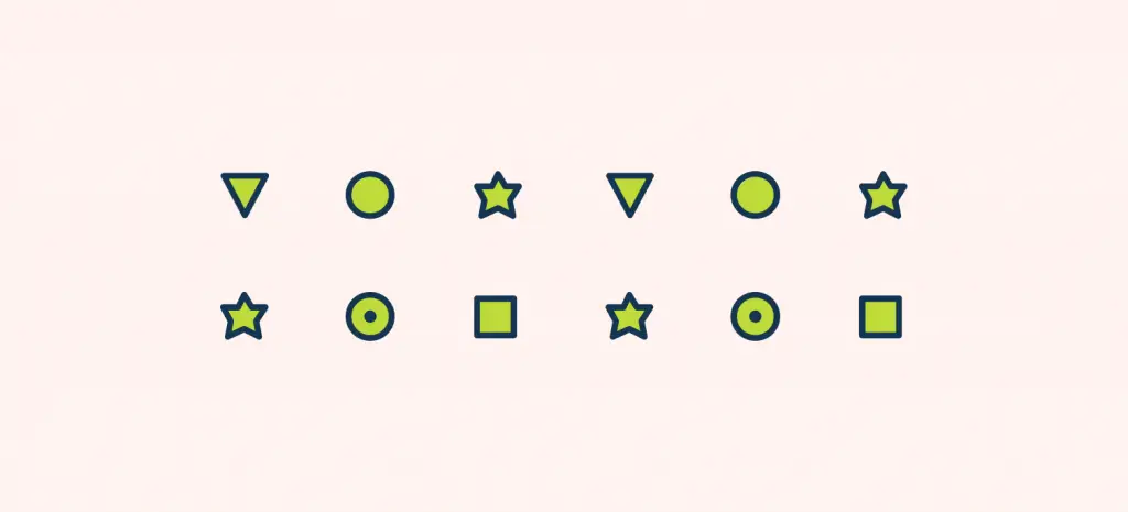
We can look at a simple example. On the frame below, there are circles and polygons of various sizes.
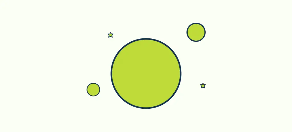
The empty space on the image above is perceived as the sky and the placed objects as stars and planets.
With a combination of visual weight and white space, we can create interesting visual illusions. Here, with some little tweaks, we can make it look like gravity is acting upon it.
Drink Seriously’s website uses a lot of white space around

7. Contrast
Contrast occurs when elements in composition have vastly different properties such as color, size, shape, etc.
Contrast creates a focal point.
Contrast is used in design to create:
- focus
- emphasis on the most important element
- interesting visuals with differences between the elements
Commonly, when contrast is mentioned, many people think about the contrast between colors. But contrast can be achieved with more attributes such as:
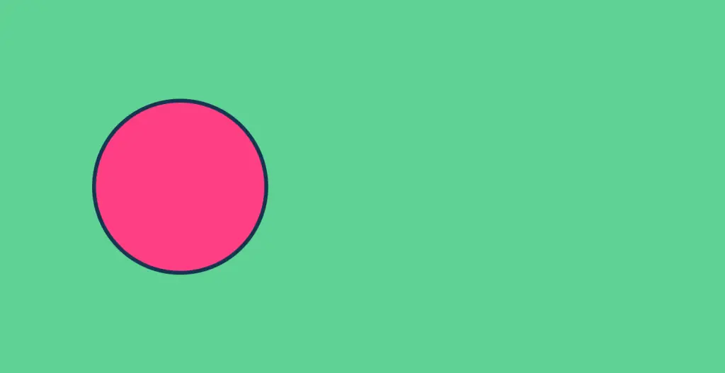
- Color contrast
In the image above, your eye is attracted to the circle. We can use color to direct users to a specific area. Color contrast is mainly used to make the design pop.
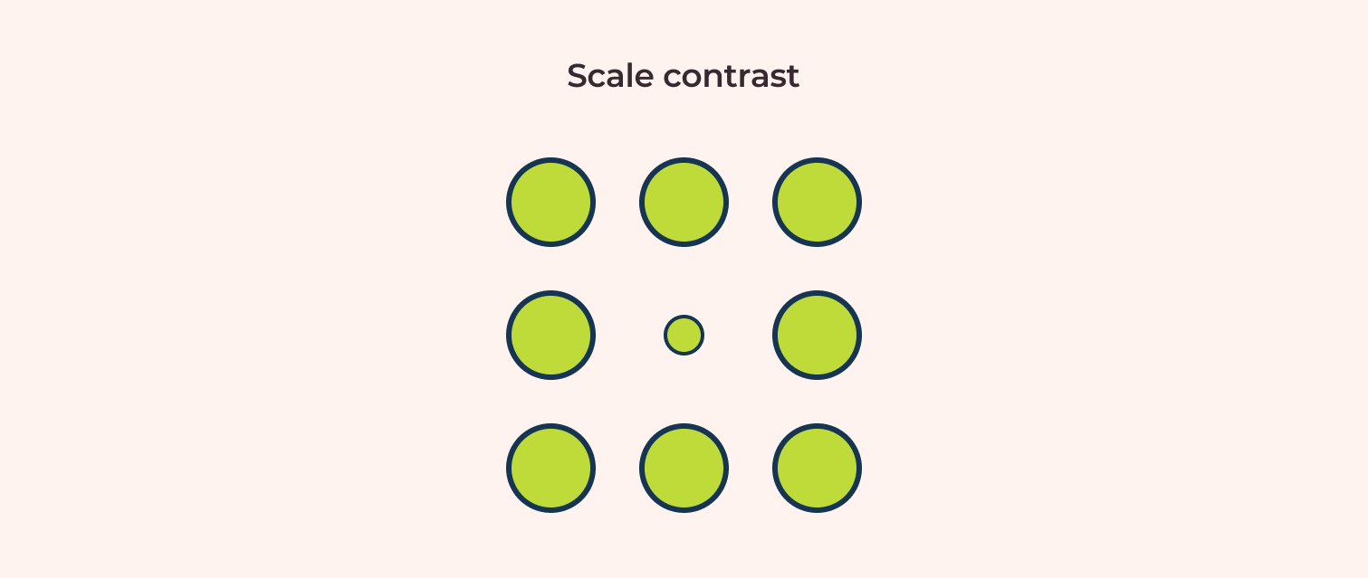
- Scale contrast
By making the circle size smaller, we can direct focus to that circle.
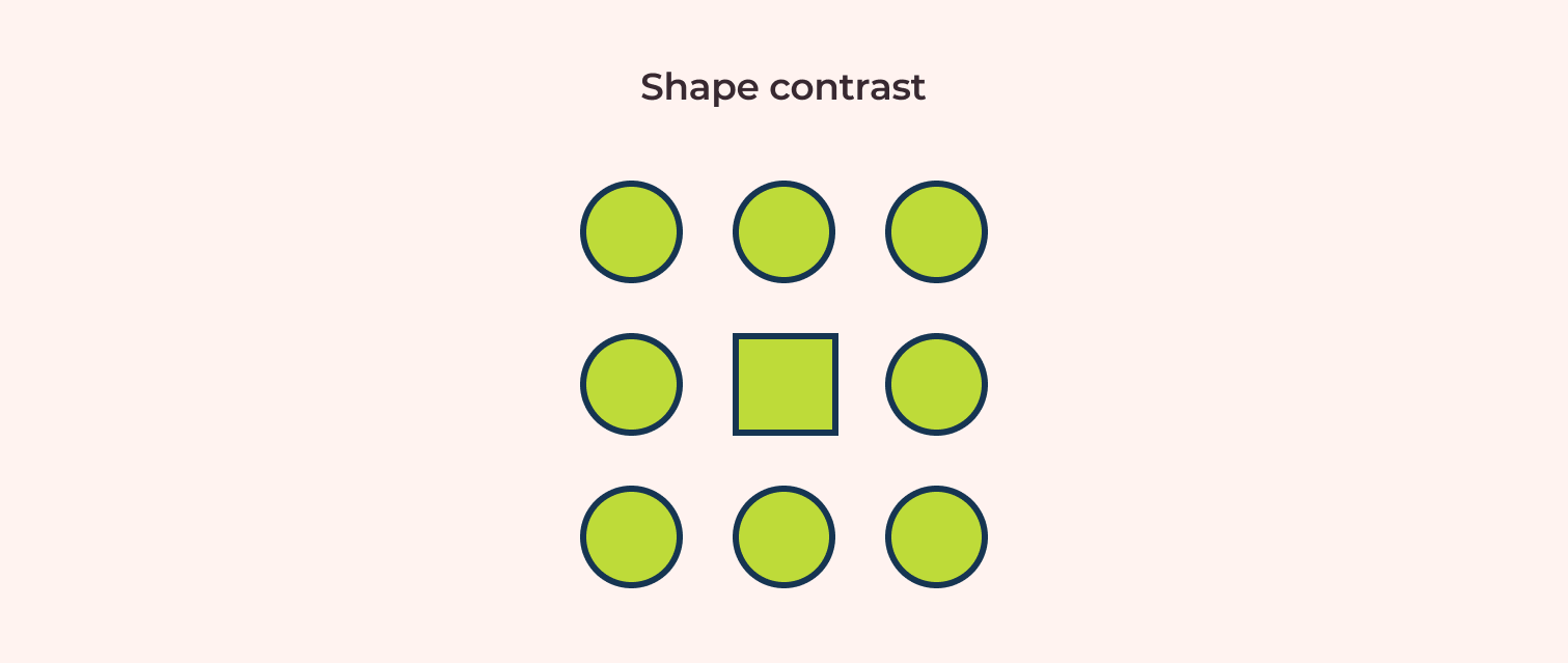
- Shape contrast
Changing the middle circle into a square creates a visual disruption that focuses on that shape.
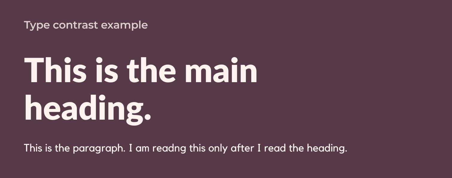
- Type contrast
Let us take a look at a self-explanatory example on the image below:
On the grid’s website uses the contrast between the city landmark image and the blue background to create a dynamic visual.

8. Emphasis
Emphasis is achieved by using basic design principles such as:
- Contrast: We can emphasize an object by contrasting it with other objects around it.
- Scale: Objects with a bigger size in relation to other objects will be more emphasized.
- White Space: Large negative space around an object tends to highlight it.
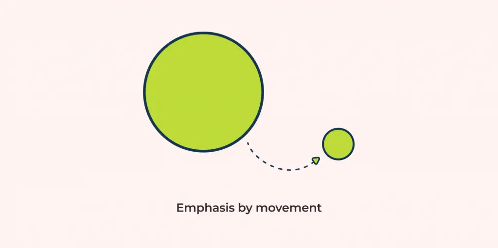
- Movement: The idea behind emphasis by movement is that even though we are immediately drawn to the bigger circle below, we then follow the arrow to the smaller circle.
Dollar shave club emphasizes a product using the scale, white space, and contrast principles.

9. Hierarchy
Hierarchy is the process of arranging elements in a composition so that it conveys information to the user in a simple manner.
While working with visual hierarchy, we not only consider the order of importance but also influence people by using the following basic design principles:
- Proportion: making elements larger than others to draw attention
- Contrast: Separation between subjects using colors or values to make an object stand out
- White space: sufficient space around an element tends to focus on the isolated element.
Nifty’s website uses hierarchy by proportion and contrast to direct the users on what to read next.

10. Variety
Variety means adding a change to disrupt the monotony of a composition.
Variety creates visual interest in a design.
Variety in design can be achieved through:
- Repetition and rhythm
- Shape and scale
- Color/Hue
- Type
- Textures
Medium uses variety in its layout to create a categorization between the type of articles.

For a deeper insight into variety, read my article on how to use variety in design.
11. Unity
Unity in design means creating a sense of visual similarity between different elements in a composition.
Unity is best applied to create consistency in design.
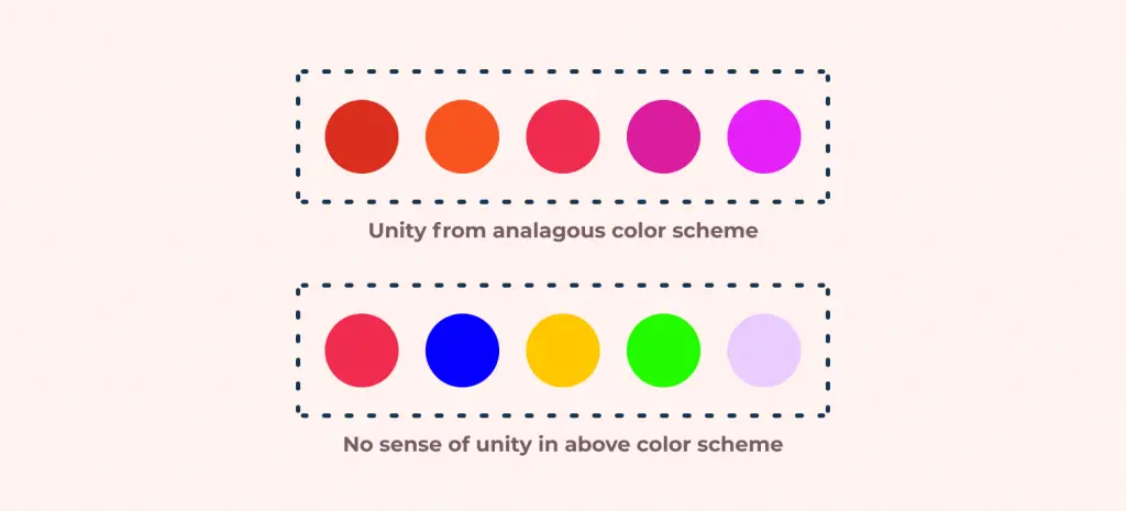
Let’s say we want to decide on our brand colors for a new project. Rather than choosing random colors, we might want to use an analogous color scheme that will provide a sense of consistency and unity in the final design.
Using dramatically different visual elements can be a bit jarring to the viewers. They might get confused about what the design is trying to convey.
If composed properly, designs with drastically different elements can be highly effective to convey certain messages. To create unity in a design, each element is created to support the other.
We can use different design principles to achieve unity in design:
- Repetition: Repeating similar components will make it look related to each other.
- Balance and alignment: Design with balanced visual weight on either side of the imaginary axis will make it related to each other.
- Proximity: Elements that are closer to each other are most likely to be perceived as elements with common properties. Explore more on this with the article “Gestalt’s design principles: Proximity”.
- Contrast: Contrast can be used in interesting ways to add more dynamics to a unified design.
Ugmonk’s homepage has an image of t-shirts on a wardrobe. The background and all other supporting elements create a sense of unison as if it really is a real-world wardrobe.

My reading recommendations

If you are looking to learn beyond the basics principles of design, my go-to book recommendation is “Universal Principles of Design” by William Lidwell Kr. As the title of the book, many of the design principles are covered in detail here. I believe the best explanation is the one with lots of examples. Luckily, this book gives practical examples for each of the topics covered. I love this book because the author also includes useful insights related to designer/user biases, design theories, and more.
Find it here: Amazon

“Visual Grammar” by Christian Leborg acts more like a pocket guide to the design principles. The book explains each of its topics visually and does not contain a lot of text. I recommend this book because it contains some of the more interesting visual concepts not covered in this article.
Find it here: Amazon
Final words and additional reading resources
These are the 11 principles of design and art. Like all universal principles, these are our basic guides for creating a visually pleasing composition. However, these are not concrete rules on how to compose any design. As they say: “Master the basics before you break them”. I believe that having a solid foundation is an absolute must before we explore more creative aspects.
The next step for learning more about design foundations would be to look up “The 7 Elements of Design“. Many people get confused between the Principles of design vs Elements of design. However, these are completely different terms.
For design principles based on how the human brain works, read up on the “7 Gestalt principles of design“.
One final word, if you want a different take on design philosophy, I suggest you take a look at the Wabi-sabi design principle which encourages us to find beauty in imperfections.
![Balance Principle of Design [Infographics Included]](https://ux360.design/wp-content/uploads/2022/01/balance-768x350.png)
![Unity Principle of Design [Infographics Included]](https://ux360.design/wp-content/uploads/2021/12/banner_unity-principles-of-design-768x350.png)