Gestalt Principle: Symmetry (How we bring balance to Compositions)
What is symmetry?
Symmetry is one of the Gestalt Principles. It is a visual property in which elements are made up of equivalent parts to resemble proportion and balance.
A common example would be how human faces have two equivalent elements like eyes, ears, hands, and legs that create a balance forming symmetry.

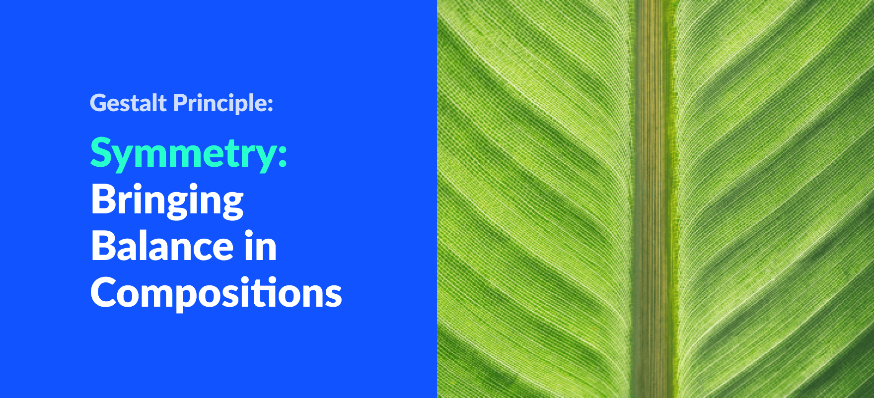
Similarly, we can find more examples of symmetry in nature. For example, take a look at this leaf with its veins being symmetrical on both sides of the axis. Here the axis is the leaf stem.
In the image below, we can see how photographers compose their photos using symmetry to create an interesting visual.

For this article, I want to focus on symmetry design principle implementations on modern user interfaces. However, we will also be looking at asymmetry and balance principles in-depth.
When is a composition symmetrical?
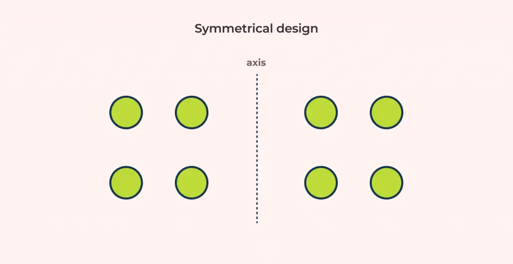
Let’s put an imaginary vertical axis in our composition called an axis. We can say that this composition is symmetrical when objects on both sides of the axis have the same arrangement.
In the image below, the middle dotted line is the axis and circles on both sides of the axis are in symmetry.
Making an Composition Asymmetrical
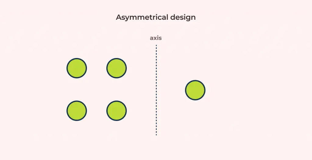
Now, let’s remove 3 circles from the right side of the axis so that there is only one circle remaining. Since both weight and arrangement are not identical, the layout is said to be asymmetric.
How to bring balance to our designs?
A composition is balanced when all objects in it have visual equilibrium.
Before we go into detail with the principle of balance, we have to understand the concept of visual weight first.
So what is visual weight?
The concept of visual weight states that every element in a composition has a perceived weight. The weight is more apparent when an element is compared to another and one seems to be heavier than the other.
When we compose our designs such that the design elements & its visual weights are equal on both sides of the axis, then we achieve symmetrical balance.
We can also bring balance to asymmetrical designs as well. In the image below, we scaled the right circle of our asymmetry diagram.
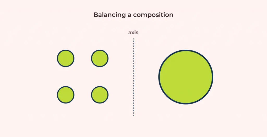
While there is only one circle on the right side of the axis and four on the other, the visual weight of the larger circle balances the design. Hence, asymmetrical balance is achieved by targeting visual weight equilibrium on both sides of the axis.
Let’s take a quick look at types of symmetry before we move on with more examples.
Types of Symmetry
Here is a quick visual representation for the types of symmetry:
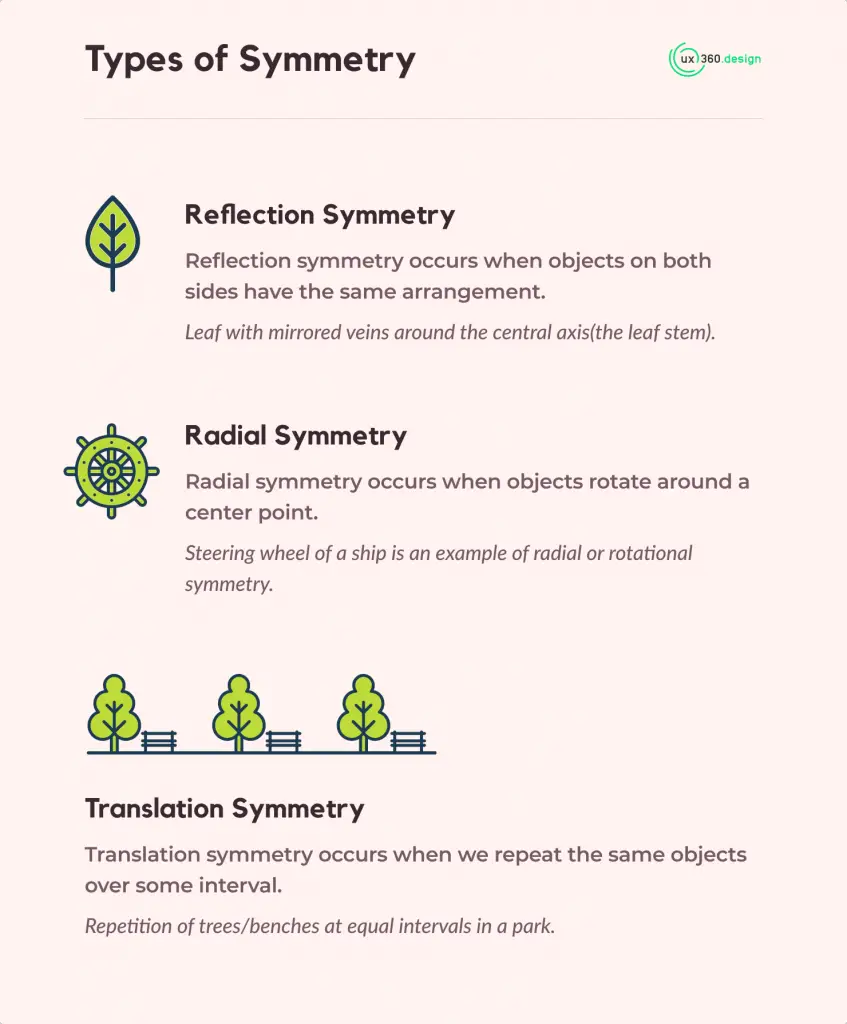
Reflection symmetry
Reflection symmetry occurs when objects on both sides have the same arrangement.
For example, Leaf with mirrored veins around the central axis(the stem). This is the most common type of symmetry most compositions are associated with. The human faces and building symmetry we previously discussed are also examples of reflection symmetry.
Radial symmetry
Radial symmetry occurs when objects rotate around a center point.
Any angle of rotation is fine taking into account that the center of rotation is common for all elements. For example, the steering wheel of a ship is an example of radial or rotational symmetry.
Translation symmetry
Translation symmetry occurs when we repeat the same objects over some interval.
For example, repetition of trees/benches at equal intervals in a park. This concept is more aligned with the concept of repetition and rhythm.
Symmetry Examples in User Interfaces
Let’s look at symmetry examples implemented on modern web and app designs.
Gucci’s website is an excellent example of symmetric balance on websites. We can notice how the elements need not be the exact same across a central axis to achieve symmetry.
Here is one more example of reflection symmetry utilized by City Dog website. In the image below, we can see how the whole homepage is symmetrical on both sides of the center axis. Even the headings and the paragraphs are center-aligned. This is how alignment is used to achieve symmetry.

Now, let’s look at a different approach: balance by asymmetrical design. 15finches’s hero banner is asymmetrical over a center axis. But the texts on the left have been balanced by the bird image on the right.

The banner also uses a clever implementation of white space to bring about balance. Notice how the pink background on the right is a bigger than the white background on the left.
Even though the bird image is small compared to the weight of the texts, the background brings equilibrium by adding more weight to the right side.
Symmetry Examples for Mobile Interfaces
For mobile interfaces, I want to share how I implemented them on my projects. Let’s look at the gift app concept I created a while ago. Here you can see how I arranged products in a grid layout.

For this type of e-commerce interface, I prefer grid layouts. This makes sure that the design looks symmetrical while also giving the product images some highlight.
Symmetry implementation like this can also pave the way for a simple design where users can memorize our elements in grids. We must always try to achieve interfaces that are easy to remember so that users can recognition and recall.
Now for the same design, if you look at the featured today section, the card layout is asymmetrical. But, the balance is brought in by using the watch to counter the weight of the left-side texts.
I want to share one more design from my personal vault: a reading app for children. This one is a bit unconventional design concerning alignment. As you can see in the image below, the first screen has the cover image aligned to the left and the book description to the right.

We can look at the design for the first screen this way: the imaginary line is drawn horizontally rather than vertically. The top-element(the book cover) and the bottom element(“Read Now” button) are always static on the viewport size. The only dynamic content is the description which can be scrolled. So, this gives me the freedom to aim for an unconventional design with unique alignments.
Wrapping Up
Summarizing the whole article into few important points, we now know that:
- Symmetry as a principle is used to bring about balance in any compositions. However, balance can also be brought to asymmetrical designs by using visual weight.
- There are three types of symmetry: Reflection, Radial, and Translation.
- Symmetry creates a base for good visuals. Humans tend to associate something not being aesthetically pleasing if a composition is not symmetrical.
- It is easier to recognize symmetrical forms.
If you are looking to further your knowledge on Gestalt principles, I would suggest reading up on following articles:
I would also recommend reading up on the alignment principle and principles of design to sharpen your design foundations.


![Unity Principle of Design [Infographics Included]](https://ux360.design/wp-content/uploads/2021/12/banner_unity-principles-of-design-768x350.png)
