

ux360.design Principles of design
Name Date
Proportion
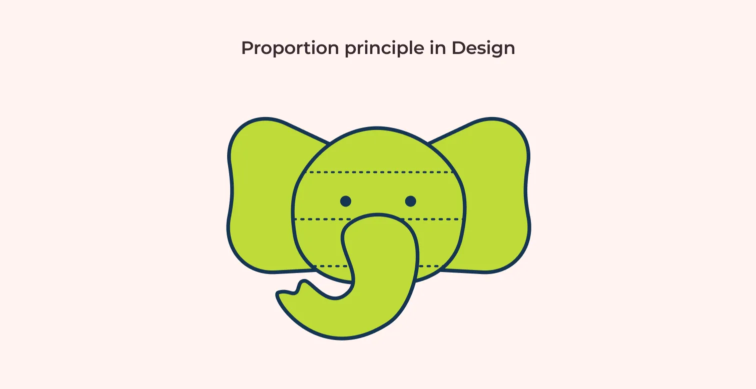
Proportion is how the sizes of things in a design compare to each other. Bigger or heavier things look more important.
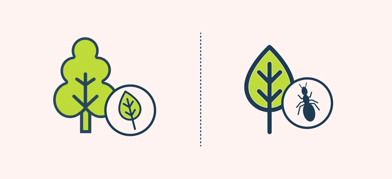
Two ways to judge it
Try it
Draw a cup on a table. Then draw it again, but change one size so it looks wrong.
How did you know the second one looks wrong? Was it context or relationship?
Read the full lesson: ux360.design/proportion-design/
ux360.design Proportion
Name
Check yourself
Circle one answer for each question.
-
1What does proportion compare?
- The colors of things in a design
- The sizes of things in a design
- How many things are in a design
-
2On a poster, the title is three times bigger than the other text. What does that tell the reader?
- The title matters most
- The title was added last
- The other text has a mistake
-
3A drawing shows an elephant with a tiny trunk. How do you know it looks wrong?
- You compare it with what a real elephant looks like
- You count how many legs it has
- You check what color it is
-
4One artist draws a leaf small next to a tree. Another draws the same leaf big next to an ant. Who is right?
- Only the first artist
- Only the second artist
- Both, because size depends on what is next to it
-
5When can breaking proportion on purpose help a design?
- Never, because it always looks like a mistake
- When you want one thing to stand out and make a point
- Only when the design has no words
Want to check online? The same questions are at the end of ux360.design/proportion-design/
ux360.design Proportion
For the teacher
Answer key
- 1B. The sizes of things in a design. Proportion is about size and visual weight: how big one thing is next to another.
- 2A. The title matters most. Bigger reads as more important, so size tells people where to look first.
- 3A. You compare it with what a real elephant looks like. That is proportion judged by context: you compare the drawing with what you expect.
- 4C. Both, because size depends on what is next to it. That is proportion judged by relationship. The same leaf can be small or big, depending on its neighbor.
- 5B. When you want one thing to stand out and make a point. Something out of proportion grabs attention. Done on purpose, it makes a statement.
In class, about 20 minutes: read the lesson, do page 1, then page 2.
More free handouts: ux360.design/teachers/