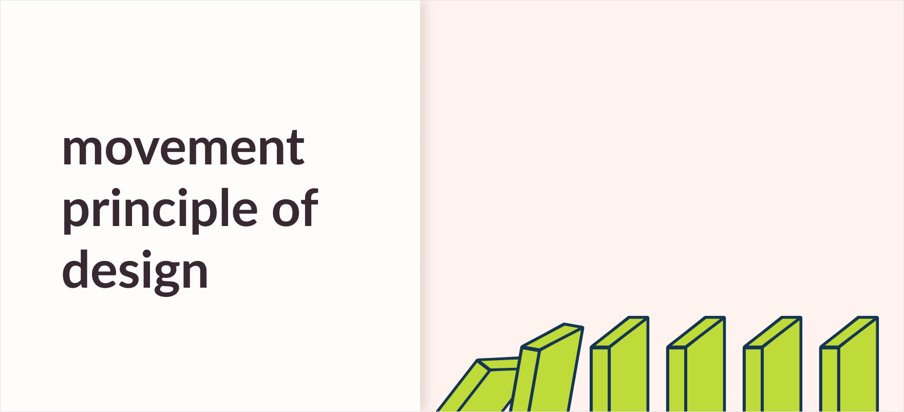
Movement Principle of Design
What is the Movement principle of design? Movement means guiding the user’s eye to a predetermined path in a composition.
When a viewer views a design they are first attracted to the focal points of the design. By careful placement of these focal points, designers can easily guide the viewer through the design. This is called Movement in design.
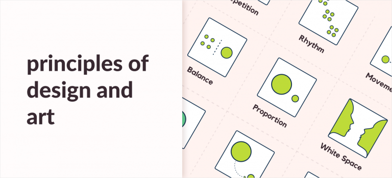
Movement might sound daunting at first but don’t worry in this article we will learn all about it one step at a time. You can also take a look at our previous article on the other principles of design for an even better insight.
Movement in design can be used in interesting ways such as the position of a subject that can suggest how other external forces can influence to move it.
Also, the same position of a subject can also suggest how these forces have influenced its movement before it reached that position.
What is an example of movement in design?
Anima graff’s “How a car engine works” uses movement and motion to explain the various steps on how an engine actually works.
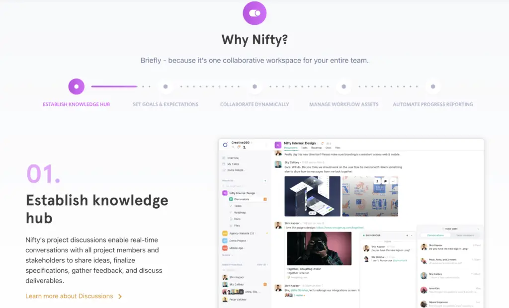
Nifty’s website is another example you can look at to understand movement better. Here, hierarchy by proportion and contrast is used to direct the users on what to read next. In the image below, you first look at the header, then the image, and finally the text.
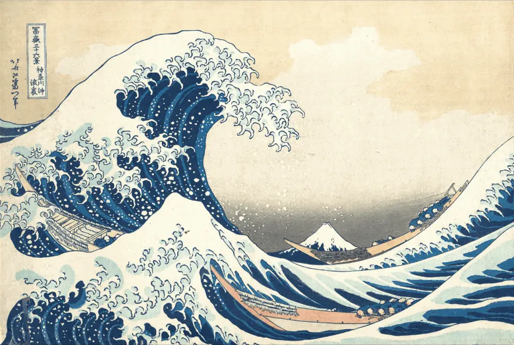
The Great Wave off Kanagawa by Hokusai perfectly shows how you can use movement to change your image from static to dynamic.
How do you show movement in design?
Now you know what movement is, the next challenge is applying it in your design.
In your composition, you can incorporate movement through the use of various attributes. These attributes direct the viewer towards the targeted points in the design.
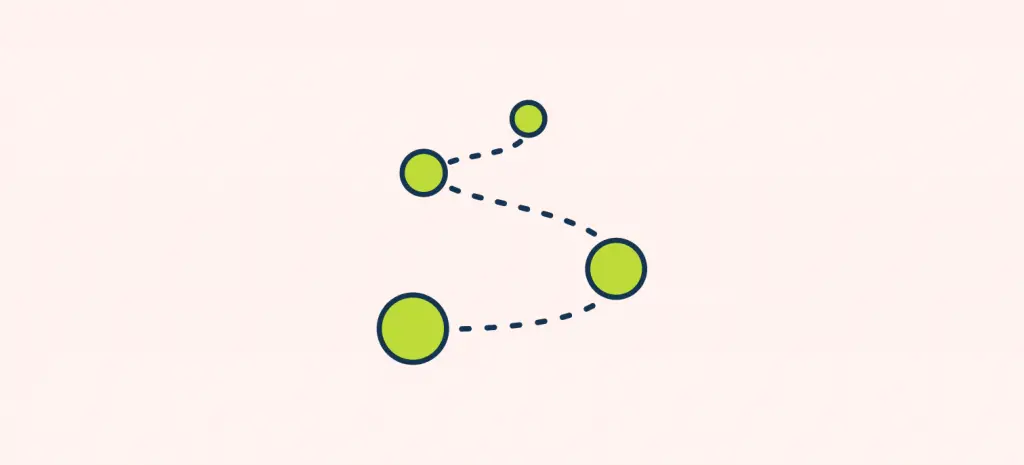
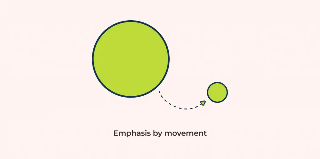
For example, in the image down below you look at the bigger circle first because of its contrasting size. Next, your eyes follow the arrow towards the smaller circle. Notice how the arrow directs your view in the composition. Here, by using the arrow we have successfully added movement to the design.
Similar to arrows, we can use other various attributes to integrate movement into our design. Let’s take a look at what these attributes are:
But how do you apply each of them? Keep reading to find out!
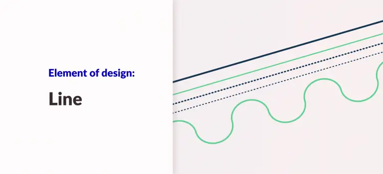
Lines for Movement
You will be surprised by how much of an impact two connected points can have on shifting your navigation. In design, lines are one of the most versatile elements of design.
You can use lines to not just break sections, but also use it to add movement to your design.
Let’s take a look at an example to understand it better;
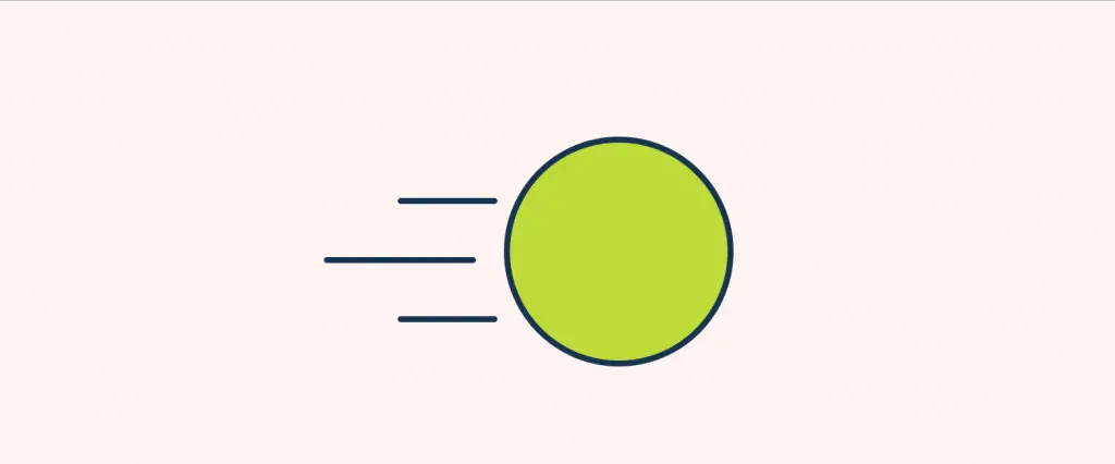
Here, if it weren’t for the lines the image would just be a circle instead of a ball moving to the right.
Rhythm for Movement
When a frequency is repeated across varying distances it is called a rhythm. When the same thing is repeated after certain intervals, viewers have an idea of what to expect next.
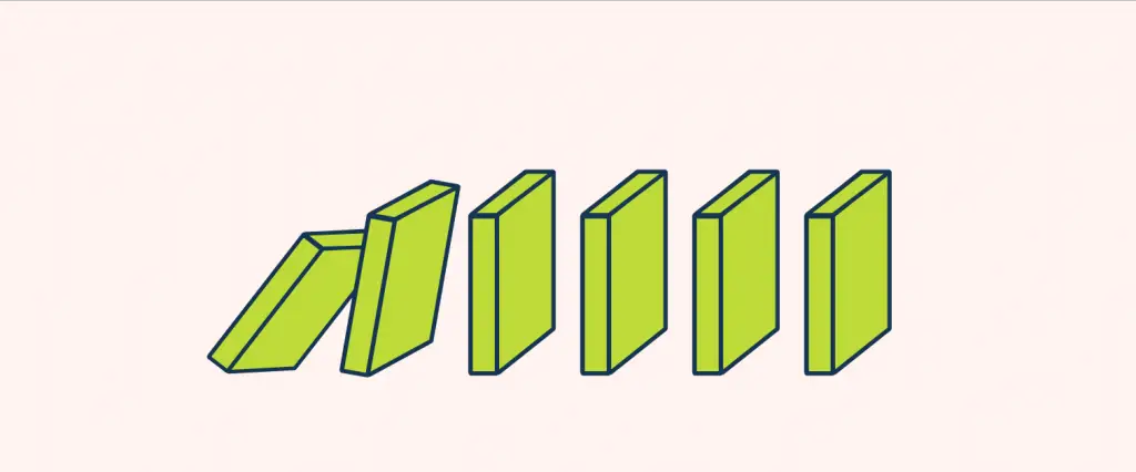
Similar to falling dominoes, let’s say. When a sequence of dominoes falls over your eyes will follow it to see where the final domino ends. Although you know what the next fall is going to be, you still follow it.
When a pattern is repeated in a particular direction the human eye follows that direction. This creates movement.
Hierarchy for Movement
Hierarchy is the process of arranging elements in a composition so that it conveys information to the user in a simple manner.
A good hierarchy directs the viewers on what to look at on a page.
By arranging the layout in a clear visual hierarchy you can define the order of importance and guide users to desired actions.
Down below you are directed from the top of the page to the bottom of the page. This is because of the visual hierarchy in the design.
Alignment for Movement
In design, the alignment principle states that multiple objects are said to be aligned when they are placed such that their left or right edges, or center-lines line up on a common position.
Human eyes tend to scan a layout from left to right which is why we can stick elements to the left of the y-axis to make it convenient for the user to scan the page.
So you see, through alignment, we can guide the user’s vision and apply the movement principle.
Here, on the left-side, you scan the text from left to right. Whereas on the right side although you scan it from left to right as well, notice how challenging it becomes?

For a deeper insight on Alignment, I suggest you check out my article Alignment Principle in Design: Importance & Examples.
Why is movement an important principle of design?
Is it that important to follow the movement principle of design? Yes! Absolutely!
Movement is what makes static designs dynamic. It is what avoids the viewers from getting lost in your design.
Movement is important because of the following reasons:
- Guides the viewers and lets them know what to look at next.
- Brings attention to focal points.
- Makes design dynamic.
Final Words
To sum everything up Movement is basically what guides the viewer through your design. In this article you learned:
- What Movement is? -Movement means guiding the user’s eye to a predetermined path in a composition.
- How can you achieve Movement in design? – With the use of lines, color, rhythm, hierarchy, and alignment you can apply movement principles in your design.
- Why is Movement important? – Movement guides users through your design while making it aesthetically pleasing and highlighting focal points.
If you’d like to learn more about the other principles of design like movement you can check out my article on the core concepts of the 11 elements of principles of design here: The 11 Principles of Design and Art [Infographics Included] (ux360.design)
![Balance Principle of Design [Infographics Included]](https://ux360.design/wp-content/uploads/2022/01/balance-768x350.png)