How I redesigned my company website in 2 hours and you can too.
A couple of weeks ago, my company, Parewa Labs, released a new look for our website. The website portrays our journey into being a values-oriented product company and perfectly embodies what we stand for as a company – a company that strives for perfection.

You’d agree when I say, a website is the modern-day storefront of a company.
Similar to a physical storefront, this is the first point of contact for the customers. It has the power to make or break a company’s good name and reputation.
An amateur looking website can push off potential customers while a professional-looking website can attract and convert new customers.
The important question is how do you design a professional-looking website?
In this article, I will share with you details on how I re-designed my company’s website into a professional-looking website in 2 hours and you can too. I will show you all the steps I took and the tools I used to accomplish the task in hand.
I will also share with you some helpful tips along the way to keep this as informative as possible.
The back story
Before I jump into the how, let’s start with the why.
As the first block of text reads, my company recently pushed out a new look for the company and I was responsible for the redesign.
I joined Parewa Labs as a lead designer and UI/UX specialist in the month of June when the company was trying to expand into the global market. My role was to push the brand globally.
This was a huge undertaking and I got to work immediately. My first priority in establishing a brand was to create a brand identity for the company’s star product: Programiz.

While working on the branding of the product, we found a set of values, vision and an overall identity that we could connect to, but something always kept bugging me.
Though our sole focus was to push Programiz iteratively faster each week, our chance to showcase our values and vision on the company website were pushed aside and the website, in itself, became a major eye-sore for me.
As a designer, I just couldn’t let the old website be. So, when our lead developer joined in the party, I came up with a hackathon plan to deploy a newly rebranded website in a single day.
As for me, I set a deadline for myself: 2 hours. You heard it right, ideate, create and deliver the final mockup in 2 hours.
Next began the actual task.
Tools for the Project
Here are the tools I used for this task.
Figma
I use Figma for everything: wireframing, creating mockups, prototyping, developer handoff, and presentation.

It is great for collaborative work and building a design system is a treat.
I suggest you use whatever is available with you. Figma is my personal choice but if you want to know the best UX tools you can read my article here.
Frankly, every modern UX tool is good enough. As they say, a bad workman always blames his tools. For those who are starting out, Figma maybe a good choice.
HTML Prototyping
For HTML prototyping, I use my own open-source SASS framework, Sass-Starter, to create initial design handoffs. This speeds up my prototyping process. Though our lead developer was the one who used this for this project, I just wanted to include it here. (Shameless plug 😅)

Pen and Paper
Even though there are vast many tools available, initially, I still prefer the old school way of working with a pen and paper. In the project, I used pen and paper for wireframing.
My Process
Okay, so the timer was set to 2 hours. For simplicity’s sake, I will divide the process into two hours, each divided into individual tasks I did.
Hour 1 – Setting a clear goal for myself (10 minutes)
First things first, I didn’t have a huge time budget, so I needed to declutter my process. Meaning things needed to go.
It is always a good rule to start off by listing what is not necessary for a project. This removes all the unnecessary distractions and keeps you focused on the task at hand.
So, I took a paper and added the things below that I could not invest my time on:
- No requirement documents
- No fancy UI flows
- No detailed wireframes
- No tablet designs
Though I usually have a set of defined UI and UX processes that I follow, in this case, I could do without some steps. So, instead of creating UI flows and detailed wireframes, I went back to the traditional way of doing things and honestly my most preferred way, pen, and paper.
Likewise, since more than 90% of our users are either on mobile or desktop, I skipped the tablet design altogether.
Without distractions out of the way. Next, I laid out the things I had to achieve:
- Layout? Single page landing
- Contents? Focus on products and visible contact details.
- Message and copy? Reflects our vision
- Design? A balance between aesthetics and functionality.
- Target audience? Male and female aged zero and up living anywhere in the vicinity of this world. Meaning, everyone. Accessibility is important.
Though this is far from a proper requirement document, this did the job for me.
In the end, my goal read:
Create a single landing page that reflects our vision and focuses on our core products while maintaining a balance between aesthetics and functionality for mobile and desktop users.
Tip: Try creating a single sentence for your goal as well, like the one above. It not only makes your goal feel tangible but also makes it easier to explain to others.
Hour 1 – Taking a look back at the old relic (10 minutes)
Now that I had a decent goal in mind, instead of getting straight into the redesign, I went back to assessing the old website.

Doing this meant I would be more clear of my do’s and don’ts and maybe get some inspiration as well. So, I started to dissect the website apart.
Looking at the hero banner first, I couldn’t help but remember a funny incident we had. Once, a person called our office to ask if he could buy some pigeons 😲. The person thought since our company’s name was “Parewa”, which means pigeon in Nepali, we bred pigeons 😂. When asked how the hell did he mistake us for the pigeon farm, he innocently told us that’s the impression he got from our website.
Now that I look at the hero banner itself, the problem is clear to see. We can see a logo in the hero banner with no context what-so-ever.
Even looking at the rest of the content, you could not easily read the text with the selected font and the only impression one would get is of a service-based company. So, the person must have jelled Parewa and service together to form a Parewa farm.

Story aside, this is what I gathered:
- The website’s above-the-fold experience was very poor and gave no context on what we were at all.
- We still showed the service side of the company which we had long left.
- The fonts were not readable enough.
- Though the overall design looked clean, it was more suited to 2014 with all its neat CSS tricks and fancy animations.
It was time for a fresh coat of paint.
Hour 1 – Looking forward to the new (10 minutes)
Now that I was well equipped with the do’s and don’ts (more don’ts obviously), I had a clear vision for what the landing page should include:
- An interesting banner image which told people what we were about, unlike the old website
- Products showcase which replaced our services with a focus on our star products.
- Contact details
For this, my initial choice for a single page layout was perfect. It’s direct, informative and achievable. We start from a single page and we can always scale later.
For the design, I chose to go minimalistic.
Personally, I have always preferred a minimalistic design to others. Throughout my career, even though I became well-versed with various design styles, I always felt inclined towards a minimalistic one.
A minimalistic design gives me a sense of completion, a whole. It gives me the freedom to minimize distractions while prioritizing what’s important to us and, most importantly, for the users.
Besides, considering the brand values we wanted to establish, this was an easy decision for me.
Hour 1 – Detailing (15 minutes)
Even though I had outlined a vision for the landing page, I had no idea what the end product would look like.
So, I started detailing the vision, and a pen-and-paper was more than sufficient for this.
Following is the refined list I came up with:
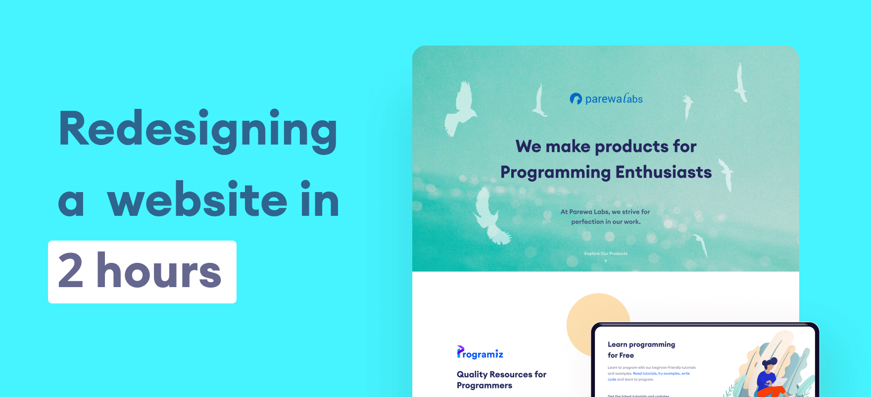
A creative header image for a good first impression: First impression is everything so I needed to be careful with this one.
A bold sentence – succinctly describing Parewa Labs – would take the center stage. Another sentence as a caption text would provide more context.
The actual texts:
We make products for Programming Enthusiasts
At Parewa Labs, we strive for perfection in our work.
Feature Products: We are a product-based company. So, we needed to focus on our feature products.
Programiz is our star product, so it got the first priority. Our other products included (in priority):
Standard Footer: A standard footer with a contact form, contact information, and copyright information would do.
Design Scalability: I had to think about how scalable the design should be so that we can add more products in the future.
For Grid Layout: A basic 12 grid bootstrap layout would make the design and development a lot easier.
Fonts and Typography / Color and branding / Logo: Since we had already created a brand identity for Programiz, we used the same font, typography, and colors to have a consistent design language.

Also, we love the current logo for Parewalabs, so I would use the same.
With this completed, I could now work on the actual mockup design.
Hour 1 & Hour 2 – Selecting a Hero Banner Image Part I (30 minutes)
Moving on to the actual designing of the page, I wasted 30 minutes (15 minutes from each hour) looking for the perfect hero banner image. All I could finish in this first half was the banner 😞.
But I had no time to panic. From my experience, I know that panicking has never helped me. In fact, it has always made things worse. Hence, I needed to improvise, adapt, and to overcome this initial setback.
I settled for an underwater shot and got some Freepik images of flying pigeons. The bright side of this one-hour investment was that I got a nice story to it by accident. One could say that the pigeons flying underwater is a visual metaphor for overcoming hardships, even in the direst of situations.

Tip: I get all my free stock photos and videos from Pexels and Unsplash. For artworks, I use Freepik and Undraw.
Hour 2 – Feature Project Section (20 minutes)
I needed to allocate time for the rest of the outline. So, for the feature project section, I went with the standard left and right section, with the focus product image on the right and a short detail copy on the left.
I usually like to have sufficient white space between visual contents. This gives the content some breathing space and creates a focus on what’s important.
Tip: Always use an 8-point grid as a handy guide for fast workflow if you want to create appropriate spacing between design elements.
For the copy, I went with a text that detailed the main features of the product. The main thing here was not to make it sound like a sales pitch; rather, it was to show our pride in having created them.

Our aim is to be dignified and proud craftsmen of digital products, with our products displayed as badges of honor.
I adopted a similar approach for our Learn Python App, but swapped the placement of the image and text. A visual language was coming to fruition as I moved along, and my design pace started accelerating.

Hour 2 – Housing remaining products and footer (20 minutes)
Next came, Online compiler and Datamentor. I wanted to house our individual product sections in a grid form. Since there were only two more products we wanted to showcase, I had it on a two-column layout.

This layout gives me the flexibility to add more products as they get made later on. Let’s say if we scale and have 10 more products, I could just show a 2×2 grid and add a “View all products” button at the end.

I then wrapped up everything with a basic footer. I just breezed through this one with a basic contact form and contact info design.

Unfortunately, the contact form didn’t make it to the production release 😔.

Last 5 minutes and mobile designs
I still had 5 minutes to go but honestly, the two-hour plan had failed. This is because even though I finished the desktop view, I couldn’t manage the mobile view. That means no mobile-first design as well.
In any case, I gave the designs to the developer and started working on the mobile design parallelly which took roughly another 30 minutes.

Before & After
Here is what the final version looks like compared to the previous design:

The Real Talk
As designers, time won’t always be on our side. It’s tempting to perfect even the tiniest pixels. We don’t want to have any creative barriers.
However, we also need to value everyone else’s time, which means making the best of what we have. This is especially true for startups.
The thing that worked for me was to go back to the basics during these strict time frames. We can’t compromise on the quality – and the basics always work in these situations.
As they say “Master the basics before you break them”. This is very true and while not perfect, I am quite happy with the results (or so I say to console myself knowing we, designers, are never happy with our work).
Key takeaways
- Have a flexible design process. We get stuck in our sprints and design processes so much that we don’t want to look at it any other way. Our design process should always be flexible in accordance with the time and resources we have.
- Sometimes the best course of action is to set a challenge for yourself and try to test your limits. This was a fun exercise for me to see if I could do this or not.
- Always remember design is an iterative process. While you can’t afford to add stuff now, you must have scalability in mind to add them later. So, thinking ahead about a time when the design could evolve and evaluating your design now helps.
![Flora: An Online Flower Shop [Case Study]](https://ux360.design/wp-content/uploads/2022/01/flora-app-case-study-banner-768x350.png)
![Neue: An Online Clothing Store for Blind People [Case Study]](https://ux360.design/wp-content/uploads/2022/01/Neue-clothing-store-case-study-banner-768x350.png)