Gestalt Principle: Continuation (Visual Perception of Continuous Flows & Paths)
Continuation is the Gestalt principle that the eye follows a continuous path, whether a line, a curve or an intersection, until it meets another path. Designers use it to lead attention through a layout, which is why carousels, progress steppers and aligned form fields all read as one connected sequence rather than separate parts.
What is the Gestalt Theory of Continuation?
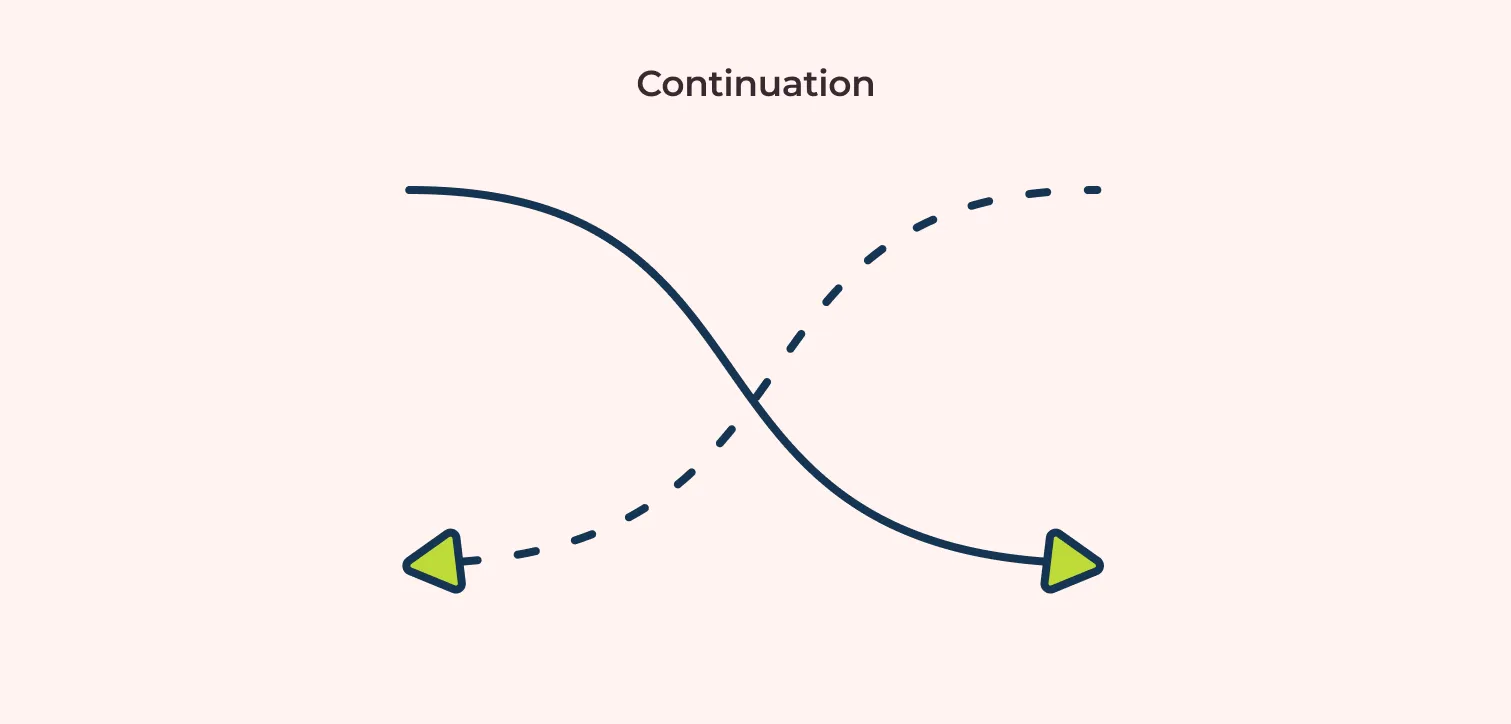
The gestalt principle of continuation is the tendency of the human eye to follow a continuous path be it lines, curves, or intersections until it encounters another path or intersection.
Simply put our eyes follow a continuous path with the least amount of resistance.
Below is an image that depicts how continuation affects us.
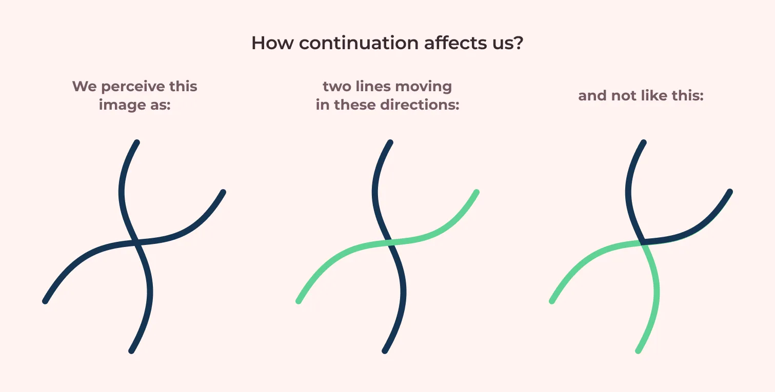
Here, we follow the line that seems to not have any or least resistance. This shows us how we can direct users through continuation.
Similar objects in a line, smooth flow of water like rivers, straight and uninterrupted roads are some of the examples of continuation in the real world.

The Gestalt Principle of Continuation in UX
Continuation lets us, direct users, in using products the way it was intended to. Swiping to view more items, drop-down lists for options, help users interact with the app properly without any instructions.
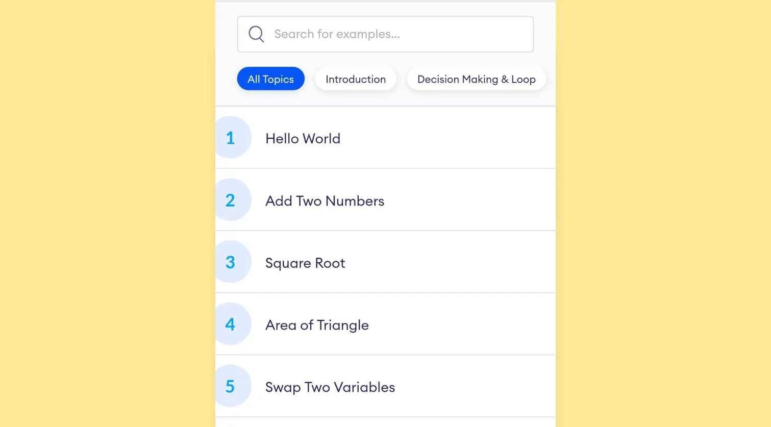
Here is an example of a continuation in a mobile app I worked on: Programiz. The partition of each row directs users to scroll down for further content. Likewise, similar shapes below the search bar suggest swiping horizontally for other topics.
This seamless design guides users without any extra texts. This is how continuation can be implemented in designs.
Properly implementing continuation in designs increases the efficiency of the product. Removing any unnecessary instructions and texts to interact with products will make the products simpler to use. It reduces complexity and provides a clean UI.
This also helps us work around limited spaces. When there is not enough space using continuation makes it easier for users to follow the design. Hiding options behind a menu icon or having a drop-down option for certain tabs allows us to convey to users that there are more options available. Here is an example.
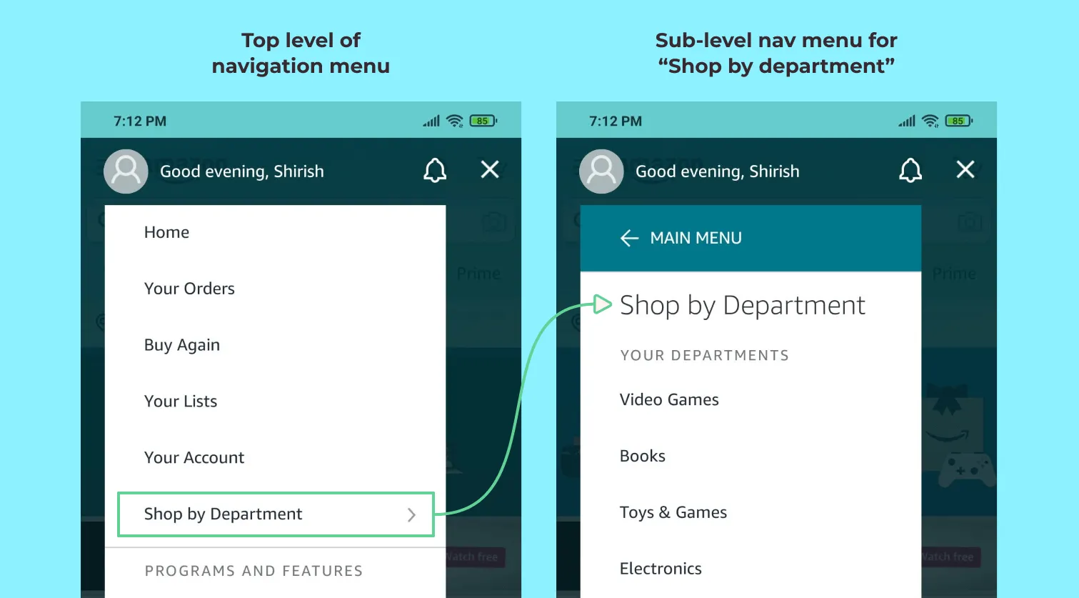
The arrowhead implies that there are more options and then it branches to show secondary options. This way we can work around limited spaces.
How to Implement Continuation in our Projects
Implementation of continuation is relatively easy but there are few things we need to pay attention to.
- The flow of elements: Avoid images or elements that disturb the flow of previous elements.
- Proper visual cues: Proper cues like drop-down and arrowheads assist the user while interacting.
- Alignment: A good alignment not only helps the flow of continuity but also provides a structure for our products.
Summing Up
Continuation is a fairly straightforward, simple principle to understand. Following an uninterrupted flow of lines or designs is what continuation is all about. We often use it without even knowing about it.
Understanding the concept of continuation, however, inspires movement through design and provides a seamless experience for users. It results in an overall better experience for the users.
Further Reading
Frequently asked questions
What is continuation in Gestalt psychology?
Continuation is the tendency of the eye to follow a continuous path, be it a line, curve or intersection, until it meets another path. The eye prefers the route with the least resistance.
What is the law of continuity in Gestalt?
The law of continuity is another name for the same principle. Elements arranged on a line or curve are perceived as more related than elements that are not.
How is continuation used in UX design?
In carousels that cut off an item to show there is more, in progress steppers, and in form fields aligned on one edge so the eye runs down them without stopping.

Written by