Gestalt Principle: Similarity (Associating relatedness from shape, size, color & orientation)
What is the Gestalt principle of Similarity?
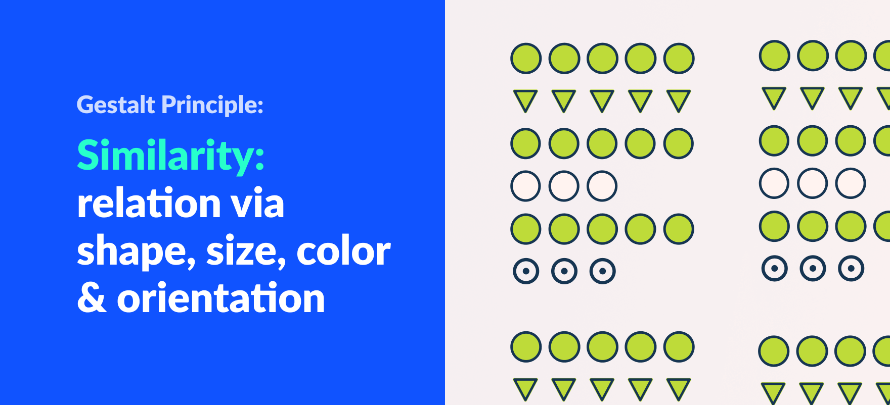
The gestalt principle of similarity states that the human eye tends to link similar elements within a composition. Similarity can be affected by the attributes of color, size, shape, and orientation.
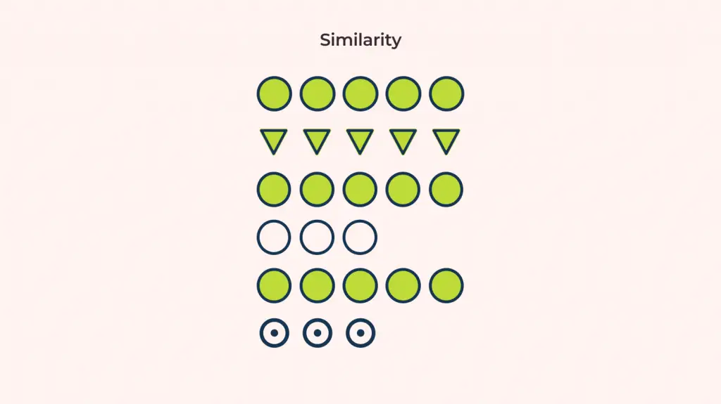
Looking at the image above, we group the circles to be related to each other. There is no real reasoning except for the fact that they are of similar shape or form.
For example, in blog posts, we can differentiate headings, content, and links by how they are designed or formatted. While scanning the post we will start linking the similar elements with big bold fonts as the header, normal fonts as content, and blue colored texts as links.
Another example would be how we psychologically distinguish between government officials or staff from a crowd of people. We link these people to their roles based on the color and shape of the uniforms.
Similarity principle in UI design
We know what similarity is now. So, why do we need to know about it? Here are a few reasons that help us understand how we can use the principle of similarity:
- Organized and clean UI through similarity. If a user is going through our application, we want them to easily scan through our product. Imagine having to scan through an eCommerce site, where the product pricings are all of different shapes and sizes. Having a consistent font size, weight, and color is very important so people can scan through pricing very quickly. This also adds to a cleaner UI and ultimately a better user experience.
- Minimizing the misrepresentation of information. When displaying information, poorly grouping elements results in users interpreting our information the wrong way. Similarity helps us prevent or minimize such problems.
Difference between Similarity & Proximity
It is very easy to get confused between two of the gestalt principles: Similarity vs Proximity. Since both principles state the human perception of relating elements, we tend to mix them up. Now let’s see how they are actually different:
Proximity is the gestalt grouping law that states elements that are close together tend to be perceived as a unified group. So, objects kept far away will not be perceived as a unified group.
Similarity is the gestalt grouping law that states that elements that are similar to each other tend to be perceived as a unified group. So, objects with different orientation or different colors will not be perceived as a unified group.
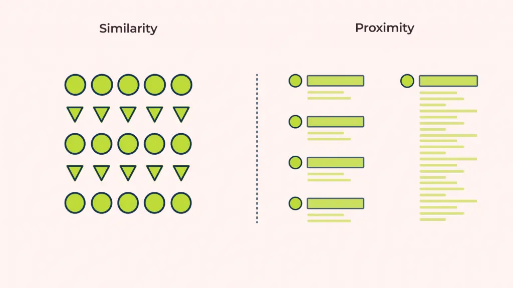
Normally both of these gestalt principles affect us simultaneously and thus we may not really see a difference between them. When designing interfaces, designers use a combination of both proximity and similarity to create a meaningful visual representation of information.

