Nutri App for Automated Nutrition Value[Case Study]
Project Overview
The product: Nutri is a recipe nutrition calculator app developed for a luxury restaurant called Cape’s Banquet located in the tourist area of Cape Town. The app is designed as an alternative for the restaurant’s more expensive and time-consuming subscription service. The app supports multiple import options for existing users who are using other platforms.
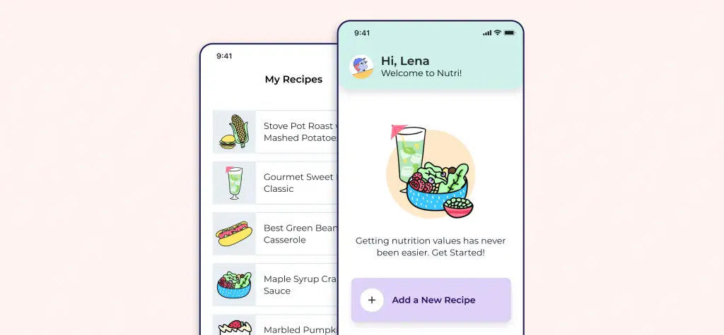
Project duration: June 2021 to December 2021
The problem: Chefs and small restaurants lack the time to calculate the nutrition data of each new + existing recipe.
The goal: Design an app for the Cape’s Banquet Restaurant that allows users to easily add new recipes and get the nutrition data automatically; saving time and money.
My Role: UX designer designing an app for Cape’s Banquet from conception to delivery.
Responsibilities: Conducting interviews, paper, and digital wireframing, low and high-fidelity prototyping, conducting usability studies, accounting for accessibility, and iterating on designs.
User Research: Understanding the user
I conducted interviews and created empathy maps to understand the users I’m
designing for and their needs. A primary user group identified through research
was chefs and restaurant owners who didn’t have enough time to calculate nutrition value.
Every individual who participated in the research had a different method of nutrition calculation and I confirmed that the data varied wildly from one user to another.
Pain Points
- Time: Chefs and cooks are busy preparing meals and nutrition data is never a priority.
- Cost: Platforms for nutrition calculation are unreasonably expensive.
- Learning Curve: Platforms for nutrition calculation usually have a high learning curve.
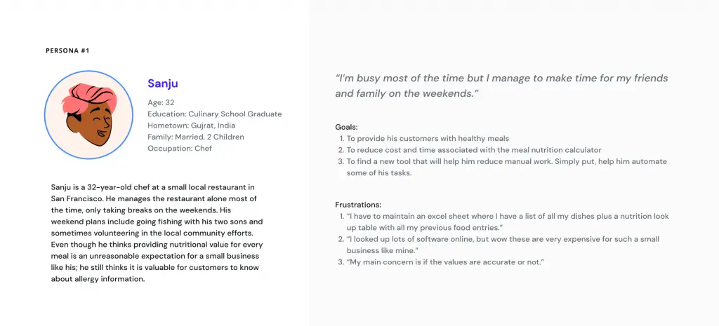
User Persona: Sanju
Problem statement: Sanju is a busy chef who needs a cost-effective nutrition calculator app because he wants to cut significant time and cost on his nutrition data work.
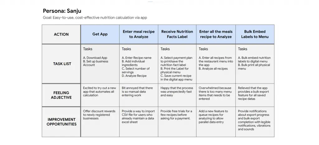
User journey map
Mapping Sanju’s user journey revealed how helpful it would be for
users to have access to a dedicated Cape’s Banquet Nutrition Calculation app.
Starting the Design
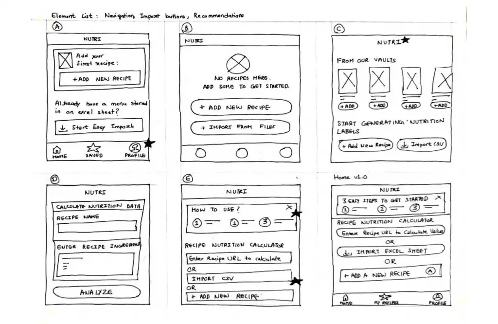
Paper wireframes
Taking the time to draft iterations of each screen of the app on paper ensured that the elements that made it to digital wireframes would be well-suited to address user pain points. For the home screen, I prioritized an easy importing of recipes to help users save time and money.
Digital wireframes
As the initial design phase continued, I made sure to base screen designs on feedback and findings from the user research.
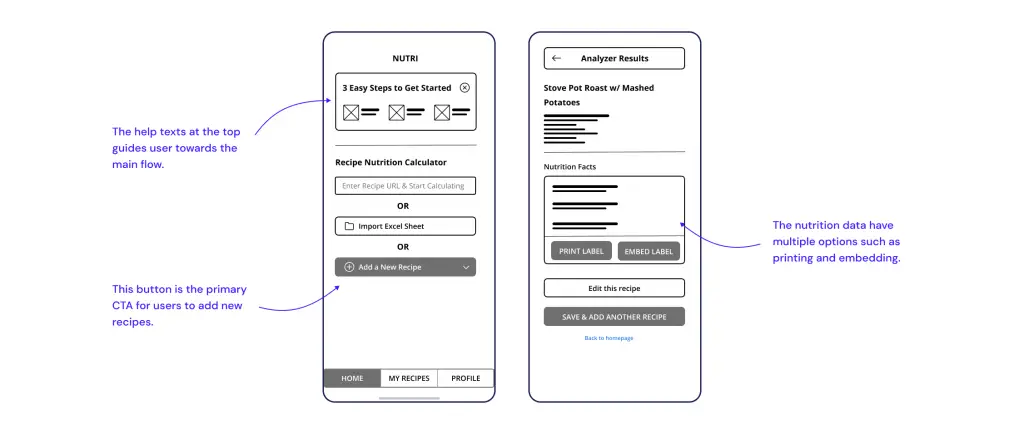
The primary goal is to generate a Nutrition Chart that provides multiple options according to user needs.
Low-fidelity Prototype
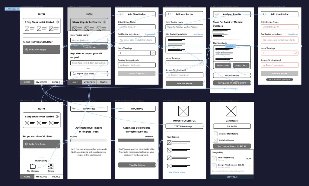
Using the completed set of digital wireframes, I created a low-fidelity prototype. The primary user flow I connected was for the “Adding a New Recipe” manual flow.
View the Nutri app low-fidelity prototype.
Usability study: Findings
I conducted two rounds of usability studies. Findings from the first study helped guide the designs from wireframes to mockups. The second study used a high-fidelity prototype and revealed what aspects of the mockups needed refining.
Round 1 Findings
- Users want a clearer instruction
- Users want bulk import
- Users want automated imports
Round 2 Findings
- There are too many import buttons which gets confusing
- Pricing option is not available for other customers
Refining the Design
Mockups
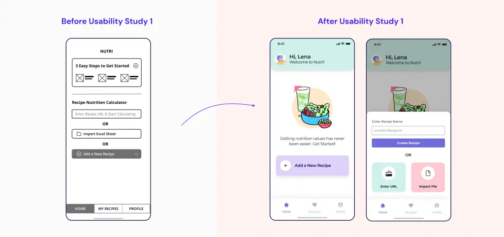
My early designs had a lot of import options thrown at the user. After the usability study, they seemed to be a bit confused so I added a single import button and made the design more contextual.
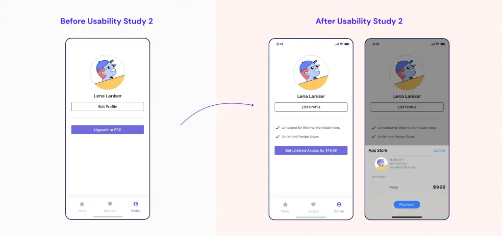
After the second round of usability studies, I noticed user concerns with vague pricing. To improve on this, I added more contextual buttons and added more descriptions to the paid tier.
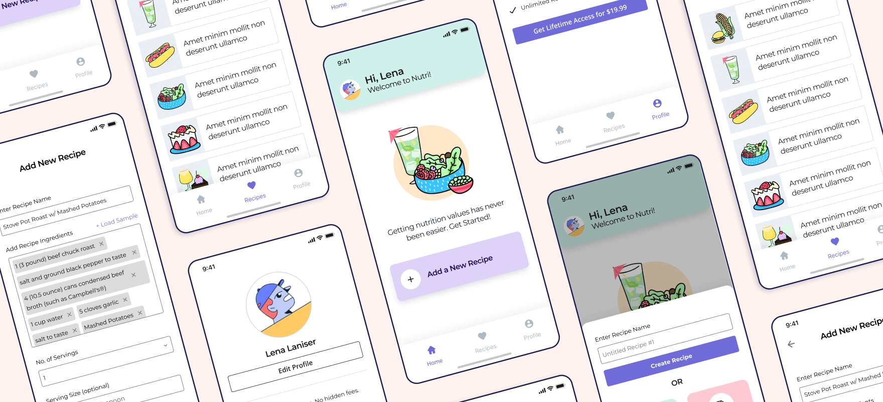
Here is how my final design looks like:
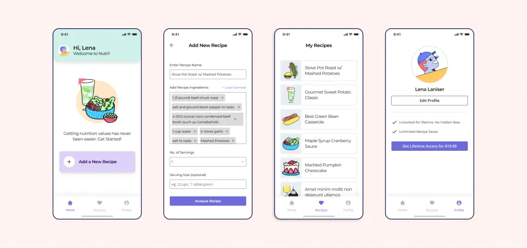
High-fidelity prototype
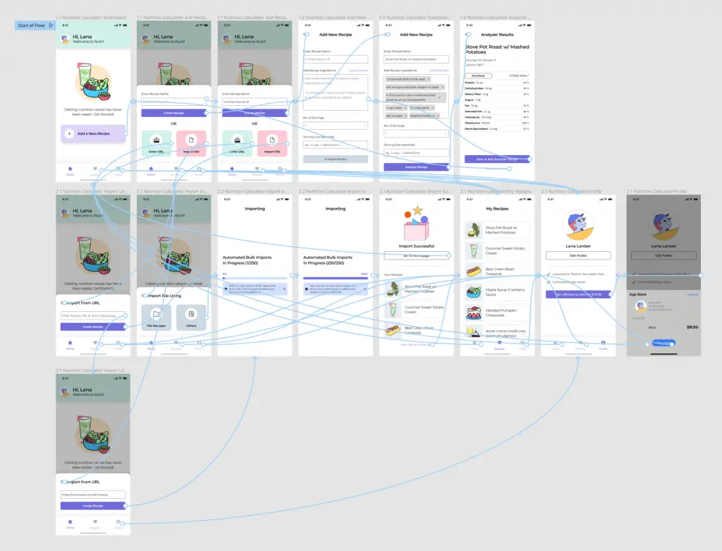
View the Figma Link for hi-fi Prototype
Accessibility considerations
1
Used appropriate contrast and tested colors so that color-blind users can easily differentiate the UI elements.
2
Used detailed instruction text and typography hierarchy to help all users better understand the design.
3
Used icons to
help make
navigation easier.
Going forward: Takeaways & Next steps
Impact:
The app saves time and cost by automating nutrition data calculation.
“I had to maintain an excel sheet to calculate all those nutrition datas just so I could save some money. I wouldn’t mind paying a small fee for this app since this solves all my concerns.”
Quote from peer feedback
What I Learned:
While designing the Nutri app, I learned that there are some biases I needed to overcome to make design inclusive. Usability studies and peer feedback influenced each iteration of the app’s designs.
Next Steps:
- Add more accessibility features so that we design for underrepresented groups which will result in a better experience for all.
- Add overlay tips for users who are not tech savvy since many of our user base falls in that category.
- Research more on the workflows of how are users actually use the app.

![Flora: An Online Flower Shop [Case Study]](https://ux360.design/wp-content/uploads/2022/01/flora-app-case-study-banner-768x350.png)
![Neue: An Online Clothing Store for Blind People [Case Study]](https://ux360.design/wp-content/uploads/2022/01/Neue-clothing-store-case-study-banner-768x350.png)