Neue: An Online Clothing Store for Blind People [Case Study]
Project Overview
The product: Neue is an online clothing store specifically focused on making purchases convenient for blind people. The app is designed around providing meaningful accessibility features that benefit users with a disability, helping them browse the store faster and make confident purchases with easy refund policies.
Project duration: November 2021 to January 2022
The problem: It is very inconvenient for people with visual impairment to visit the physical store to buy clothes and many of the online alternatives don’t have helpful accessibility features.
The goal: Design an app for the Neue Clothing Store that allows users with a disability to easily browse through products and make purchases online w/o having to visit the physical store.
My Role: UX designer designing an app for Neue Clothing Store from conception to delivery.
Responsibilities: Conducting interviews, paper, and digital wireframing, low and high-fidelity prototyping, conducting usability studies, accounting for accessibility, and iterating on designs.
User Research: Understanding the user
I conducted interviews and created empathy maps to understand the users I’m
designing for and their needs.
Every individual who participated in the research showed a different approach for making purchases online and I confirmed that people with disabilities rather face the hassle of having to use workarounds to overcome online-platform shortcomings rather than having to visit the physical store.
Pain Points
- No support for assitive technologies: Assitive technologies like Screen readers are rarely supported in most apps.
- Non-descriptive copies: Online shopping platforms generally have undescriptive Call-to-actions and product descriptions.
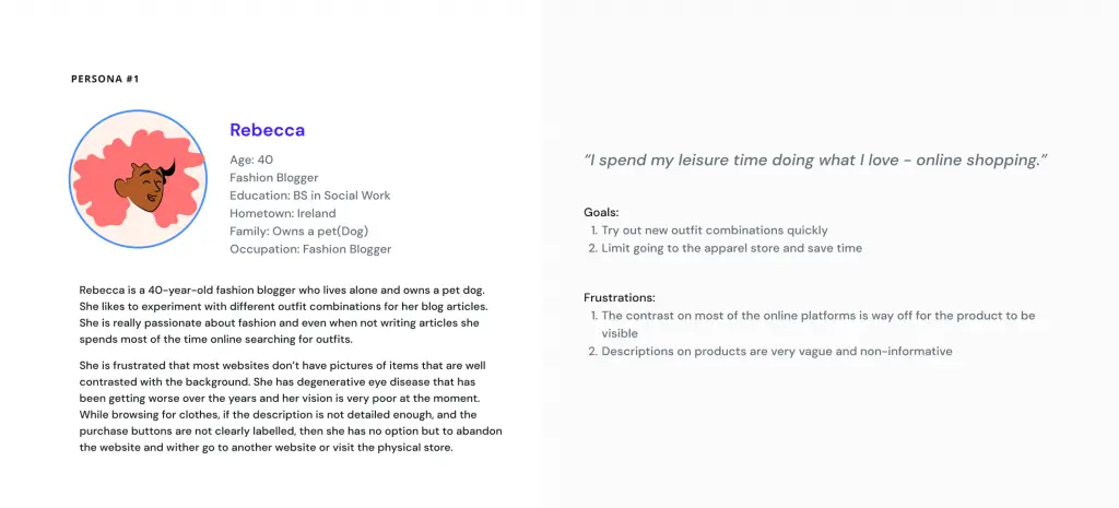
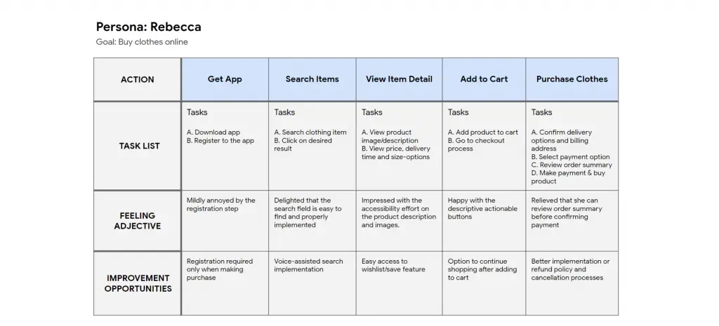
User Persona: Rebecca
Problem statement: Rebecca is a blogger with visual impairment who needs an accessible online store to purchase outfits for her articles because going to the physical store is very inconvenient.
User journey map
Mapping Rebecca’s user journey revealed how helpful it would be for
users to have access to a dedicated Online Clothing app for the blind.
Starting the Design
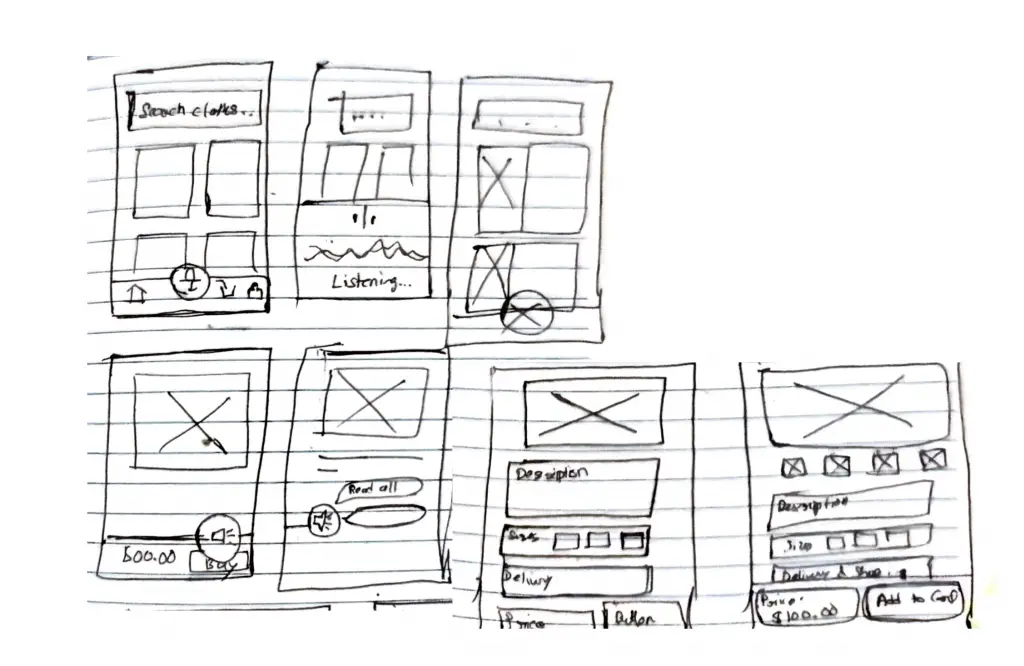
Paper wireframes
Taking the time to draft iterations of each screen of the app on paper ensured that the elements that made it to digital wireframes would be well-suited to address user pain points. For the home screen, I prioritized the search field to help users with disability easily browse products.
Digital wireframes
As the initial design phase continued, I made sure to base screen designs on feedback and findings from the user research.
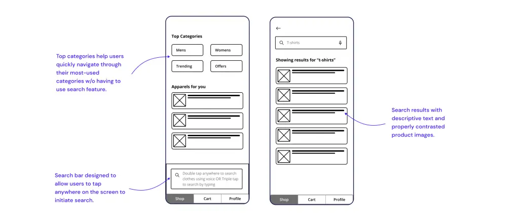
The primary goal is for users to find items they are looking for fast and easily.
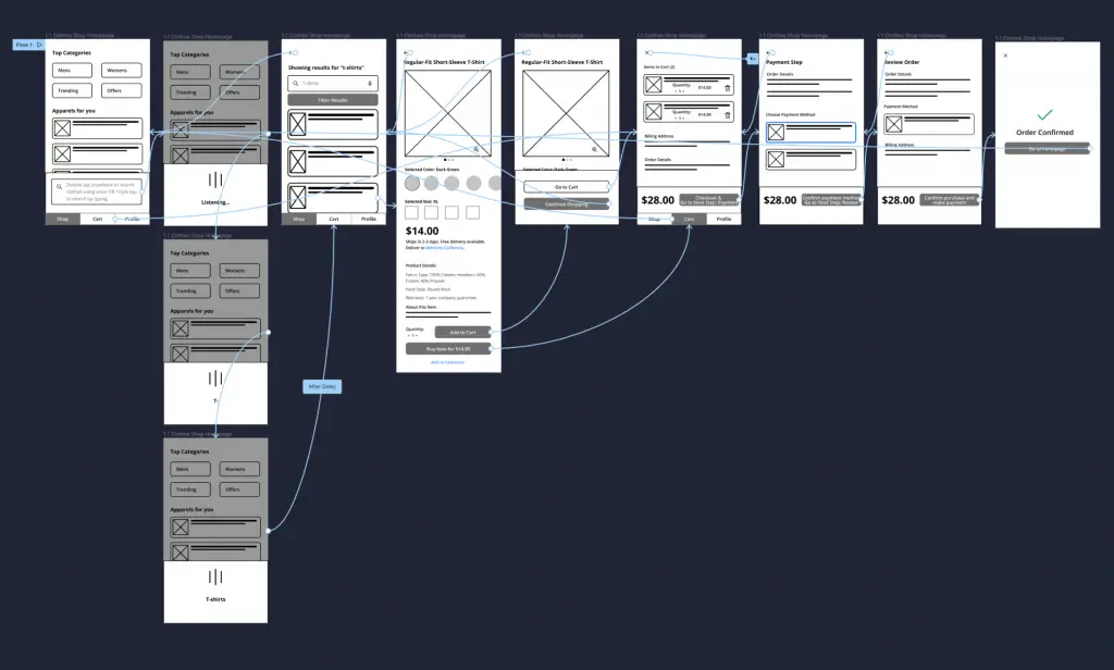
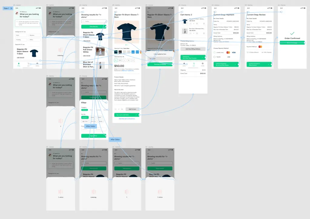
Low-fidelity Prototype
Using the completed set of digital wireframes, I created a low-fidelity prototype. The primary user flow I connected was for the “Making a purchase” manual flow.
View the Neue app low-fidelity prototype.
Usability study: Findings
I conducted two rounds of usability studies. For synthesizing my results I create an affinity diagram.
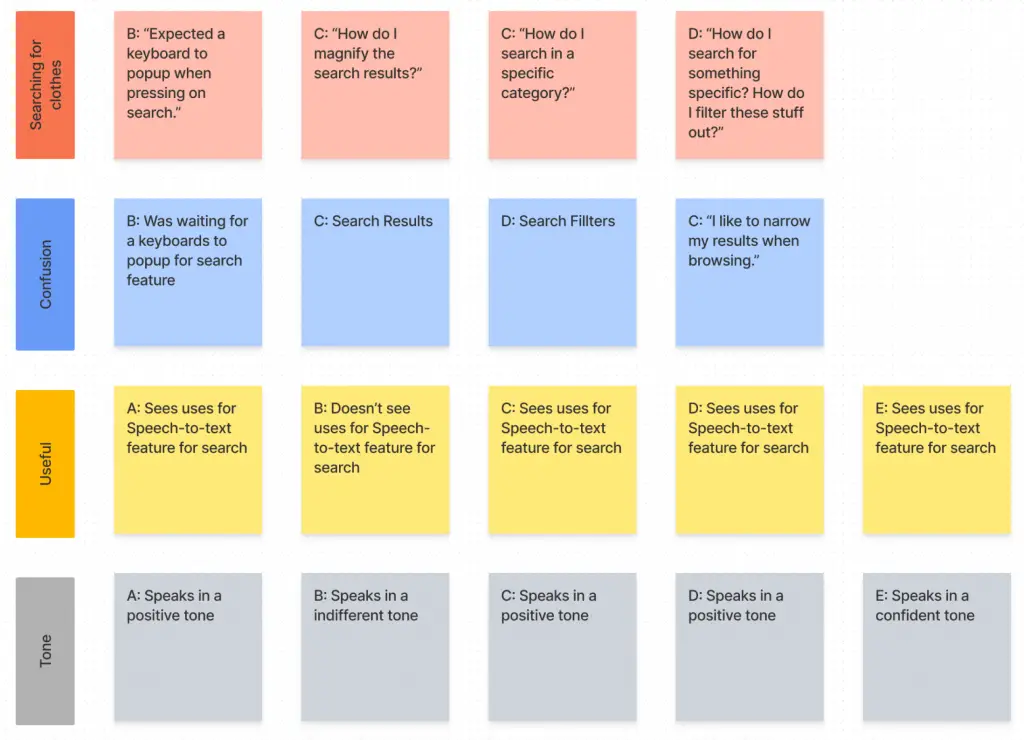
Findings from the first study helped guide the designs from wireframes to mockups. The second study used a high-fidelity prototype and revealed what aspects of the mockups needed refining.
Findings:
- Users want a filter options to find specific results.
- User want to have easier search typing feature.
- Users want to have well written descriptions & CTAs for screen readers.
Refining the Design
Mockups
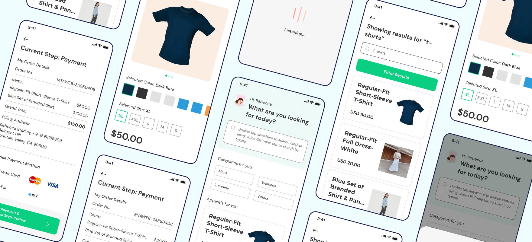
My early designs didn’t have contextual headings and placeholder texts for screen readers. So, I added a bit more context to every actionable task such as descriptive headings and search input placeholders.
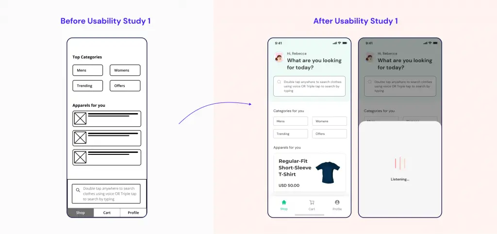
After the second round of usability studies, I noticed users wanted specific results as search output instead of a never-ending list of results. To improve on this, I added a prominent filter button to help users narrow down search results.
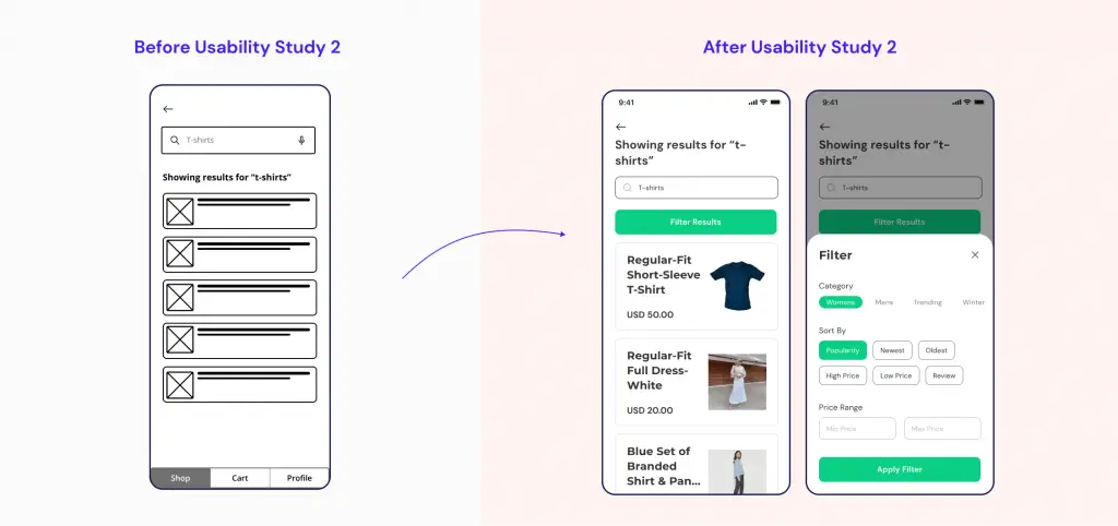
Here is how my final design looks like:
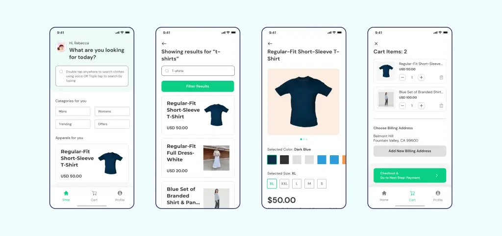
High-fidelity prototype
View the Figma Link for hi-fi Prototype
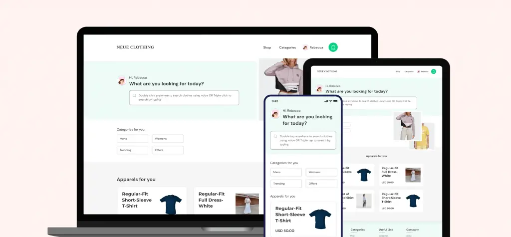
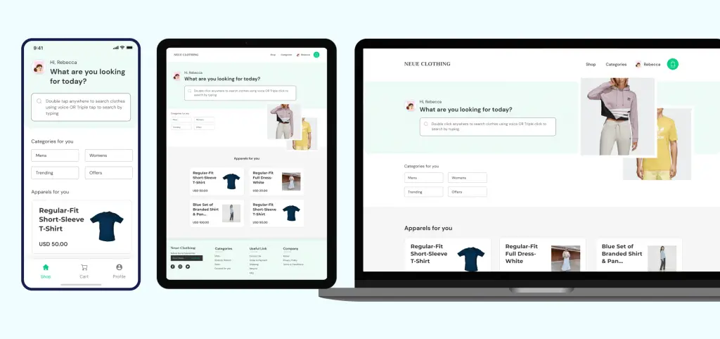
Responsive designs
The designs for screen size variation included mobile, tablet, and desktop. I optimized the designs to fit the specific user needs of each device and screen size.
Accessibility considerations
- Used appropriate contrast and tested colors so that color-blind users can easily differentiate the UI elements.
- Used detailed instruction text and typography hierarchy to help all users better understand the design.
- Used gesture navigation wherever possible to make navigating through the app a lot easier.
Going forward: Takeaways & Next steps
Impact:
The app helps users with disabilities buy clothes online w/o having them visit the store physically.
“All I wanted was a good search bar. Didn’t know this was the one I wanted.”
What I Learned:
While designing the Neue Clothing app, I learned that there are some biases I needed to overcome to make design accessible. Usability studies and peer feedback influenced each iteration of the app’s designs.
Next Steps:
- Add more accessibility features which will result in a better experience for all.
- Add overlay tips for users who are not tech savvy since many of our user base falls in that category.
- Research more on the workflows of how are users actually use the app.
![Flora: An Online Flower Shop [Case Study]](https://ux360.design/wp-content/uploads/2022/01/flora-app-case-study-banner-768x350.png)