Flora: An Online Flower Shop [Case Study]
Project Overview
The product: Flora is an online flower shop based in San Fransico, California that also ships its products to the UK. The app is designed around making buying flowers as easy as possible for all types of users with accessibility as a priority. As part of the accessibility focus, the app is designed to work across as many devices as possible including mobile, tablet, and desktop.
Project duration: August 2021 to October 2021
The problem: Interior designers need to experiment with a lot of decoration plants but clunky interfaces and vague refund policies make it difficult to make online purchases.
The goal: Design an app for the Flora Flower Store that allows users to easily purchase flowers, not having to worry about getting low-quality items; saving time and money.
My Role: UX designer designing a web app for Flora from conception to delivery.
Responsibilities: Conducting interviews, paper, and digital wireframing, low and high-fidelity prototyping, conducting usability studies, accounting for accessibility, and iterating on designs.
User Research: Understanding the user
I conducted interviews and created empathy maps to understand the users I’m designing for and their needs. A primary user group identified through research was interior designers who had to make a lot of indoor flower purchases for experimentation.
Every individual who participated in the research showed a similar pattern where they primarily browse through the products using categories.
Pain Points
- Time: Buying flowers frequently takes longer through online purchases due to shipping periods.
- Cost: Buying flowers frequently adds on extra cost for shipping fees.
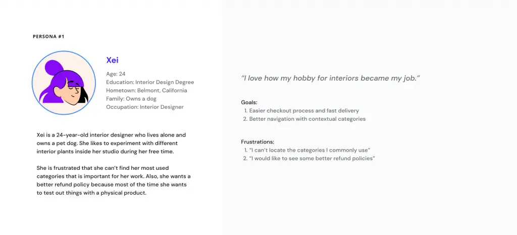
User Persona: Xei
Problem statement: Xei is a passionate interior designer who needs an online platform that contains intuitive navigation for browsing plants and flowers because she wants to experiment with different plant decorations for her work and studio.
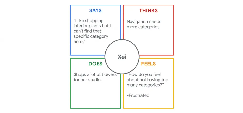
Empathy Map for Xei
I created an empathy map to understand Xei’s needs and help me make better decisions while designing the product.
Starting the Design
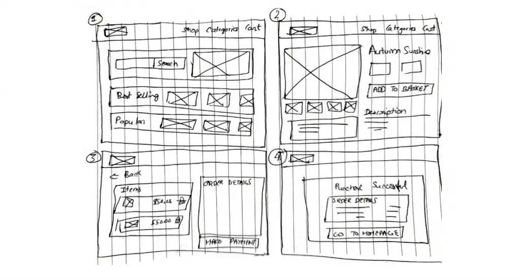
Paper wireframes
Taking the time to draft iterations of each screen of the app on paper ensured that the elements that made it to digital wireframes would be well-suited to address user pain points. For the home screen, I prioritized the search feature to help users find what they are looking for easily.
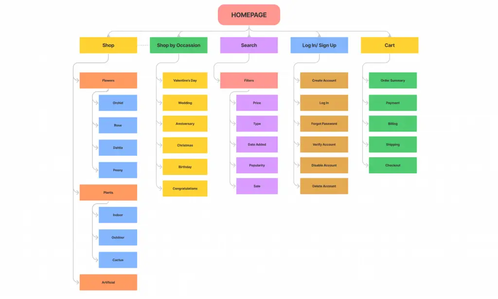
Information Architecture for Flora Website
I started working on the IA for the website next so that I can visualize the website before I digitize the wireframes. This helped the lot with what the primary navigation would look like and how the sub-pages would be categorized. This is how the final IA diagram looks like.
Digital wireframes
As the initial design phase continued, I made sure to base screen designs on feedback and findings from the user research.
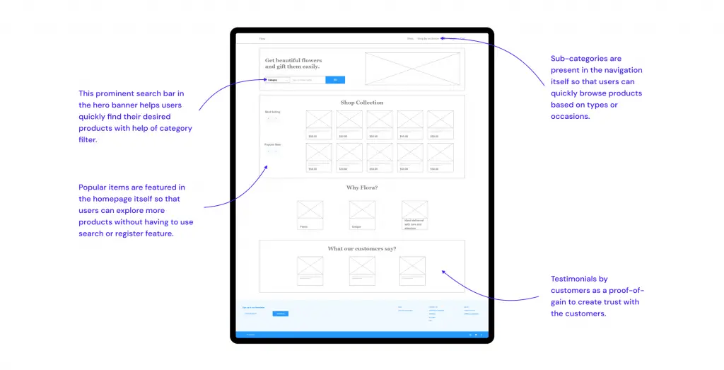
The primary goal is to create a search feature that integrates category filters in itself.
Low-fidelity Prototype
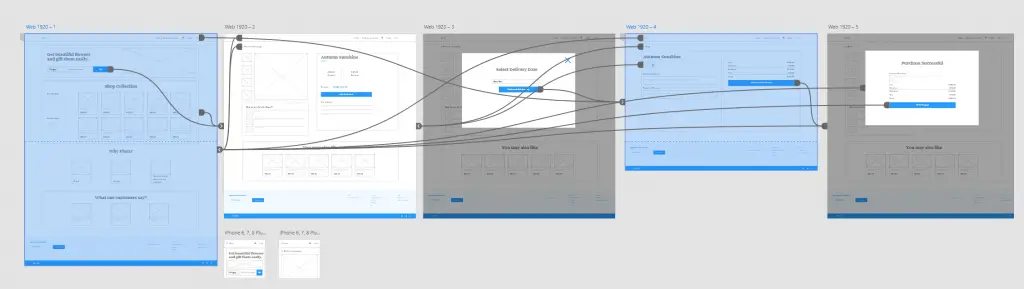
Using the completed set of digital wireframes, I created a low-fidelity prototype. The primary user flow I connected was for the “Making a purchase” manual flow.
View the Flora app low-fidelity prototype.
Usability study: Findings
I conducted two rounds of usability studies. Findings from the first study helped guide the designs from wireframes to mockups. The second study used a high-fidelity prototype and revealed what aspects of the mockups needed refining.
Findings:
- Users want a better purchase flow.
- Users want detailed descriptions for their items.
Refining the Design
Mockups
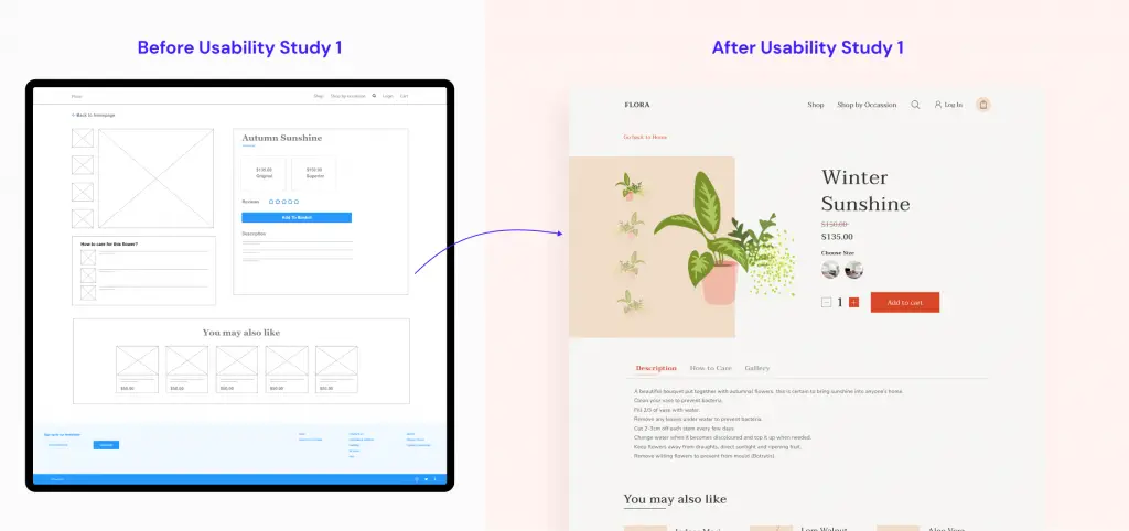
My early designs had a vague representation of item descriptions and details. After the usability study, many participants kept asking about how detailed the descriptions would be, so I organized the description into tabs and added an additional gallery option for inspiration on decorating.
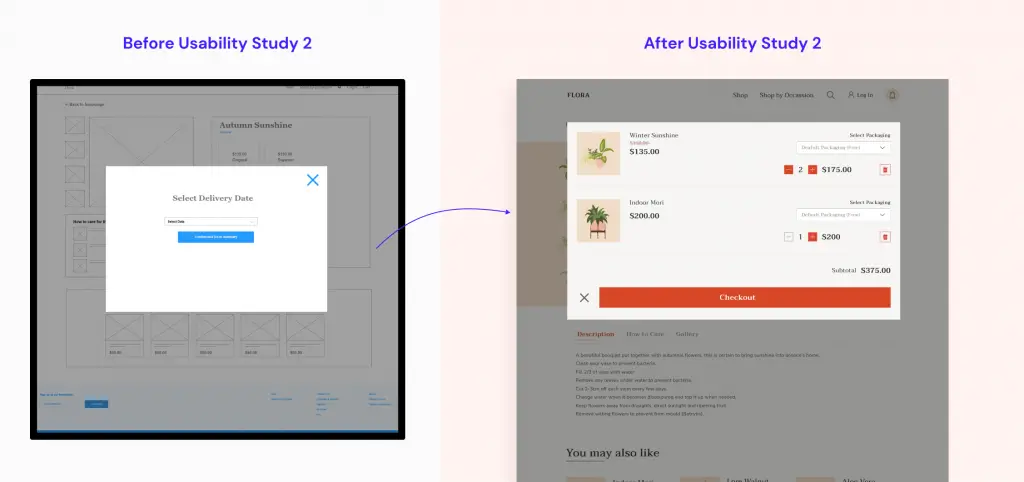
After the second round of usability studies, I noticed users were confused about the payment flow. To improve on this, I added a few more steps with detailed instructions on how to make a purchase.
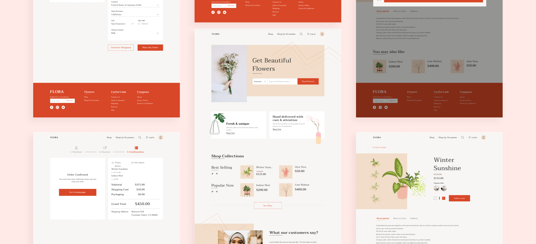
Here is how my final design looks like:
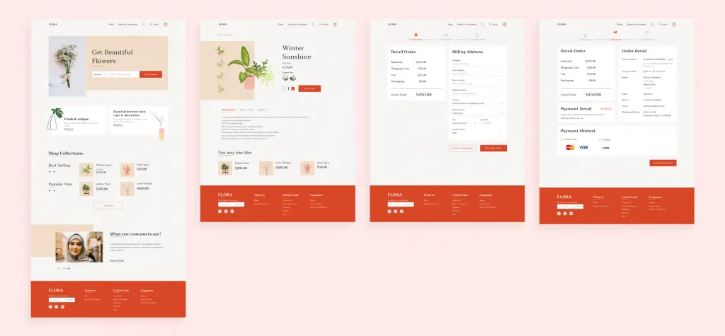
High-fidelity prototype

View the Figma Link for hi-fi Prototype
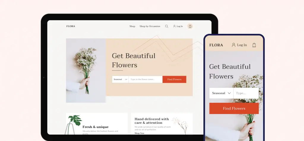
Resonsive designs
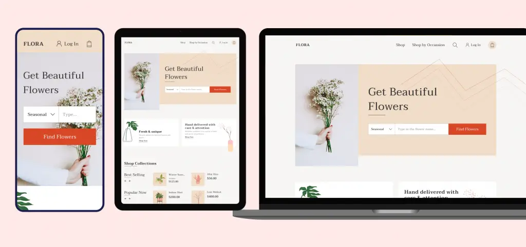
The designs for screen size variation included mobile, tablet, and desktop. I optimized the designs to fit the specific user needs of each device and screen size.
Accessibility considerations
1
Used appropriate contrast and tested colors so that color-blind users can easily differentiate the UI elements.
2
Used detailed instruction text and created support for assistive technologies such as screen readers.
3
Designed the app to adapt to any screen or device size so that users can access it through any device of choice.
Going forward: Takeaways & Next steps
Impact:
The app helps users purchase high-quality flowers for themselves or as gifts.
“I like how there are inspirations for designers on each product. This will help me out a lot before making a purchase decision.”
Quote from peer feedback
What I Learned:
While designing the Flora app, I learned that there are scenarios where my solution may not be the best solution for the majority of the users. Usability studies and peer feedback influenced each iteration of the app’s designs.
Next Steps:
- Add more accessibility features so that we design for underrepresented groups which will result in a better experience for all.
- Add overlay tips for users who are not tech savvy since many of our user base falls in that category.
- Research more on the workflows of how are users actually use the app.
![Neue: An Online Clothing Store for Blind People [Case Study]](https://ux360.design/wp-content/uploads/2022/01/Neue-clothing-store-case-study-banner-768x350.png)