Design for Accessibility: Meaningful Additions to make Products Accessible
Good design isn’t just about making one’s product pleasing to the eye – it is also about making them easy to use and interact. For instance, one could make a website with beautiful web pages, but if it doesn’t have proper links and navigation section, then the user will have immense difficulty in using the site.
In this section, we will discuss the principle behind making products simple and easy to use: accessibility.
What does accessibility mean?
An object or surrounding designed to be usable by any people abled or differently-abled alike – and without any additional instruments is known as accessibility.
This very practice is applied in every modern product we use from simple food cans to high tech machines. Similarly, our apps or websites can also follow the principles of accessibility. This way the majority of people can use our product to its full potential.
An example of accessibility in software would be the feature to accommodate color blind people in the popular video game Fortnite. The game has a color-blind mode, which can be adjusted by people as per their preference.

Guidelines for Accessible Designs
Here are the principal characteristics of accessible designs:
Make designs easily perceived by the users:
Perceptibility is achieved when people can easily understand the design’s purpose regardless of their sensory abilities.
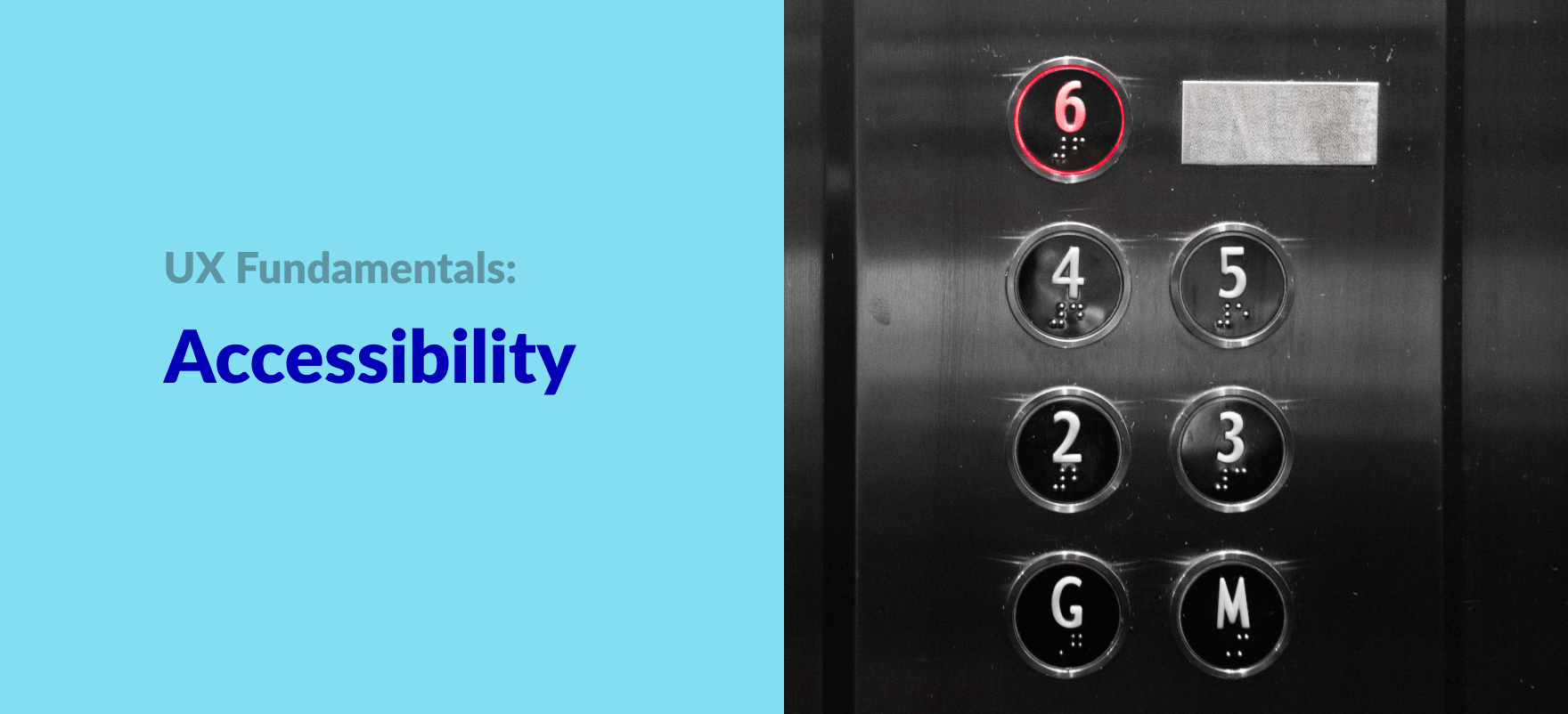
For example, elevators must have their buttons to be centered 42 inches from its floor, so that even people who are on wheelchairs can access it easily. Also, there is an auto verbal announcement for a stop as well as signals for passed and present floor.

Implement perceptibility by:
- presenting info with different mediums as in sounds, texts, and images.
- making products compatible with sensory assistive technologies like ALT tags for images on the internet.
- positioning controls to accommodate both standing and seated users.
Make easily operable products:
Designs should be easy enough to be operable by people regardless of their physical abilities.
Taking the same elevator as an example: We have already looked at how to make the button information more perceivable. Now, we need to look at how it is designed to be operable by everyone. There are braille included below the floor numbers in the button itself. This is so that even blind people can operate it easily. Also, two-way communication in elevators is mandatory so that deaf or blind people can operate it too.

Implement operability by:
- minimizing repetitive actions to limit sustained physical effort.
- making products compatible with physical assistive technology like prosthetics and wheelchairs.
The simplicity of the interface:
Designs should be simple so that people should understand it regardless of their experience or literacy.
Implement simplicity by:
- getting rid of unnecessary complexity.
- label controls clearly.
- using progressive disclosure, a design technique to help maintain the user’s attention by reducing clutter
- ensuring texts are easy to understand for the majority.
Forgiveness:
Designs should minimize the number of errors and their consequences on the product.
Implement forgiveness by:
- good constraints (controls that will only execute when correctly done).
- using confirmations and warnings for the user’s actions.
- including reversible actions like an undo button to reverse the last action performed by the user.
Summing Up
- Always create products that can be used and understood by all demographics.
- The design should be easy to understand, easy to use and should be forgiving.
- Accessibility is important to expand your product reach and attract new users.


