Unity Principle of Design [Infographics Included]
What is unity in design?
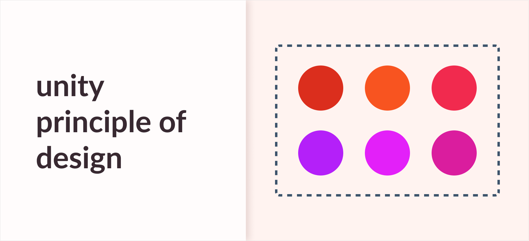
Unity in design means creating a sense of visual similarity between different elements in a composition. It unites all the elements used in a composition and balances them with each other to create a sense of visual similarity.
In this article, we’ll be talking about unity and its example with some infographics to better understand the topic. Let’s dive into it straight away.
Introduction
Essentially, unity refers to the merging of all things that come together while ignoring their distinctions.
In design and art, unity equals harmony and balance between the elements used in a composition. It provides a constant sense of visual familiarity to the users. A basic example of unity in design can be seen in Ugmonk’s site. Ugmonk’s homepage has an image of t-shirts on a wardrobe. The background and all other supporting elements create a sense of unison as if it really is a real-world wardrobe.

What is the importance of unity in design?
Unity is best applied to create consistency in design.
Let’s assume we’re working on a new project and we need to choose our brand colors. Instead of using random colors, we might want to use an analogous color scheme to give the final design a feeling of consistency and cohesion.
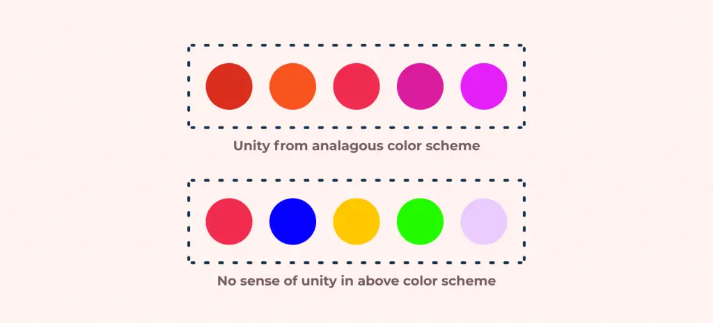
Lack of unity in design would make the composition disarranged and disorganized, further proving it to be an important aspect in design.
For me personally, designers who are just getting started should invest and focus on achieving unity in their designs first. Only then would it be easy for designers to get more into advanced implementations like variety. It is the one area that can visibly differentiate a good designer from the rest of the crowd.
Unity is an important aspect in design and its importance is needed to achieve the completeness of a product. Some of its importance are listed as:
- It emphasizes your concept and theme and helps communicate your message to your reader.
- It brings wholeness to the entire design to bring balance and visual comfort to your users.
- It leads to order and organization between the design elements and lets the designers offer creativity to their work.
- It guides the designer on how to use all the other principles to achieve visually pleasing compositions.
How to achieve unity in design?
To create unity in a design, each element is created to support the other. We use different design principles to achieve unity in design:
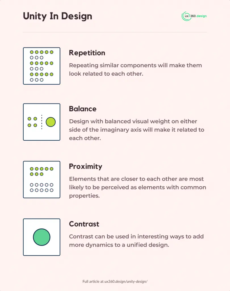
- Repetition: Repetition is the use of similar or connected elements. It works with patterns to make the artwork active and give a sense of familiarity to the users. It is because repeating similar components will make them look related to each other.
- Balance and alignment: Elements that follow a common axis and bring equilibrium to the composition creates unity. Design with balanced visual weight on either side of the imaginary axis will make it related to each other.
- Proximity: Elements that are closer to each other are most likely to be perceived as elements with common properties. It goes hand in hand with repetition. Explore more on this with the article “Gestalt’s design principles: Proximity”.
- Contrast: Contrast can be used in interesting ways to add more dynamics to a unified design. It can be applied using color, typography, alignment, or some other combination.
In order to establish unity in your design, the best way is to continuously take a step back along the process and analyze whether or not its core is unified. If you’re a designer, it’s a good idea to have your friends or coworkers review your work from a unity standpoint before making a striking change.
The next step to get further into unity and how it can be achieved with the other principles of design would be to understand ‘variety’. Visit my article on “Variety- Principles of Design” where I explain how unity can be achieved through variety here.
Also, check out my article on the 11 design principles which explains the guidelines on how to use visual elements to create a composition. I would also suggest you read up on the Variety principle of design to better understand how these two principles are interconnected.

![Balance Principle of Design [Infographics Included]](https://ux360.design/wp-content/uploads/2022/01/balance-768x350.png)
