Variety Principle of Design
Variety means adding a change to disrupt the monotony of a composition. It creates visual interest in design. Variety can be achieved through a number of different factors, listed as
- Repetition and rhythm – unpredictable patterns on design
- Line – different lengths and weights
- Shape and scale – changing up the look of some elements
- Color/Hue – using diversity in the color tones and hues
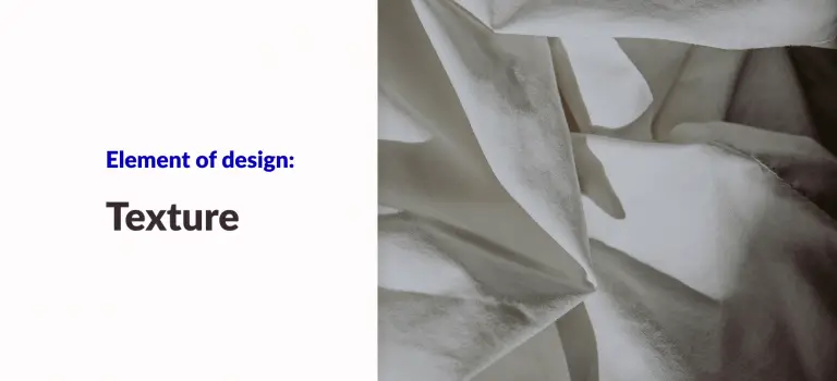
- Textures – rough or smooth planes
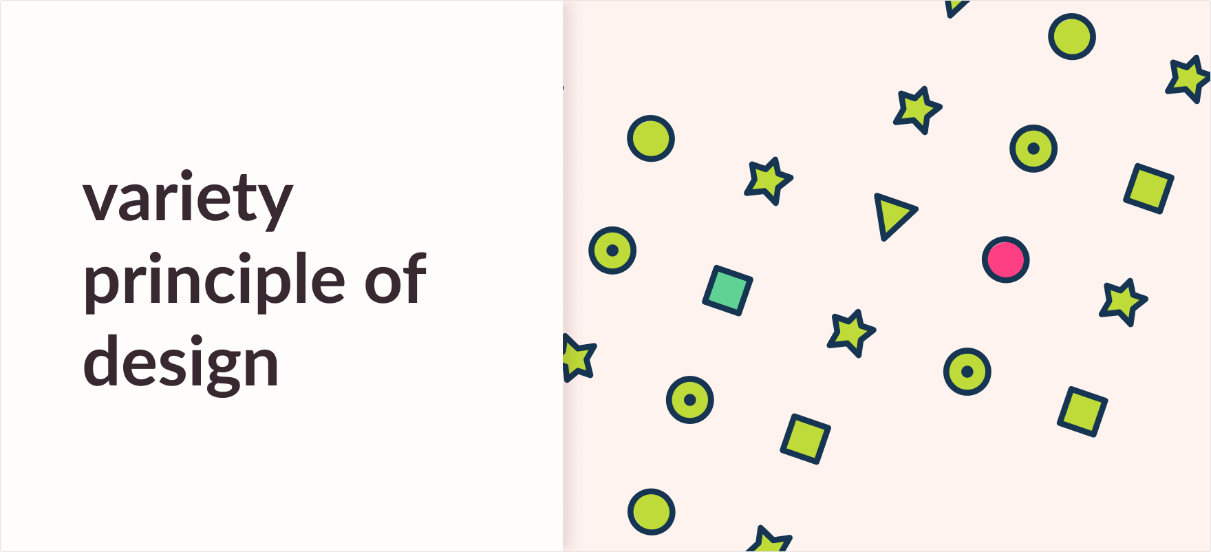
With the use of variety in your design, you can quickly save it from becoming boring and monotonous. You can draw attention and entice your audience with a few simple changes. It creates visual interest and energy. Let’s take a look at this easy diagram.
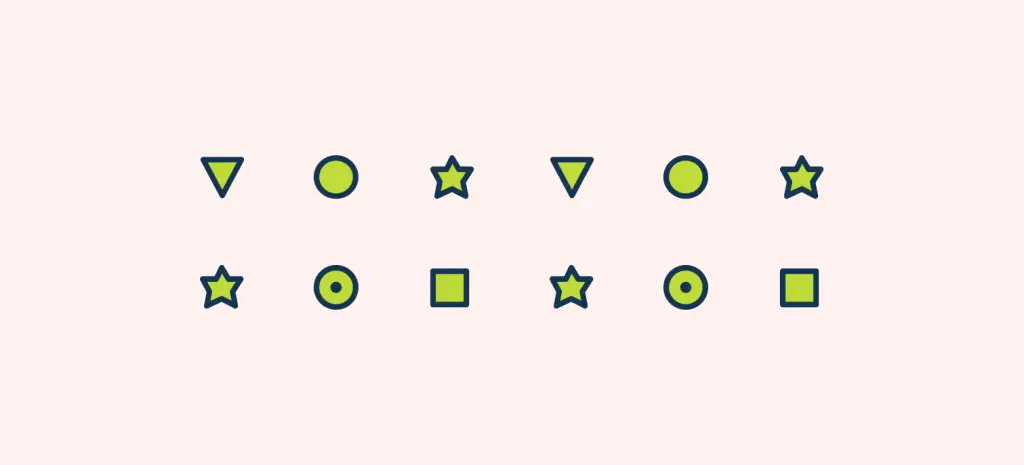
In the image above, you can see how the use of basic shapes can add variety to your design so that it piques the user’s interest.
Keep in mind that the use of excess variety in your design can make it overbearing and overwhelming, ultimately turning chaotic and difficult for the general audience to understand.
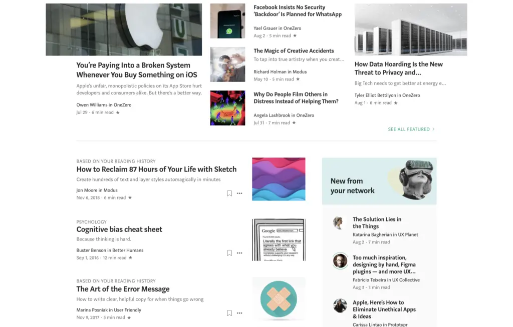
TO illustrate the variety principle in UI design let’s take a look at the Medium homepage. Medium uses variety in its layout to create a categorization between the type of articles as shown in the image below.
What is variety in principles of design/art?
As mentioned, in principles of design and art, variety adds an interesting outlook to your design. It is an important design aspect because of a number of reasons. Some of them are listed as:
- Variety holds the viewer’s attention on your design.
- It guides the user’s eye through and around your work.
- It shows contrast in your design.
- It adds diversity and prevents your design from getting dull.
- You are able to direct the user’s attention to the most relevant aspects of the design.
What is unity and variety in principles of design?
In principles of design, you will stumble upon the terms ‘unity’ and ‘variety’ at some point in your journey. These are the two most important principles of design as both of the principles hold the composition together and influence the overall outlook of the work. Simply put, a good design is achieved by a balance of unity and variety.
In my article about unity in design and art, I’ve touched upon the topic and reiterated that unity is all about making different elements come together as one. When variety is added to the mix and paired with unity, it offers the viewers points of interest. Variety, for the sake of variety, is useless and it is only best applicable when it props up other design elements to create a more interesting and aesthetically pleasing result.
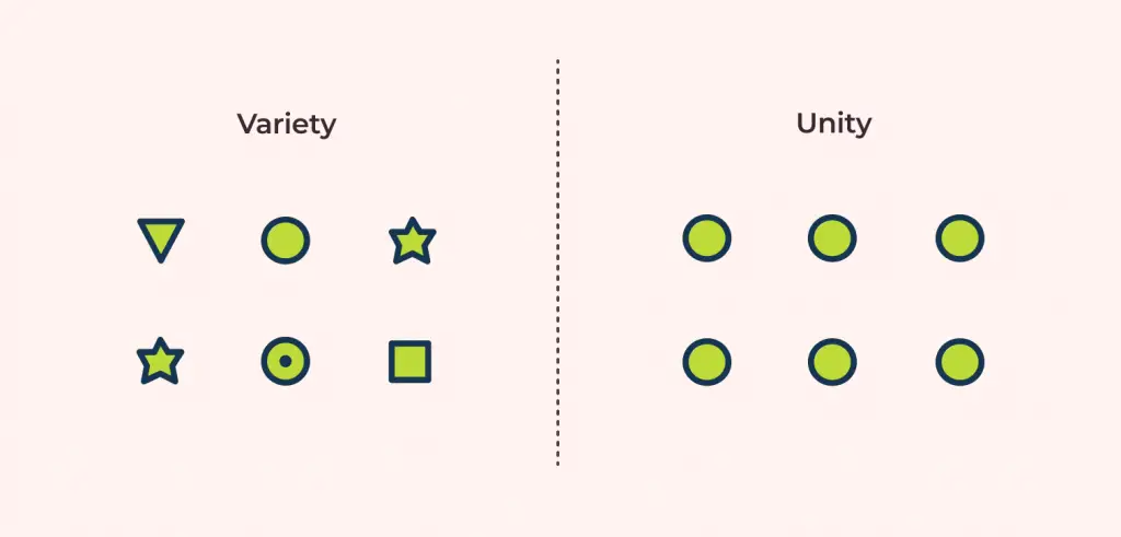
When a design uses both variety and unity in a single composition, it creates a perfect balance and utilizes the core concept of principles of design. When either of the two principles is used more, it disconnects the balance and disrupts the harmony in the design. When unity is extreme, the design turns dull and uninteresting. Similarly, when variety is over the top, it turns the design disorganized and disordered
Quick tip, always try to be as mindful as possible about the use of these principles of design and make an effort to get a perspective on how things look in your work.
Simple ways one can add variety to their work is by adding curvy lines next to straight lines, geometric shapes in the midst of organic shapes or even adding bright neon colors next to dark grey tones. This is simply meant to say that variety, when added to a design, is what captures the attention of the audience and makes the design worth looking at.
To get more information on how variety adds that extra spice and how it should be used with the rest of the core concepts, make sure to check my article on it here: The 11 Principles of Design and Art [Infographics Included] (ux360.design). I would also suggest you read up on the Unity principle of design to better understand how these two principles are interconnected.

