Point in design
A point on itself is an abstract object defined by a coordinate that is not tangible (seen or be felt). It is a single entity that functions as a focal point in a composition of its own.
In this article, we will be looking into what a point basically is and how it is used in design.
What does point mean?
In design and art, a point or dot is a starting point of any figure. It can also be seen as a building block of any sort of composition since every shape always begins with a point. The strongest feature of a point is that it’s an area of focused attention.
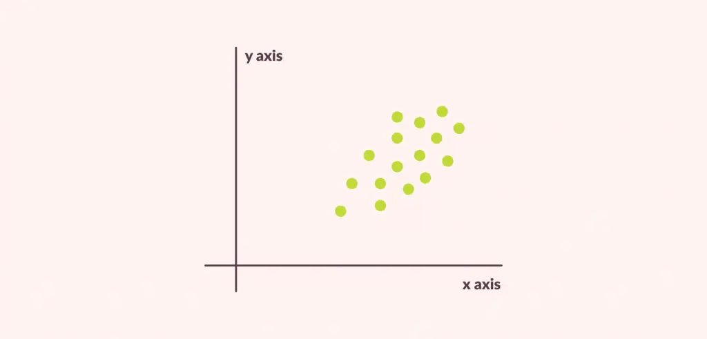
A point is defined by its coordinates and it doesn’t cover an area.
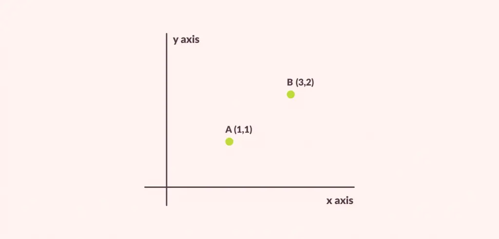
In the figure above, point A is at coordinate (1,1) and point B is at coordinate (3,2).
How is a point used in design?
Points establish a relation with the space surrounding them. Even when there is only one point present in the design, our brain works to find the meaning of its placement and tries to make something out of it. By taking advantage of this phenomenon, a single point can be used to create a wide range of visual effects based on its position.
Let us take a point that is placed in the center of an area.
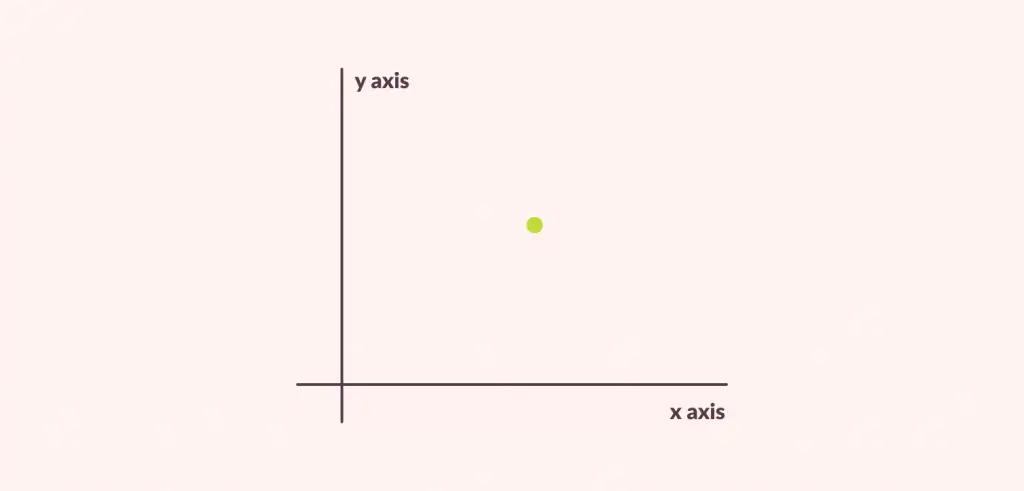
This figure can be used to represent calm or tranquility in your design.
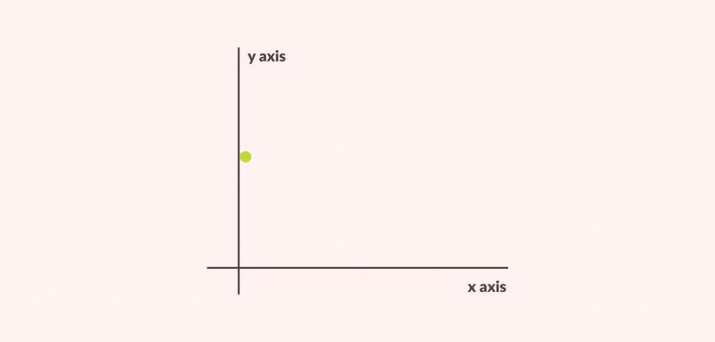
When the same point shifts and is placed towards the end of the area, it can be used to create tension in the design. Similarly, repetition of such points can be used to create interesting and vivid effects.
When the size of a point increases and we start to see it as a shape of some sort, it still retains its most important quality of attracting visual attention to it. Now let’s move on to how we can make an impression using the relationship between the two points in design.
Relation between 2 points
Although a single point can make a visual change to your design, the situation becomes more intriguing when another point is added and we study their interaction.
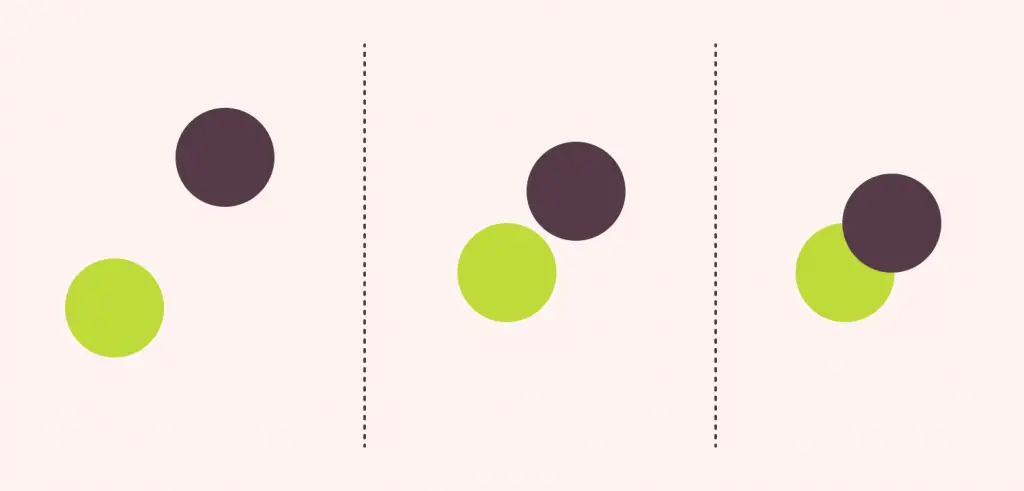
When two points are placed further from each other, the points act as different entities and it can be used to emphasize the structure between them. When multiple points are added to the figure, a pattern is created and further emphasis is placed on its structure.
Similarly, when two points are placed near each other, tension is created between them. Closer the distance, the higher the tension. As the points come closer to each other, the tiny space that remains between them holds all the tension and becomes more important than any of the points present in the figure.
At some point, when we allow the points to close onto each other, a new relation is created where one point is in the foreground and the other is in the background. Overlapping points form other complex shapes like lines and curves. Lines and curves lead to concepts of movement and creating design flow.
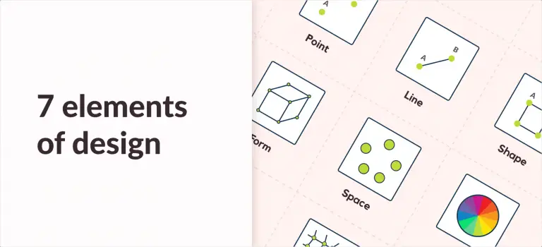
To sum it all up, we can say that a point is the simplest element of design that holds the fundamental function of entry points and focal points. As a beginner, it is incredibly important to get a clear understanding of such basic elements right from the start. To learn more about other elements of design, be sure to check my article on all the 7 design elements where I have briefly included all the information to get you started on the right foot.

![Balance Principle of Design [Infographics Included]](https://ux360.design/wp-content/uploads/2022/01/balance-768x350.png)
