Proportion Principle of design
In a composition, proportion refers to the relationship between objects with reference to their size and visual weight. It is one of the easier design principles to understand that mainly focuses on the comparison of shapes and sizes of elements in relation to another.
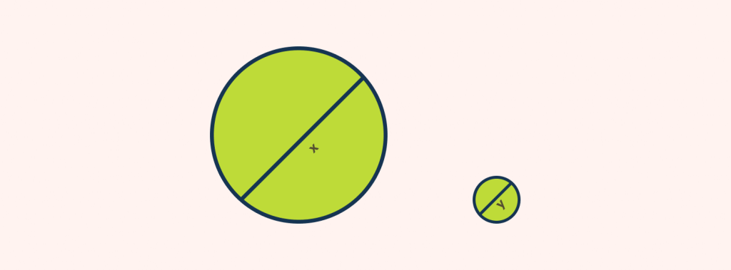
For size, making an element LARGER gives it much higher importance than those elements with a smaller size.
For visual weight, making this part of the sentence bold, makes it look more important than this part of the sentence.
What is an example of proportion in design?
Let us get a closer look at the topic with an example of proportion on Avrox’s website. On their site, a dominantly large product image is used to draw attention towards it.
The product image is relatively larger and given highlighting than all other elements in UI to create a sense of importance. In this article, we will learn about what proportion actually is and how you can apply scale and proportion to enhance your designs.
What is proportion in visual design?
Simply put, proportion is all about how objects relate to each other in terms of size, scale, shapes, and quantities between the various elements of a composition. Designers use the concept of proportion to create sensations such as perspective, realism, balance, and elements of surprise in their work. It is an important design principle that evenly specifies the element that needs more focus than the other.
A good proportional design is easy on the eyes and creates harmony and balance between the elements. It gives a clear picture of what is supposed to be seen and brings a visual hierarchy to your design.

In opposition to that, a bad proportional design can be confusing to the general audience and push them away from seeing the actual content.

We talked about proportion in design, now let’s answer what proportional means in a design composition?
Proportional means the relative size and scale of various elements in a design. The main concern lies when the proportion is to be maintained with other objects used in a composition. This means that it is necessary to understand it in terms of context and standard used.
Most of the time, proportion goes unnoticed until something is out of proportion. When the relative size of one object seems wrong or out of balance with respect to another object, it is ‘out of proportion’.
We have two ways to look at proportion in a composition. They are listed as:
- Proportion based on context
- Proportion based on relationship
Let’s take the help of an example to better understand the concept. Consider an elephant – large ears, big trunk, and small eyes.
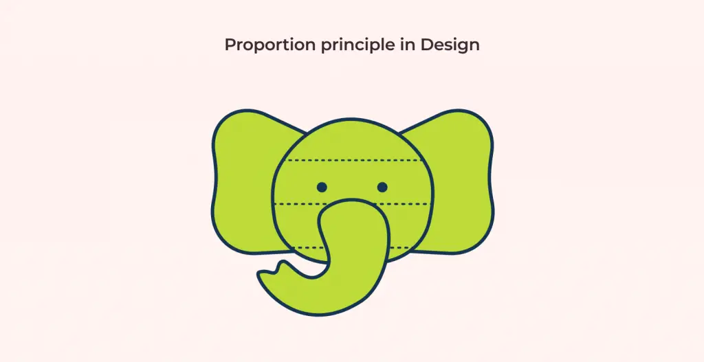
When we see an elephant in real life and notice its trunk being unusually smaller than that of a regular-sized elephant, we say it looks “out of proportion”. We pass our judgments with respect to the standard and on the basis of what is expected. This is a proportion based on context.
Another way to look at it is through the concept of proportion based on relationship. In the same sense, when the elephant’s eye is bigger than the rest of its features, we say it is “out of proportion”. This is because its sizing is much different than that of what is expected and we pass our judgments with respect to its relationship with other facial features.
The end goal of using proportion in design is to always create a harmonious relationship between the elements in the same composition. Although in the constant need of harmonious proportion, it can sometimes create a sense of monotony in your work. Every so often, when something is out of proportion, it does help create a statement as well.
Achieving Proportion in our Designs
Now let’s look at how is the proportion principle is achieved? Basically, a size comparison tells us if a proportion is best applied in the design. It can be made between
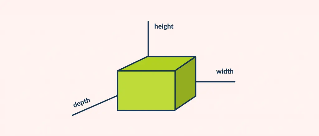
- Height, width and depth of elements
- Size of one element to that of another
- Size of one area to the size of another
- Relationship between the elements
Let’s get deeper into each of the topics.
Height, width, and depth of elements
Let’s not take size into consideration for a moment. Apart from size, we take the element’s height, weight, and depth. Suppose, we have cuboids to illustrate in a composition. In the case where we fail to represent any of its properties, the true essence of the element cannot be seen. Let’s say we create one cuboid with all of its properties (height, width, and depth) and the other without defining height (width and depth), the figure looks ‘out of proportion’ and the real meaning gets lost in the image.
Size of one element to that of another
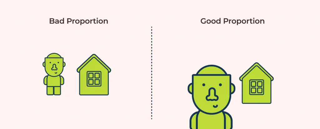
The size of the elements we use makes our work proportional. If the size of the house is smaller than the size of a human in your design, it can distort the proportion. In case you have to make the house smaller than the human, it is required to take perspective into account and make it seem like the man is nearer to the viewer’s eye than the house. This makes the design more presentable and the viewer can relate to the image.
Size of one area to the size of another
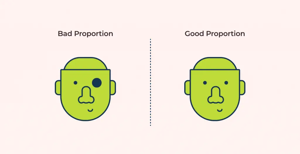
Since size is such an important aspect in proportion, it is equally important to take the sizes of the area an element covers in the design. We have to be mindful not to make too much difference in areas as it may disconnect the elements and the relationship between the two cannot be made. For example, if the size of one eye is smaller than the other, the face looks disproportionate.
Relationship between the elements
Before moving on to the next part of designing, it is important to understand the relationship between the elements that are to be included in the composition. Let’s take a leaf for an example.
A leaf should be smaller in size when it is presented alongside a tree but when the same leaf falls over an ant, it should be bigger in size. Similarly, different elements have a relationship with each other and you should always be careful about how it exists in nature.

All in all, it is extremely important to consider proportion in your design when you are creating a composition. To get more information on how you can further use proportion in unification with other design elements, check out my article on the core concepts on 11 elements of principles of design here: The 11 Principles of Design and Art.

